Studio: Flightpath | Client: Optimum/Cablevision
A relaunch for the Optimum: Get Started website, a tutorial and informational website for new customers. My role in this project was lead web developer.
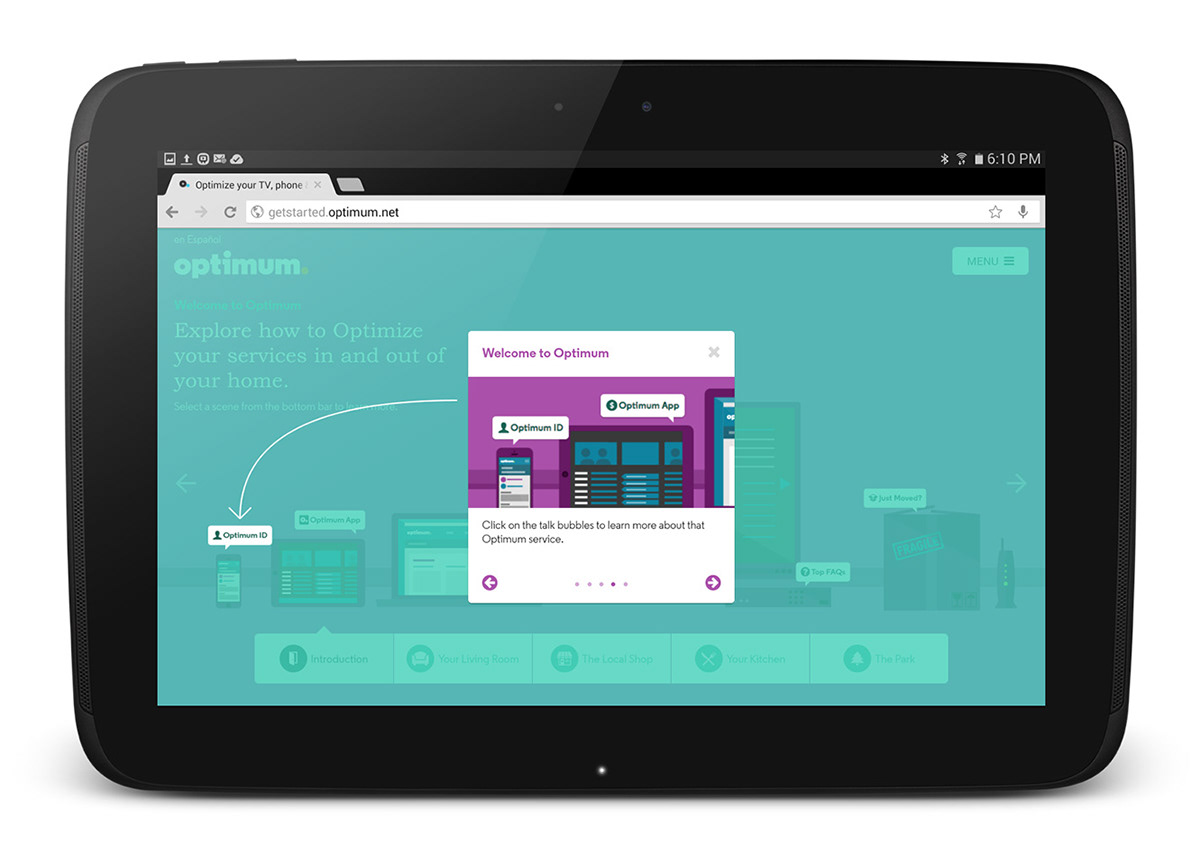
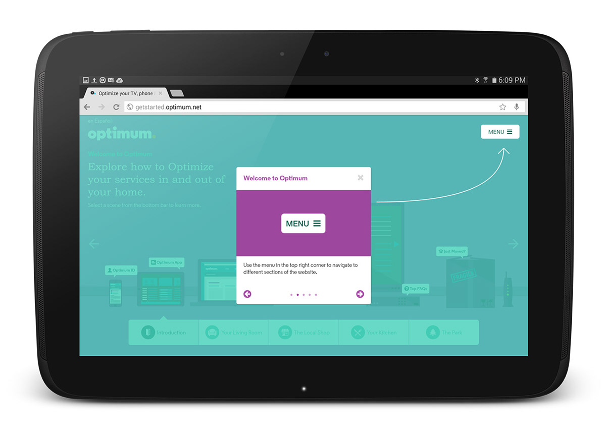
When a user first visits the site, they are greated with a tutorial on how to navigate. The tutorial itself is rather simple, but it did post some challenges in its implementation, which required some creative solutions
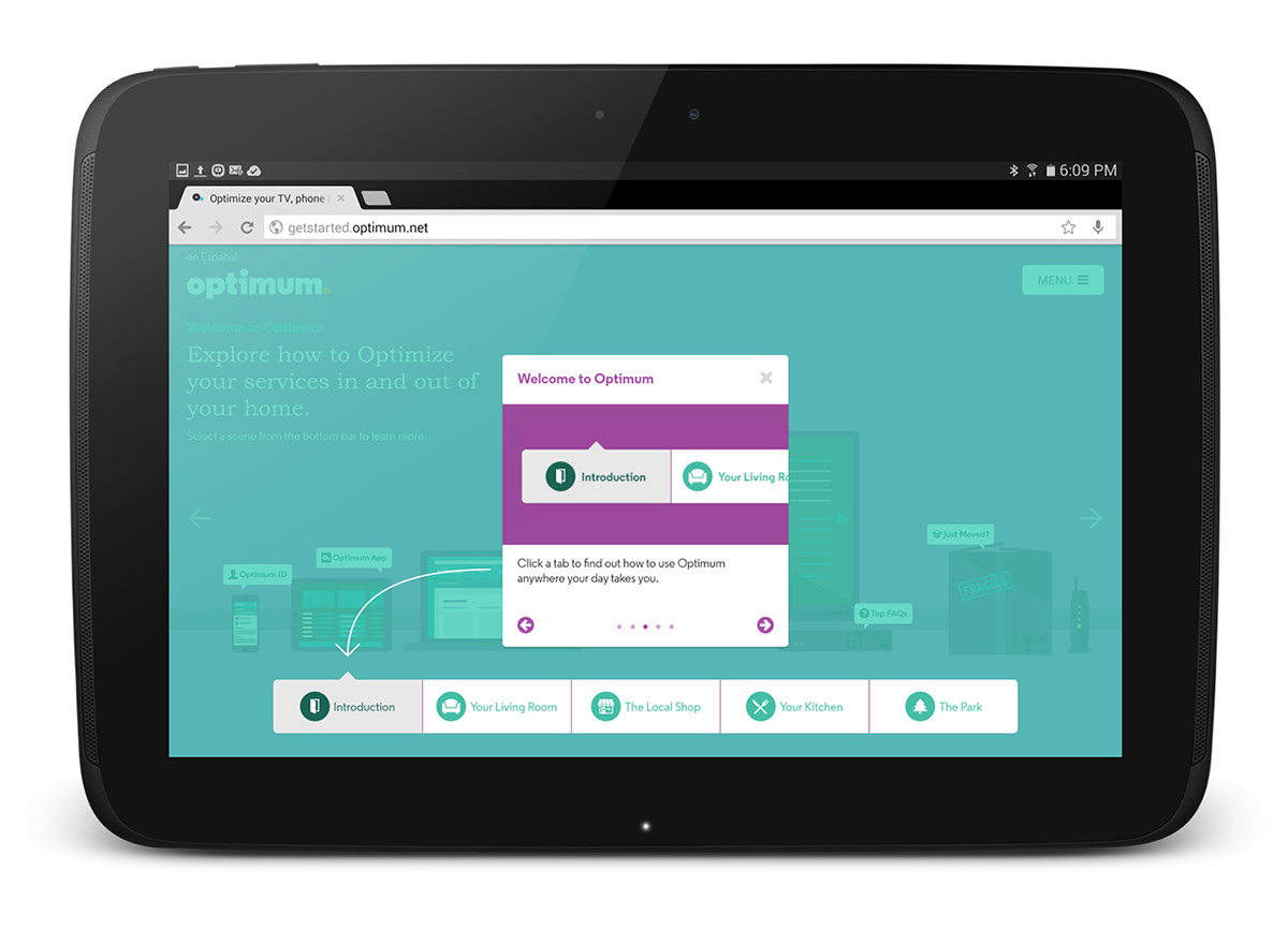
three tutorial slides features arrows pointing at a particular object to demonstrate a point of interaction. The issue with this is that this site is responsive, and that the targeted elements such as the bottom array of buttons or the menu toggle button, are affixed to points relative to the viewport, while the tutorial window itself is always affixed to the center of the viewport.
Traditional raster images, as a result, would not be an applicable solution, as they require a fixed start and fixed end point. A more flexible solution, and thus ultimately the one chosen, was to create the arrows with HTML5's canvas element.
Because the canvas element is generated via JavaScript, each arrow is assigned start and end points, calculated dynamically based on the width and height of the viewport, with adjustments relative to the targeted element. Each arrow was given its own canvas object, and it's visiblity, opacity, and animation was animated via CSS and changes to the parent class, which in turn managed the states of each child object, like the tutorial buttons, slides, and demonstartional objects.


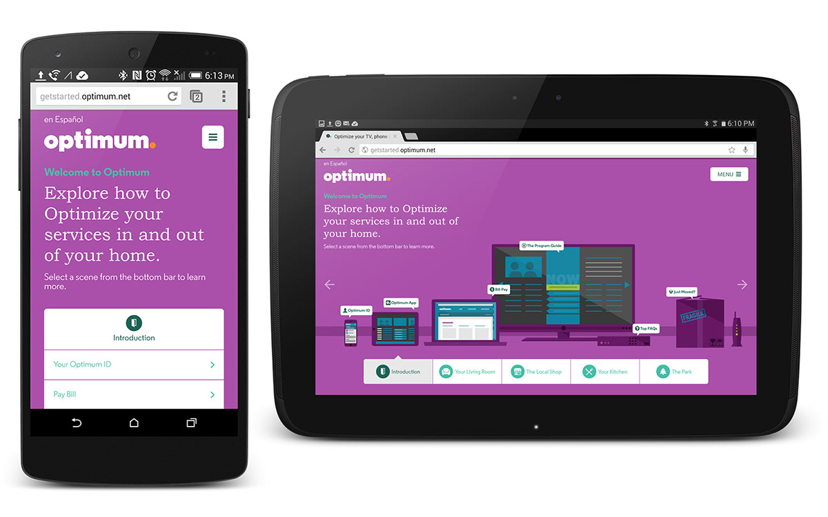
Making the homepage responsive was a bit of a challege as each object (phone, tablet, computer, etc) was its own div with links placed absolutely within it. This allowed for easier link placement than placing each link independent of its reference object, but posed challenges of preserving the function of each link. Divs are boxes, and although its innate transparency can elude users into thinking that visible objects are clickable, it isn't always the case. The challege, therefore, with Optimum, was to develop the interface in such a way that the bounds of the div would not overlap a top a div. His means adjusting placement of each object in the DOM so that higher stacked objects (in this case, the phone) would be indexed higher than a visually farther back object such as the television.
Eventually, however, no matter how much adjustments you do to the objects, you run out of space and things start to overlap, in which case the issue becomes size. In order to mitigate that, the homepage objects were given media query states which used CSS Transform to scale the objects down 70%, with a transform scale upwards 120% for each anchor child element in order to compensate for their size. This allowed for tablets to keep a similar sense of scale to their desktop counterparts, and preserve usablility.
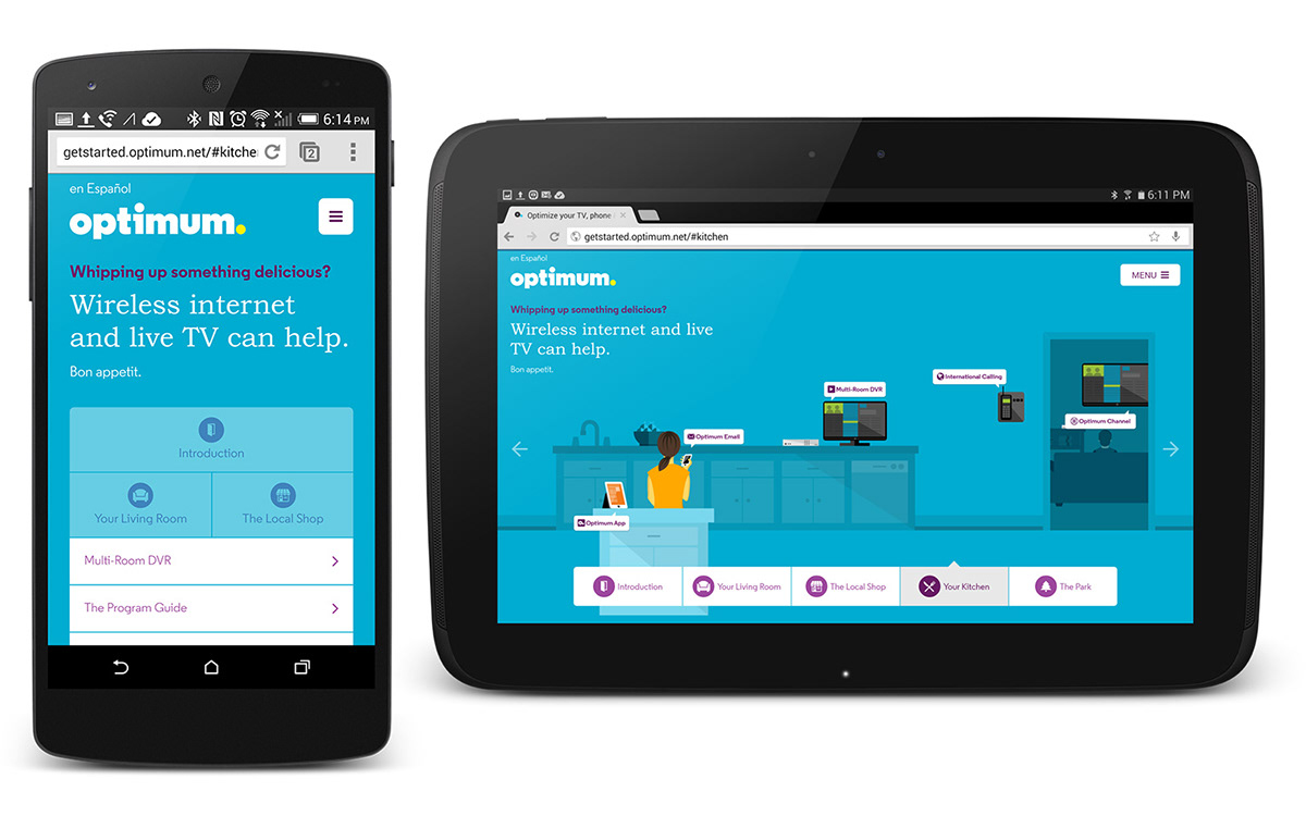
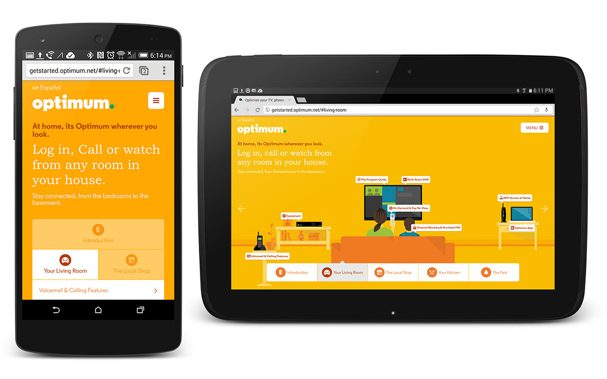
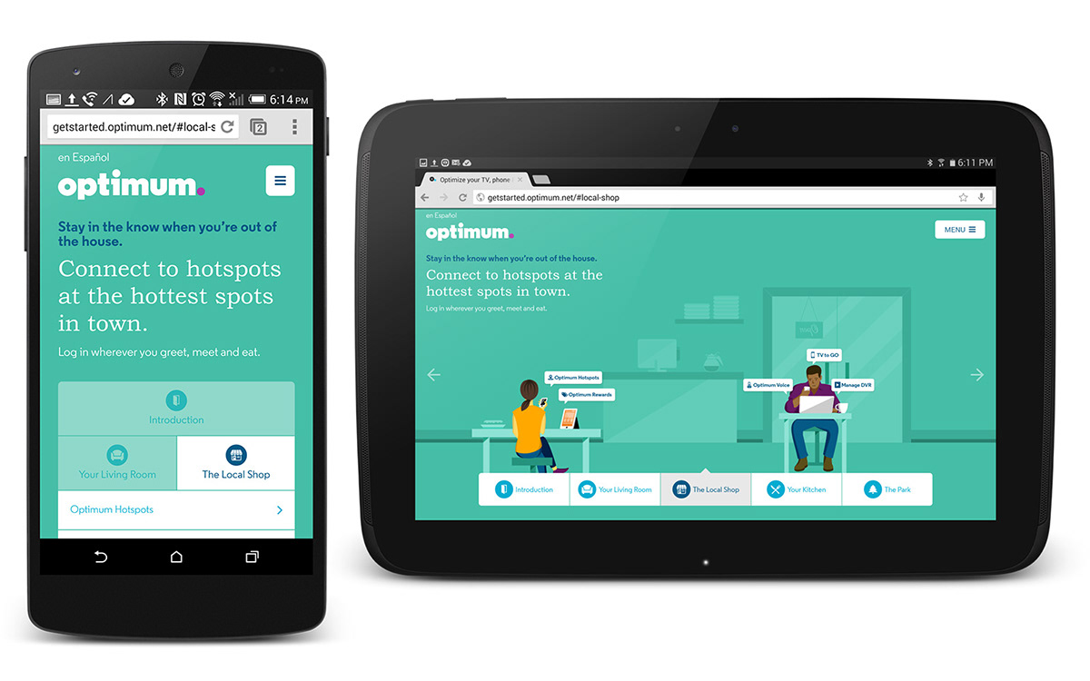
The optimum brand comprises of a series of color swatches. In this case, five primary color options, and four secondary colors for each. Because the themes needed to change dynamically on the front end based on user selection, each theme would be represented by a class embedded in the body tag.
Because themes are adjusted dynamically on the homepage, and are utilized throughout the site, each theme was given a class, which would be applied to the body tag of each page. This would allow for all child elements to have their properties adjusted in unison dynamically with a simple class replacement via JavaScript. This also enabled features like changing the svg fill color of the period in optimum, something that would have required an image swap in a traditional raster image, reducing overall page weight.


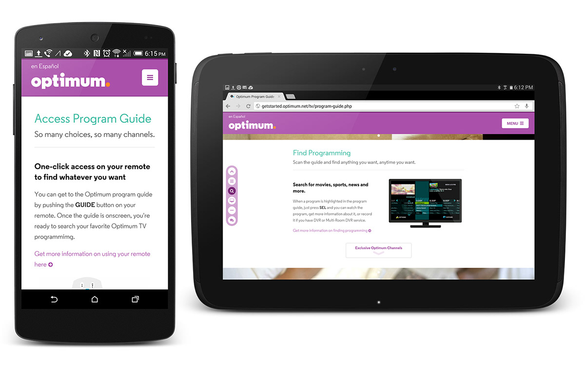
The interior pages are divided into a series of sections, which each point quickly accessable with a menu affixed to the left side of the viewport on desktop and tablet devices. On Desktop, divider images are given a parallax effect as the user scrolls. The image appears to scroll at a slightly slower pace than the page itself.