


THE CHALLENGE
SHIFTING FROM
BEING A PRODUCTION
COMPANY TO A BRAND
Forme is the flagship brand of Frosio Bortolo Group, a company born as a cleaning activity for handle articles, which soon moved on to manufacturing third-party products, and finally offered products on the market with its own brands.
However, the company was not successful in evolving towards positioning and developing the various brands on the market due to a set up scenario difficult to read and confusing for the customer. The company wasn’t able to develop a brand and product strategy, essential steps to transfer the company's potential into a brand recognized by the market. This is where our journey together began to bring order to the 3 brands of the group.
THE LANDSCAPE
HOW TO BUILD
BRAND CULTURE
AND CLARITY
By working mainly with distributors, Frosio Bortolo Group was not in the position of getting a 360° view of his target audience. We therefore needed to further explore the perception of the brand and of the product the customers had. The company used to bring the product to the market with no distinction under the Frosio or Forme brand, and in some cases also rebranded at the request of some distributors with proprietary brands.
The primary objective we have given ourselves is to clearly define the positioning of the product brands (Forme, Class) and their relation with the production brand (Frosio Bortolo) in order to effectively promote its values and portfolio of products.

STRATEGY
FOCUSING ON
CORE VALUES:
DESIGN
The focus of our activity has turned to Forme, the brand that with its catalogue represents almost the entire turnover. We first had to define strategy and vision at group level to set up the role and positioning of the 3 brands.
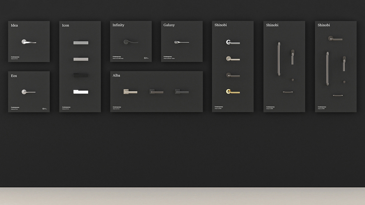
Forme was still largely associated with the parent brand Frosio Bortolo and had an extremely wide product portfolio that was uneven and difficult to manage. Having identified the architect as the main audience to support the commercial partners, we started working on both the brand and the product through a strategic review of the portfolio with the aim of increasing the perceived value of the product through the definition of three product lines. The line that embodies the Forme brand offers products designed through collaborations with designers and architects from all over the world.
BRAND
A LOGO WITH
A SECRET
We took care of redesigning the Forme logo to make it more recognizable and defining. Our purpose was to create a link to the past by using a lighter lowercase lettering, but with the addition of a detail that could provide it with character and was recognizable through the insertion of a hidden handle. An almost secret detail, a symbol that represents the idea of a discreet, exclusive design that reveals itself little by little, careful to what it shows as well as what it hides.
At the same time we undertook the restyling of the Frosio Bortolo Group logo, to align it with the Group's new vision without altering it.


Visual language
We wanted to create a language that stands out for its contemporary elegance and the use of geometry. The typography composed of a serif and a sans serif font was chosen to emphasize this contrast. In the palette, we have kept a dark colour nuance, turning the previous black into an anthracite gray paired with secondary colours that are inspired by the finishing of the products.


We have chosen to describe the products by placing them in a neutral context characterized by the presence of 3 tactile material cubes in motion in a space that reproduces an ambience with a strong architectural appeal. This language has allowed us to valorise a product such as the handle that, within the architectural context for which it is designed, is a detail.


Physical material supplies
When considering the sector in which Forme works and its target audience, classical tools still play an essential role. We have designed three catalogues and explicitly stated for which typology of architecture Forme designs the different product lines.
We have also overseen the creation of other small scale catalogues and brochures used by the brand to promote new product launches.
We have also overseen the creation of other small scale catalogues and brochures used by the brand to promote new product launches.


Display units - Exhibition stands and Showroom
When choosing a handle, the possibility of holding the product to test its ergonomics and of experiencing the applied finishing for real are essential factors.
Based on these prerequisites, we have designed two different display formats, one dedicated to the brand's showrooms and the other designed for exhibition stands at trade shows and events.


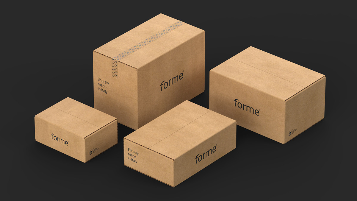
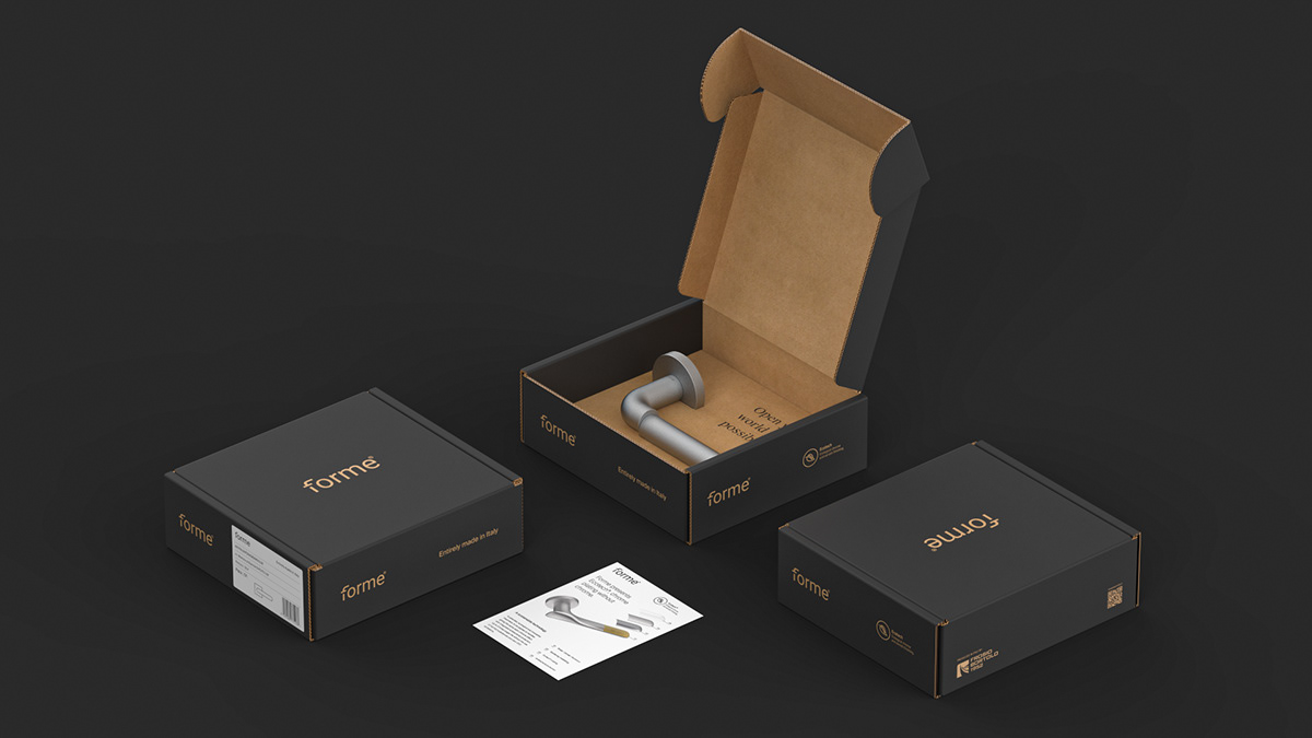
Packaging
We have redesigned every single packaging, outlining specific rules for the two typologies of boxes, one for the product and the other used for multi-shipments; the goal is to maintain a consistent language, assembly instructions and links to online resources included.


EXPERIENCE
A DESIGNER-ORIENTED
LANGUAGE
First, we built the identity of the Forme brand on social channels, and then we designed one website for the parent company, and a second one for Forme where the product lines are showcased.
Leverage search features to deliver a working tool
The design of the new website has represented a fundamental step in our development path. The Forme site is dedicated primarily to professionals and architects; we therefore decided to organise the products in family groups.
The products can be browsed by line thus allowing the user to visually compare them based on his/her interest thanks to a structure of filters responding to different needs. For the architect, it will be important to compare families of products with the same finishing by looking for the models in each collection. A window manufacturer, on the other hand, will be interested in assessing the window handles, and he will be able to compare them in the overview.
PRODUCT
PRODUCT
COLLECTION
The design activity of new products for the brand has begun with the suggestion of two collections of handles that have marked the beginning of the collaboration and propelled the growth of the brand.
SHINOBI
For Shinobi, one cut perfectly splits the iconic shape of the handle, creating an evocative, reimagined design. Two suspended elements that harmonise and impress.
The Groove version of Shinobi features a knurling on the final part of the handle. A texture that enriches the design and reinforces the ergonomics of the structure.
Shinobi Special is a third version in which the final part of the handle changes character to fit different contexts. A new material, marble or wood, to convey new tactile sensations.
Shinobi has received the Good Design Award 2022, a prestigious international industrial design award organized every year by the Chicago Athenaeum Museum of Architecture and Design, in the 'Hardware' category.


GAS
Gas is the contemporary reinterpretation of the common industrial flat lever handle, historically created through bending sheet metal. It is from these origins that the Gas handle is generated.
The fifth and last collection designed for Forme is Gas Groove, twin of the Gas handle. The same industrial spirit but with a knurled detail that adds an element of unprecedented elegance to a project with a solid and compact mood.


