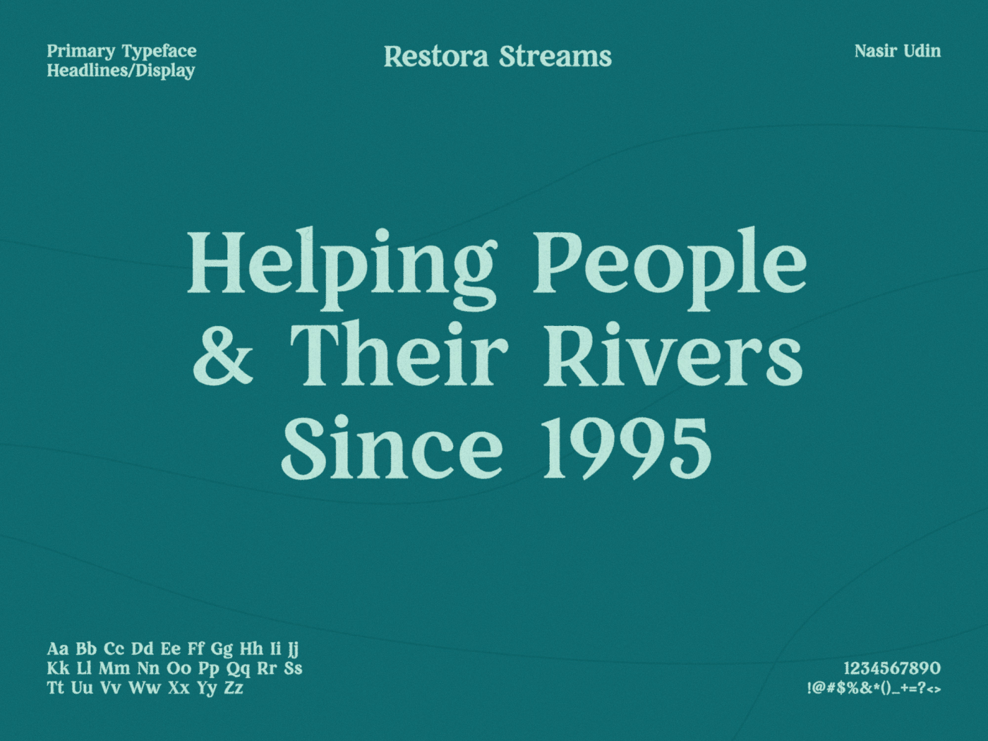
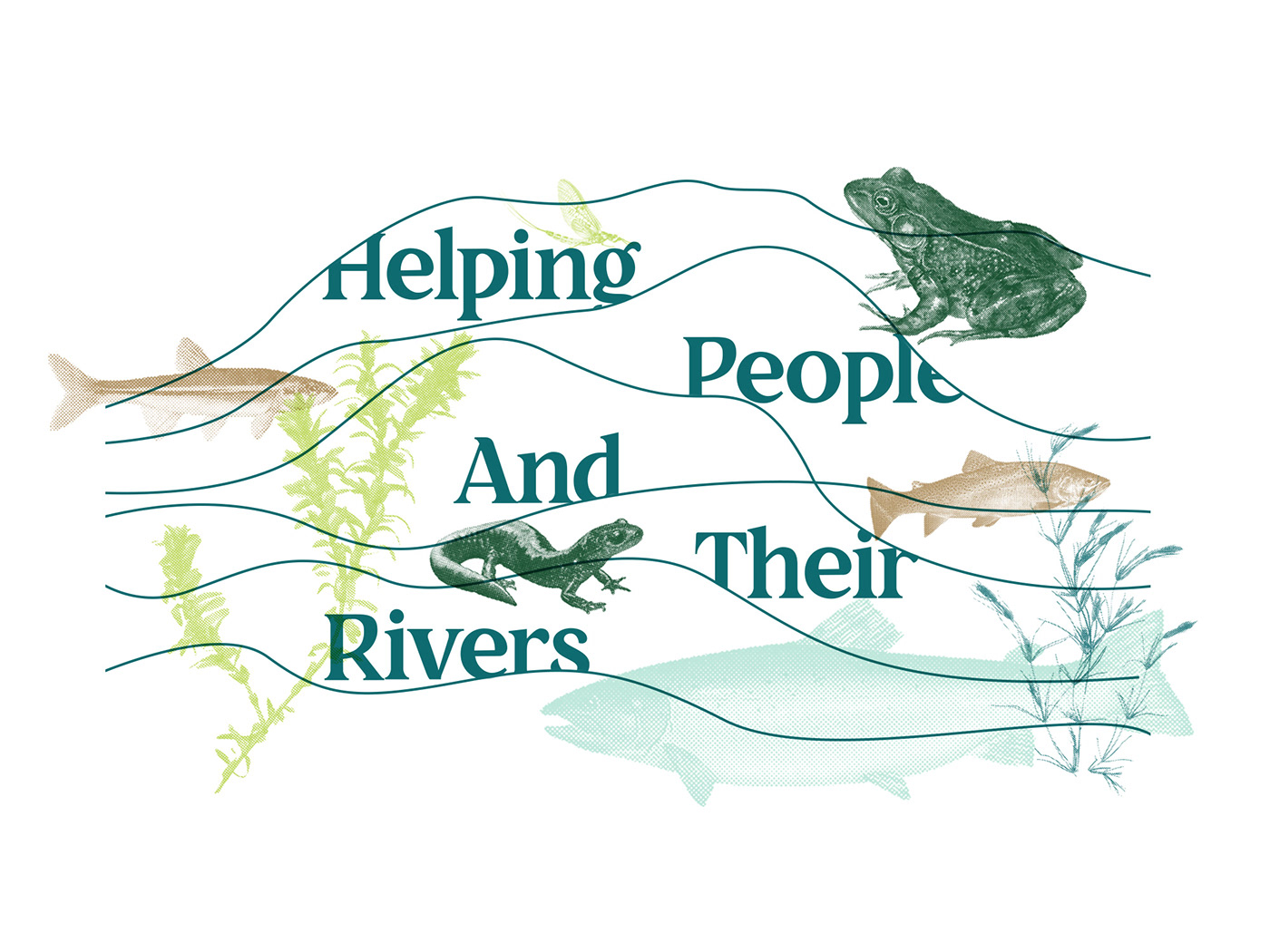
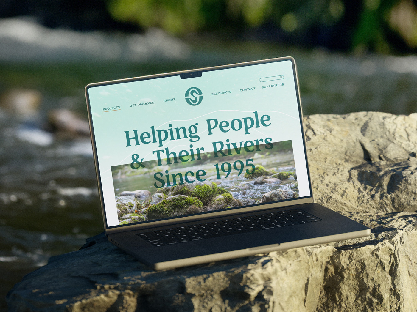
Helping People & Their Rivers
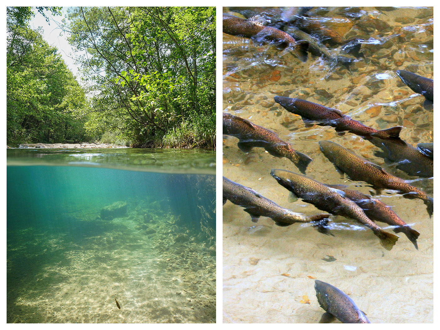
Established in 1995, Ontario Streams is an environmental charity dedicated to the conservation and rehabilitation of streams and wetlands, through education and community involvement. Since their inception, they have worked closely with numerous communities, landowners, and school groups to develop lasting partnerships in education and environmental stewardship. With over 25 years of experience, Ontario Streams has continued to demonstrate leadership in aquatic ecosystem rehabilitation, using the principles of Natural Channel Design. They have been sought after for information on an international level, however our most significant work has taken place in Southern Ontario. To date, many of Ontario Streams' projects have occurred in and around the Greater Toronto Area, where the need for rehabilitation has been greatest. They regularly coordinate several projects with activities such as tree planting, garbage clean-up, habitat creation, bioengineering, biological monitoring, mitigating fish barriers, and restoring and creating wetlands.

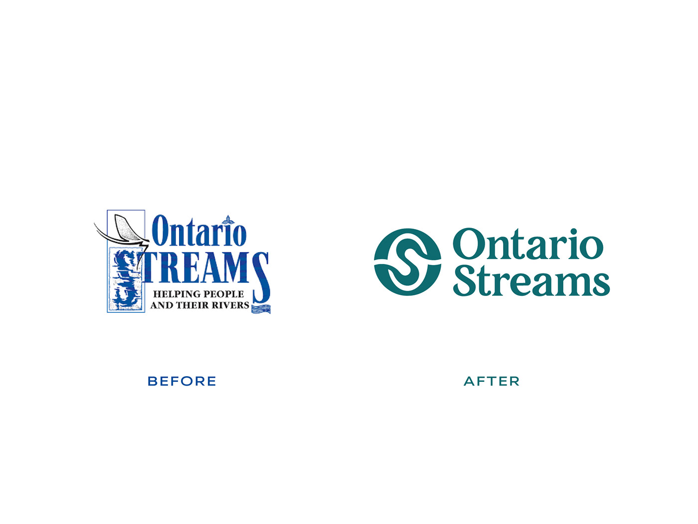
Since 1995, Ontario Streams has maintained the same logo over the years, with one minor change occurring early on to change our slogan from “Friends of the Resource” to “Helping People and Their Rivers” to better reflect their mission. During their strategic planning process in the summer and fall of 2022, an idea blossomed around starting our next chapter with a rebrand of the logo. Over the years, Ontario Streams experienced challenges with their logo including scaling, legibility, and incompatibility for various uses. I came in to solve those issues, but also help this amazing non-profit stand out amongst their partners as well as resonate with their community.
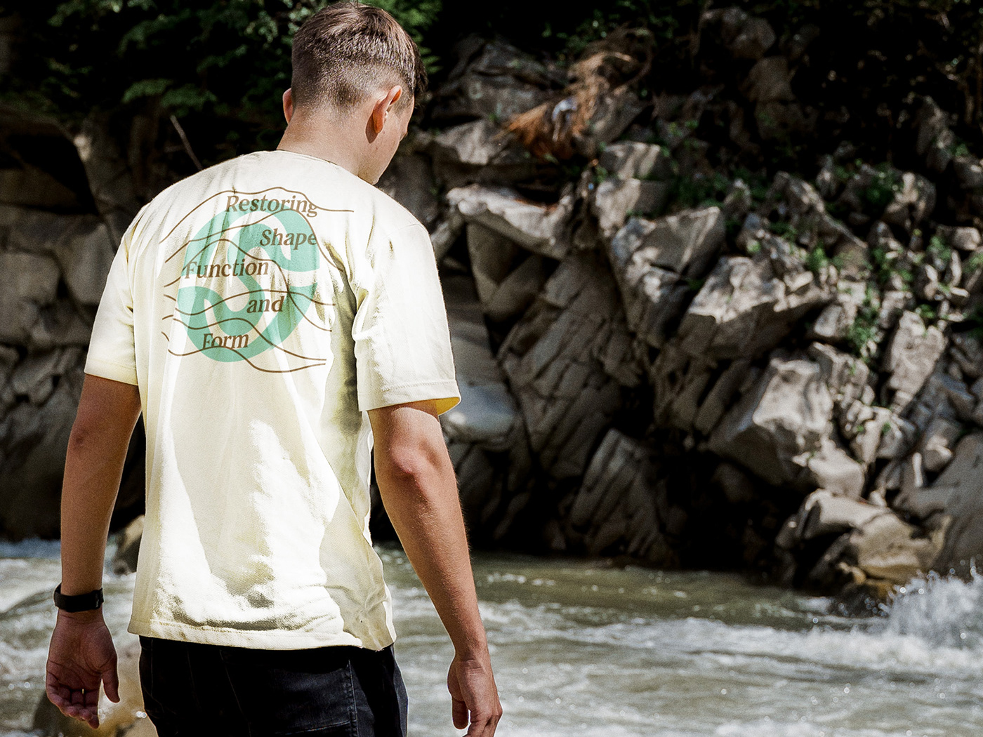
As I worked with the Ontario Stream's staff, we knew we wanted to prioritize their organizational values of community-based, grassroots and reliability captured in their new identity. Some of our early inspiration came from vintage field notes and halftone effects to create relay the grassroots nature of Ontario Stream's work. I made special note that Ontario Streams' work is as diverse as the environment that they are working tirelessly to protect.
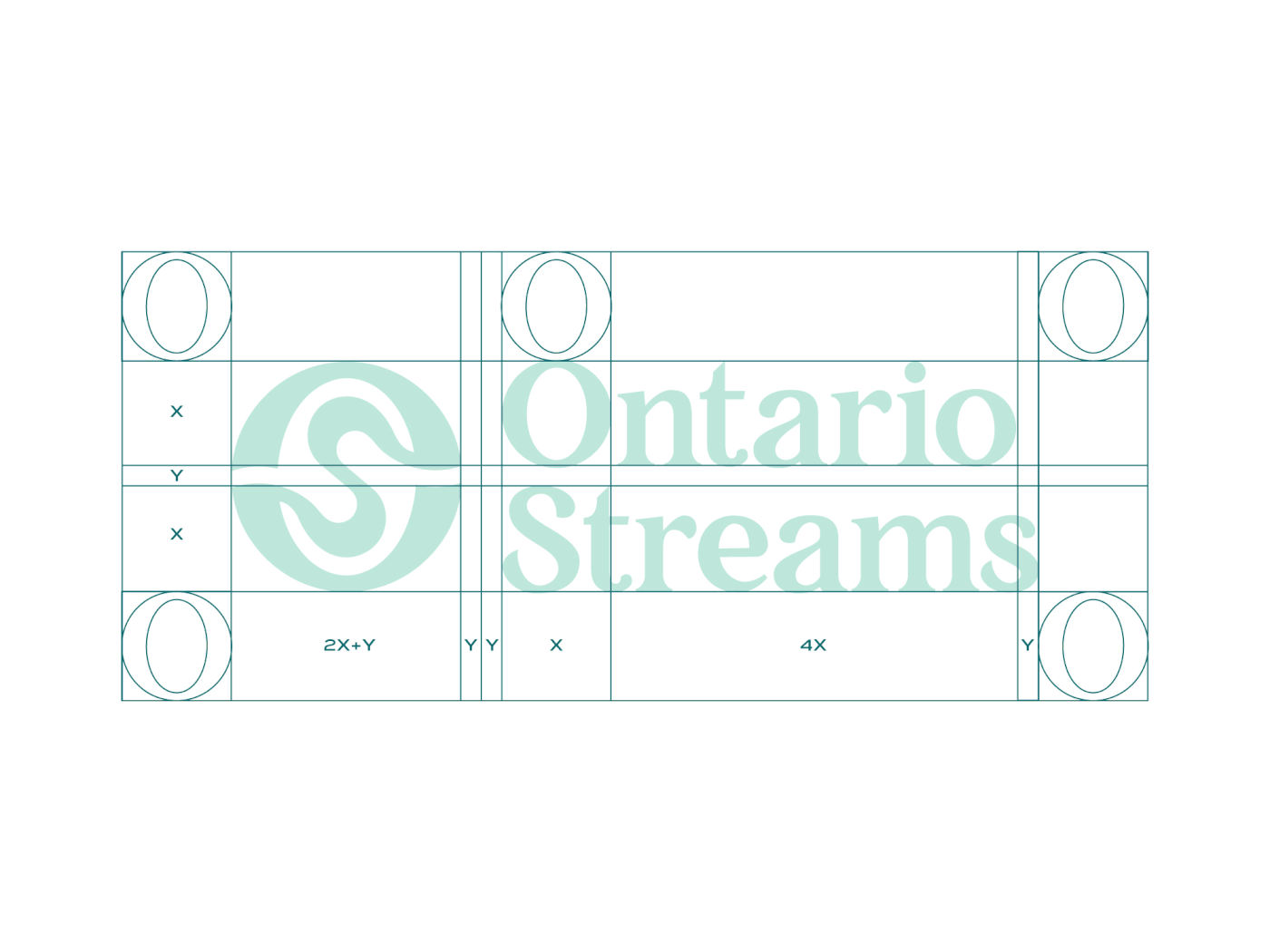
Over several months, I provided insight towards Ontario Streams rebrand and prioritized that their new identity maintains their values. I gathered feedback from Ontario Streams staff and board of directors to better understand our wants and needs for a new logo. Early in our design discussions, the concept of a monogram was an intriguing idea, also for certain applications, Ontario Streams utilized an "OS" mark that derived from their original logo. We also liked this approach because none of their allies/partner organizations utilized a monogram form for their logo.


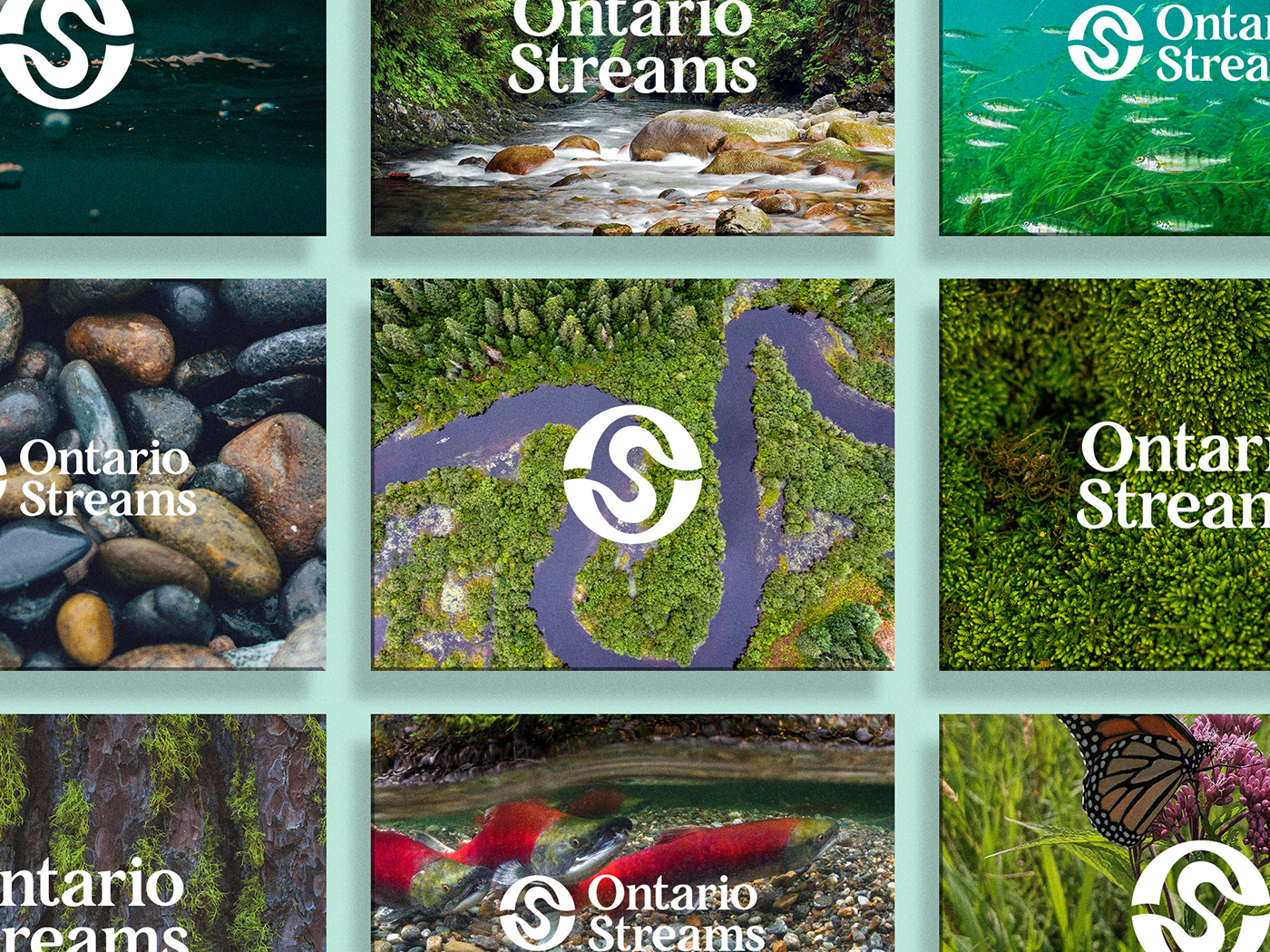


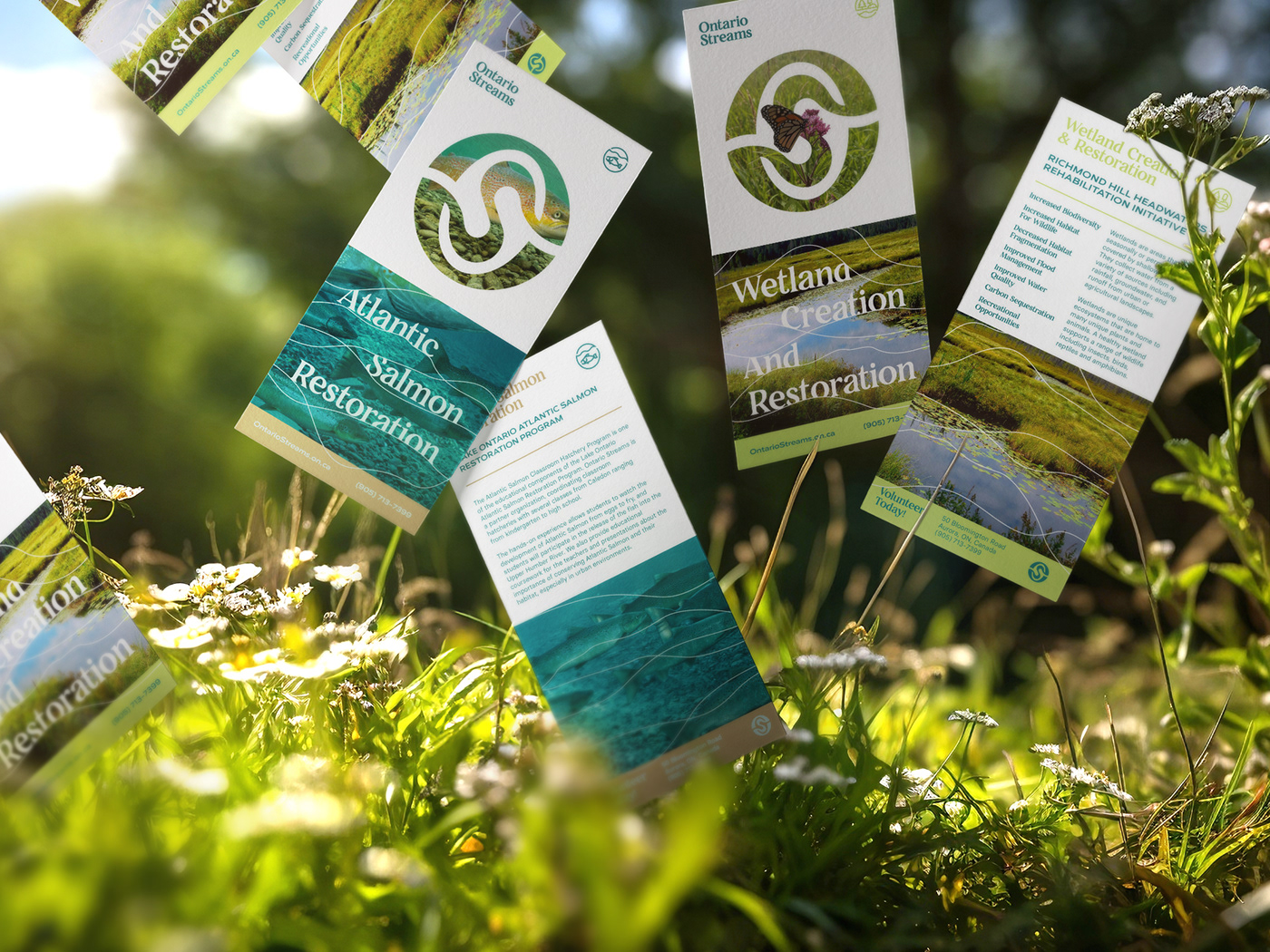
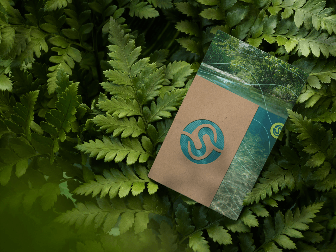
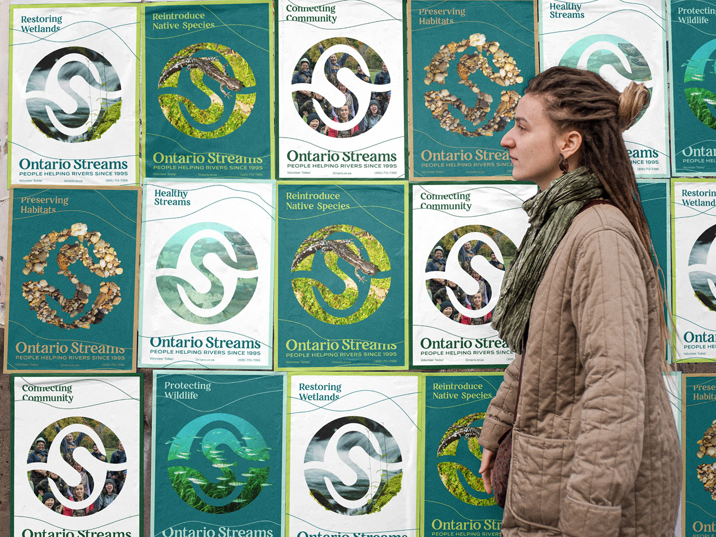
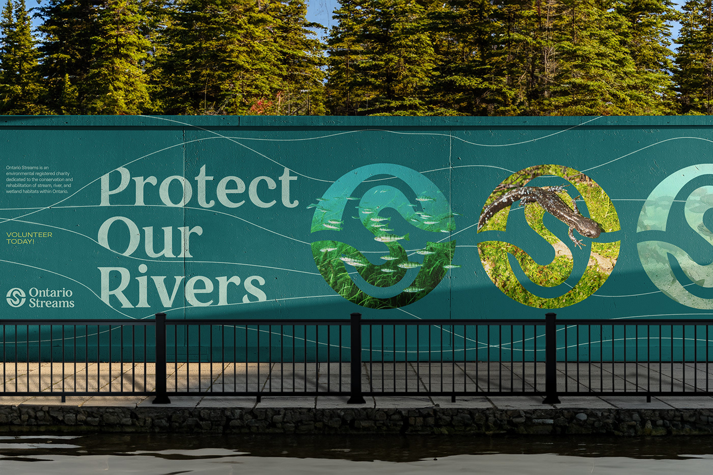
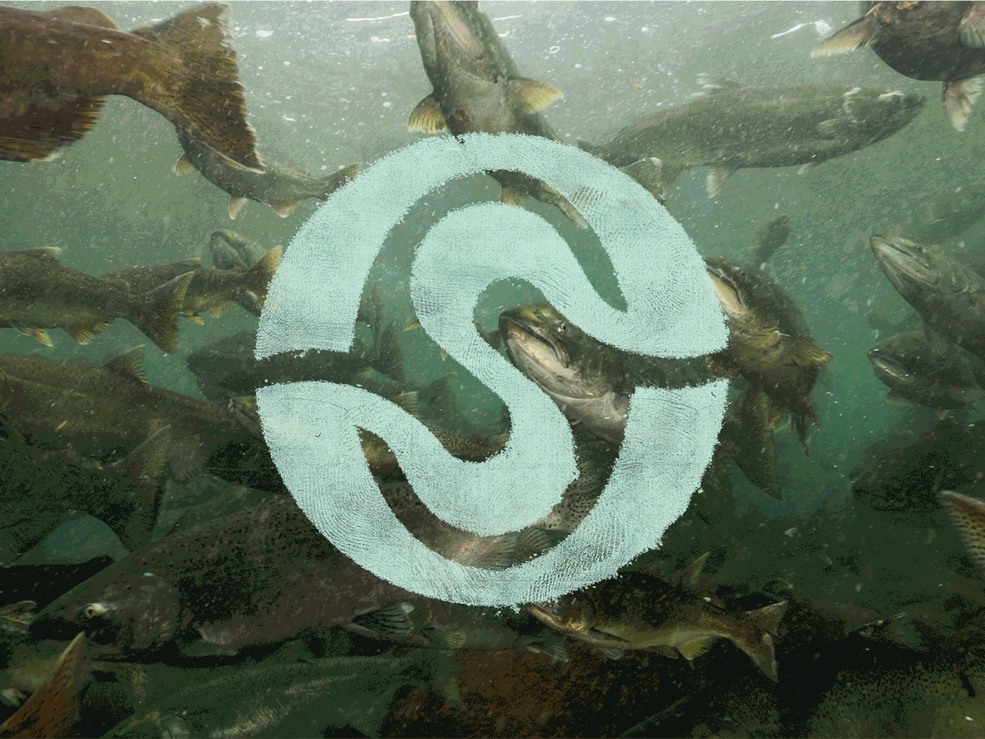
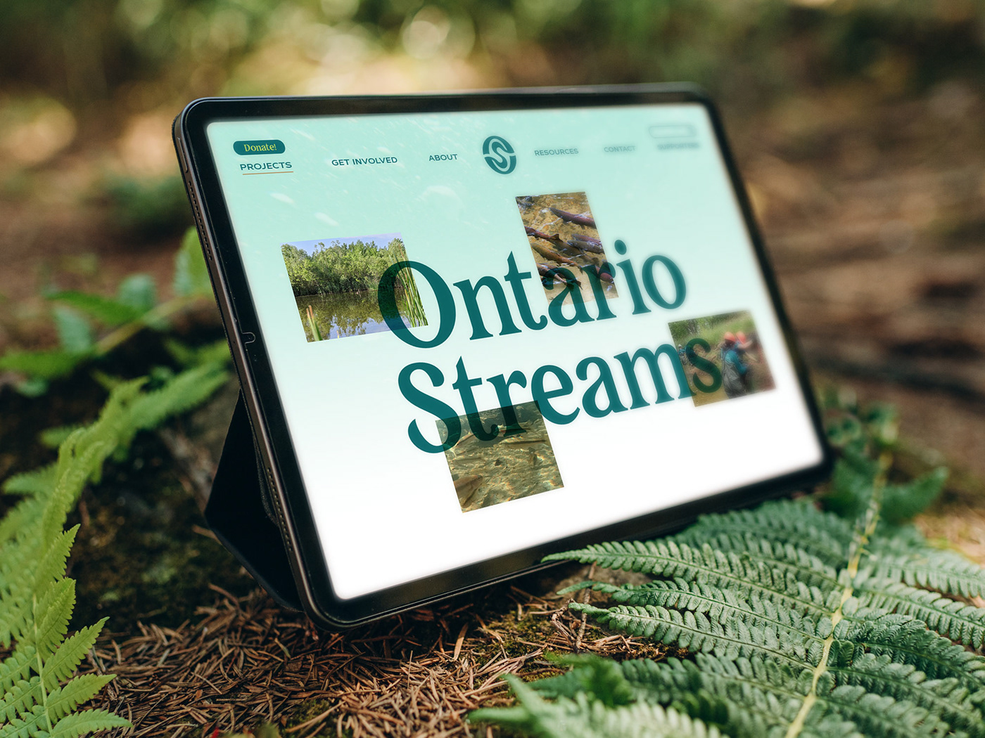
While I was creating the new identity for Ontario Streams, I wanted the logo to have the ability to act as a “window” into an Ontario river/stream/forest/wetland. Ontario Streams’ work is so diverse, and I wanted to compliment that with a logo that can change to whatever story they are wanting to tell. For instance, if they wanted to focus on a campaign about Jefferson Salamanders, they have the ability to crop in a photo or overlay a cutout on the logo while maintaining the overall silhouette of the logo and reinforcing their brand. Because of the simplicity of the logo, it has amazing flexibility to adjust to whatever campaign or story they want to tell.


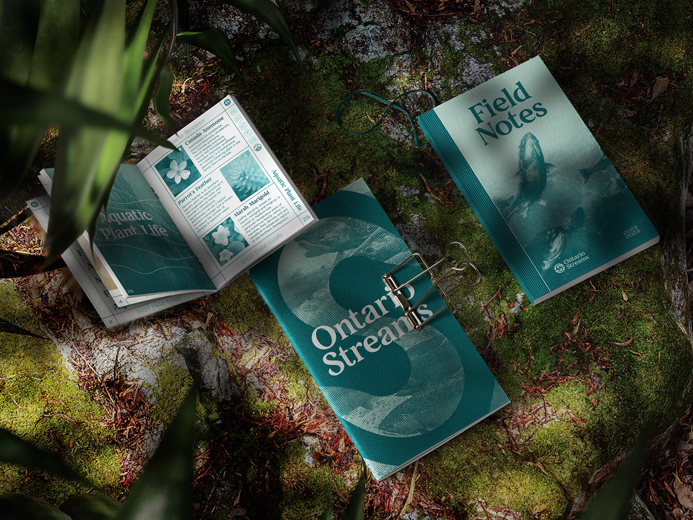


While rebranding Ontario Streams’ visual identity, I saw the opportunity for creating a suite of unique icons to help break up copy and provide supporting visuals for their organizational projects and campaigns. Taking inspiration from the waterline cuts within the OS monogram symbol, I developed a set of circular icons that directly connect with their logo while establishing a personality all their own.