The small presence of traditional British street food choices and the general public ignorance about the actual existence of the subject in the country, has gave me the idea of creating the branding for a street food festival.
The rise of farmer markets, food and street food festivals, the rejection of mass production in favour of quality are about creating a connection between maker and consumer. The latter is keen to understand a product's heritage. The best way to communicate this, is to showcase the production process but also people behind it.
The aim of my brand is to make the audience rediscover the direct connection with producer/maker, the joy and pleasure of food even if it is meant to be on the go, increasing knowledge and interest about the country's culture and tradition.
LOGO
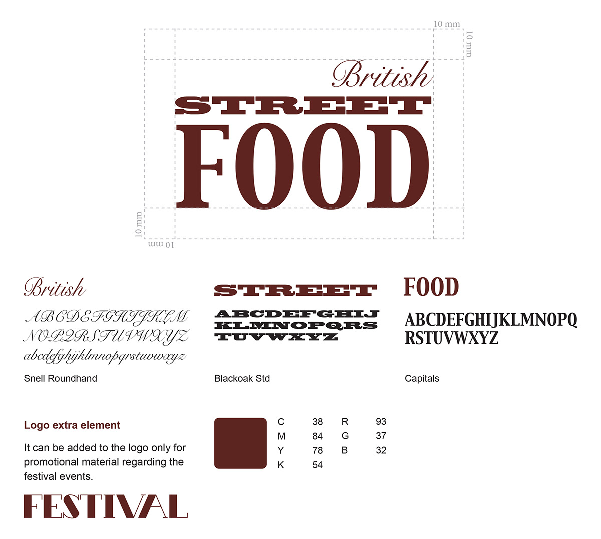
The idea for the logo was inspired by the typefaces used on pubs board. Block serif typefaces with high legibility combined with a calligraphic typeface, Snell Roundhand, to represent the Britishness.
PATTERN
A pattern has been also designed. It includes products of the nation street food tradition and characteristic elements of British culture. It will appear on posters, wrapping paper and customized products to create a connection between the whole range of festival materials.

POSTER - PROMOTIONAL MATERIALS - PACKAGING - WEBSITE


