


The idea:
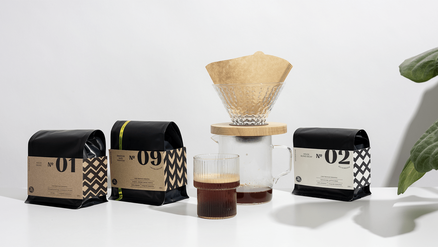
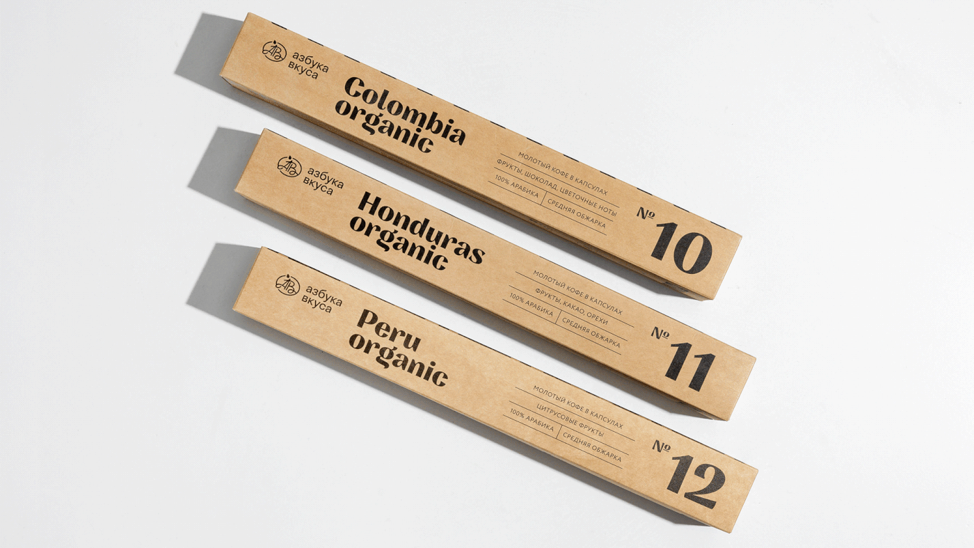
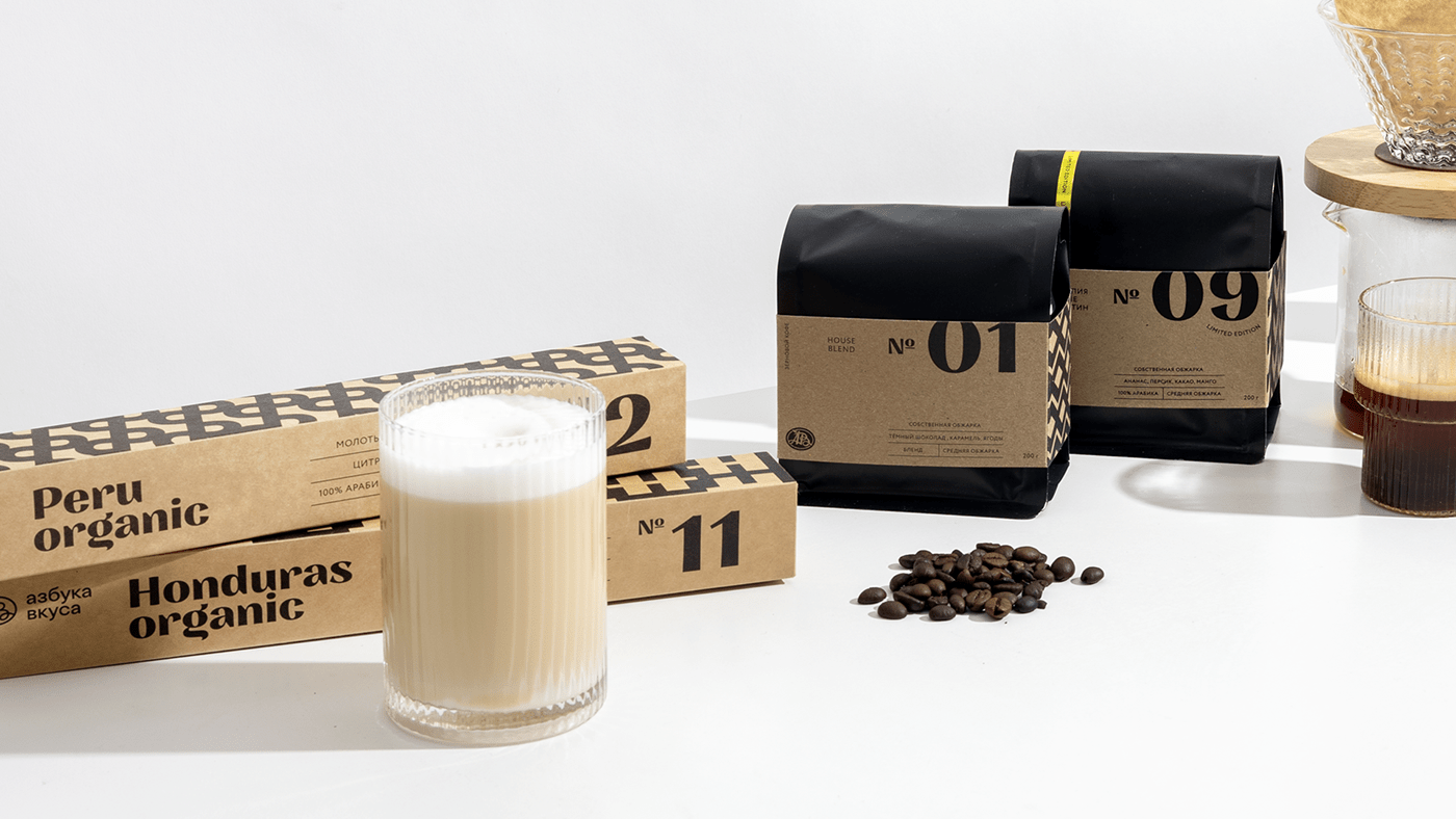
Translate the laconic, but at the same time crafty character of the premium line of coffees of our own roasting. There are 9 types of coffee beans in the line, 3 of them are for the coffee machine, the remaining 6 are for alternative coffee brewing. And also 3 new lots - organic types for capsule-type machines using compostable capsules. Each variety contains its own number, variety No. 9 is a limited variety that will change. This variety has a distinctive feature — a thin golden ribbon that distinguishes it from the rest.
Translate the laconic, but at the same time crafty character of the premium line of coffees of our own roasting. There are 9 types of coffee beans in the line, 3 of them are for the coffee machine, the remaining 6 are for alternative coffee brewing. And also 3 new lots - organic types for capsule-type machines using compostable capsules. Each variety contains its own number, variety No. 9 is a limited variety that will change. This variety has a distinctive feature — a thin golden ribbon that distinguishes it from the rest.
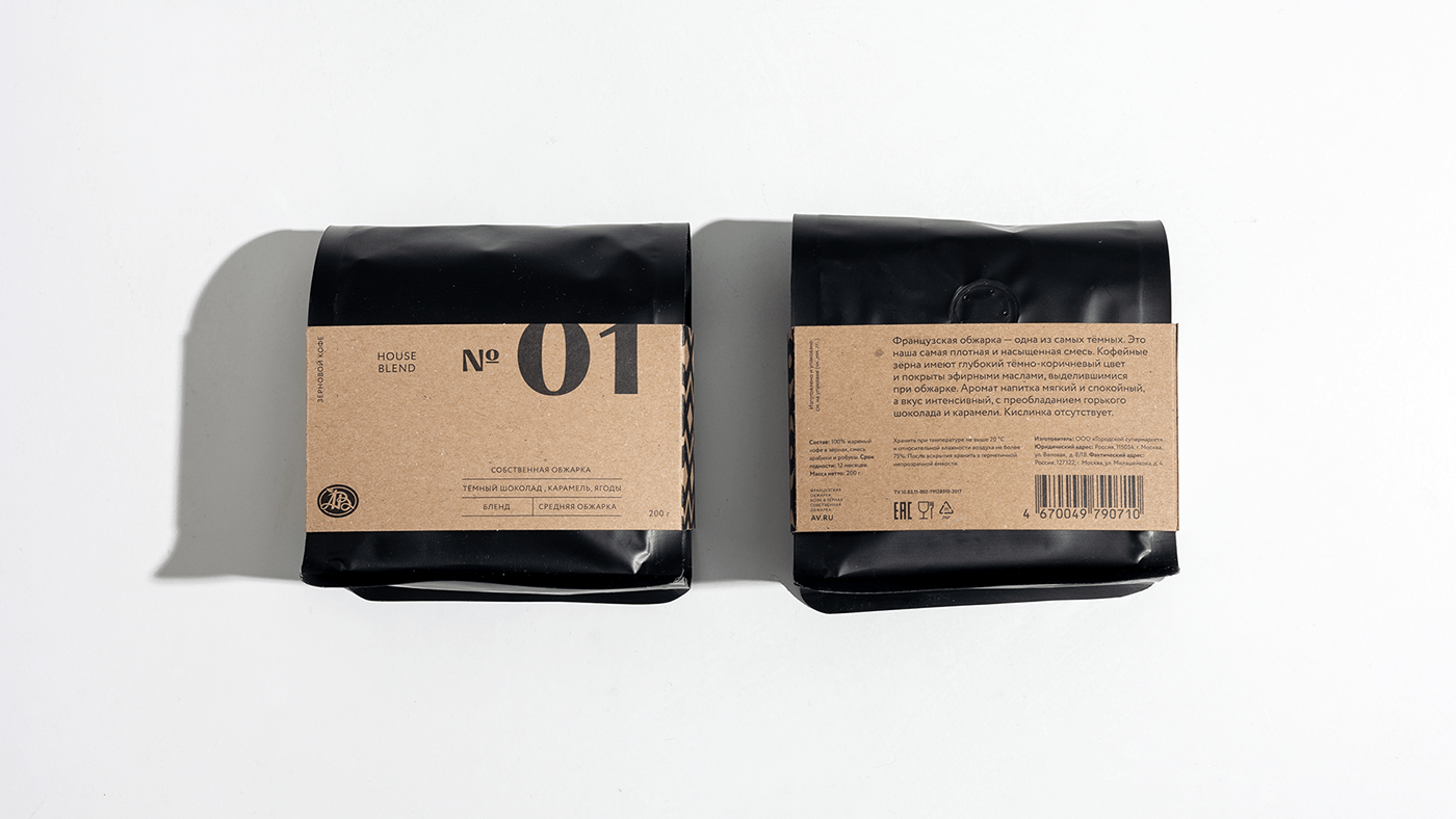
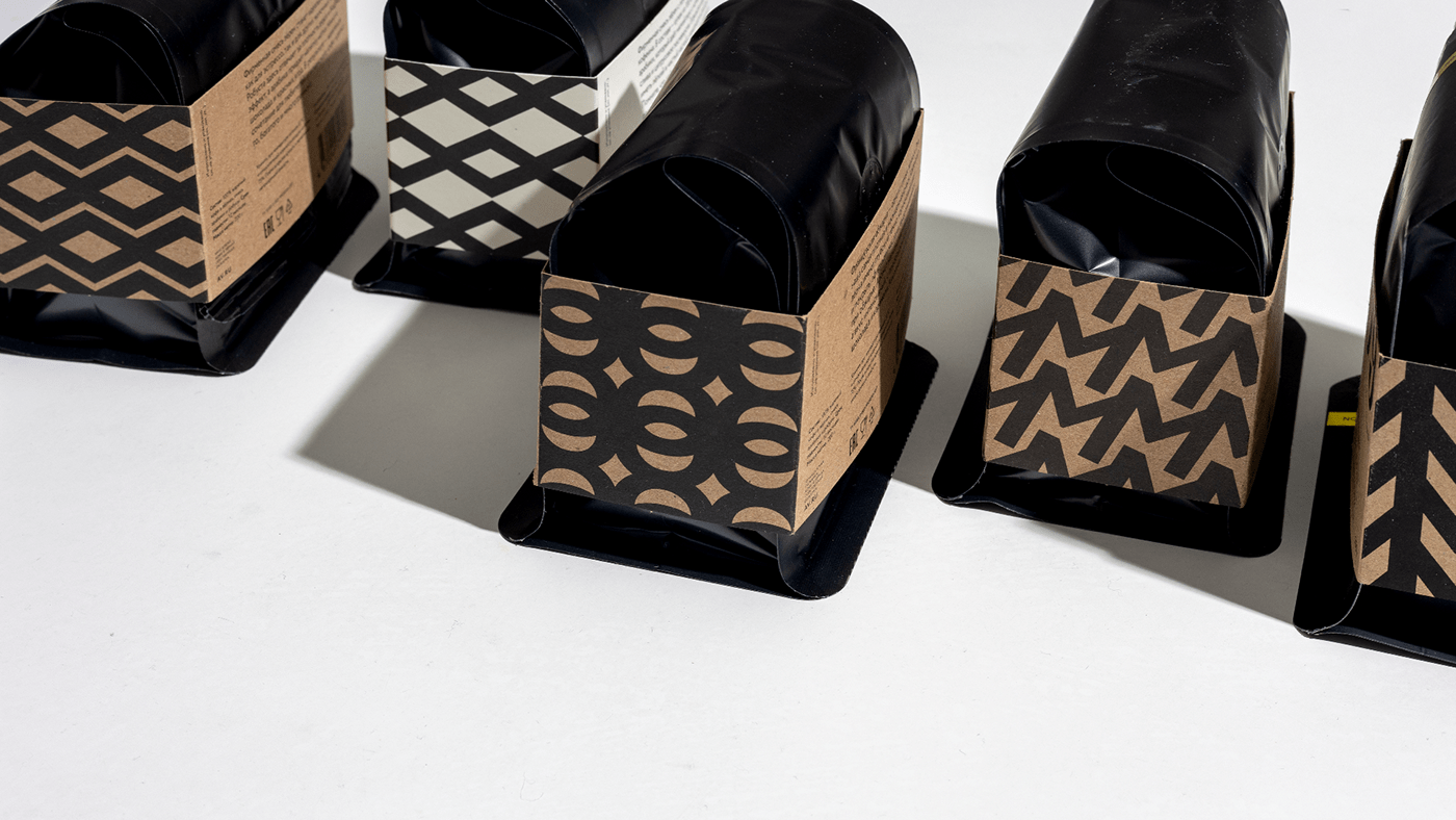
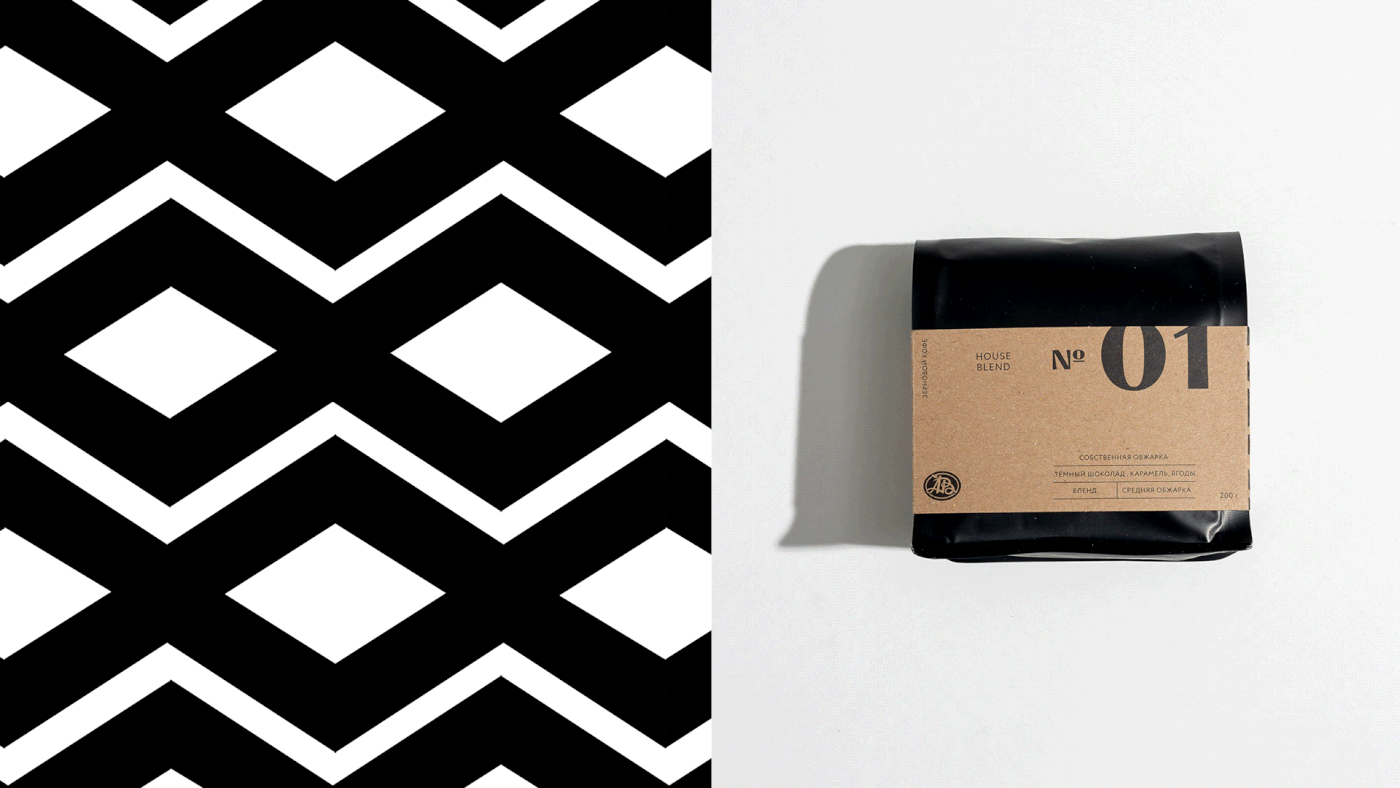
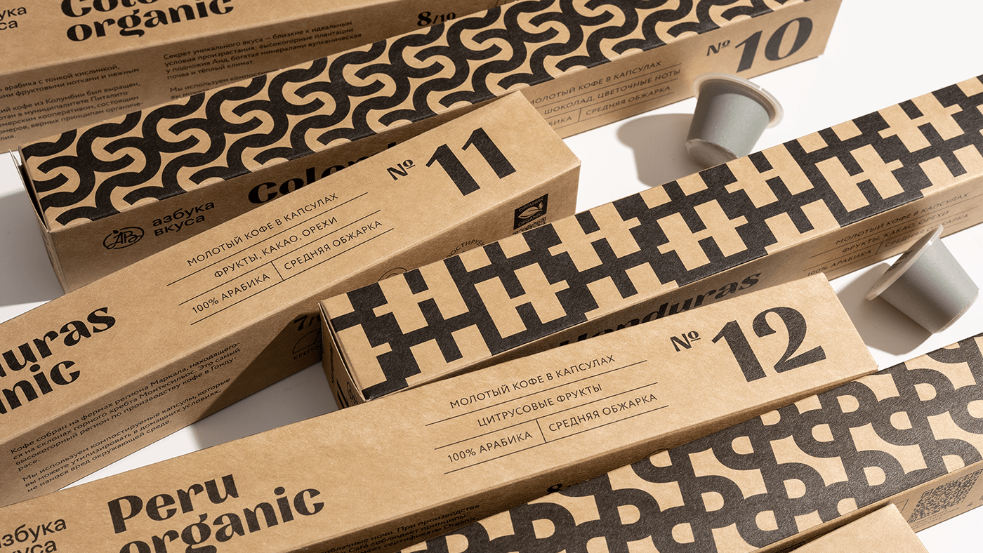
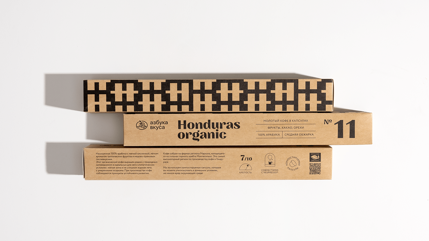
The number system emphasizes the value of each individual type of coffee, it has its own serial number as an exclusive lot. The number system also allows the buyer to navigate by numbers, he does not have to pronounce and remember the name if he doesn’t want to. We didn’t want to make the concept sterile, the ethnic component is also important to us, so for each variety we came up with patterns based on the letter from the name of a particular variety, for example, for No. 7 Costa Rica Terrazu the pattern is based on the letter "T". And placed them on the side of each case. For convenience, we added icons of brewing methods with an explanation, as well as the marking “alternative” or “coffee machine”, the markers differ in color.
On the “face” of the package are the most important facts about a particular variety, which allows you to quickly read the necessary information about the variety, does not require the buyer to look for info on the back of the package. But for people reading the compositions on the back, they provided a detailed description of the region and place of growth. The main target audience of this line is coffee gourmets. In the visual and semantic concert of the packaging, they tried to take into account all the necessary qualities.
Design director: Arnis Millers
Art director: Alexandra Loginevskaya
Lead designer: Daria Kwon
Manager: Denis Kulakov
Special thanks: Julia Khateenkova
Photography: Daria Kwon


