The National Museum in Kraków – brand identity
The National Museum in Kraków is one of the largest museums in Poland. Its collection covers an incredibly diverse range of art—from antique sculpture to contemporary industrial design, with a masterpiece by Leonardo in between. Creating a new visual identity for the Museum was a challenge in many ways. Not only should it use timeless symbol not aligned with one style or period, but also one that would embody 12 distinct branches scattered around the vibrant city of Kraków and beyond.

The symbol
The Inspiration
The new identity is based on the metaphor of weaving threads of inspirations and artworks into the vast body of art—as the basis and DNA of the collection. The symbol is timeless and abstract in its geometric interpretation of classical typography. It is a graphic rendering of the abbreviated name of the Museum—MNK.
The new identity is based on the metaphor of weaving threads of inspirations and artworks into the vast body of art—as the basis and DNA of the collection. The symbol is timeless and abstract in its geometric interpretation of classical typography. It is a graphic rendering of the abbreviated name of the Museum—MNK.
Structure and grid
The logo is based on a meticulously designed geometric grid that forms the basis for the layout system of the identity.

Branches
The dynamic serif
To capture the diversity of the 12 branches of the Museum and its collection, the first serif is a dynamic, changing form. Each shape is inspired by the art or building of the branch it represents.

The naming
One of the problems we encountered during our workshop and strategy phase, was the complicated and inconsistent names of the Museum's branches. In cooperation with the Museum, we introduced a new system of short, memorable names for the branches, and connected them to the main MNK brand.

The system
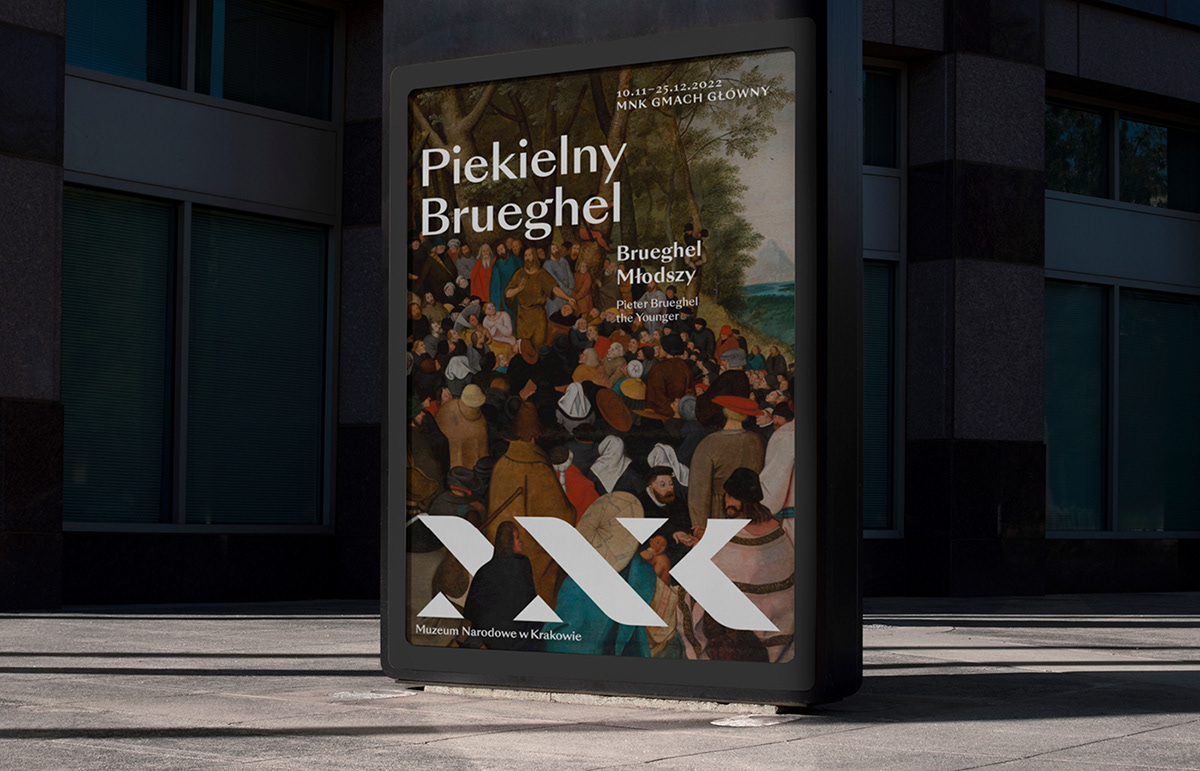
The identity is an extensive visual language, and enables many forms of communication—from the elaborate and artistic to the very functional and straightforward.


The DNA Thread
The metaphor of the thread is a central element of the logo and identity. The shape serves as a vehicle for artwork, and is the basis of the geometric icon set.
The metaphor of the thread is a central element of the logo and identity. The shape serves as a vehicle for artwork, and is the basis of the geometric icon set.


Illustrations & Patterns
The identity includes a striking and original illustration style that complements the artwork displayed during exhibitions. They can adorn anything from t-shirts to posters and create a contemporary, fun way to show art. Each od the dynamic serifs is a starting point for a decorative pattern. Together, the patterns are an abstract illustration of the rich tapestry of the Museum's collection.
The identity includes a striking and original illustration style that complements the artwork displayed during exhibitions. They can adorn anything from t-shirts to posters and create a contemporary, fun way to show art. Each od the dynamic serifs is a starting point for a decorative pattern. Together, the patterns are an abstract illustration of the rich tapestry of the Museum's collection.


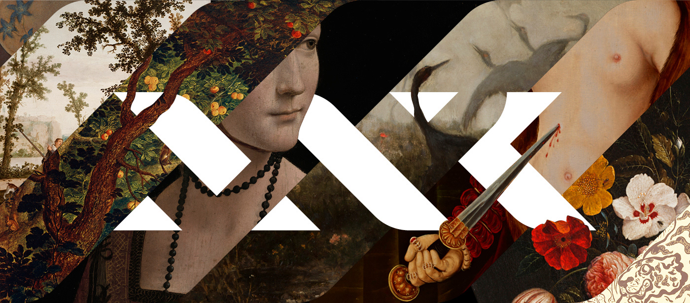
Art & Symbol as One
The visual language fuses the Museum's symbol and its art into one form. Thanks to the timeless geometry of the symbol, it can be interwoven with medieval paintings and modern abstract sculpture alike.
The visual language fuses the Museum's symbol and its art into one form. Thanks to the timeless geometry of the symbol, it can be interwoven with medieval paintings and modern abstract sculpture alike.
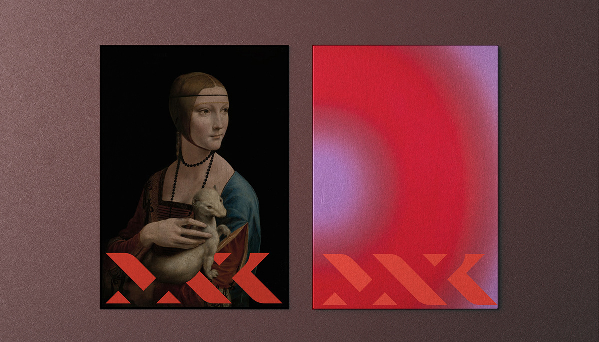


Color Palette
The color range was selected to fit the needs of the vast collection and branches. The main color is a vibrant red, complemented by a rich aubergine.
Icon System
The icons are based on geometric forms of the main symbol. They are intuitive and simple to read, but unique and elegant at the same time.
The icons are based on geometric forms of the main symbol. They are intuitive and simple to read, but unique and elegant at the same time.


Typograhy
The typographic system is based on the Sangbleu typeface by Swiss Typefaces. Its letterforms are at once classic and modern, and have the elegance and finesse to fulfil all the different identity needs.
The typographic system is based on the Sangbleu typeface by Swiss Typefaces. Its letterforms are at once classic and modern, and have the elegance and finesse to fulfil all the different identity needs.


Creative Director: Emilka Bojańczyk / Podpunkt
Concept: Emilka Bojańczyk, Zuza Charkiewicz / Podpunkt
Concept: Emilka Bojańczyk, Zuza Charkiewicz / Podpunkt
Design: Emilka Bojańczyk, Zuza Charkiewicz / Podpunkt
Photo: pixeden unsplash pixpine mrmockup
Art: MNK collection
Illustrations: Zuza Charkiewicz / PodpunktAnimations: Ewa Najnigier-Galińska, Zuza Charkiewicz, / Podpunkt
Typeface: SungBleu Sanrise by Swiss Typefaces
•
Visually strong and well made products by
podpunkt.pl / superskrypt.pl