
Intro
The product team was struggling to scale, as we were working with an insufficient component library.
EDealer
A technology solution for automotive dealers, providing services such as: Marketing, Web Design, Eccormece Integrations, Inventory Management Tools, CMS, CRM, etc. EDealer works directly with multiple automotive brands to provide a cohesive 3rd tier (auto dealerships) experience to the automotive's global consumer base.
The Problem
EDealer's clientele of certified automotive brands was growing at a steady pace. The Web Design team was operating on an insufficient component library that was not brand specific. This required the designers to put together brand-specific mocks from scratch, averaging 2-3 hours to reach brand compliance per project. In the same manner, the Development team was operating on a site-to-site basis, manually adjusting the CSS styling on each component and token across new client sites.
My Role
As Web Design Manager, it was my role to facilitate improvements within the department with the goal of decreasing strain on the designers and up-hold a high quality brand compliant output to 1700 dealer clients.
My Project Contributions
- Fabricate & map out the system architecture
- Refactored the legacy component library and tokens to meet the new system constraints
- Turned ambiguous brand guidelines into design tokens that fit within our system structure
- Planned project roadmap, tracked and shared progress
- Collaborated with cross-functional team leads (Development, QA, Client Services, Certified Programs)
Project Goals
EDealer's Business Goals
1. Become Certified Providers for auto brands
2. Meet program timelines
3. Increase amount of clients/sites
User Goals (Designers, Developers, QA, CS)
1. Follow program requirements
2. Reduce strain + turn-around of production by increasing automation
3. Have readily available resources: System + Certified Programs Requirements

The Process
I had to make a few assumptions about the influx of work we could be facing from the Certified Programs. We wouldn't have exact numbers until program vendors were selected, and enrolment began. We anticipated that in 2019 we may have 3-8 program applications.
Evaluate Pain Points
Meetings were held with cross-functional team leads, as well as my own team of designer, to understand our main pain points and see how they could be addressed through the structure/assets/resources of the System. We discussed what parts of our current process worked, and which did not.
Main 4 pain points:
1. Manual brand styling: a big root of the design system initiative.
2. Manual data input: with high fidelity mocks the designers input all the Dealer's proper information - this involved manually adjusting spacing and ensuring we had all accurate data applied.
3. Custom requests: this was essentially 1 off components that were created on a request basis through Client Services - these were projects or page templates that was costing our production teams a lot of time, with little return value.
4. Varying brand resources: our team was working from the brand guidelines provided by the manufacturers, these PDFs documents varied in information, categorization and specs provided. Making it a tedious task to verify the compliance on the simplest detail.
Research
Design Systems
While researching Design Systems, and how other companies were using them, I of course, stumbled upon Brad Frosts' Atomic System methodology. The granular approach of mirroring a molecular form would allow our team to configure component, reducing custom adjustments & building 1 off components. I customize the architecture, language and functions of the system to meet our team and tech stacks needs. terms of the Atomic System structure would need to be adjusted to fit our team's pre-existing language and use cases.
Software for building a design system
At the time of this project, Q2 2018, Sketch, Adobe XD and Figma were leading options for UI design. I spent time reviewing the platforms and their current capabilities. Sketch was the more senior of the options with 8 years on market. However when breaking down the features all platforms were relatively similar.
Our team had already been using Adobe Creative Cloud to maintain brand tokens and marketing assets for many years across the Design Department (Web & Marketing teams). For this reason, I decided to build within Adobe XD to keep current resources usable and leverage our team's familiarity with the Adobe platform. This also ensured we had an easy transition from our legacy files, in Photoshop to our new living library.
System Structure
The base brand system was established in order to design components in a neutral low-fidelity like format, allowing the team to re-skin them with the brand specific styles. The following style sheets were shared with the EDealer team using the Adobe XD's Development Tokens tool, creating a handoff with ease.
Component Breakdown
The atomic system structure was utilized to provide our team with the flexibility we needed to accommodate various brands and customer requests.

(1+ 2) Atoms/Molecules: The fine details of our UI - button variants, smaller interactive items, link styles, etc. Atoms and Molecules have defined interactive styles to keep consistency throughout the websites. (3) Components: Different sections within the page, made up of Atoms and Molecules to form a complete functioning section on the page. We have a range of component types which serve different purposes. (4) Page Templates: Homepage or Inner page templates which are built up of multiple components with a set structure and layout pattern.
The System Architecture
It was crucial to have 1 Master file which contained the base structure of the entire system. This way we'd have 1 source of truth for the entire component library, set structure and be able to track version history.
Without knowing what constraints each OEM brand would have, it make sense to ensure each future Brand's System/Theme would be independent. Allowing changes to be made individually without impacting the other Design Systems of the foundational Design System.

Style Sheets
Design Tokens
Each automotive brand has specific rules for their brand colours and fonts. I designed a colour palette sheet which could present the colours and implementation standards in a clear, scannable way while still providing necessary details to our Development team. Please note the Accessibility chart was created using an online resource which simply states the 4:5:1 ratio grade which we designed.

The Colour Style Sheet includes break downs of Accent, Neutrals and UI specific colours. Colour implementation rules are demonstrated through colour combination & gradient sections. Lastly, the colours are input into an accessibility chart to verify their pairing abilities.

An extensive range of typography classes were built into the system to allow the designers to design with clear content hierarchy. The type specifications were documented in PX + REM sums to accommodate Designers & Developers native formatting.
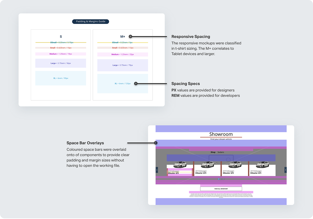
Spacing Values
To maintain a visual rhythm within components, molecule and pages I defined our spacing (padding + margins) in a simple, yet effective scale. These spacing sizes adapted based on the responsive screen size to ensure white space scaled at an appropriate rate.
The space bars were used to annotate our components, making it crystal clear for our Developers and QA team to implement and review without having to open the design files or development panel within the shared Adobe XD resource.
Interactive UI
All interactive atoms and molecules are defined within the remaining style sheets of the Design System. This ensures all micro-interactions are defined and set with global styling across all components.

UI Patterns
Having defined patterns allowed Design and Development to implement, customize and iterate in a more efficient way.
Components
A large library of components was already available via the legacy web templates, these were all pulled into the new design system and modified to match the new style sheet requirements.
Since our primary goal is to utilize the component library, these assets were front and centre within our working file. The Designers had access to the full brand system atoms and molecules to modify default components when necessary.
Components range from headers to footers, etc. Each component type has 3-10 configurable variations, providing a variety of starting points for Designers.

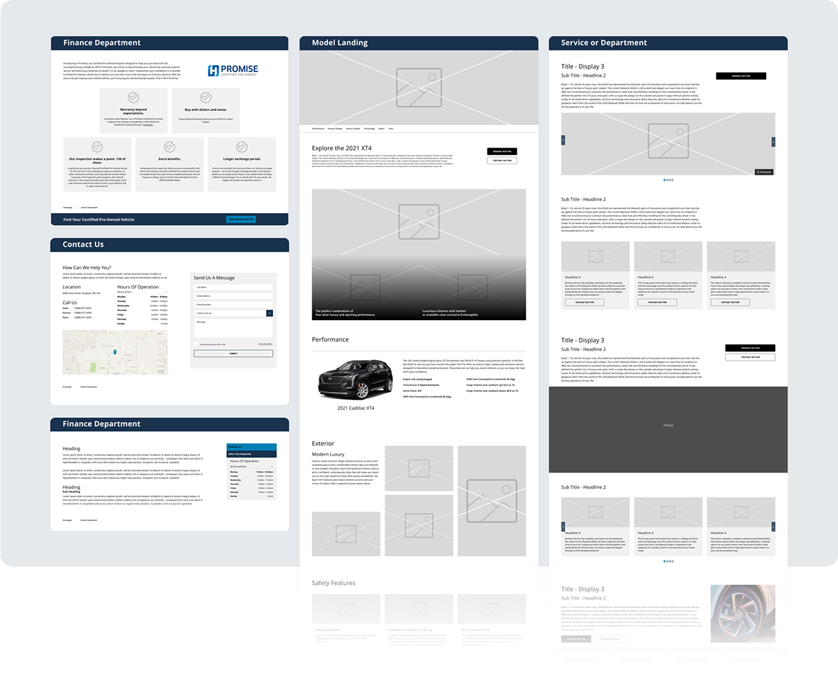
Page Templates
Standard pages create based on our clients' goals and product line. Content structure on the page is configurable based on the goals and copy.
Applying the Brands
Some automotive brands provided extensive documentation, where others provide ambiguous implementation references. I was responsible for interpreting this documentation to create undeniable guidelines for our Design & Development teams. During this process, I created program grades based on the requirements. Level A being the most strict, and Level D being the most open to custom branding adjustments (at the Dealer's discretion).
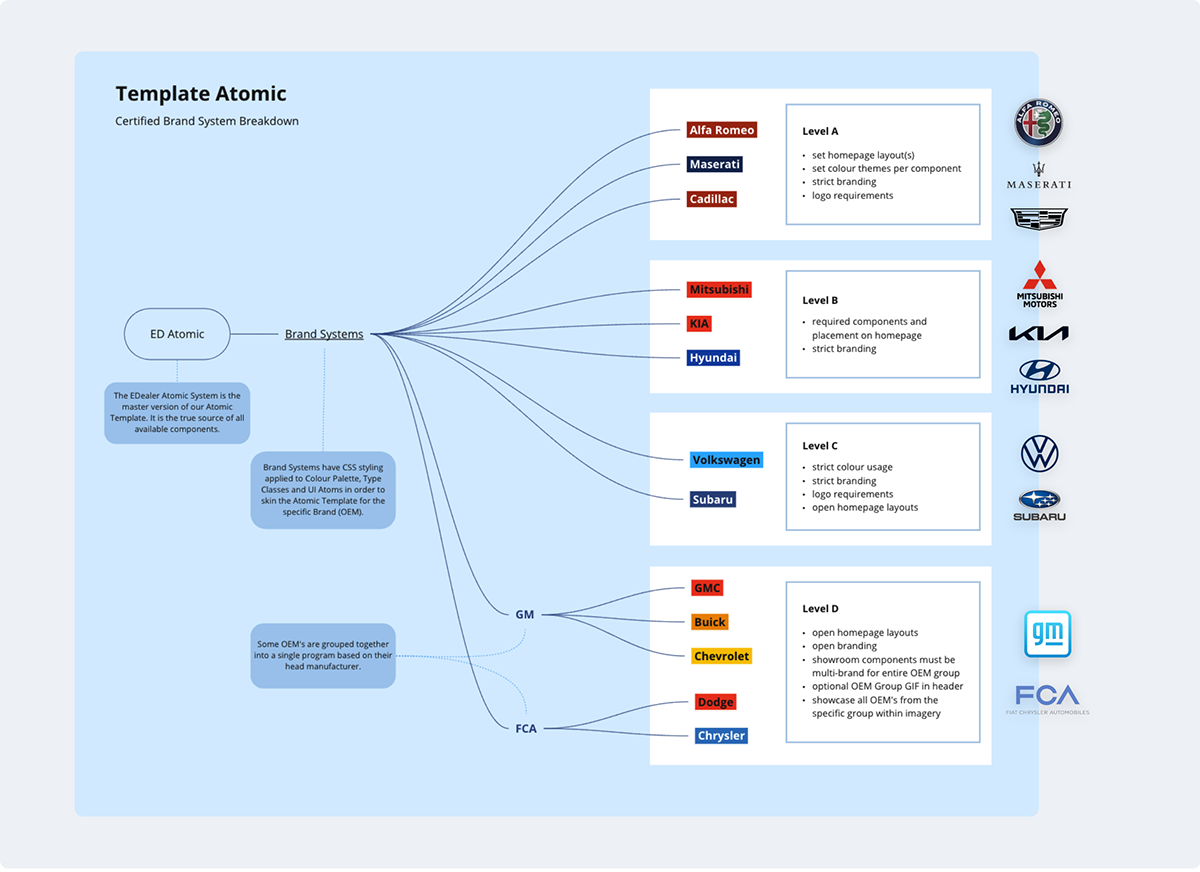
The diagram shows the relationship of all brands to the parent ED Base system.
Brand Specific Systems
Creating individual Brand System which inherited the structure of the Base Brand System allowed us to reuse components, page templates and more, increasing efficiency of the department.

High Fidelity Mockups
Below are examples of a CTA component and Homepage template styled in different brand systems.


Documentation & Resources
Documentation was created using an online web service called Zeroheight. This allowed me to create, write and manage content on a responsive platform with low construction cost to the team. This was our alternative to using Storybook at the hands of our Development team.
Component Library
The Adobe XD files fit perfectly into the Designer's workflow, however our Developers and QA team were not currently relying on the files as much. To make the brand system components and page templates more accessible I created supporting documentation. The documentation provided responsive previews, usage examples and annotations for each component. This helped to clarify use cases, edge-cases and configurable options on a component basis.


Certified Programs
The style sheets were able to capture all UI styling requirements, however many Certified Programs had restrictions that surpassed the basic branding one the website, such as Homepage component requirements and structure, or Vehicle Showroom stipulations.


Conclusion
The creation of this Multi-Brand Design System was one of my most notable achievements at EDealer. Improving the team's efficiency by 50%+ (reducing time spent from 2-3hrs to 30-45min) while maintaining a high-quality output to over 1700 automotive dealers. The teams design process became less strenuous, clearly-cut and brand cohesive.
The System continues to be used to this day, growing as EDealer acquires certification for other Automotive Brands.


