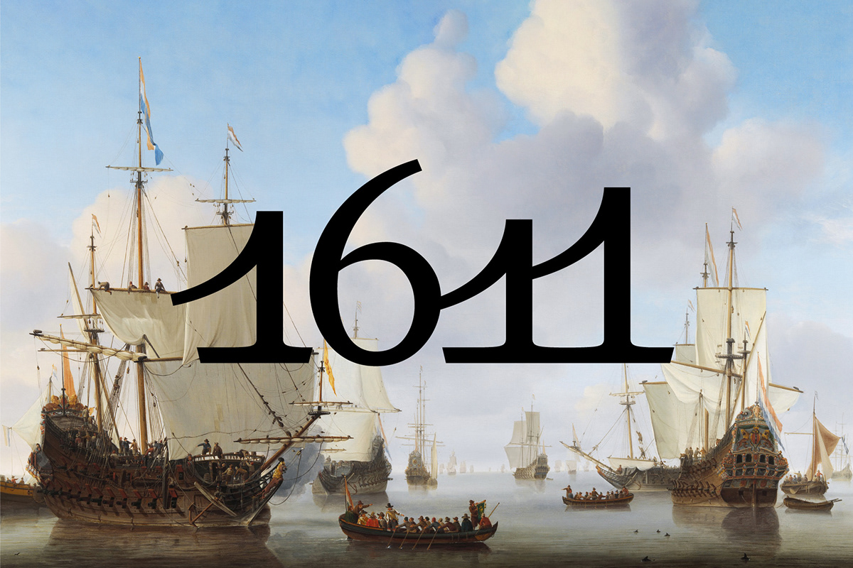
1611
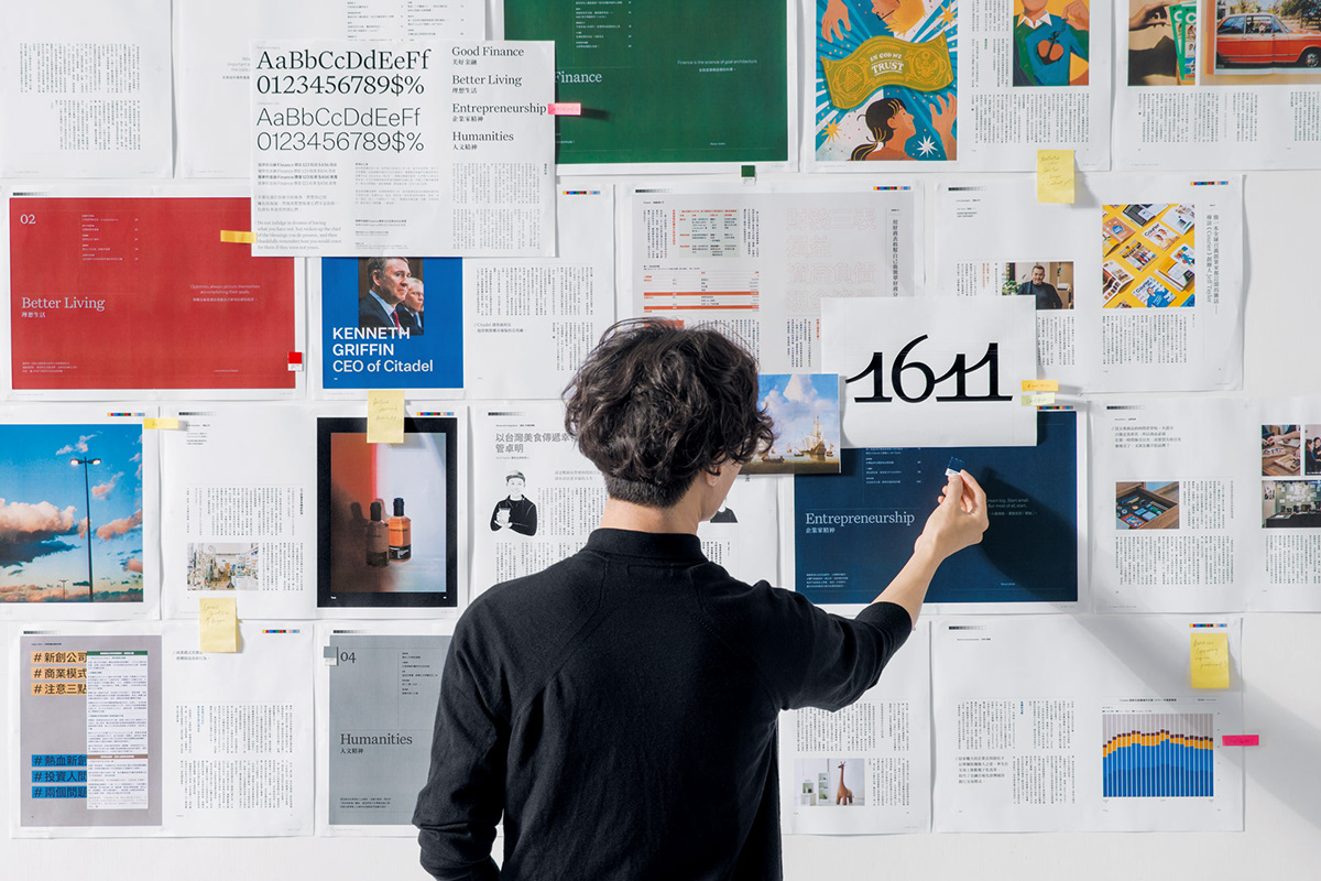
1611 is a financial magazine from Taiwan that aims to introduce to the world a lifestyle-oriented way of engaging with finance. For 1611, we created a brand identity and refreshing magazine design with an extensive range of publication layouts.
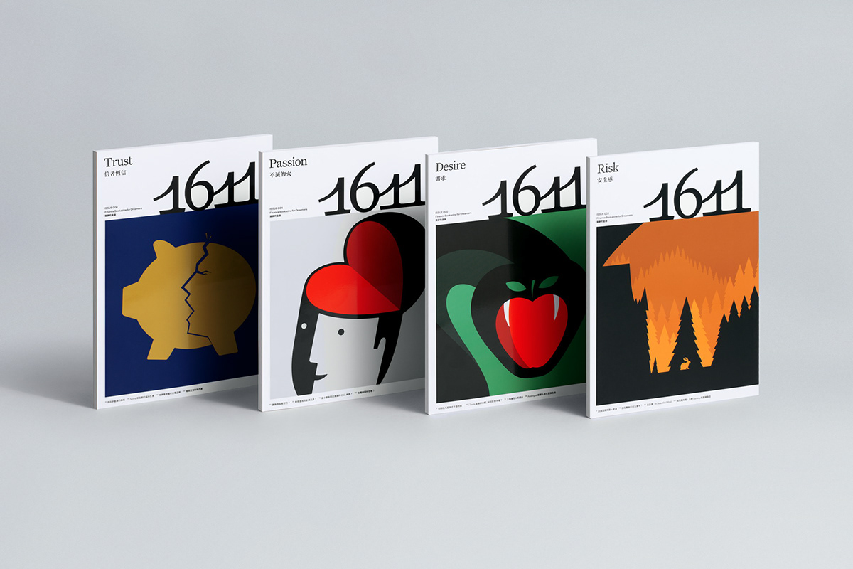
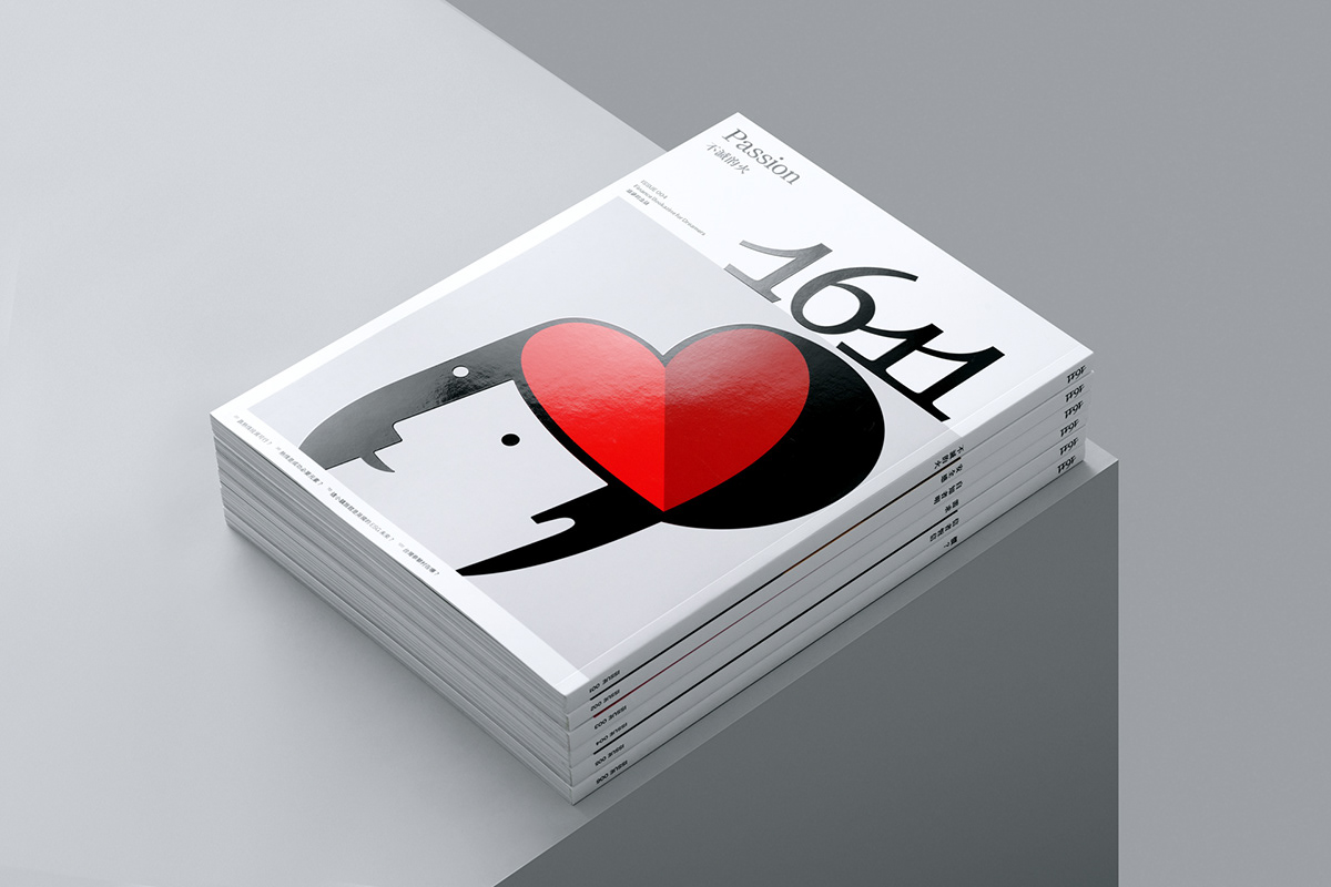
Named after the year in which the world’s first stock exchange was set-up by the Dutch East India Company to fund growing maritime trade, the logo is formed in homage to this entrepreneurial spirit with nautical origins. Taking after the shape of a ship’s sails, the logo sits on the rightmost sea line edge of each cover’s masthead, visually representing forward motion and the endless possibilities of bold enterprise.
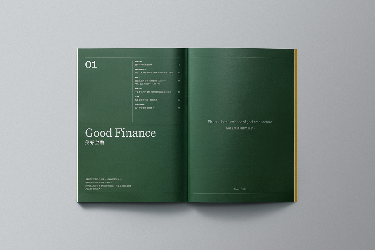
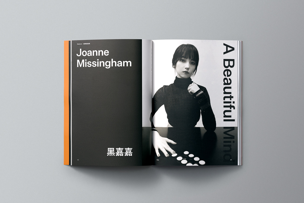
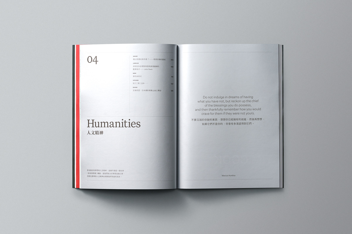
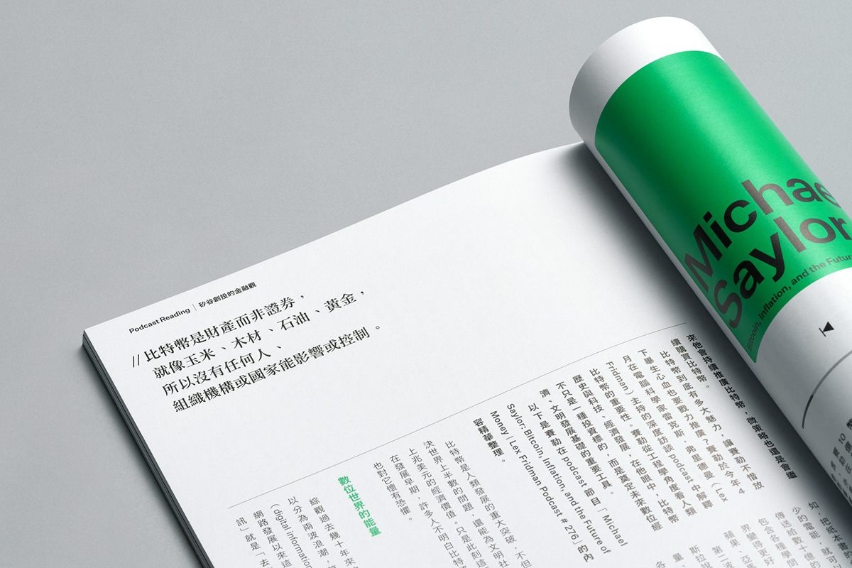
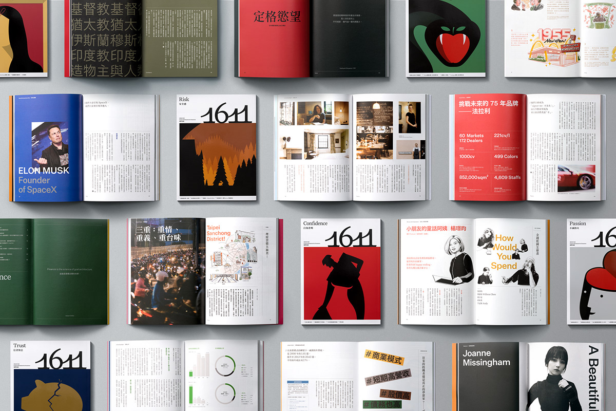
Showcased on the front cover design is also an illustration that introduces the issue’s theme. Bold, and set in a graphic style, the illustrations express the strength of character that often accompanies the conviction required to pursue one’s dreams. The earliest of these have been created by renowned graphic illustrator Noma Bar. Inside the issue, clean yet dynamic layouts house illustrations, photos and graphs for a visually engaging reading experience.
Named after the year in which the world’s first stock exchange was set-up by the Dutch East India Company to fund growing maritime trade, the logo is formed in homage to this entrepreneurial spirit with nautical origins. Taking after the shape of a ship’s sails, the logo sits on the rightmost sea line edge of each cover’s masthead, visually representing forward motion and the endless possibilities of bold enterprise.
Showcased on the front cover design is also an illustration that introduces the issue’s theme. Bold, and set in a graphic style, the illustrations express the strength of character that often accompanies the conviction required to pursue one’s dreams. The earliest of these have been created by renowned graphic illustrator Noma Bar. Inside the issue, clean yet dynamic layouts house illustrations, photos and graphs for a visually engaging reading experience.


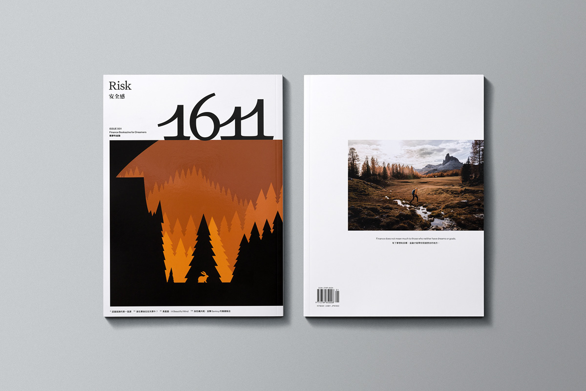
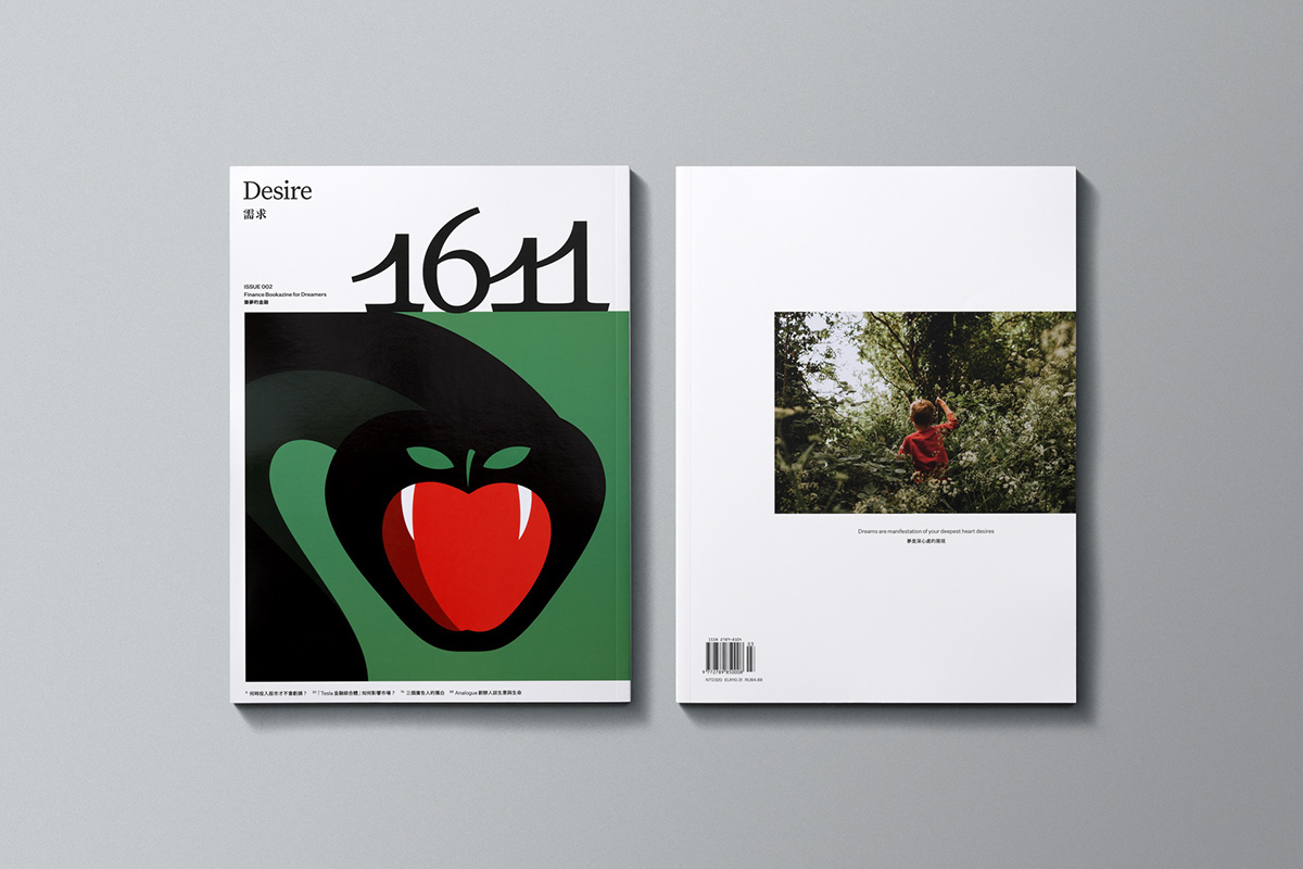
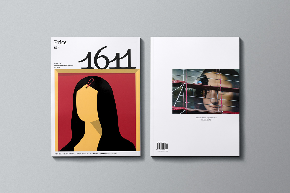


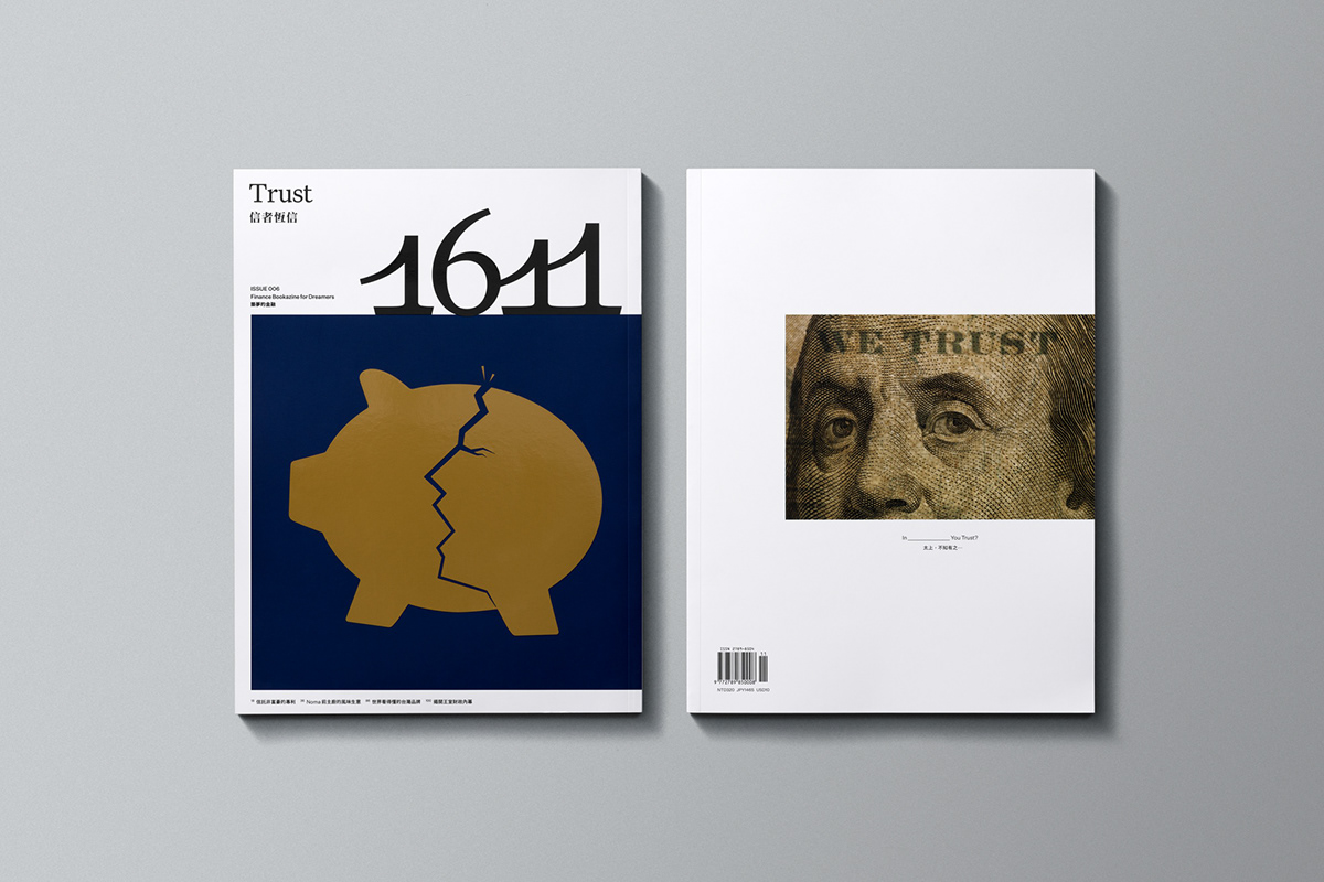
The currency featured on the back cover of each issue will vary depending on
the current global economic situation.