


Lía Cafe
Lía is a coffee brand based in Qatar that combines the rich flavors of French-style coffee with minimalist design. The brand is of a young Qatari who was passionate about coffee and wanted to create a brand that would offer the best of both worlds: the unique tastes of Qatar and the timeless elegance of French coffee culture.
Lía's coffee is carefully crafted using only the finest beans, roasted to perfection to bring out their rich, complex flavors. The brand's commitment to quality is evident in every cup, with a smooth, satisfying taste that lingers on the palate long after the last sip.
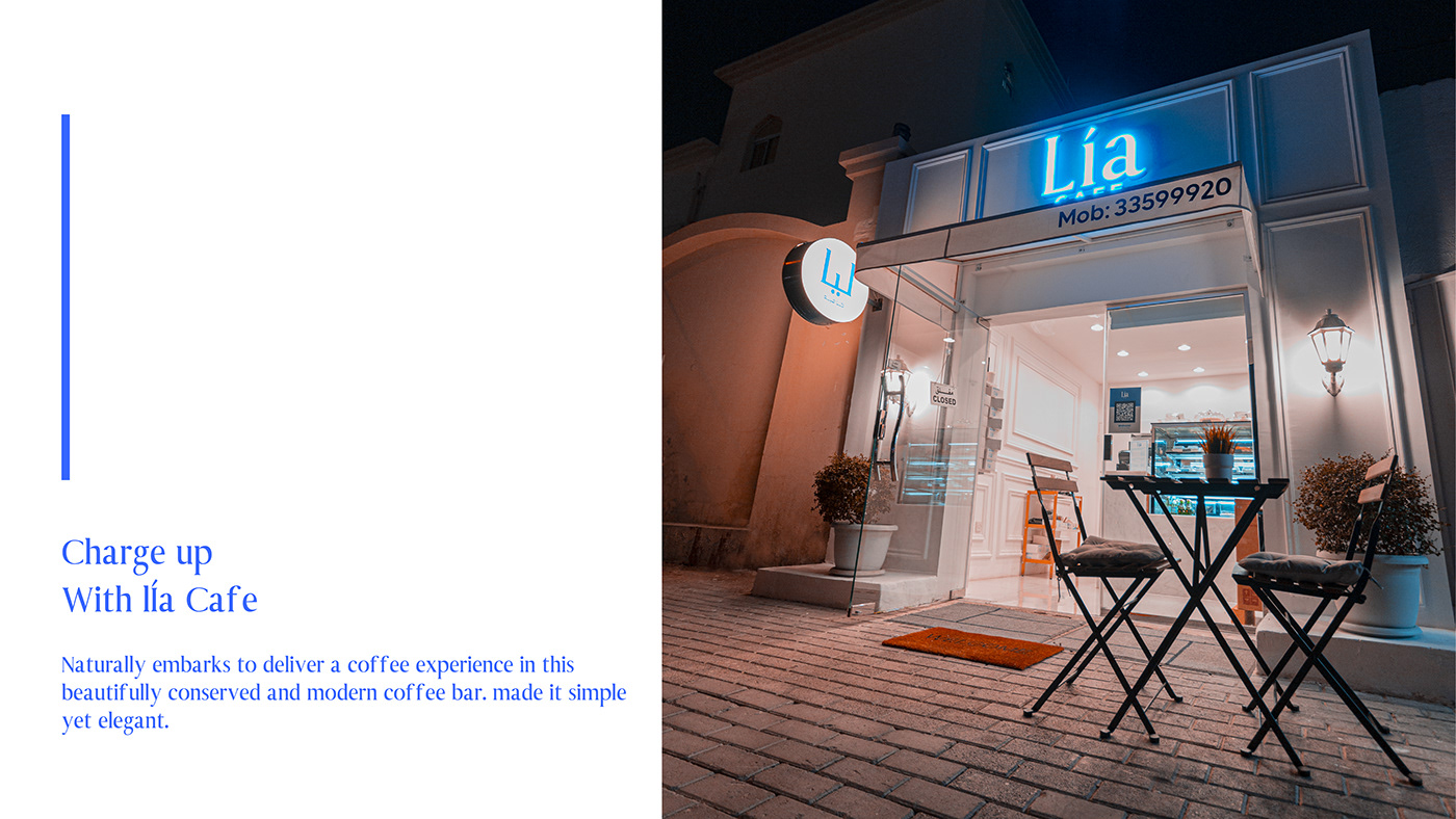
But Lía's appeal goes beyond just its great-tasting coffee. The brand's minimalist design, inspired by French cafes, is a visual representation of the brand's commitment to simplicity, elegance, and attention to detail. The logo, with its clean, serif font style, is instantly recognizable and has become an iconic symbol of the brand's identity.
Lía is more than just a coffee brand; it's a lifestyle. With its sleek, minimalist design and rich, complex flavors, Lía's coffee is the perfect choice for those who appreciate the finer things in life. Whether you're sipping a cup of Lía's coffee at home or enjoying it at a local café, you're sure to be transported to a world of elegance and sophistication.
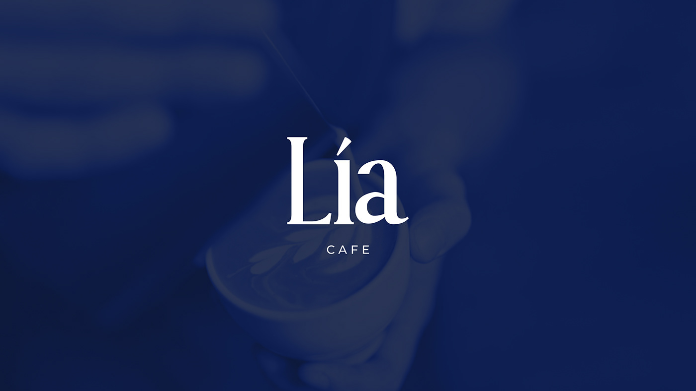
The Lía logo is a perfect representation of the brand's commitment to elegance and simplicity. The logo features a serif font style, which is known for its classic, timeless look. The serif font used in the Lía logo is clean and easy to read, with each letter crafted with precision and care.
The serif font style gives the Lía logo a touch of sophistication and refinement, while still maintaining a clean and minimalist look. The subtle curves and flourishes of the font add a touch of elegance to the overall design, while the simplicity of the letters ensures that the logo remains easily recognizable and memorable.
The choice of serif font style is a nod to the brand's French-inspired roots, as it is a popular style in French café culture. The classic and timeless look of the serif font is a perfect fit for the Lía brand, which seeks to provide a high-quality, premium coffee experience that is both simple and refined.
Overall, the Lía logo with its serif font style perfectly captures the essence of the brand, and is a visually striking symbol that instantly communicates the quality and elegance of the Lía coffee brand.


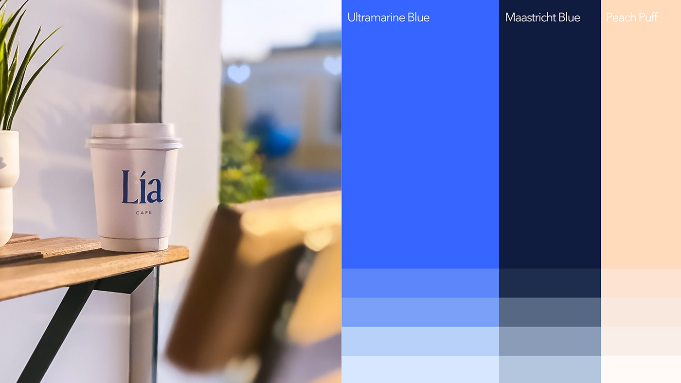
The Lia logo color combination uses Ultramarine Blue, Maastricht Blue, and Peach Puff colors.
Ultramarine Blue is a rich and deep blue color with a hint of purple, often associated with luxury, sophistication, and depth. It's a timeless color that adds a sense of elegance and class to any design. The name Ultramarine comes from the Latin word "ultramarinus" which means "beyond the sea."
Maastricht Blue, on the other hand, is a dark and intense shade of blue that leans more towards a navy tone. It's a color that exudes confidence, power, and professionalism. The name Maastricht Blue comes from the city of Maastricht in the Netherlands, where it was originally used as a color for the city's coat of arms.
Peach Puff is a soft and warm shade of orange that's light and delicate. It's a color that symbolizes friendliness, warmth, and approachability. The name Peach Puff comes from the fruit peach and the soft and velvety texture of its skin.
Together, these three colors create a harmonious combination that's both striking and inviting. The use of Ultramarine Blue and Maastricht Blue as the primary colors adds a sense of sophistication and strength to the design, while the addition of Peach Puff brings warmth and approachability. The combination of these colors conveys a message of professionalism, trustworthiness, and friendliness.


The main packaging challenge for Lia coffee shop would be to create a design that stands out in a crowded market while also accurately representing the brand's identity and values.
As a coffee shop, Lia's packaging design should convey the quality and taste of their coffee while also appealing to their target audience. The packaging should also be practical and functional, keeping the coffee fresh and easy to store and transport.
One possible approach for Lia's packaging design would be to use a minimalist and modern design that emphasizes the premium quality of their coffee. The use of high-quality materials, such as matte or glossy paper and metallic foils, can add a touch of luxury to the design. The incorporation of the brand's signature colors, such as Ultramarine Blue and Peach Puff, can also help create a memorable and distinctive packaging design.
Another possible approach for Lia's packaging design would be to incorporate eco-friendly and sustainable materials, such as recyclable or biodegradable paper and plastics. This can appeal to consumers who are environmentally conscious and aligns with Lia's values of sustainability and ethical practices.
Overall, the main packaging challenge for Lia coffee shop would be to balance functionality, visual appeal, and brand identity in a way that sets them apart from their competitors while also accurately representing their values and products.


Design & Photography
Omar Laghmich
Yaear
2022


