
C L I E N T
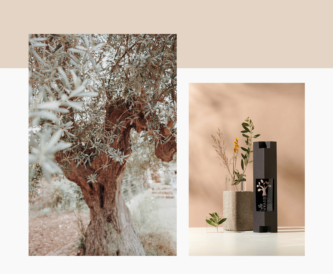
Sv. Ivan is the name of the brand behind the 'ultra' extra virgin olive oils, and it was born from many years of experience and love for the olive itself and olive oil. The quality of the oil Sv. Ivan has been recognised and awarded several years with the highest honours — gold and silver medals, both at domestic and international prestigious competitions around the world.
D E S I G N
We created visual identity and a packaging design for a brand of extra virgin olive oils called Sv. Ivan (St. John). The task was to distinguish the products as premium quality in a cost-efficient manner. Since the bottle was predetermined and is commonly used by other oil producers, the label is unconventionally positioned and the supplementary box is designed according to it. Made from paperboard, the box has an unique locking system, which is used as elevation pilars for the bottle. The combination of typographic style, illustrative identity, colour coding and the box with a sculptural feel to it, make this design elegant yet affordable. In 2011 the project received Red Dot Communication Design Award.


Thanks for watching and for more info please visit Sv. Ivan official page.
©Marita Bonacic, Katarina Peric, Negra Nigoevic. Please do not use any photo without author's permission. Feel free to contact us :)


