


More Fish is a brand new Chinese fusion restaurant brand that focuses on cooking fish and seafood dishes. The brand concept is to provide a space for people to slow down and escape from busy and stressful urban life. More Fish emphasizes an emotional connection with our customers, and we strive to create a warm and comfortable experience through high-quality food and a cozy atmosphere.
We want the customers to feel at ease, to slow down, and not get bogged down by external competition.To achieve this, We have focused on the emotional part of the brand that emphasizes the value of human connection. We want our customers to feel a sense of belonging, to be able to empathize with our brand's story, and to enjoy a delightful dining experience in a comfortable and cozy environment.

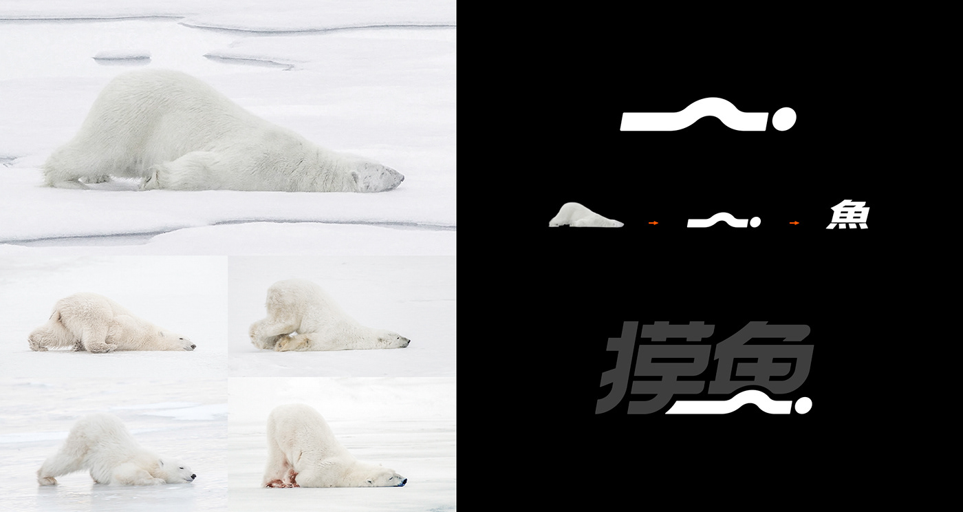

The logo design is Chinese word-mark based, and the graphic part is inspired by the idea of lazy polar bears. The word-mark features a modern font with thick and bold strokes to convey a lazy and laid-back feeling. We hope that the brand's concept and intended values can be conveyed directly to customers through the logo.


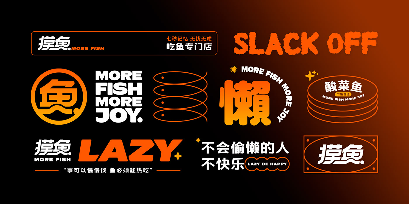
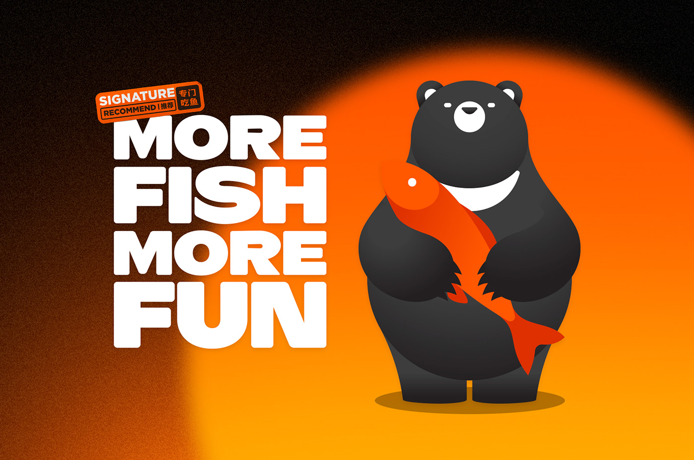
For the color scheme, we opted for a combination of orange and yellow with black and white. The warm tones of orange and yellow evoke a cozy and inviting feeling, perfectly aligned with the ambiance we want to create - the sunset after a long day. While sunset may mark the end of a busy day for many, it's also an opportunity to unwind and start living the real moments of life. Our goal is not to promote extreme idleness, but rather to infuse positivity and energy into our brand concept. Orange and yellow hues reflect this theme perfectly.

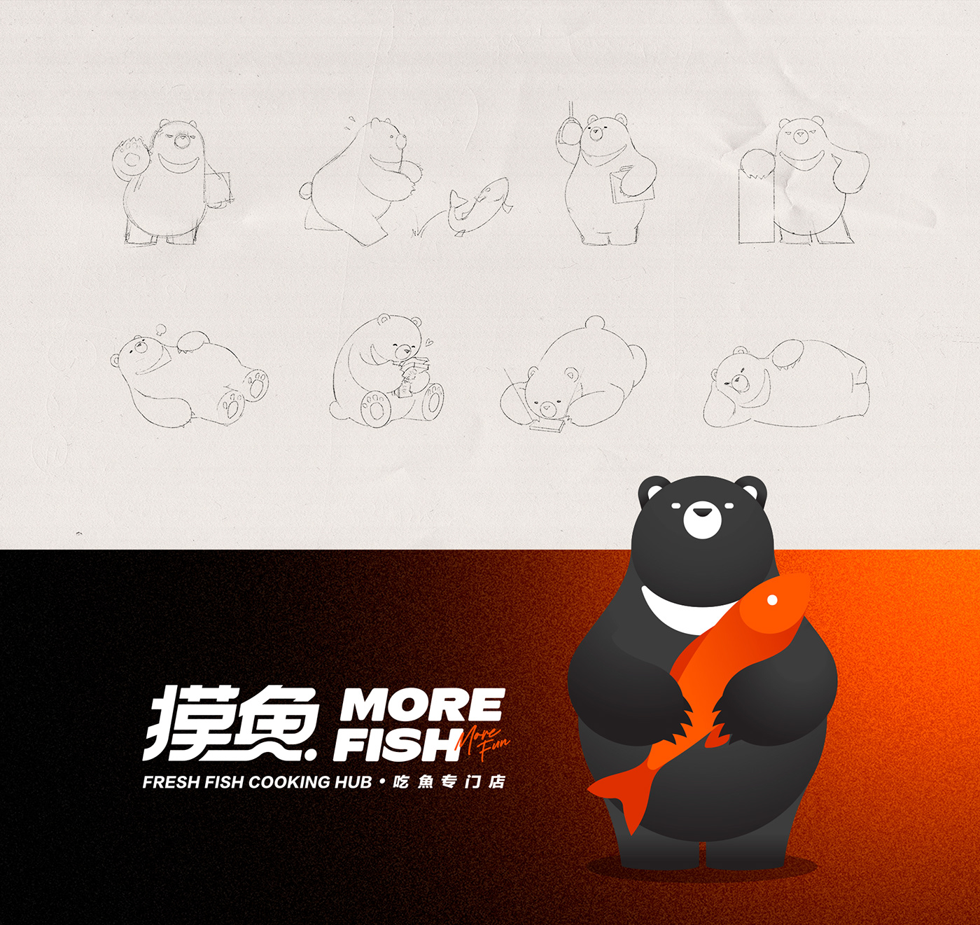

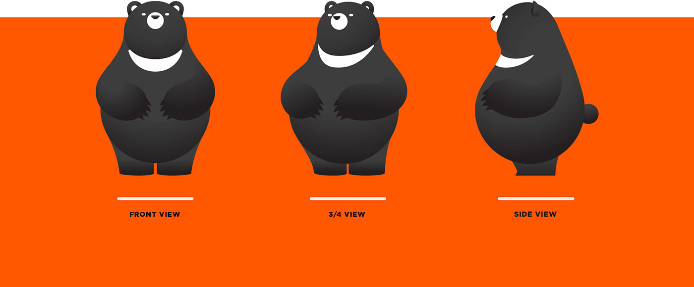
We believe that the image of a bear best represents the emotional expression that the More Fish brand hopes to convey. We have integrated different species of bears into one character, combining the physique of a brown bear, the fur color of a black bear, and the affinity of a polar bear. In terms of anthropomorphism and personality, we took inspiration from Totoro. We hope to guide the audience to focus more on the emotional expression and brand personality conveyed by the character. In terms of appearance, we abandoned the use of lines and excessive colors. By simplifying the design while maintaining a cute appearance and distinctive personality, we maximize the practicality of the character.


We hope that when you see this post or walk into the restaurant, you feel a sense of care and warmth. We understand that not everyone has the luxury of a job they love or can easily find their passion, but we firmly believe that the only true passion lies in loving oneself and embracing life. We hope that everyone can escape the hustle and bustle of the outside world and simply relax. We hope you enjoy our works and join us in being a bear who loves life and indulging in a little bit of fishy goodness!
Designed and illustrated by Astro Circo Studio
THANKS FOR
WATCHING!
Check out more of our fun stuffs


