


With its expertise in both the legislative and technical aspects of gaming, the Malta Gaming Authority is not only responsible for regulating all gaming activities in Malta, but has also branched out to provide its services worldwide. In 2022, we worked with MGA to initiate a complete brand re-haul, aiming to refresh the Authority’s visual identity and communicative voice, both internally and externally.
A key principle of the Authority is One MGA – meaning that from top to bottom, the entire MGA team is in line with each other, and working towards the same goals. Keeping true to this value, our first step was to conduct workshops, in order to gather information from all levels of the MGA team.
The results of the workshop helped us to identify what the common fundementals were, as well as areas where the team saw room for improvement. Based on this, we created a basic profile of what the future identity should be.
The Brand Colours
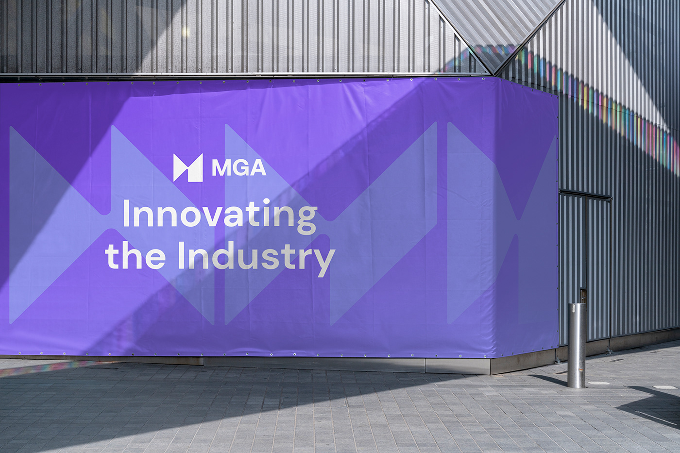
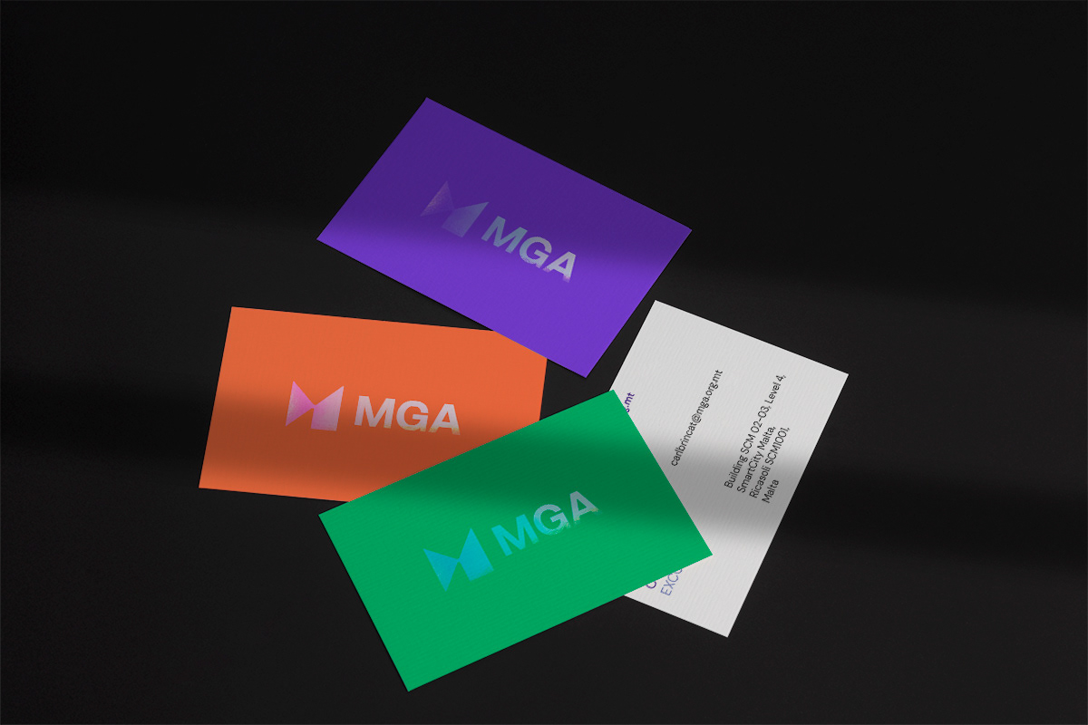
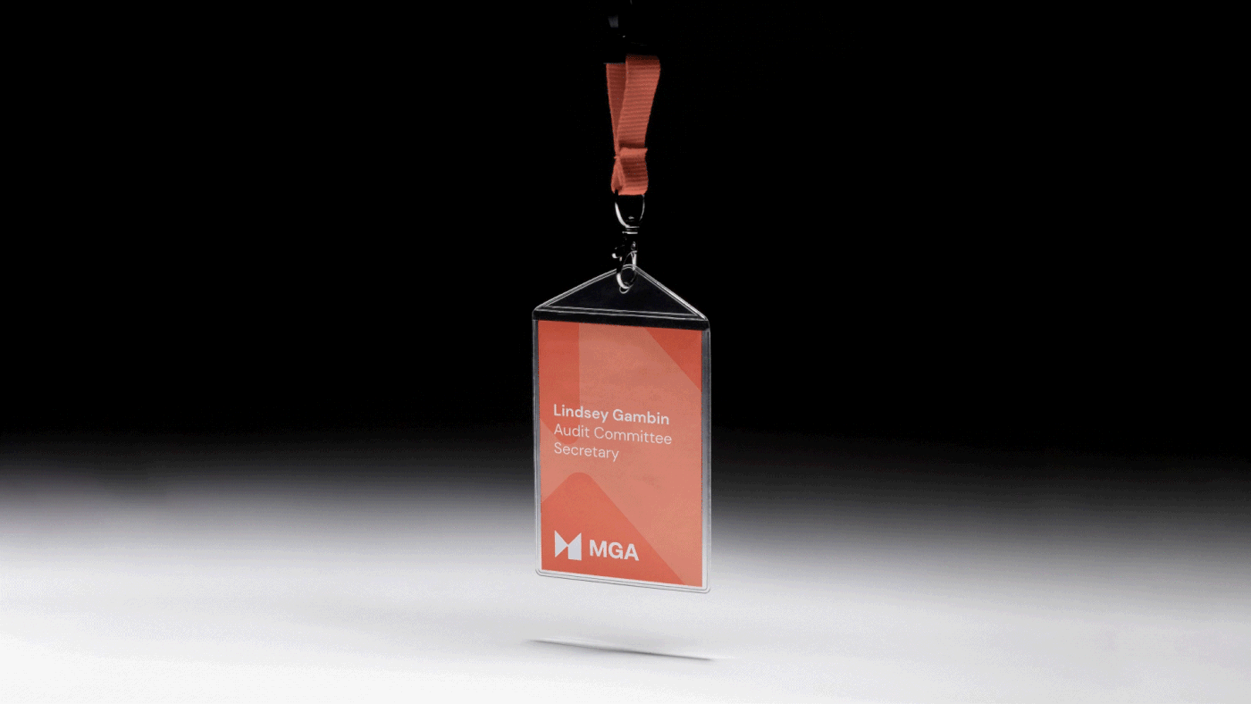
The brand colour palette is an indicator of the MGA’s positioning within the global gaming regulatory scene. Three vibrant colours form the core of the MGA’s visual identity, with purple being the main colour. This distinctively unique approach to a regulatory body’s visual identity speaks to the MGA’s agility and innovation – an identity that stands out for an Authority that is one of a kind.


Innovative
The drive towards being forward thinking and remaining an industry leader puts the brand on track to stay at the forefront and remain future-proof. Flexibility and adaptability are of utmost importance on all fronts – both in terms of operational expertise, and in brand optics and application.
Transparent, open
Conducting communication in a transparent manner improves brand image and reputation, whilst openness allows for approachability. On an internal level, this means that excess beaurocracy is eliminated, allowing internal communication and collaboration to happen seamlessly.
Exemplar of integrity
Building trust on all fronts and staying honest and true to the Authority's values reinforces perceived integrity and builds trust in the brand.


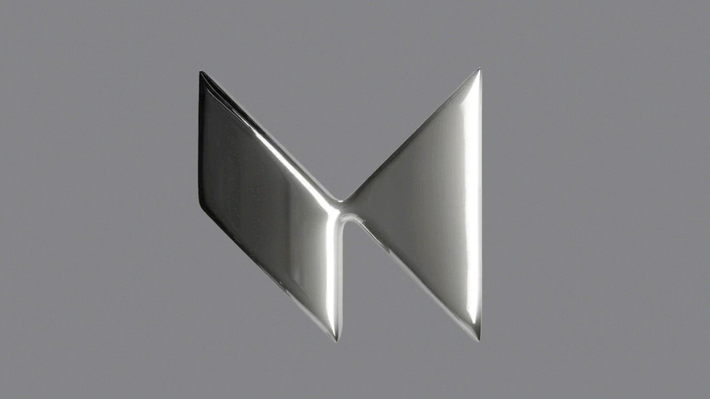
Dynamic logo
The brand icon shifts and transforms into different dynamic forms, reflecting the MGA’s flexibility and constant evolution. While the base shape stays the same, smooth transitions allow the marque’s nodes to morph seamlessly, in continuous re-invention, while always maintaining the core foundations.


Credits:
Design Agency: Redorange
Creative Direction: Stelios Ypsilantis
Design Lead: Michela Sammut
3D and Motion: Astrid Dorekens
Project Manager: Alison Gauci
Client: MGA mga.org.mt
Thank you!


