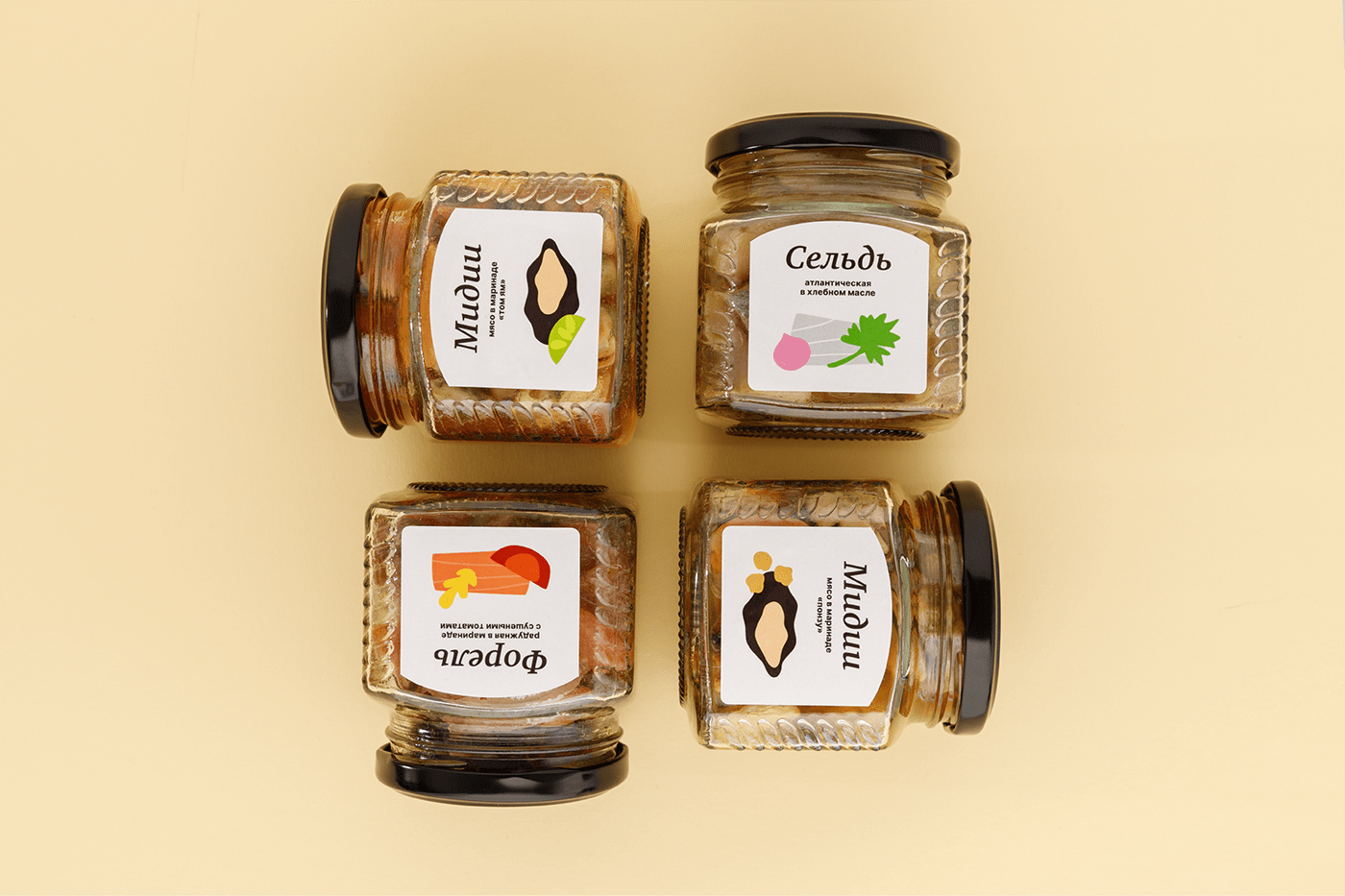


Preserves
The line of preserves consists of five flavors individually created by a freelance chef for the shop " Chetverg". The style of the store is quite dark, black color prevails. However, the design of the preserves label is significantly different. It is light, bright and minimalistic. Here are some reasons why the design is different. Firstly, the full assortment of the store is either finished products from manufacturers from different countries or packaged in-house. Preserves, on the other hand, are an individually assembled mix of fish products, sauces and other ingredients, subjected to special processing (preservation) and completely ready for use. Preserves are made in the store's own production. Therefore, the task was to make the product line different from other products. To convey the uniqueness of the composition, purity and quality ingredients. Secondly, most of the ingredients are somehow related to Asian cuisine. In addition to fish and seafood, ponzu sauce and soy sauce are used, which belong to Japanese cuisine, as well as tom yum, a national dish of some countries in Southeast Asia.
I have tried to use the style of this part of the world. Add uniqueness and originality. Concentrate the buyer's attention on the drawing and the large inscription. There are no distracting details and unnecessary decorations around. This would also reduce manufacturing costs.
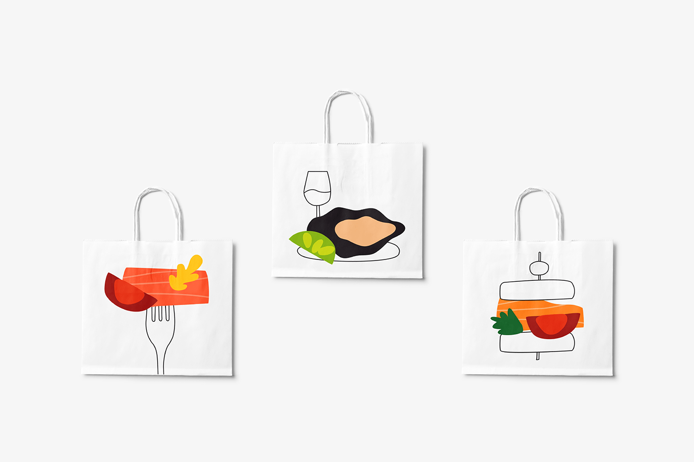
At the beginning of the work, when I received documents describing the composition of dishes, I chose the most interesting and essential ingredients and divided them into groups. I assigned each ingredient its own color and shape. If some products were duplicated, I used one image. Thus, I created a kind of product coding. Further, I began to collect compositions from the received elements: