


The Client
Teazen is a tea specialty company that pursues a healthy and energetic lifestyle based on tea. They have launched a popular stick drink brand, Kombucha, and have a market share of 7-80%. This product is established as a healthy drink by reducing sugar and calories and adding probiotics, and they also offer RTD (Ready-To-Drink) products that can be conveniently enjoyed in busy daily life.
티젠은 차(茶)를 기반으로 건강하고 활력있는 라이프 스타일을 추구하는 티 전문 기업으로, 대중적인 스틱 음료 브랜드인 콤부차를 출시하여 점유율 7-80%를 차지하고 있습니다. 이 제품은 당류와 칼로리를 줄이고 유산균을 첨가하여 건강한 음료로 자리매김하고 있으며, 바쁜 일상 속에서 간편하게 챙길 수 있는 RTD(Ready-To-Drink) 제품도 출시하고 있습니다.

The Objective
Teazen Kombucha offers various flavors to provide customers with their preferences and strives to have competitiveness as the next-generation tea. YNL Design is building a brand concept based on the new Kombucha Culture led by Teazen, providing an iconic BI (brand identity) and artistic graphic motifs that can appeal to the MZ generation.
티젠 콤부차는 다양한 맛을 출시하여 고객의 취향에 맞게 제공하고 있으며, 차세대 차로서 경쟁력을 갖추고자 노력하고 있습니다. 이에 YNL Design은 티젠이 이끄는 새로운 Kombucha Culture를 기반으로 한 브랜드 컨셉을 구축하여 MZ세대에게 어필할 수 있는 아이코닉한 BI(브랜드 아이덴티티)와 아티스틱한 그래픽 모티브를 제공하고 있습니다.
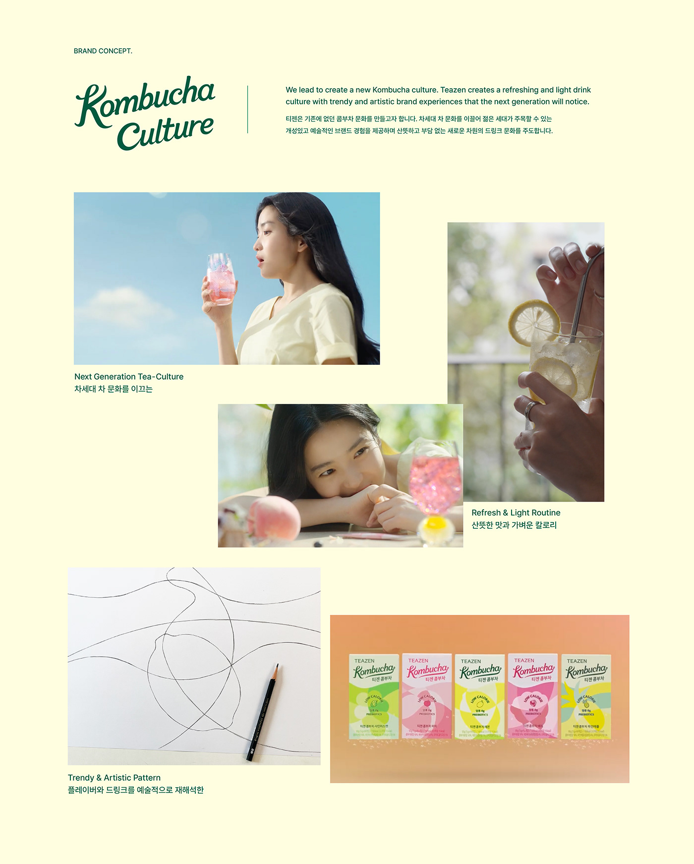
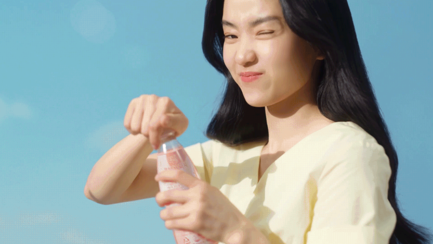
The existing Teazen Kombucha brand image tended to rely heavily on models, making the brand model more of an identity than the product's unique features. Therefore, YNL Design aims to establish a strong brand identity that can capture the attention of the young MZ generation through a robust BI that leads Kombucha Culture and eye-catching artistic graphic motifs. Through this, they aim to show more than just drinking Kombucha, but also showcasing one's personality and proposing an Instagrammable and attractive drink culture.
기존의 티젠 콤부차 브랜드 이미지는 모델에 대한 의존도가 높아 제품의 특장점보다는 브랜드 모델이 곧 정체성이 되는 경향이 있었습니다. 이에 YNL Design은 Kombucha Culture를 리드하는 견고한 BI와 시선을 사로잡는 아티스틱한 그래픽 모티브를 통해 젊은 MZ세대가 주목할 수 있는 강력한 브랜드 정체성을 구축하고자 하였습니다. 이를 통해 콤부차를 마시는 것 이상의 자신의 개성을 보여주며, 인스타그래머블하고 매력적인 드링크 문화를 제안합니다.

The Solution
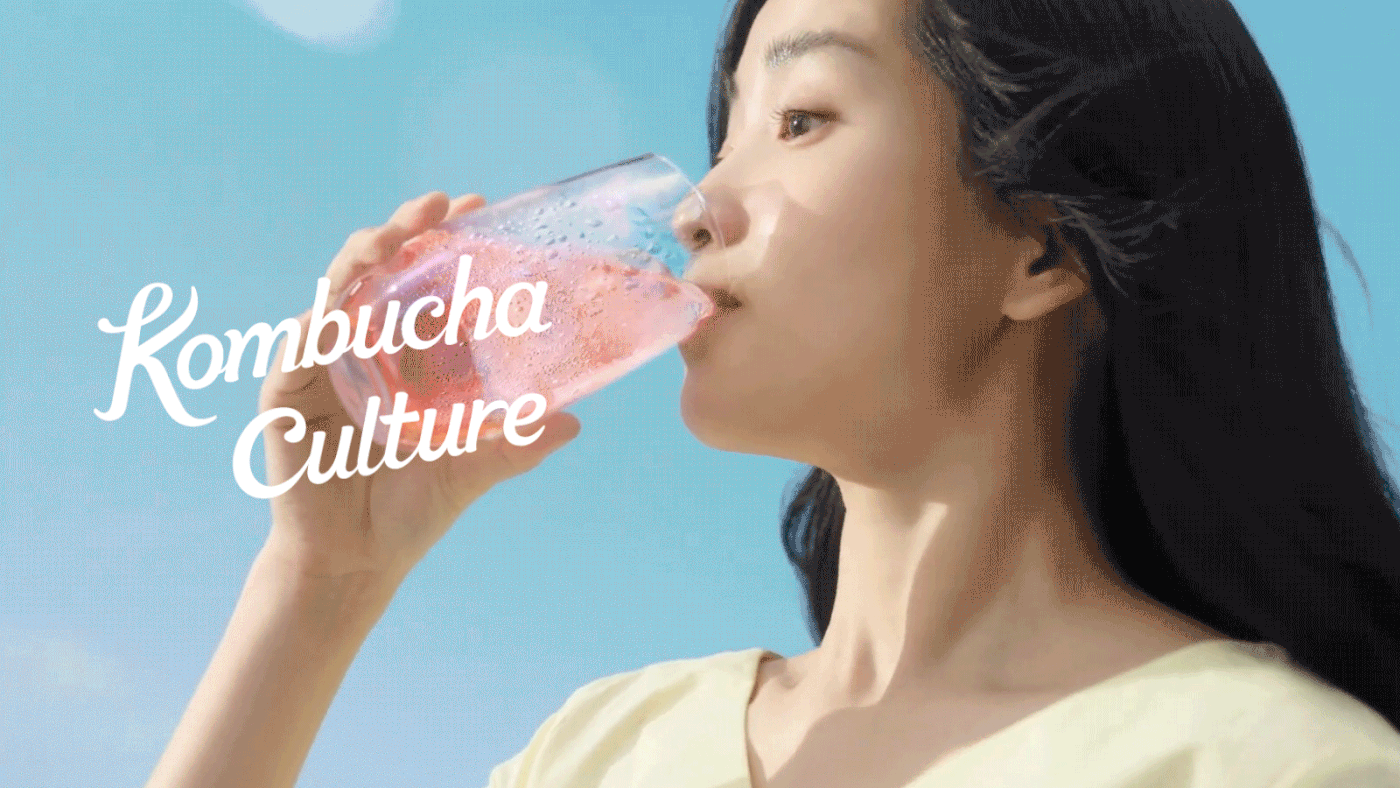
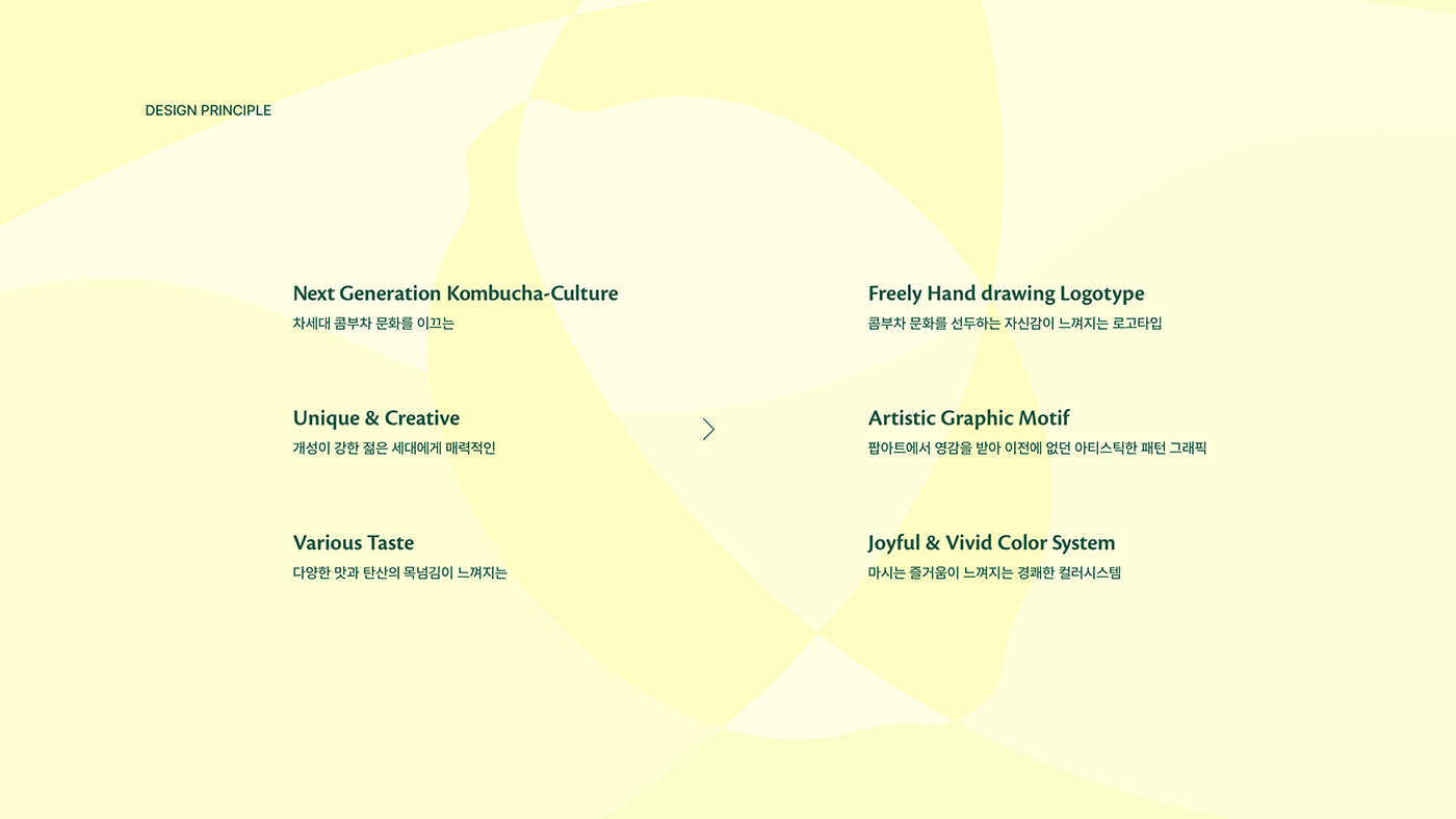
YNL Design actively utilized the 'Kombucha Culture' concept to develop a free-spirited and artistic BI and graphic motif with a new pop-art feel. These design elements convey a creative and unique sensation that cannot be found in the existing beverage market and were strategically used to achieve the goal of making Teazen Kombucha a popular and trendy brand.
YNL Design은 티젠이 주도하는 'Kombucha Culture' 컨셉을 적극적으로 활용하여, 새로운 팝아트적 무드의 자유로우면서도 예술적인 BI와 그래픽 모티브를 개발하였습니다. 이러한 디자인 요소는 기존 음료 시장에서는 찾아볼 수 없는 창의적이고 독특한 느낌을 전달하며, 티젠 콤부차를 대중적이고 트렌디한 브랜드로 만들기 위한 목표를 이루기 위해 전략적으로 사용되었습니다.


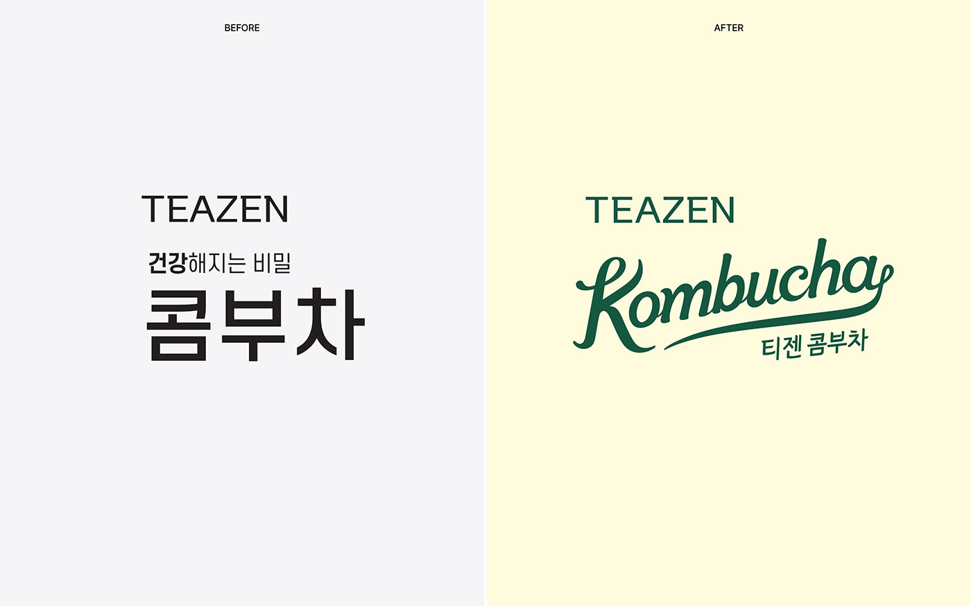
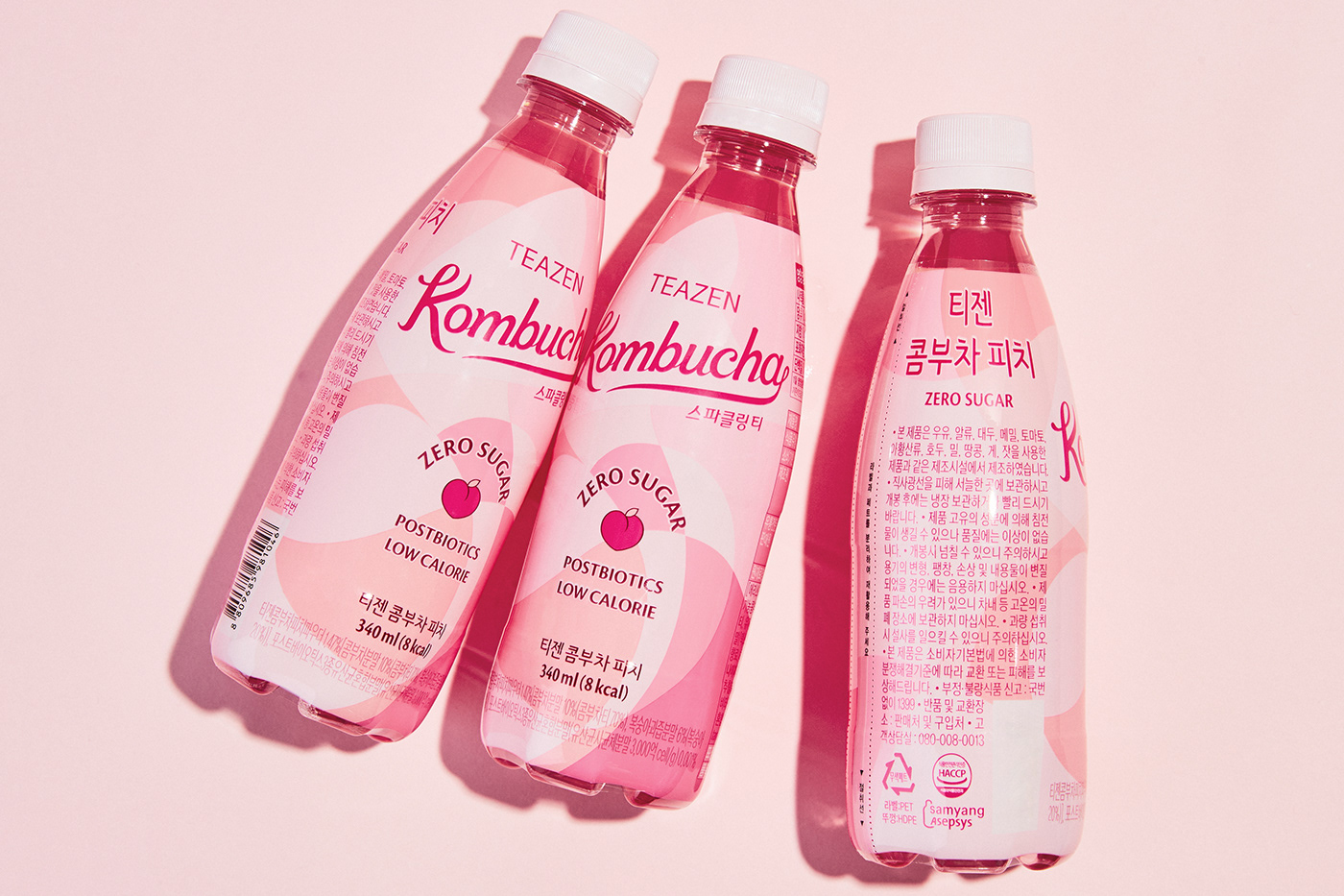
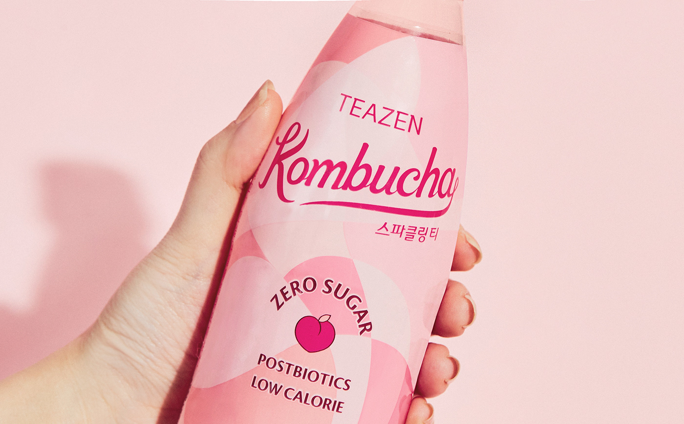
The 'Kombucha Culture' BI is a logotype that contains a free-spirited emotion and artistic aesthetic and is designed in a rising script form. This fits well with Teazen Kombucha's brand vision targeting the MZ generation, conveying a modern and trendy image.
'Kombucha Culture' BI는 자유로운 감성과 예술적인 미학을 담은 로고타입으로, 상승하는 스크립트 형태로 디자인되어 있습니다. 이는 MZ세대를 타겟으로 한 티젠 콤부차 브랜드 비전과 잘 어울리며, 현대적이고 트렌디한 이미지를 전달합니다.


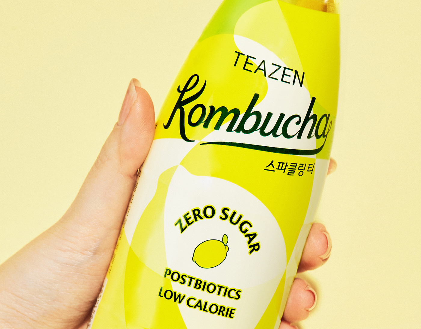
The graphic motif reinterprets the shape of fruit into a design that utilizes gentle curves. This visually represents the fresh and sweet taste of Teazen Kombucha, conveying a refreshing and lively sensation.
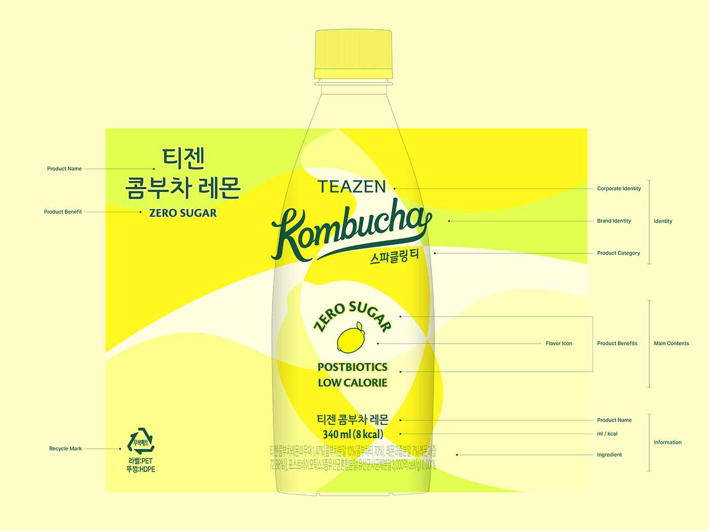
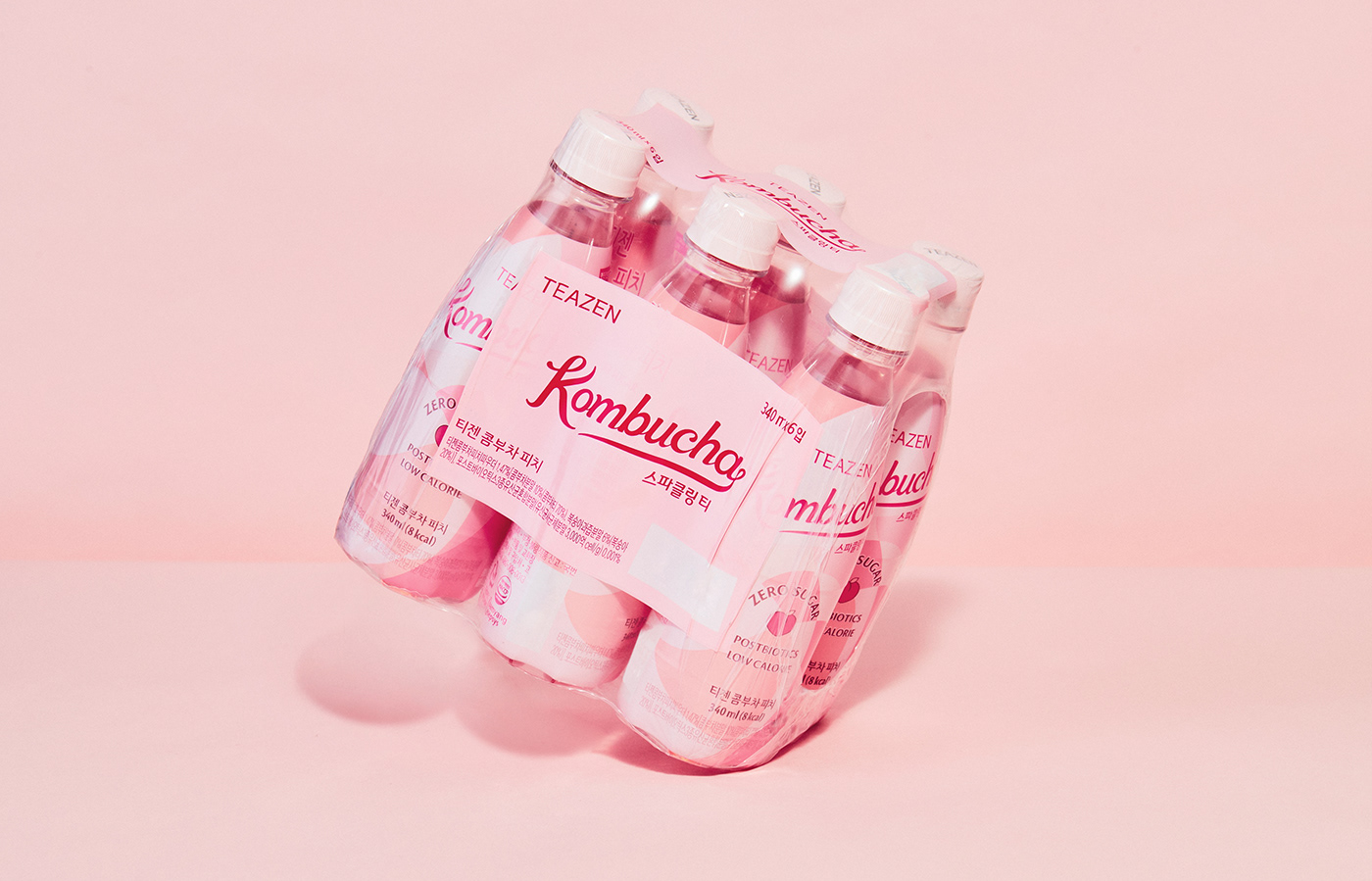
Furthermore, YNL Design developed package designs for Teazen Kombucha's five flavors. These design elements utilize a colorful system of intuitive associations with each flavor, visually expressing the lively and lively drink culture of the MZ generation. Additionally, the overall package family system was systematically established, considering the scalability for future flavor expansions.
In summary, YNL Design developed Teazen Kombucha's BI and package design based on the goal of improving the brand image of existing Teazen Kombucha and introducing a new pop-art mood and brand vision to grow into a popular and trendy brand with the MZ generation at the center.
그래픽 모티브는 과일의 형태를 재해석하여, 부드러운 곡선을 이용한 형태로 디자인되었습니다. 이는 티젠 콤부차의 상큼하고 달콤한 맛을 시각적으로 표현하며, 상쾌하고 경쾌한 느낌을 전달합니다. 또한, YNL Design은 티젠 콤부차의 다섯 가지 맛별 패키지 디자인을 개발하였습니다.
이러한 디자인 요소는 각각의 맛을 직관적으로 연상시키는 다채로운 색상 시스템을 활용하며, 발랄하고 경쾌한 MZ세대의 드링크 문화를 시각적으로 표현합니다. 더불어, 앞으로 추가적으로 출시될 플레이버에 대한 확장성도 고려하여, 전체적인 패키지 패밀리 시스템을 체계적으로 구축하였습니다.
총평하자면, YNL Design은 기존 티젠 콤부차의 브랜드 이미지를 개선하고, 새로운 팝아트적인 무드와 브랜드 비전을 도입함으로써, MZ세대를 중심으로 대중적이고 트렌디한 브랜드로 성장하기 위한 목표를 기반으로 티젠 콤부차의 BI와 패키지 디자인을 개발하였습니다.


TEAZEN KOMBUCHA Sparkling Tea
Brand Identity & Packaging Design
Client
주식회사 티젠
Industry
F&B
Service
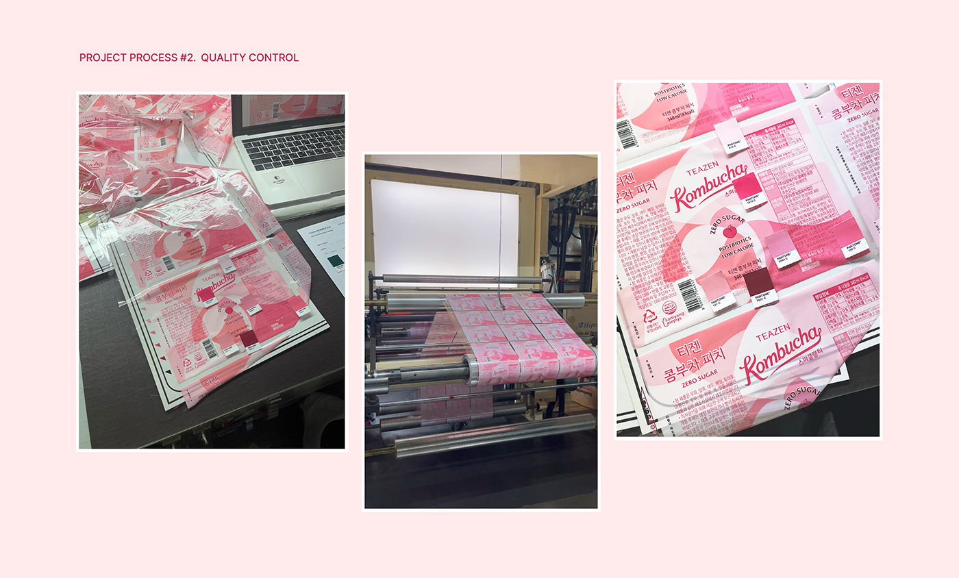
Creative Strategy / Branding(BI) / Packaging Design / Quality Control
Project Team
Brand Design : YNL Design
Art Direction & Design : Liz Yoona Lee
Brand Design : Kwangsu Shin, Sohee Kim, Eunah Kim, Minji Seo
Thank you.


