

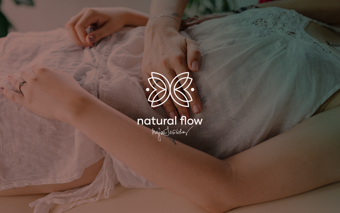

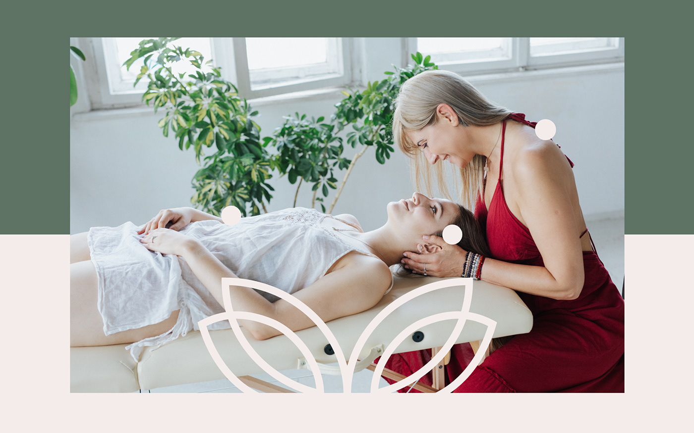
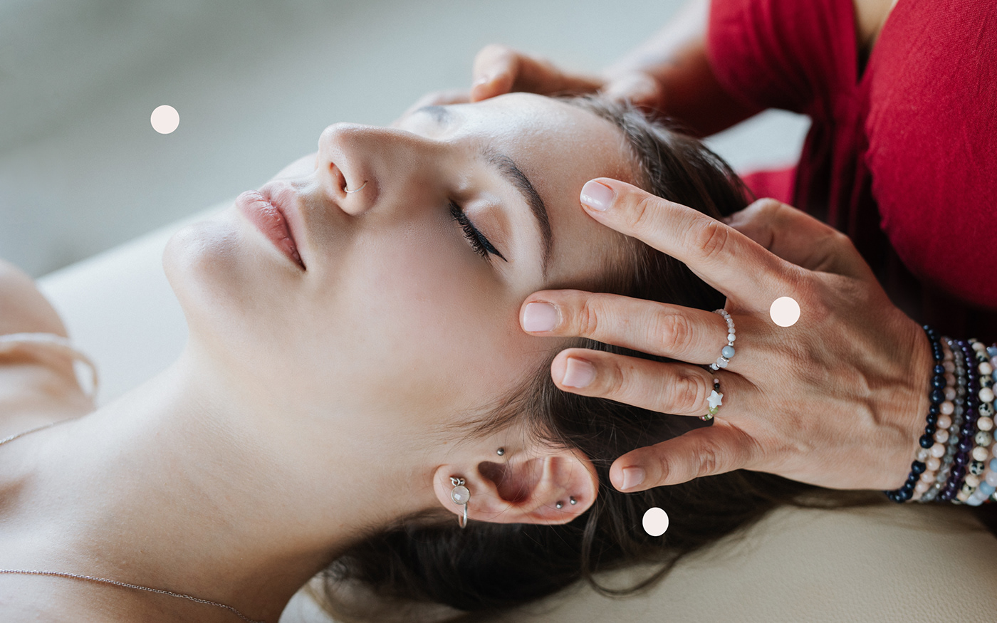
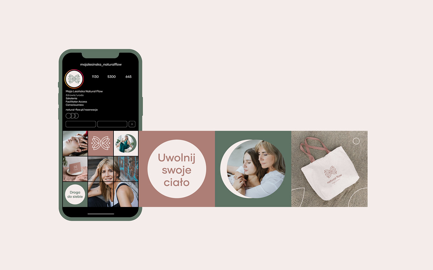
This project proved to be an interesting journey through uncharted territory for us. Maja from Natural Flow is a very charismatic person who approached us with a need to rebrand her personal brand. Maja works with the body - Shiatsu, Cranio-Cervical Therapy, Access Bars® or Facial Yoga.
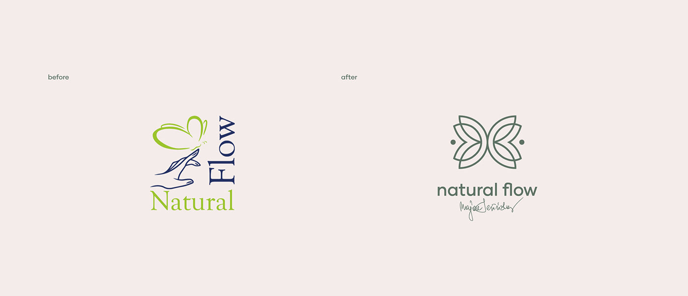
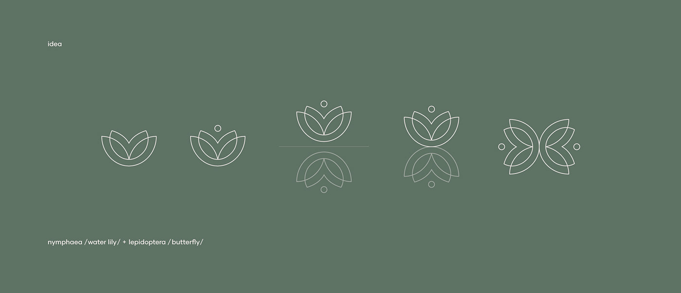
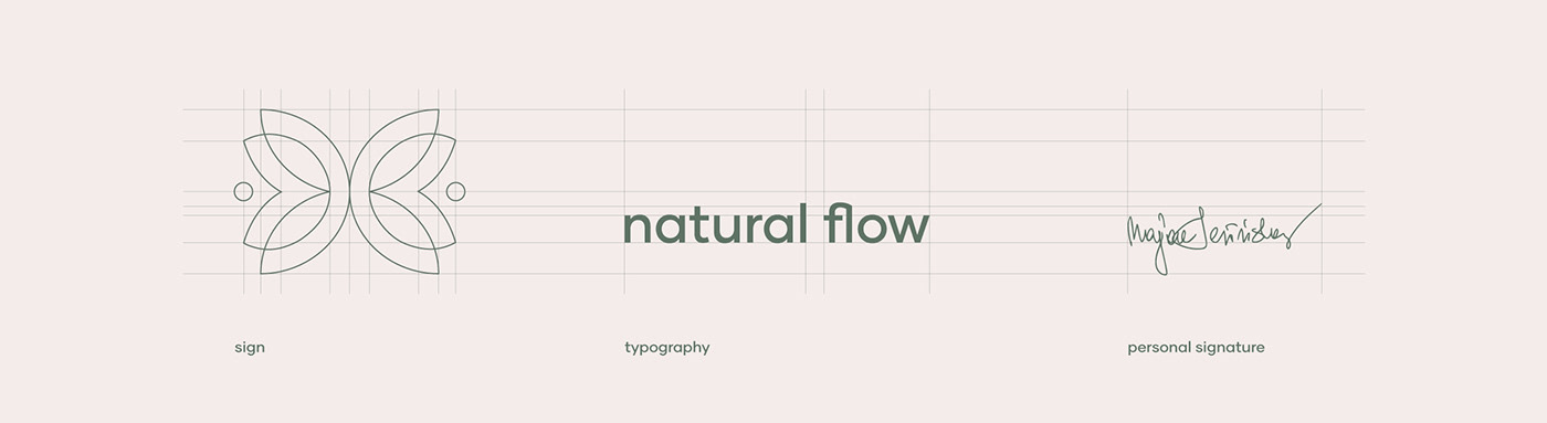
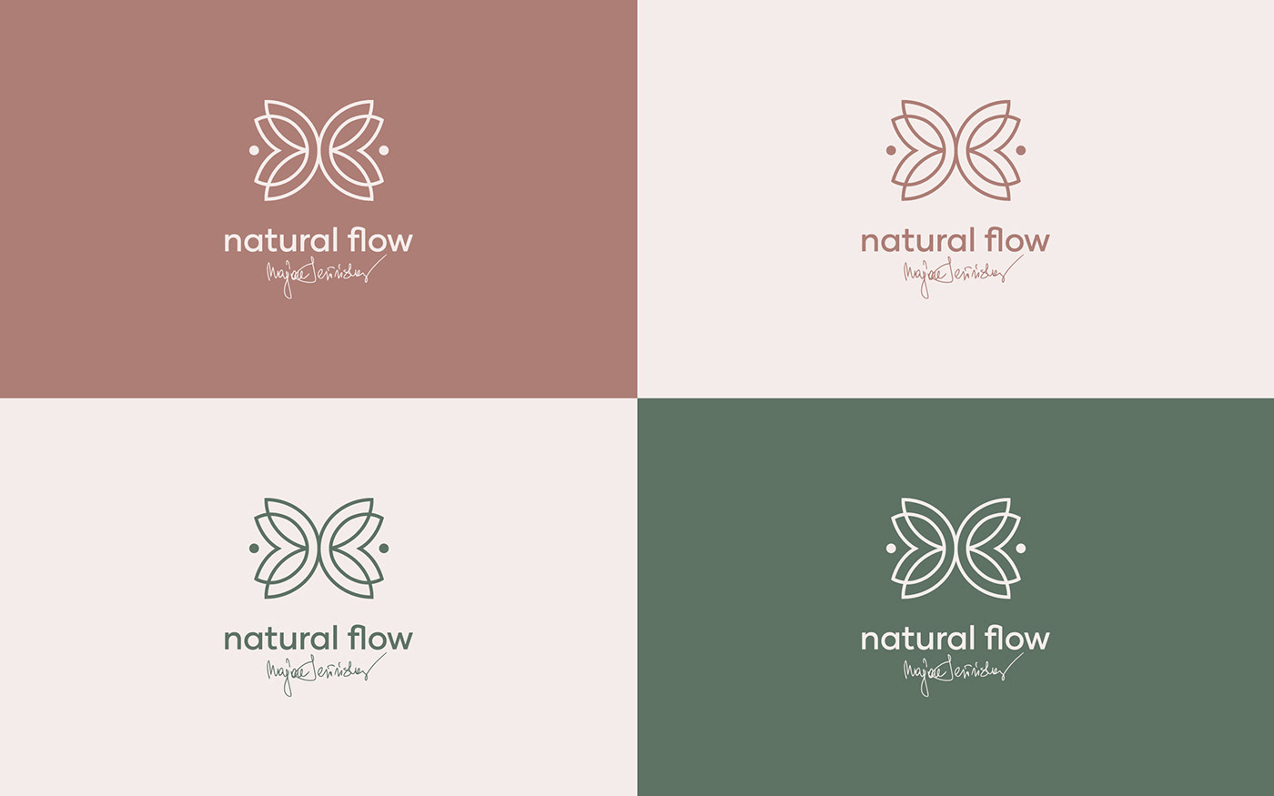
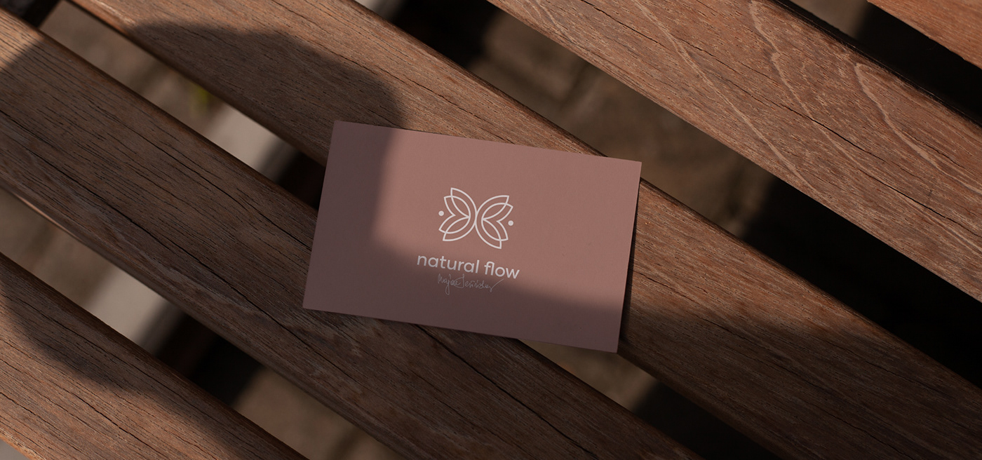
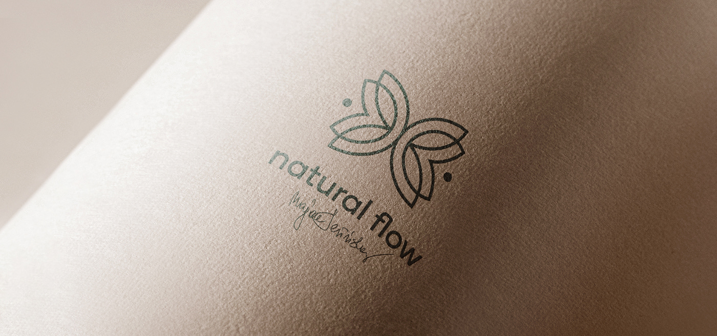
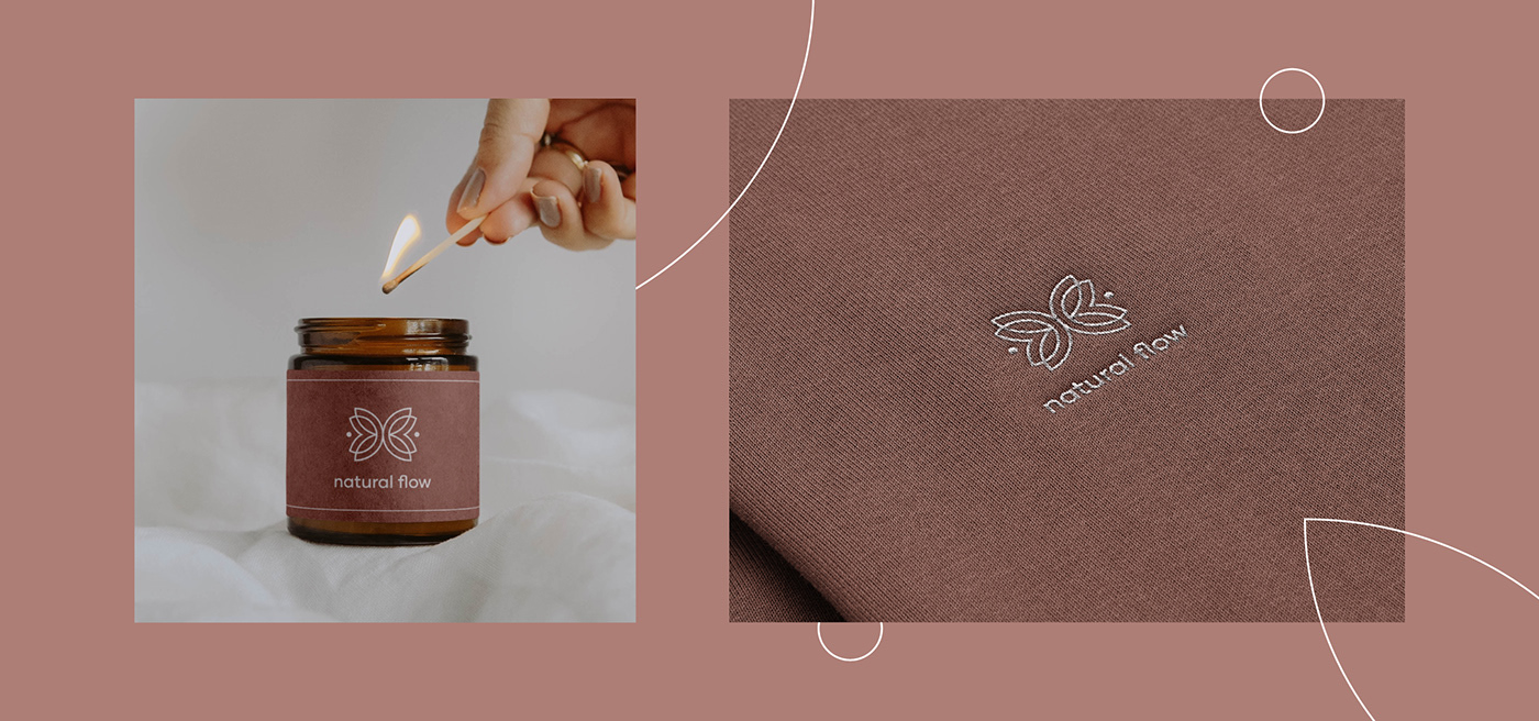
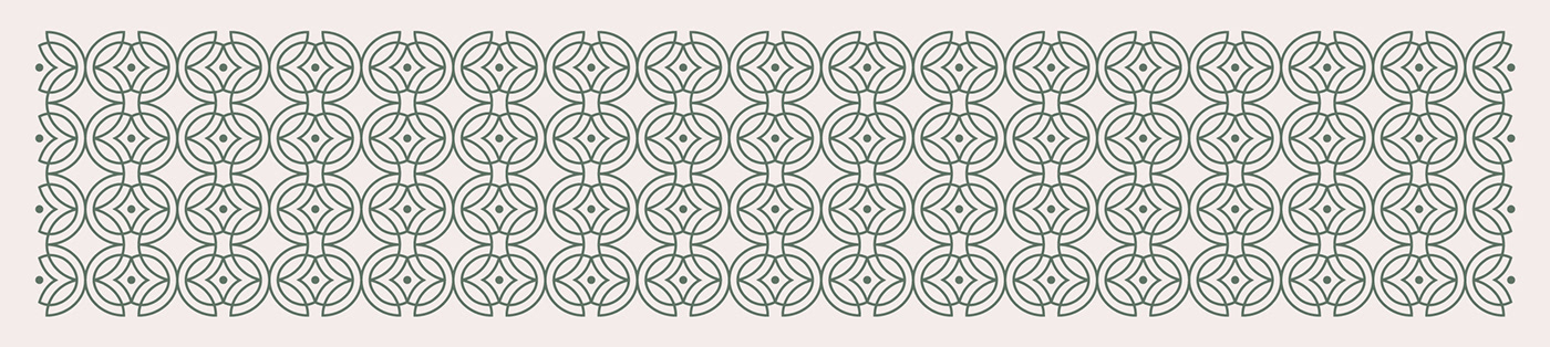
The concept for her brand was created by combining the symbolism of the lotus flower - balance, equilibrium, harmony - and the butterfly - delicacy, freedom, freedom, awareness of movement, closeness to nature. The mark was composed using reflection (like the reflection of the lotus flower in a lake) thus creating the graphic form of a butterfly. To emphasise the personal dimension of the brand, we decided to use the owner's handwritten signature, which is very important for her image. We used it to create a graphic element which, combined with simple and delicate typography, became part of the logotype. In this way, we wanted not only to emphasise the personal side of the brand, but also to create a sense of closeness with the viewer.


REBRANDING Natural Flow
design: Studio Spectro
art direction: Gosia Macioch
graphic desigers: Magdalena Przewłocka
art direction: Gosia Macioch
graphic desigers: Magdalena Przewłocka
photo: Iwona Weiss
year: 2022
All rights reserved.
year: 2022
All rights reserved.


