


Eye Catching Circus|Branding
Eye Catching Circus is a circus-based performance team that has won three consecutive Taichung Outstanding Performing Arts Teams. Their decision to rebrand in 2022 is to carry a richer development in the future.
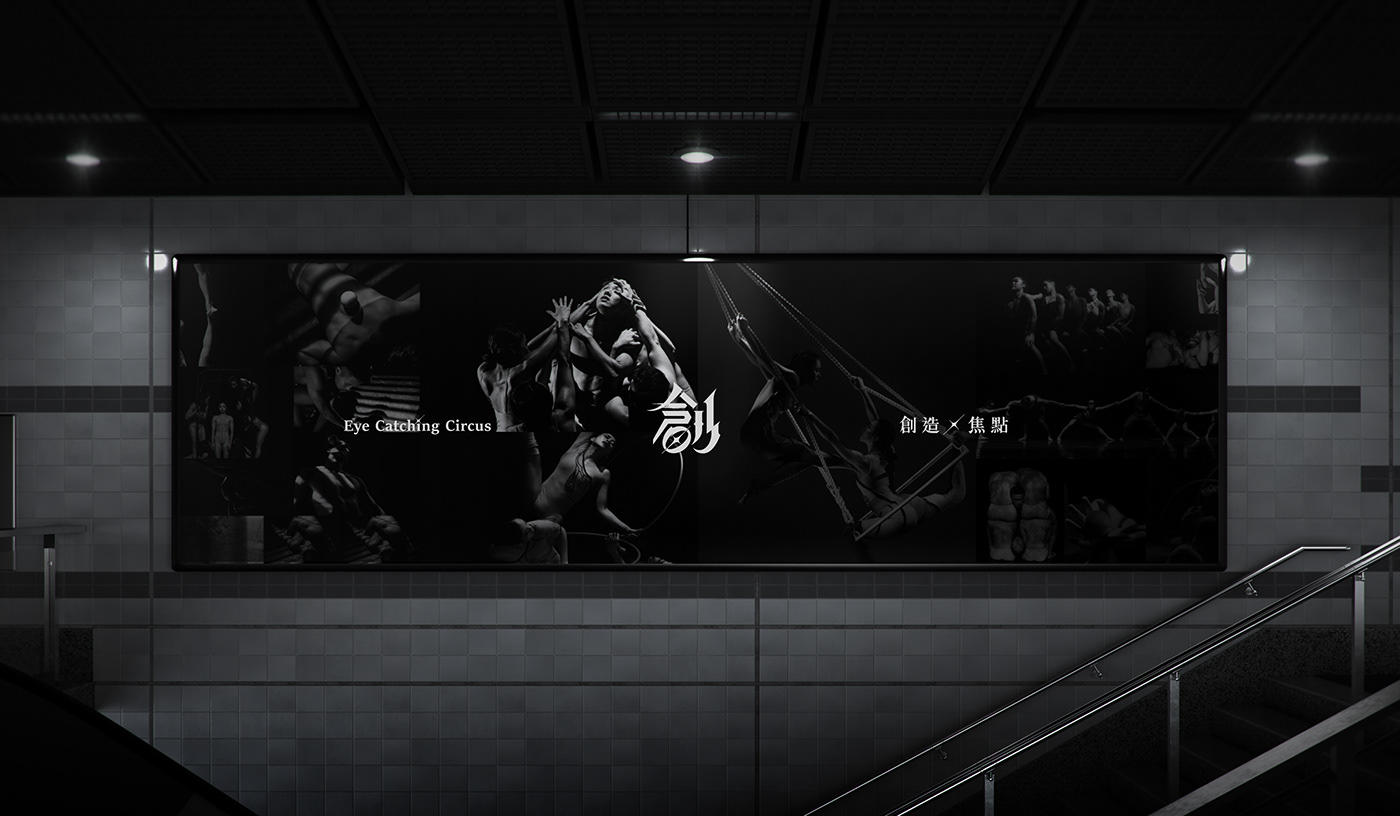
The new brand merges the original turquoise color, adding an enthusiastic red and calming blue, and using black as the background color to present a professional brand.
The logo takes the word "創" (meaning creation in Chinese) as the basis, integrating eastern and western typographic styles: gothic, brush, black, and serif, to symbolize Eye Catching Circus’ multiculturalism. Eye Catching Circus continues to develop diverse performances, injecting rich new aesthetics of circus culture into Taiwan's performing arts.


Credits
Client | Eye Catching Circus 創造焦點
Production | Grandvity Design
Art Director | Noodlemaker
Account Manager | Grape Chiu
Project Manager | Sarah Peng
Design Director | Si Jia Sun
Logotype Designer | Noodle Wang
Visual System Designer | Patricia Ho
Font | Arphic Fonts 文鼎字型


