Re•Style
Création d'identité visuelle pour une marque de protection d'appareils électroniques
Création d'identité visuelle pour une marque de protection d'appareils électroniques
Création d’une identité visuelle pour une marque de protection de smartphones, tablettes, et écouteurs avec pour objectif de se démarquer dans un marché hautement compétitif. J’ai choisi de positionner la marque dans une esthétique rétro et colorée pour refléter son audace et la promesse d’avoir des accessoires stylés et originaux.
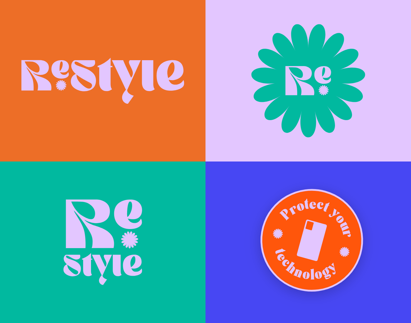
Le logo a été conçu pour être facilement reconnaissable et déclinable. La typographie choisie reflète ce choix de personnalité affirmée avec des lettres aux pleins et déliés extrêmement marqués et aux formes inhabituelles.
En plus du logo, j’ai choisi une palette de couleurs joyeuses pour exprimer l’esprit rétro de la marque. Les couleurs principales, comme l’orange foncé vif, un lila pâle et un vert acidulé, ont été inspirées par les couleurs utilisées dans les motifs des années 70. Ces couleurs ont été associées à un symbole abstrait entre la fleur et le soleil qui apporte joie et bonne humeur. Pour permettre à la marque de s’exprimer sur tous les supports, j’ai créé des stickers au slogan « protect your technology » (« protégez votre technologie ») à apposer partout.
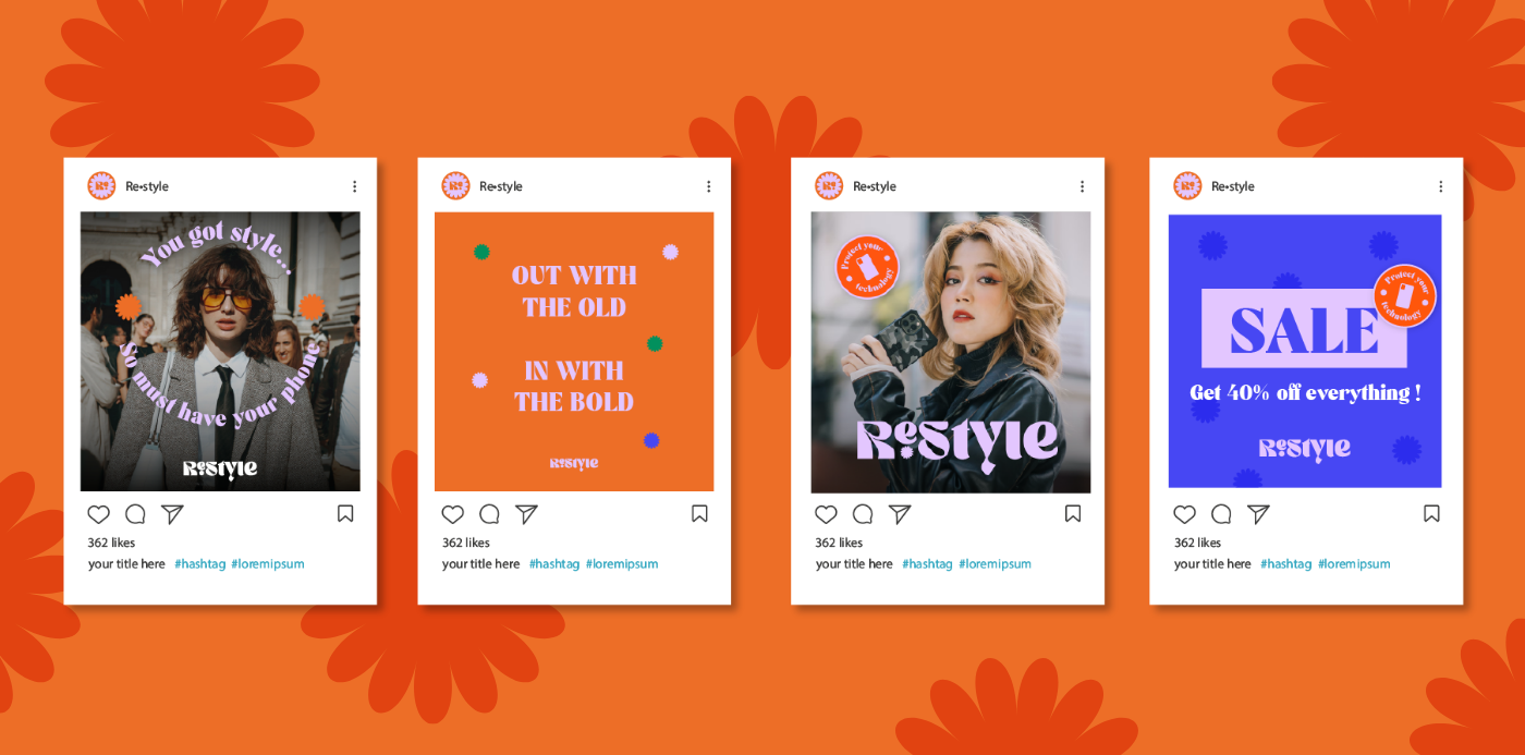
Cette identité visuelle est ensuite déclinée sur la boîte d’envoi dans lequel sont envoyés les produits aux clients, et les visuels des réseaux sociaux, avec une préférence pour instagram.
Brand identity for a brand of electronic devices protectors
Creating a visual identity for a brand of smartphone, tablet, and earbud protectors with the aim of standing out in a highly competitive market. I chose to position the brand with a retro and colorful aesthetic to reflect its boldness and the promise of stylish and unique accessories.
Creating a visual identity for a brand of smartphone, tablet, and earbud protectors with the aim of standing out in a highly competitive market. I chose to position the brand with a retro and colorful aesthetic to reflect its boldness and the promise of stylish and unique accessories.
The logo was designed to be easily recognizable and adaptable. The chosen typography reflects this choice of assertive personality with letters with extremely marked strokes and unusual shapes.
In addition to the logo, I chose a cheerful color palette to express the brand's retro spirit. The main colors, such as bright dark orange, pale lilac, and tangy green, were inspired by colors used in patterns from the 70s. These colors were combined with an abstract symbol between a flower and a sun that brings joy and good mood. To allow the brand to express itself on all mediums, I created stickers with the slogan "protect your technology" to be placed everywhere.
This visual identity is then adapted to the shipping box in which products are sent to customers, and to social media visuals, with a preference for Instagram.