Flor & Fjære
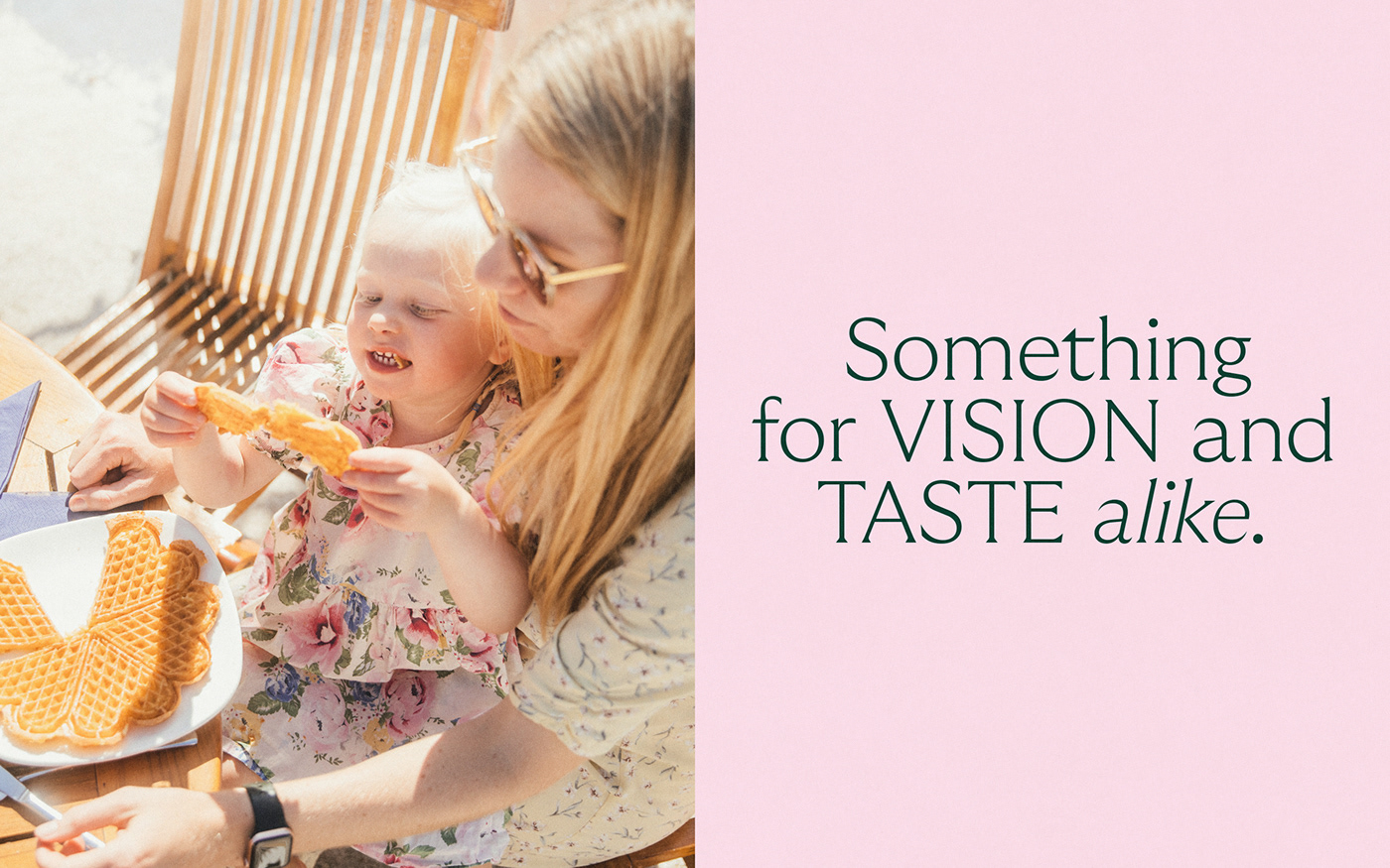
A feast for the senses
__
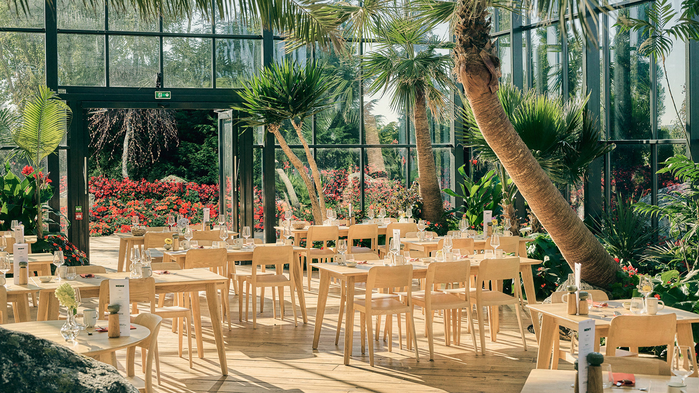
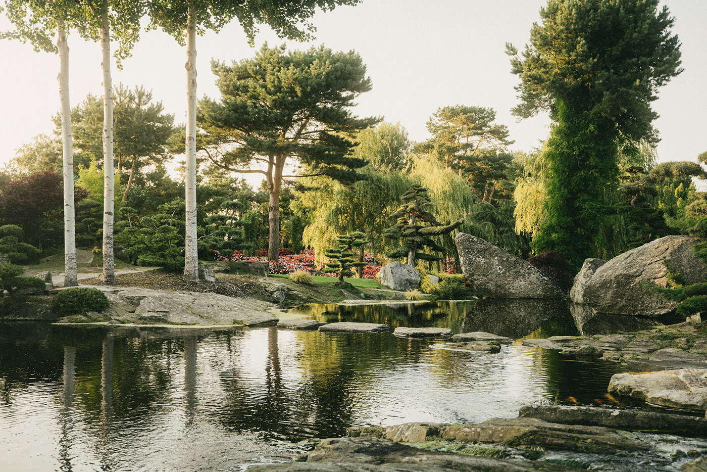
Flor & Fjære is a unique family owned destination located on an island in the cold fjords outside Stavanger, Norway. A one-of-a-kind greenhouse restaurant that can seat up to 600 guests, placed in the middle of 50 acres of incredible gardens with beautiful beaches and tropical palm trees – a visit here is both peaceful and exciting.
Together with the family we defined a brand strategy and visual identity to tell their story.
Credits:
Robert Lönnqvist, Anne Valeur
, Tom Haga
Year:
2022
Deliverables:
Brand platform, Design strategy, Visual identity, Web Design, Illustration

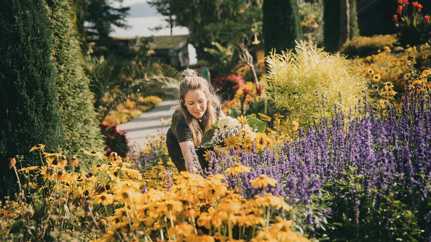
Family history
From purchasing the homestead in 1965 – to opening for guests in 1995 – the Bryn family have transformed a windswept islet into a breathtaking garden.
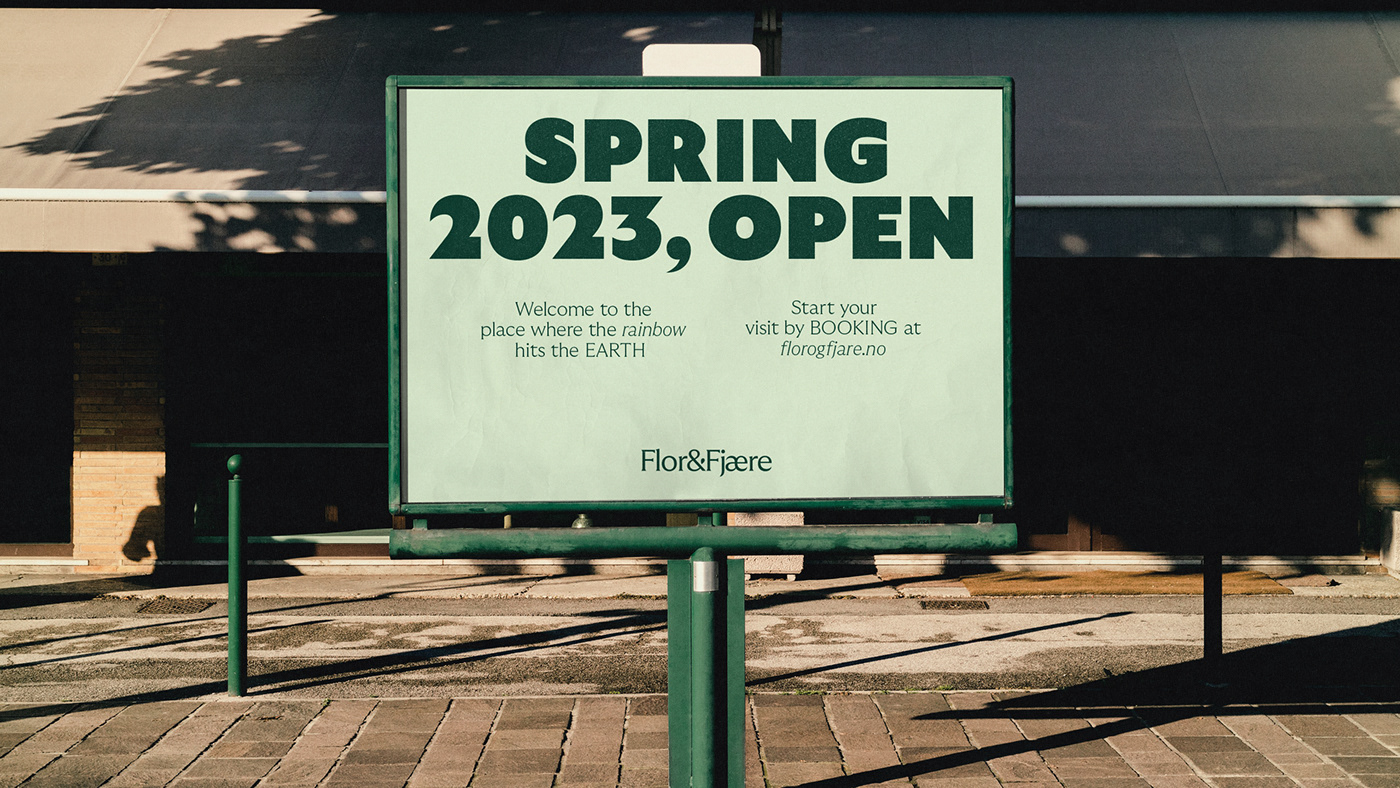
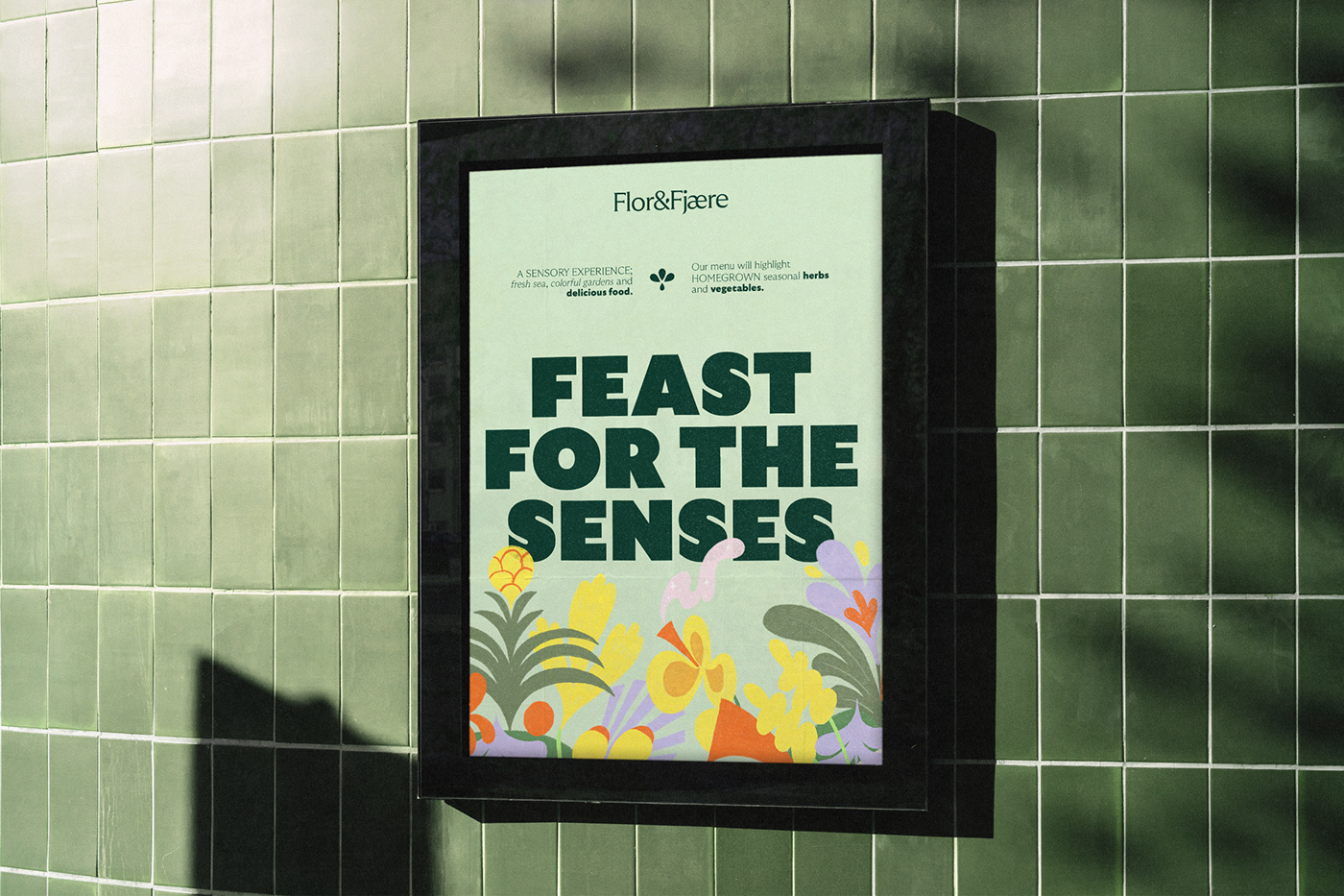
Fresh sea, colorful gardens and delicious food – Flor & Fjære is many things. The logo symbol hints to it all, but is foremost a homage to the northern most palm tree garden in the world.


Much like Flor &Fjære itself, the chosen brand typeface is both sophisticated and bubbly.


The energetic architecture and finespun details in GT Ultra allow for flexibility across all levels of the brand.
Each letter of GT Ultra Ultra is designed to be as bold as possible, and the same philosophy goes into Flor & Fjære’s creation of gardens.
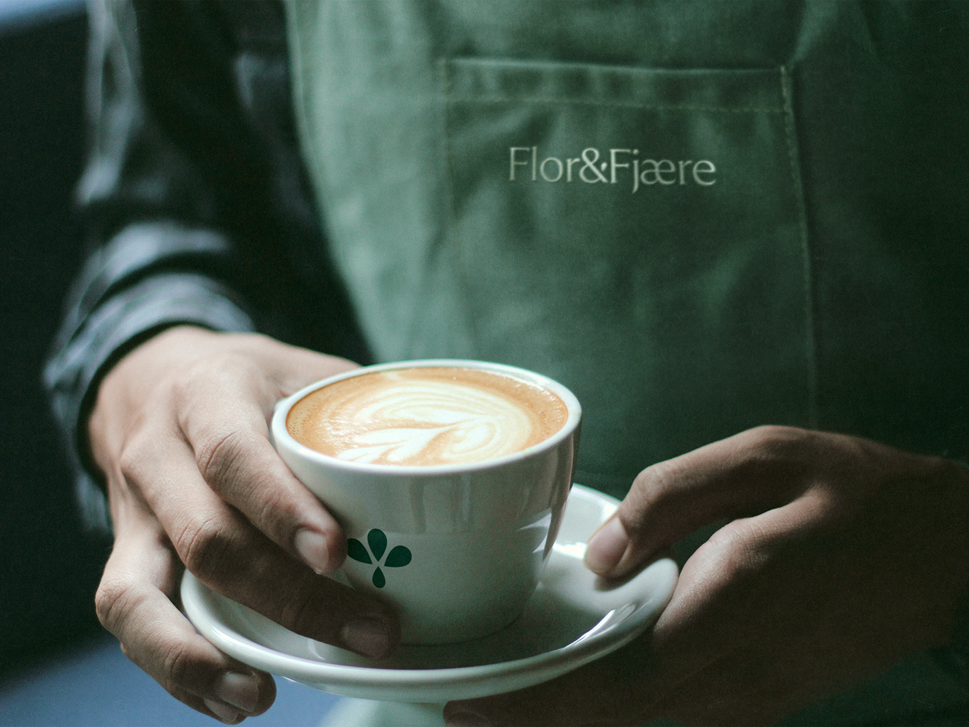
The identity utilizes greens as its base color, ranging from a sprouting bright green to a dark evergreen.

The extensive secondary color palette borrows from the vibrant splendor of the gardens’ flowerbeds.


The family goal has always been to give their guests the best possible experience – welcoming them wholeheartedly into their garden.


Locally sourced
Flor & Fjæres chef serves fresh, locally-sourced ingredients and produce, as well as homegrown herbs and vegetables from the greenhouse.


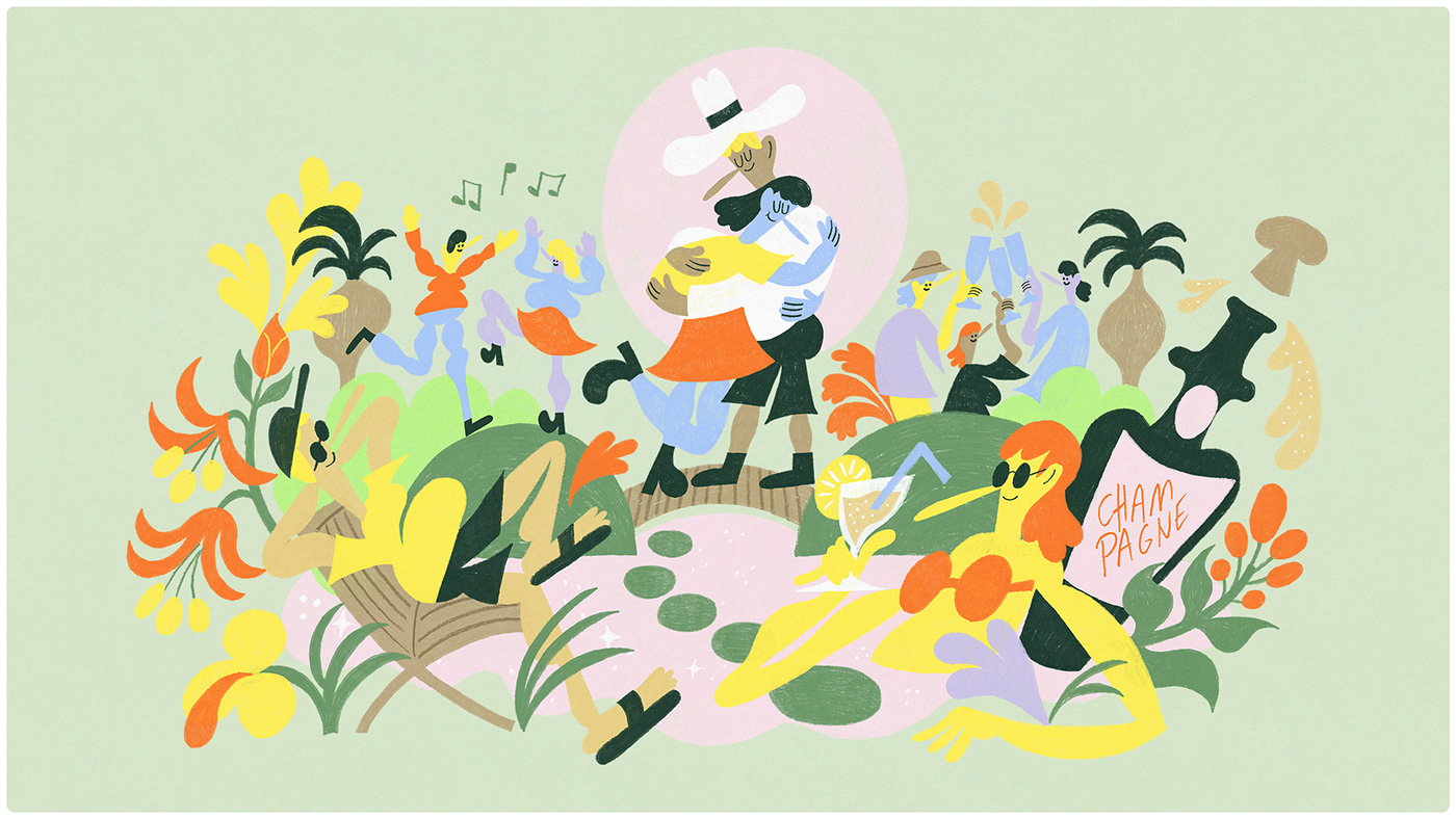
Together with Finnish illustrator Robert Lönnqvist we created a set of brand illustrations expressing the emotional experience of Flor & Fjære.


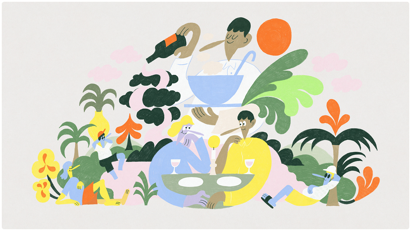


The illustrations are closely linked to the typographic details and the logo symbol shapes – creating a consistent and familiar visual language.


The website is designed to feel like a visit to the island: Welcoming, wonderful and seamless.


The site accommodates for a broad target audience with easy storytelling, exciting imagery and an effortless booking experience.
All elements acts consistently together, in physical space, in print or in digital – creating a comprehensive identity and experience of Flor & Fjære.