

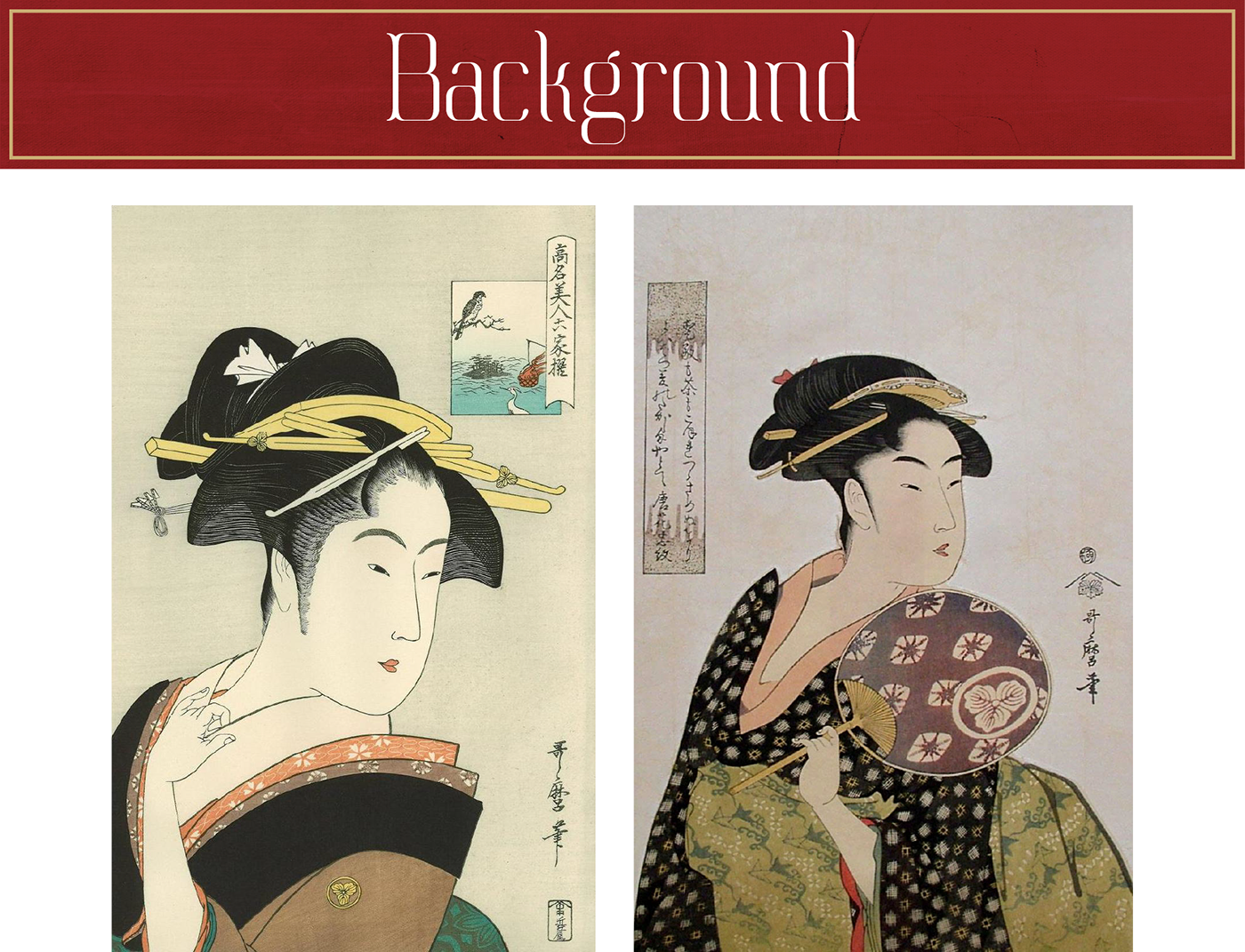
The Edo period is a time where people embraced a hedonistic lifestyle, evident from the flourishing arts and literature scene
as well as an open admiration for the courtesans.
as well as an open admiration for the courtesans.
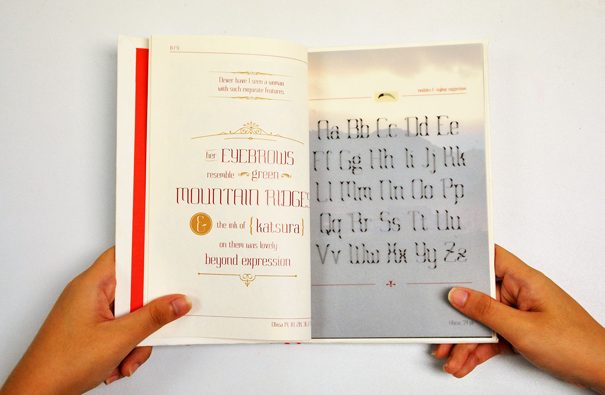
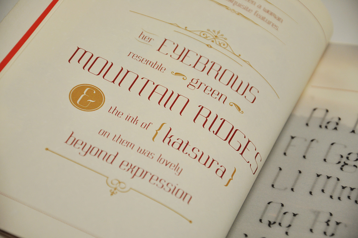
Texts from the era described the fragile beauty of the ideal woman, describing her as having “slanting eyes of lotus petals”, “dark eyebrow ink of katsura”, and “beautiful lips of red fruit”.
Inspired by the way Edo literature likened the ideal woman’s facial features to nature, the modules are taken from the facial features, namely the eyebrows, eyes, nose, and lips, to create the typeface.
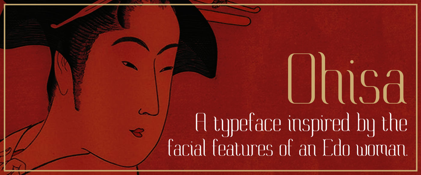
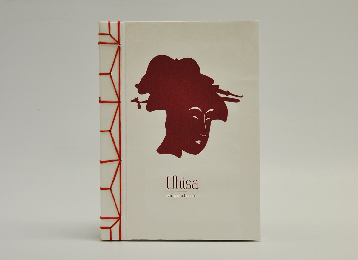
I find that the portraits of women by the ukiyo-e artist, Kitagawa Utamaro, best illustrate the preferred beauty of the Japanese
at that time. Ohisa, the daughter of theTakashima teahouse, was a favourite subject of Utamaro’s, and with that, I decided to create a typeface inspired by Ohisa.
at that time. Ohisa, the daughter of theTakashima teahouse, was a favourite subject of Utamaro’s, and with that, I decided to create a typeface inspired by Ohisa.
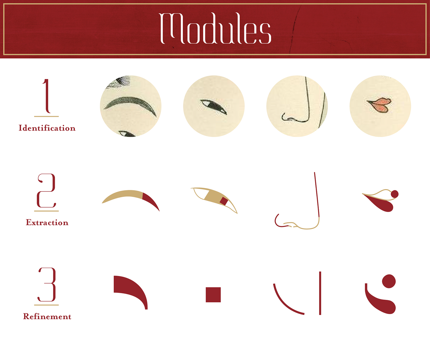

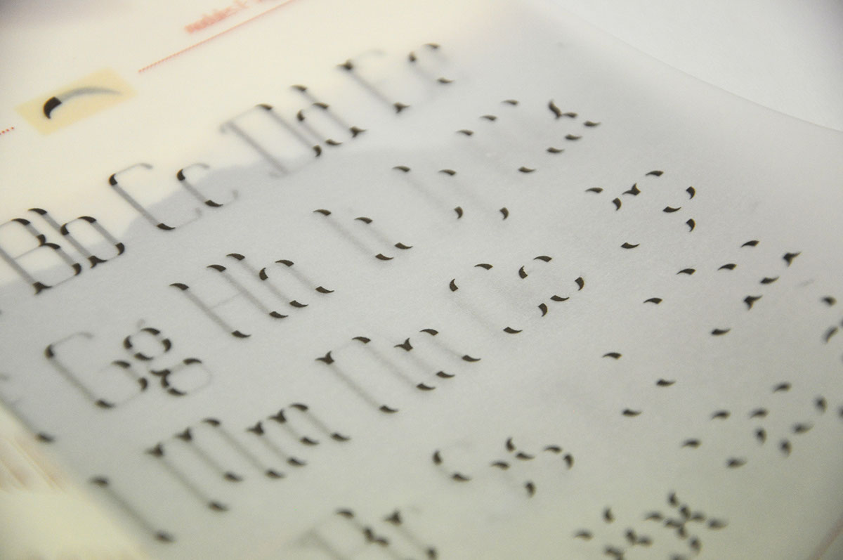
The typeface is carefully built-up using the 6 extracted modules.
Nothing quite exudes the elegance of women like modern serifs such as Bodoni and Didot,
thus Ohisa is made to have high contrasts of thick and thins.
thus Ohisa is made to have high contrasts of thick and thins.


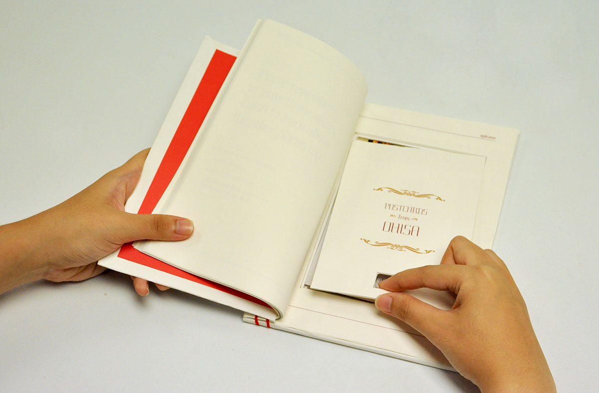
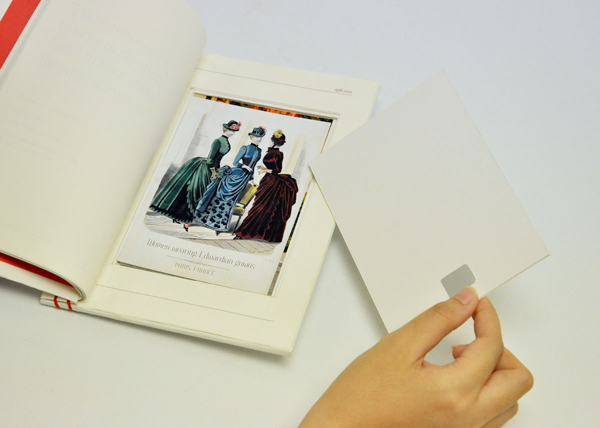
For the specimen book, I decided to make it in the form of a secret admirer's journal.
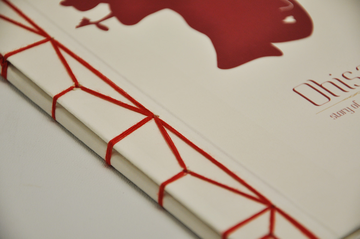
The book is hand-bound through stab-binding, a traditional binding method used by East Asians,
to set the stage of the story in a historical light.
to set the stage of the story in a historical light.

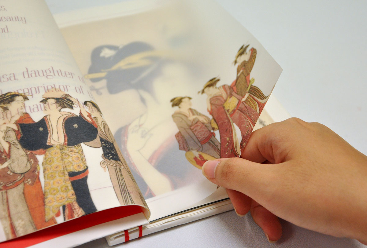


To enhance the concept of a secret admirer's journal further, the book includes
a compartment in the back cover where he stores Ohisa's postcards to him.
a compartment in the back cover where he stores Ohisa's postcards to him.
Thank you!
• Feedback and comments are much appreciated •
—
Done for Typography III module.


