Kennie Electric
Logo Design - Brand Identity - // 2021
Description
Kennie is an electrician who came to me from South Carolina, with an idea, a brand to carry forward, with a basic and generic logo that needed to be changed urgently and give a creative touch.
In my video on TikTok and Instagram I share a bit of how was that creative process with the sketches shown, before creating them I usually make a game with shapes or in this case, the initial letters of the brand name, and that ends in a visually successful way, that anyone outside my field can grasp the idea, the sense, that projects in seconds. I leave here Kennie's user name in case any of my followers live in South Carolina and require electrical services at home. Kennie Electric
PROJECT SCOPE ROLE
Logo Design - Brand Design Logo Designer - Brand Designer
INDUSTRY CREATIVE
Electrical Contractor By Dichisito Design

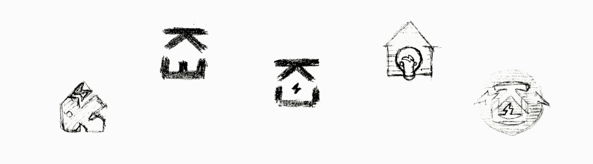
Creative Process
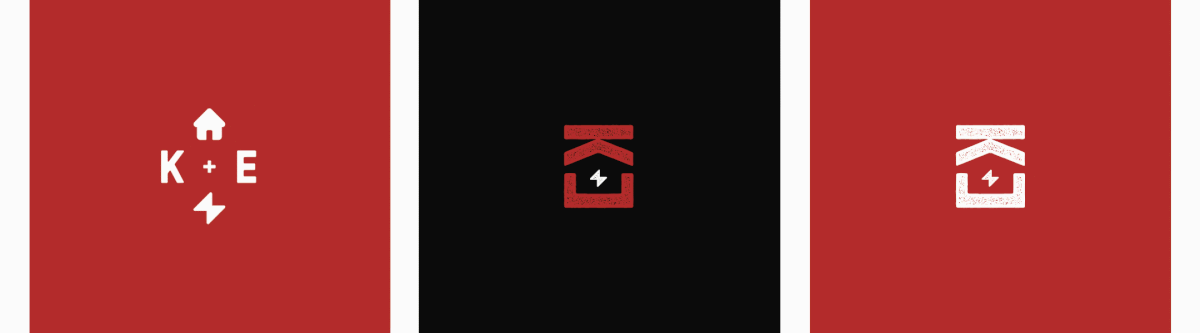
For the concept of the logo I was direct in representing the agreed elements ¨house, electricity¨, using the closure gestalt principle.
“The principle of closure states that when we look at a complex arrangement of visual elements, we tend to look for a single, recognizable pattern.
In other words, when you see an image that has missing parts, your brain will fill in the blanks and make a complete image so you can still recognize the pattern”.
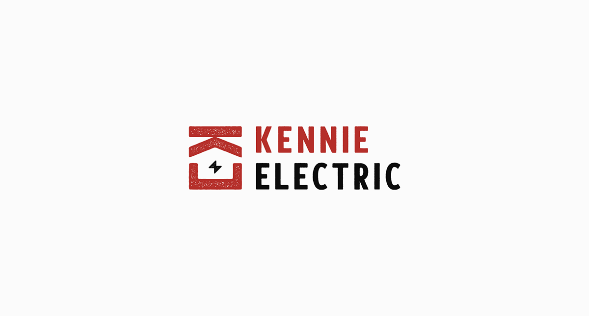
With this version I used the initials of the brand name "Kennie Electric" - K - E - thus placing the K downwards and the E upwards to generate the shape of a house and taking advantage of the middle arm of the E to incorporate it with a lightning bolt, with a grunge look.
For a logo to be efficient and easy to remember, it must be different, it must have a good concept, well constructed and it must be simple enough to be perfect to understand at first sight.

Alternatives:
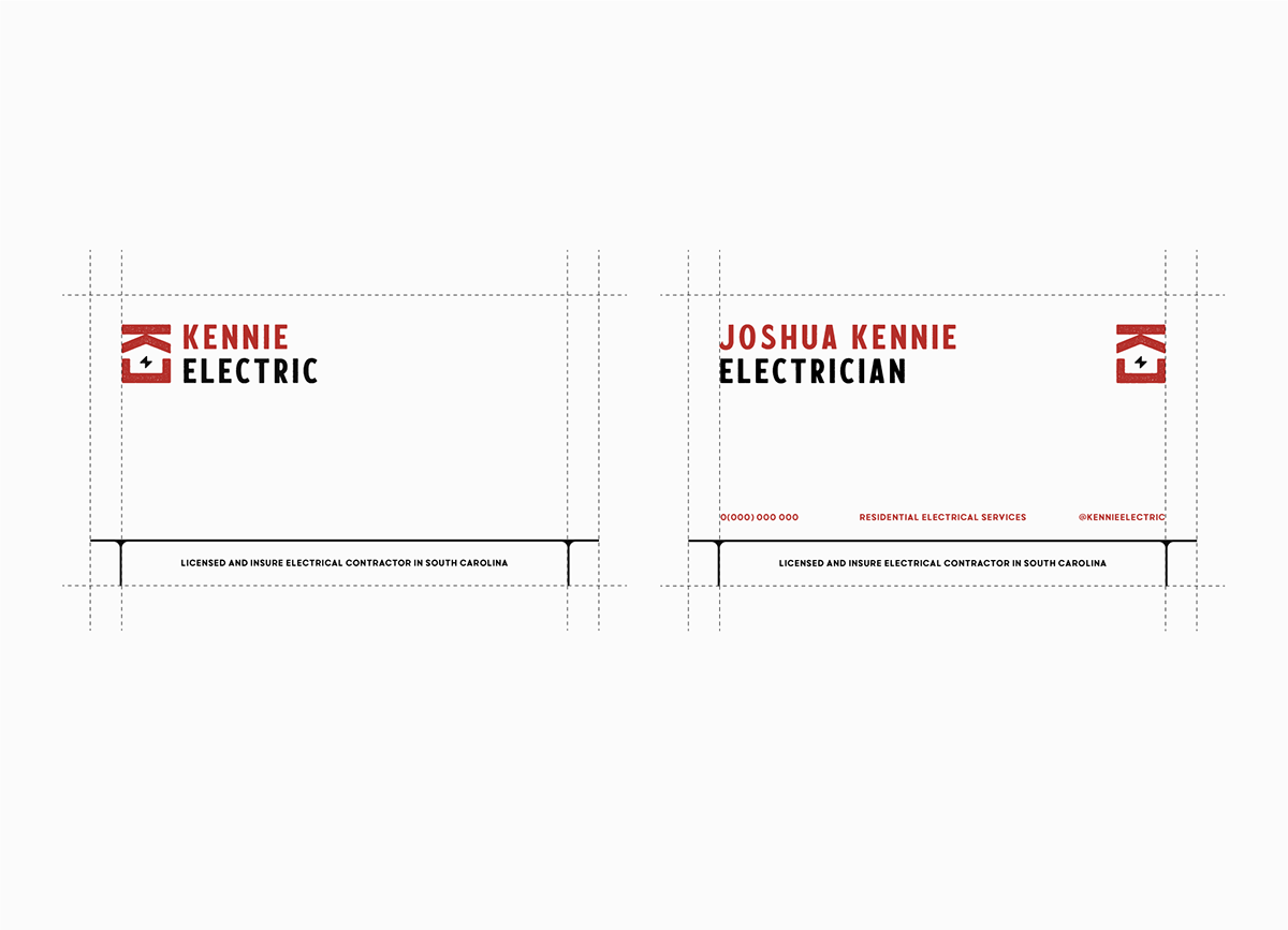
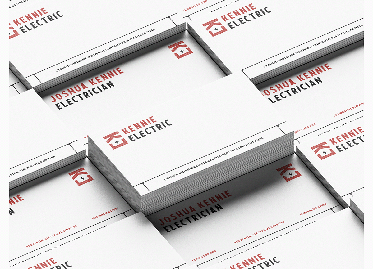
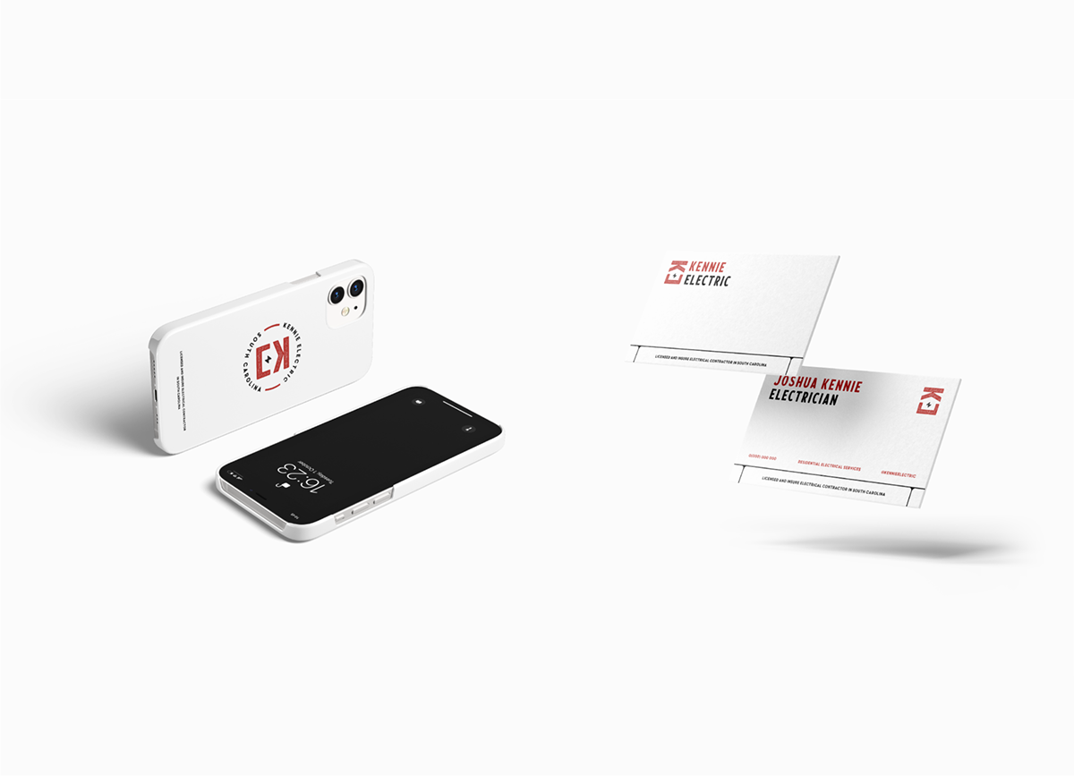
Applications: