Wigan Little Theatre
Wigan Little Theatre is a 230-seater intimate venue located
in the heart of the North West of England. The theatre is host
to a real mix of traditional and contemporary practice, but the
exsisting brand was dated. As a self-initiated brief, we decided
to bring some life to the theatre by making the transition from
traditional to contemporary, attracting a newer more youthful
audience, whilst retaining the current loyal fan base.
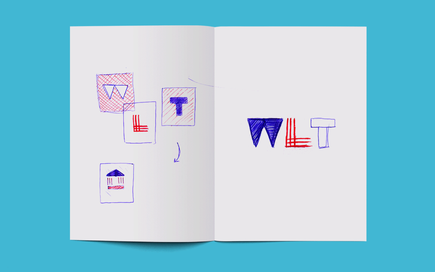
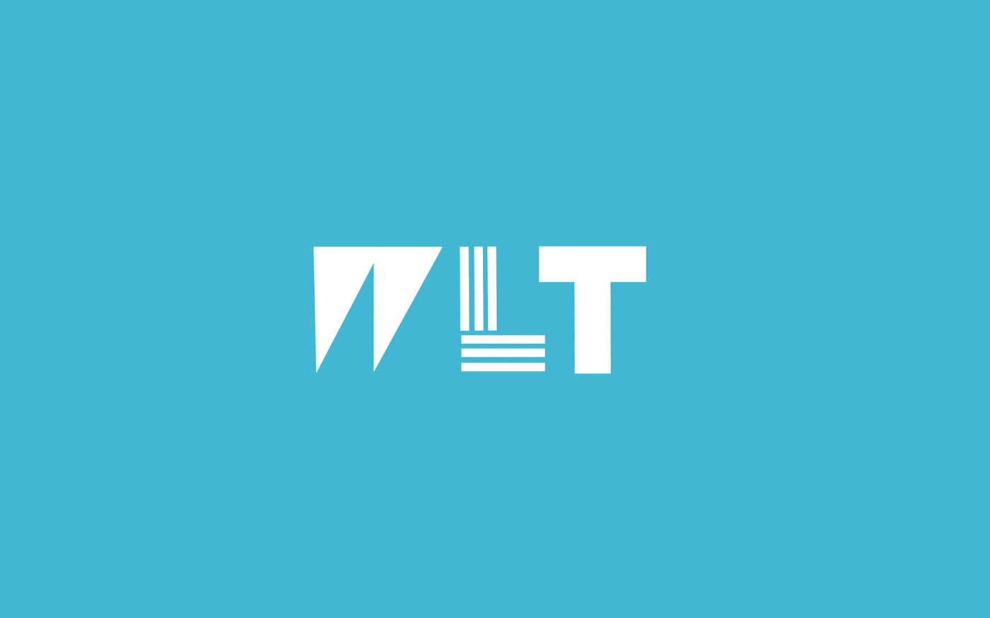
A Transitional Brand
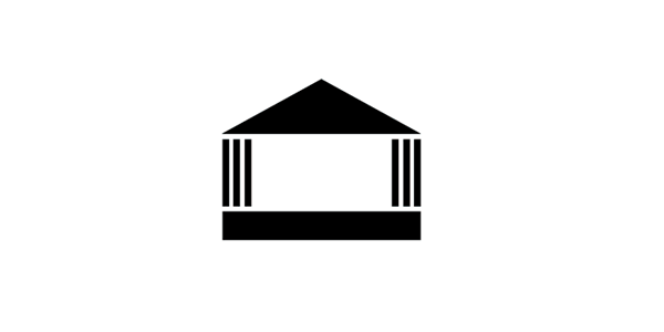
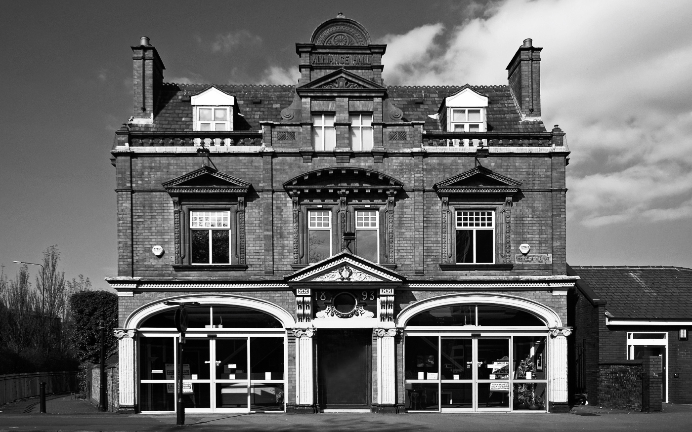
The original brandmark of the theatre, which is based off the
front of the building, was over 150 years old so the re-brand
was carefully considered. The old brandmark was refined then
split into a series of shapes which formed the new brandmark.
The letterforms of the initials of the theatre were generated from
these shapes. The brandmark is interchangeable, meaning that
the transition from old to new isn't lost entirely.
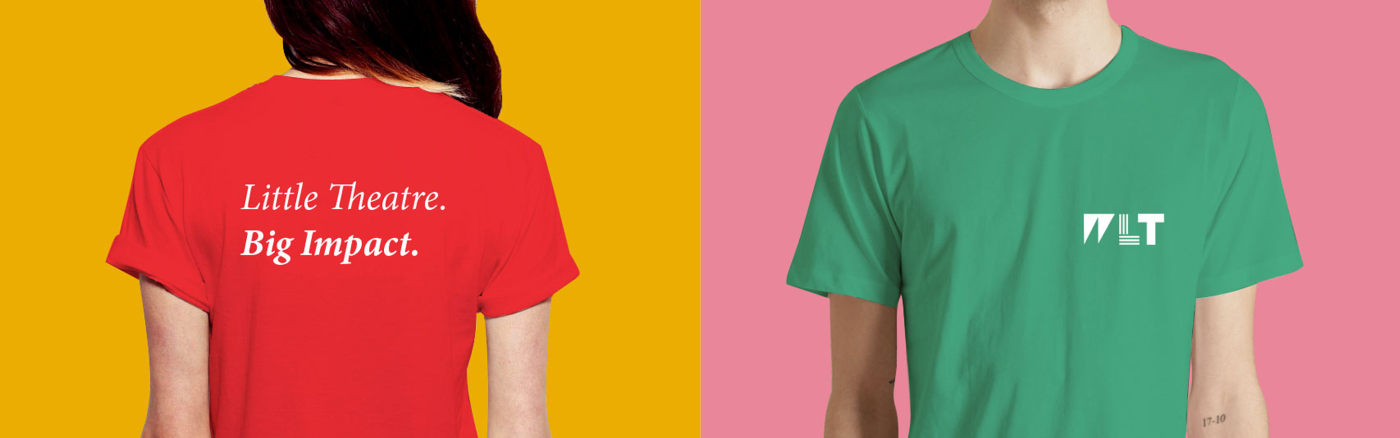
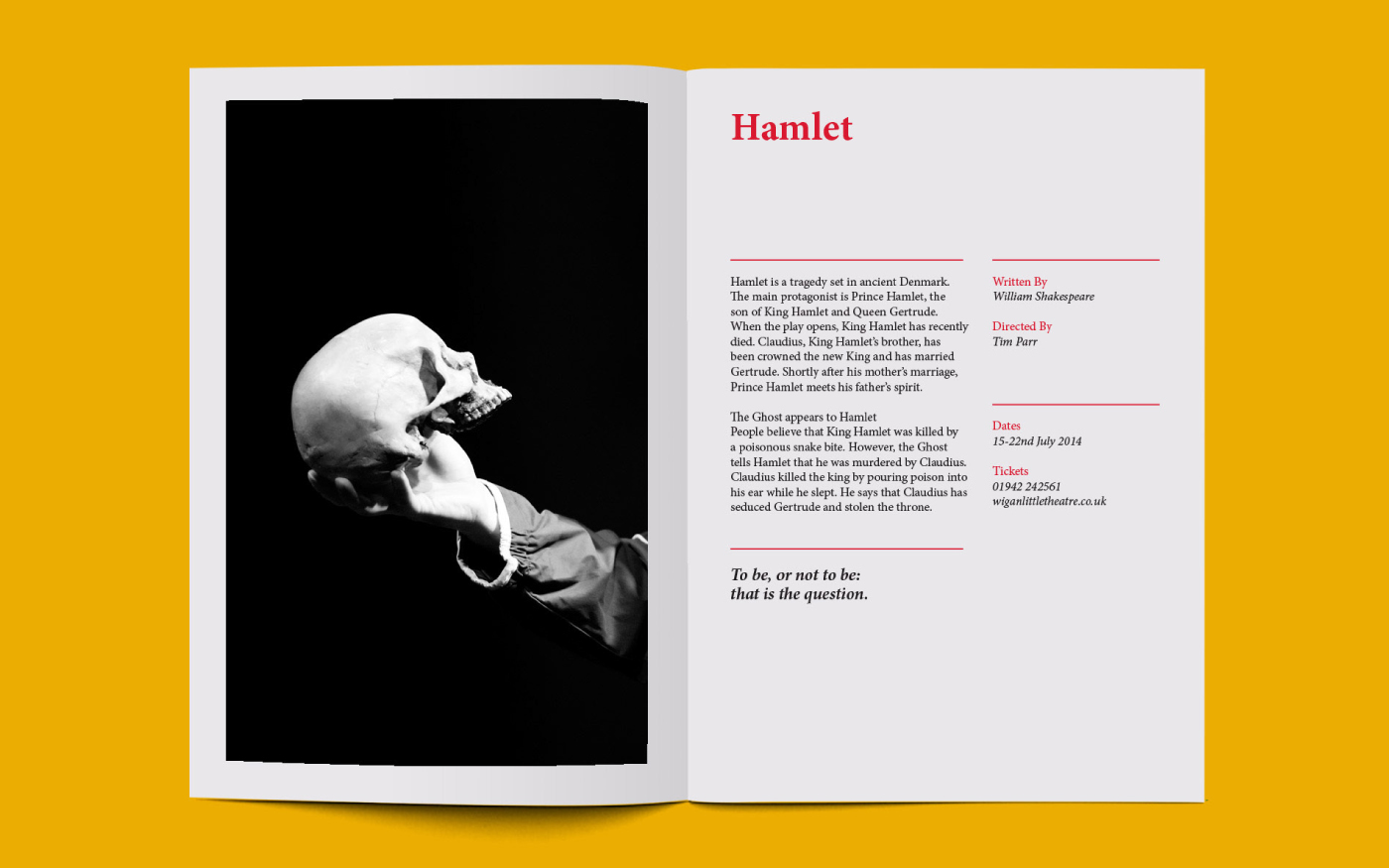
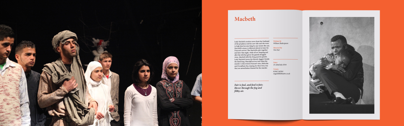
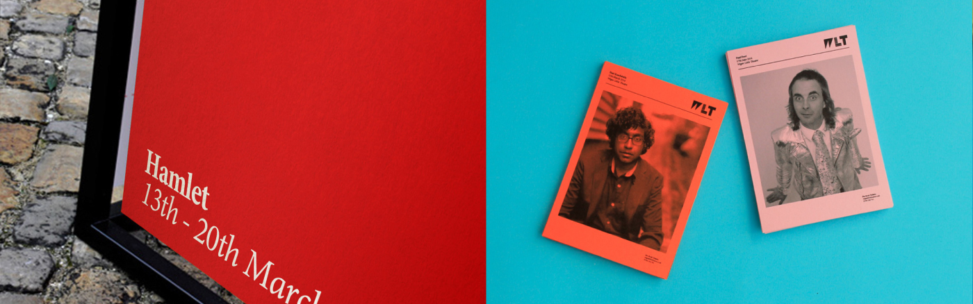
Selling Theatre to the Next Generation
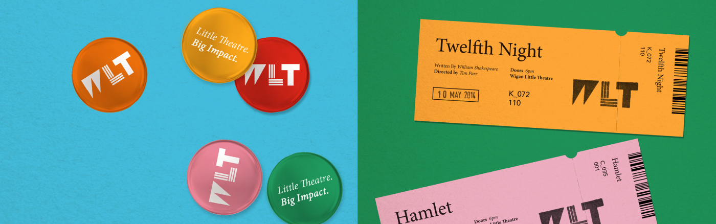
A new colour scheme was created which consists of 3 pairs
of complementary colours plus black and white. This not only
helps break up different events and sections within the theatre,
but also helps make that transition from traditional to contemporary
a little clearer. This was paired with a new slogan and corporate
typeface which plays on the fact that the theatre might be small,
it still packs a punch.
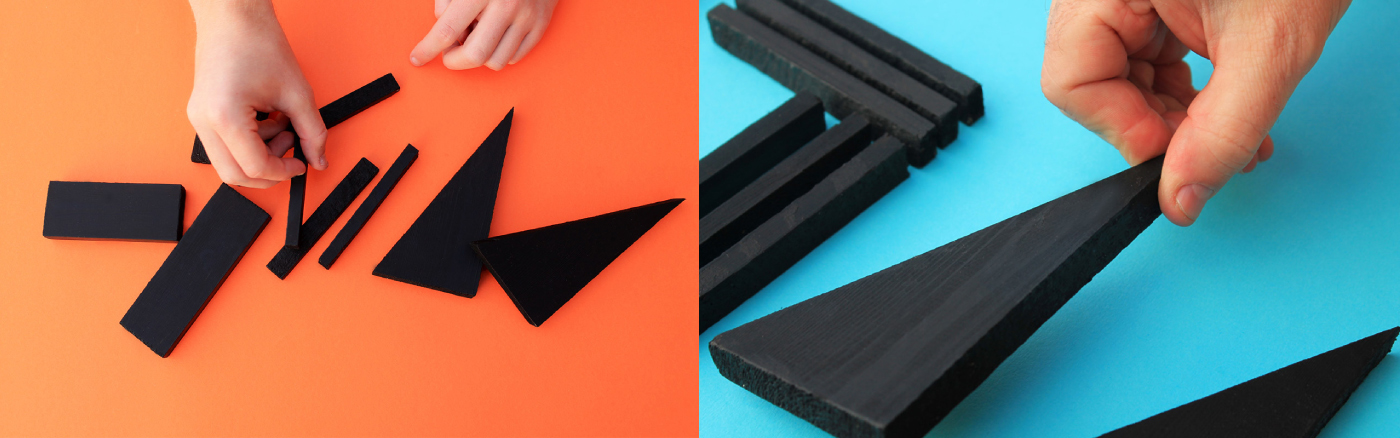
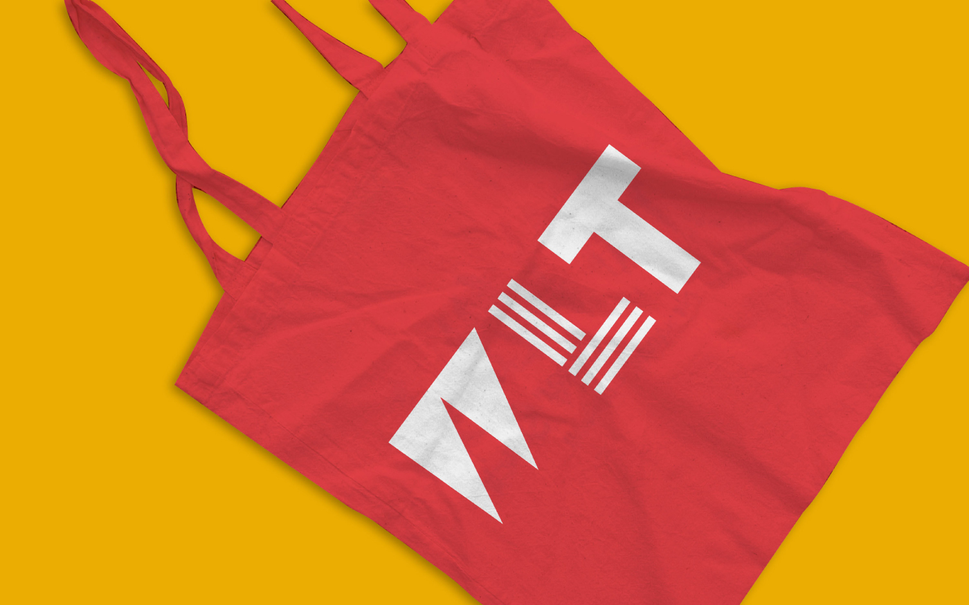
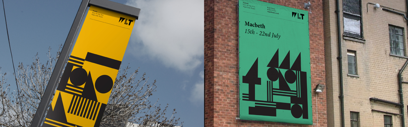
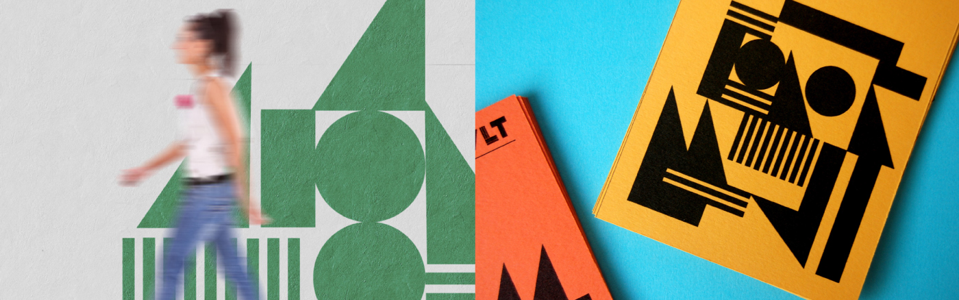
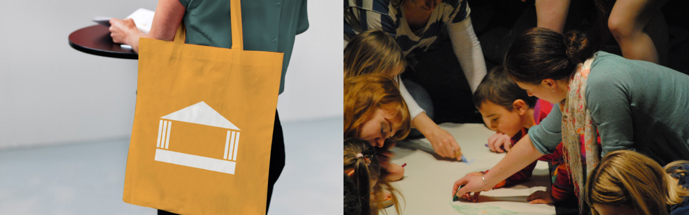
Brand Building Blocks
The Brand System is built upon a series of interchangeable
shapes which have been derived from the brandmark. These
shapes are what we call the 'Brand Building Blocks' and are
used at the heart of internal and external campaigns.
shapes which have been derived from the brandmark. These
shapes are what we call the 'Brand Building Blocks' and are
used at the heart of internal and external campaigns.


Brand Building Blocks
The Brand System is built upon a series of interchangeable
shapes which have been derived from thel brandmark. These
shapes are what we call the 'Brand Building Blocks' and are
used at the heart of internal and external campaigns.
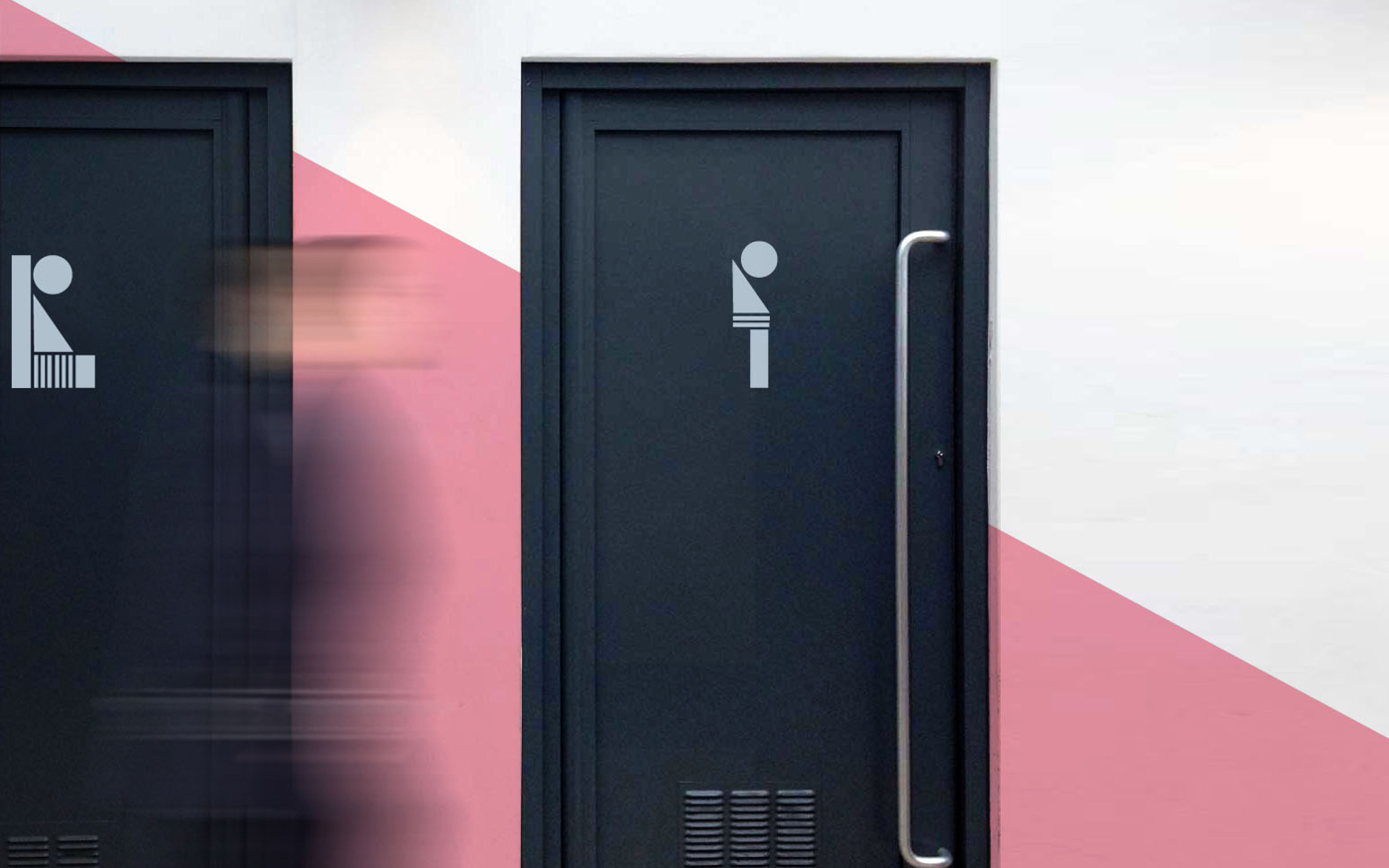
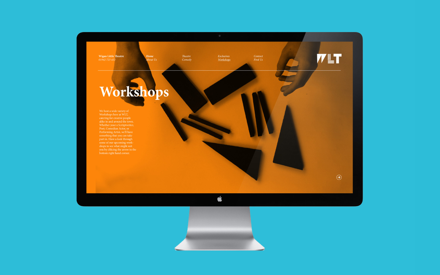
Versatile Brand System
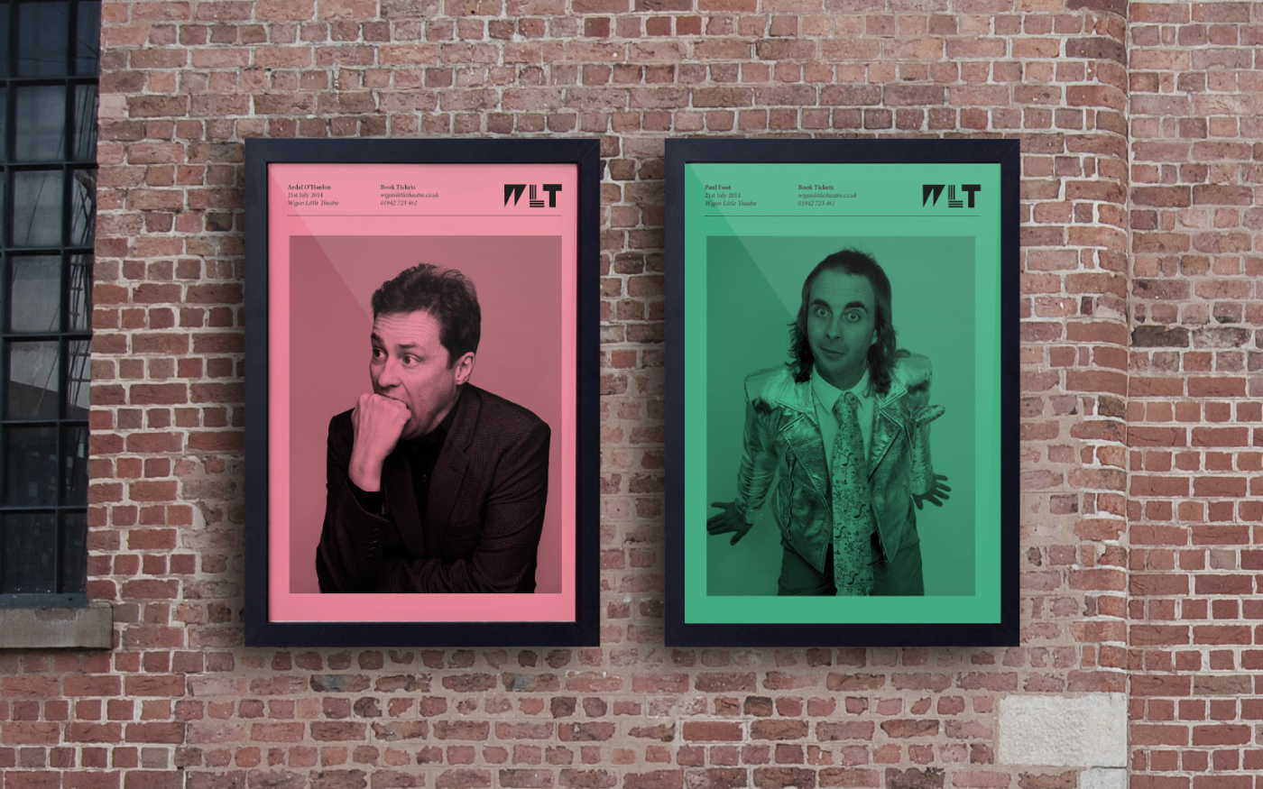
The brand system is versatile. The shapes used in the templates
are easily swapped out for imagery. This is used to full effect when
promoting live comedy or music nights at the theatre.
are easily swapped out for imagery. This is used to full effect when
promoting live comedy or music nights at the theatre.
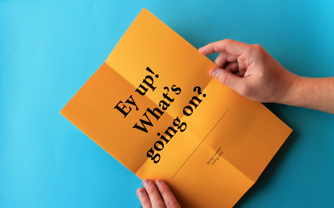
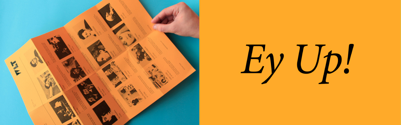
Dialect directed at Northerners
Being located in the North West of England meant that
the target audience was specific to that area. We decided
to emphasise the local language through creative copy
writing in order to make the brand more unique to the town
as well as grabbing the attention of the small community.
the target audience was specific to that area. We decided
to emphasise the local language through creative copy
writing in order to make the brand more unique to the town
as well as grabbing the attention of the small community.
Online Presence
The bold playful brand was translated to web as well as print.
The bold colourways are used as a full-bleed background to
show off the latest events and activities.
The bold playful brand was translated to web as well as print.
The bold colourways are used as a full-bleed background to
show off the latest events and activities.

Thanks for scrolling
To see the full case study, visit our website;
madebyalphabet.com
Want to work with us?
madebyalphabet.com
Want to work with us?
hello@madebyalphabet.com
Copyright Alphabet 2016. All Rights Reserved
Copyright Alphabet 2016. All Rights Reserved


