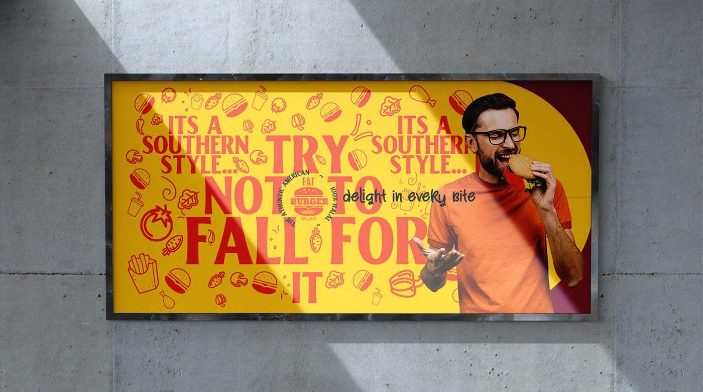
Introducing "Try Not to Fall for it", a fast food and burger restaurant branding and packaging project that aims to captivate and challenge your cravings! The concept revolves around the idea of playing hard-to-get with your taste buds, teasing and tempting you with mouth-watering burgers, fries, and shakes that you just can't resist.
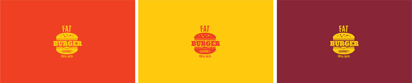
To convey this playful yet bold approach, we used a vibrant color scheme of deep yellow, amber, and bright red,
which creates a sense of excitement and urgency. The typography is also blocky and bold, giving a strong and confident
look that matches the fast-paced nature of the industry. And to add a touch of fun and humor, we added fast food doodles
and illustrations that playfully interact with the typography and packaging.
Overall, the goal of this project is to make you crave for our burgers and fries, while challenging you to resist the temptation and try not to fall for it. So come and join us in this delicious game, and let's see who can resist the ultimate fast food experience!
TRY NOT TO FALL FOR IT !