


A new brand for a brand new service
Yandex.Market changed in October 2020. After 20 years as a price comparison platform, the service transformed into an online marketplace. A new model meant a new approach to everything: logistics, partner relations, and sales. For our design team, that translated to brand identity and user interaction.
How it all started
The new Yandex.Market came about rather quickly, which is why we had such little time to come up with a new brand identity. Our internal design team realized that in situations like this, you have to focus on what you already have.
But all we had was the color yellow from Yandex and scotch tape with the old Yandex.Market logo from when we merged with Beru. This became our jumping-off point and first challenge: grow a new brand with nothing but yellow tape.
We tried using it as the main visual element. It's simple, straightforward, and versatile: you can do anything with it. But it was boring. So we started to experiment. We added lines to it. Then those lines started to twist and bend. This went on until a pattern emerged that we felt reflected our message: variety, simplicity, and vibrance.
That's how we got the Yandex.Market icon, one of the new brand's first and main attributes, from tape. A simple "M" inspired ideas for the pattern and even became one of its base elements.


Brand makeover
After finding a solution and introducing the world to the tape icon in January-February 2021, it was time to move forward. We started to develop the nascent brand gradually.
We found our overall style fairly quickly. The tape pattern was such a perfect fit and everyone liked it so much that the next step was pretty obvious: we had to scale it. So we started putting it on boxes, cars, packages, and even couriers.


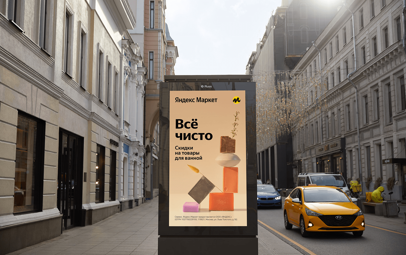
We also started wondering what we should do with the products. We wanted to highlight the reason why people visit marketplaces. So we decided that our only "models" would be the products themselves: just the item on a neutral background. No distractions, right to the point.


This all had to look appealing and straightforward both online and off.


There was still another issue we had to tackle: how the new Yandex.Market would communicate something abstract to its users through design. Illustrations helped a lot here. Our designers created a style that turned information on payments, delivery methods, innovations in the app, and the advantages of pickup points into funny but intuitive metaphors.
Later, it turned out that we had even more reasons for illustrations than we could imagine. So we came up with a style where new illustrations could be created from individual elements. All we had to do was draw these elements. That and develop a constructor that we could use to quickly generate more and more new images. Easy!

For pickup points, we had to dabble in architecture and city planning. After all, we wanted them to stick out while still fitting into the city landscape. They also had to be able to fit any space and layout.
We ended up with a flexible and intuitive guide, which made ours pickup points bright, convenient, and friendly places that look as good on any street as they do in a cozy courtyard or shopping mall.


Design director — Dmitry Bykov
Production group head —Aleksandra Iaskevich
Digital art director — Viktor Akifev
Designers — Vanya Kazukov, Denis Koshkarev, Aleksei Brodovskii, Galya Sholokhova
3D/Motion Designer — Ekaterina Grebenyuk
Photographer — Vanya Knyazev
Copywriting — Anton Resalyuk


