

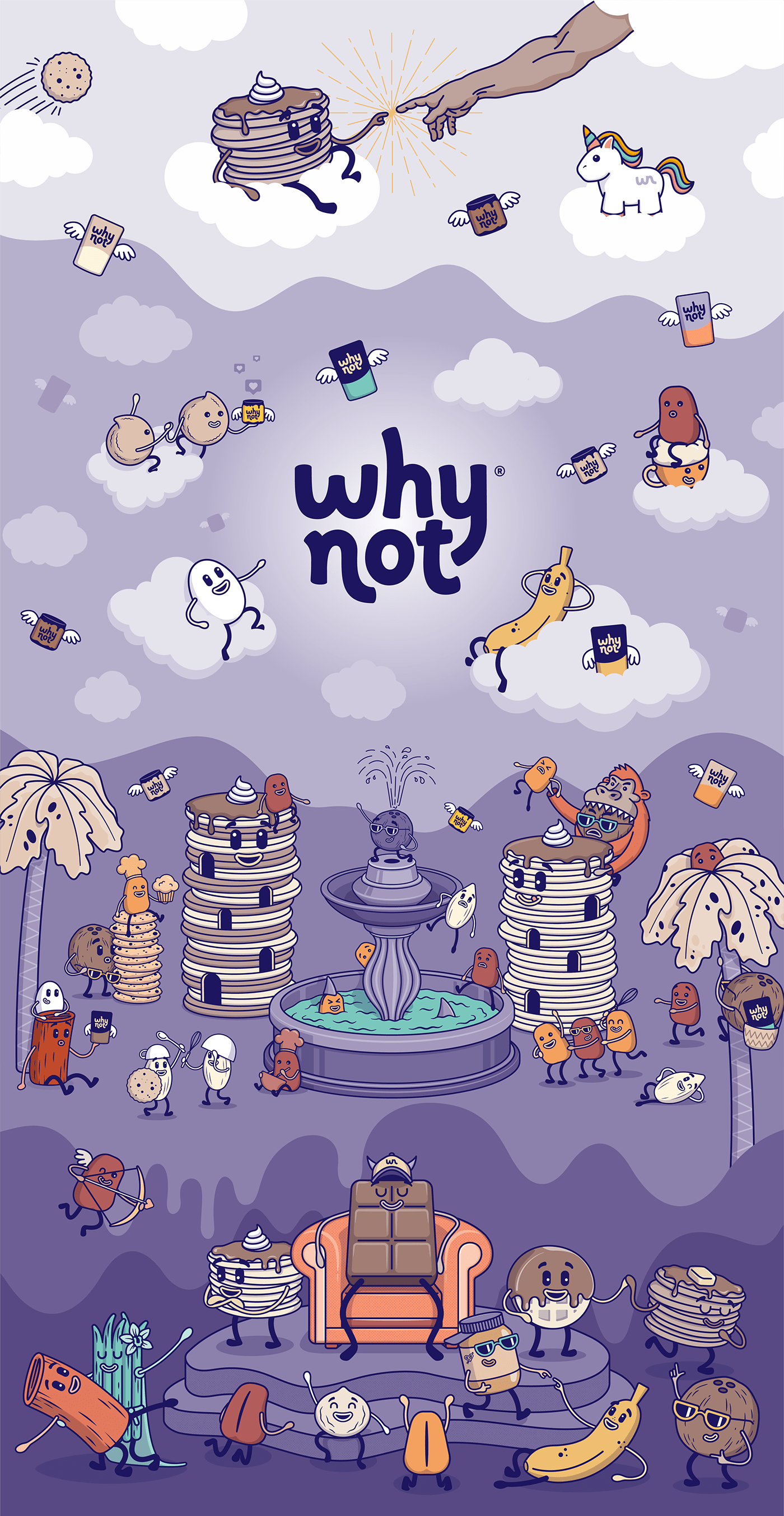
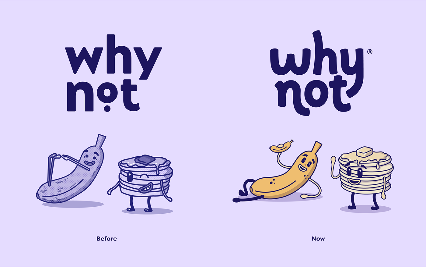
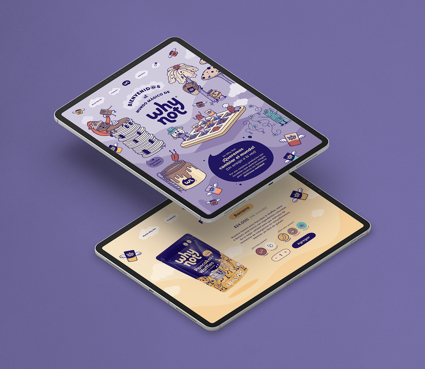
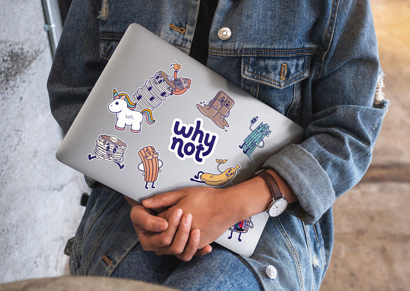
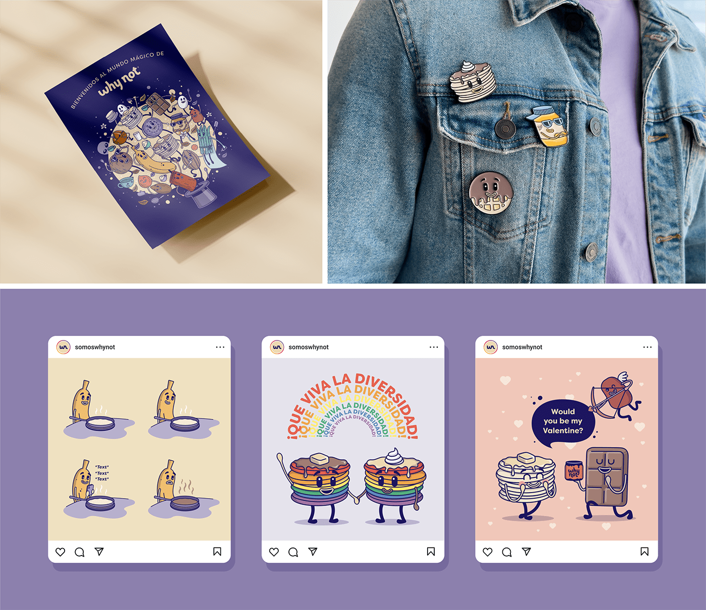
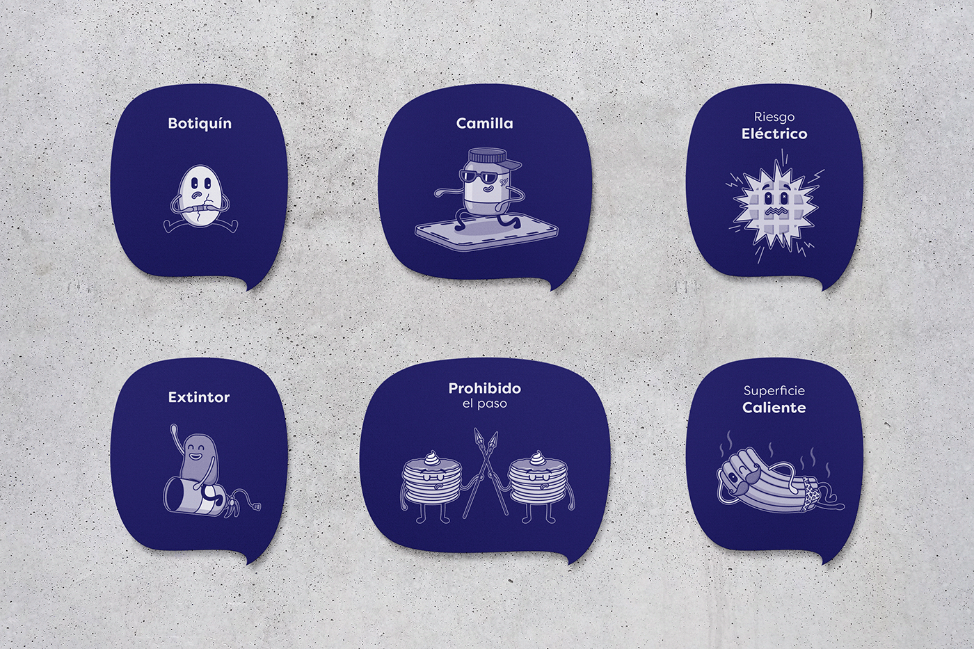
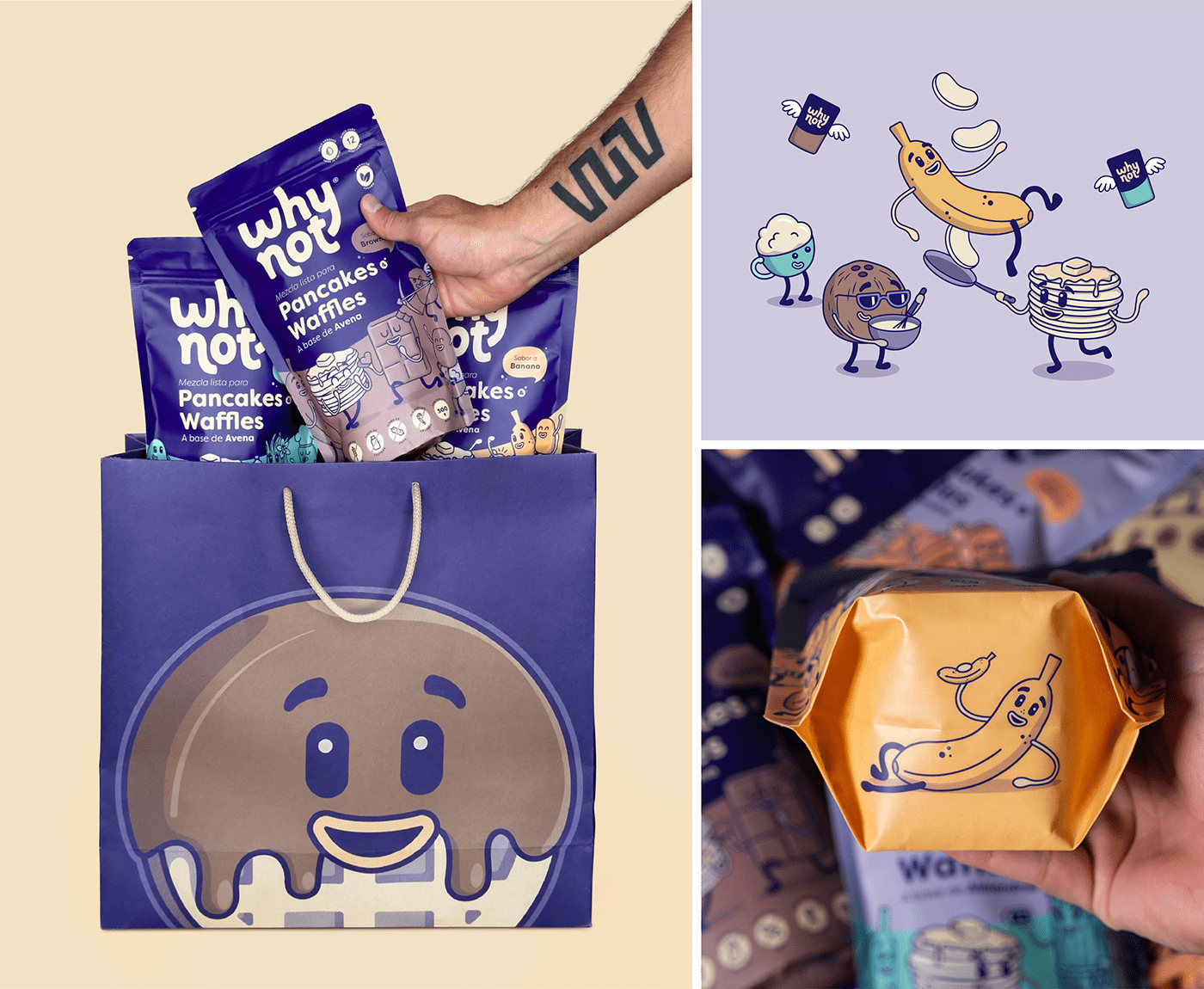
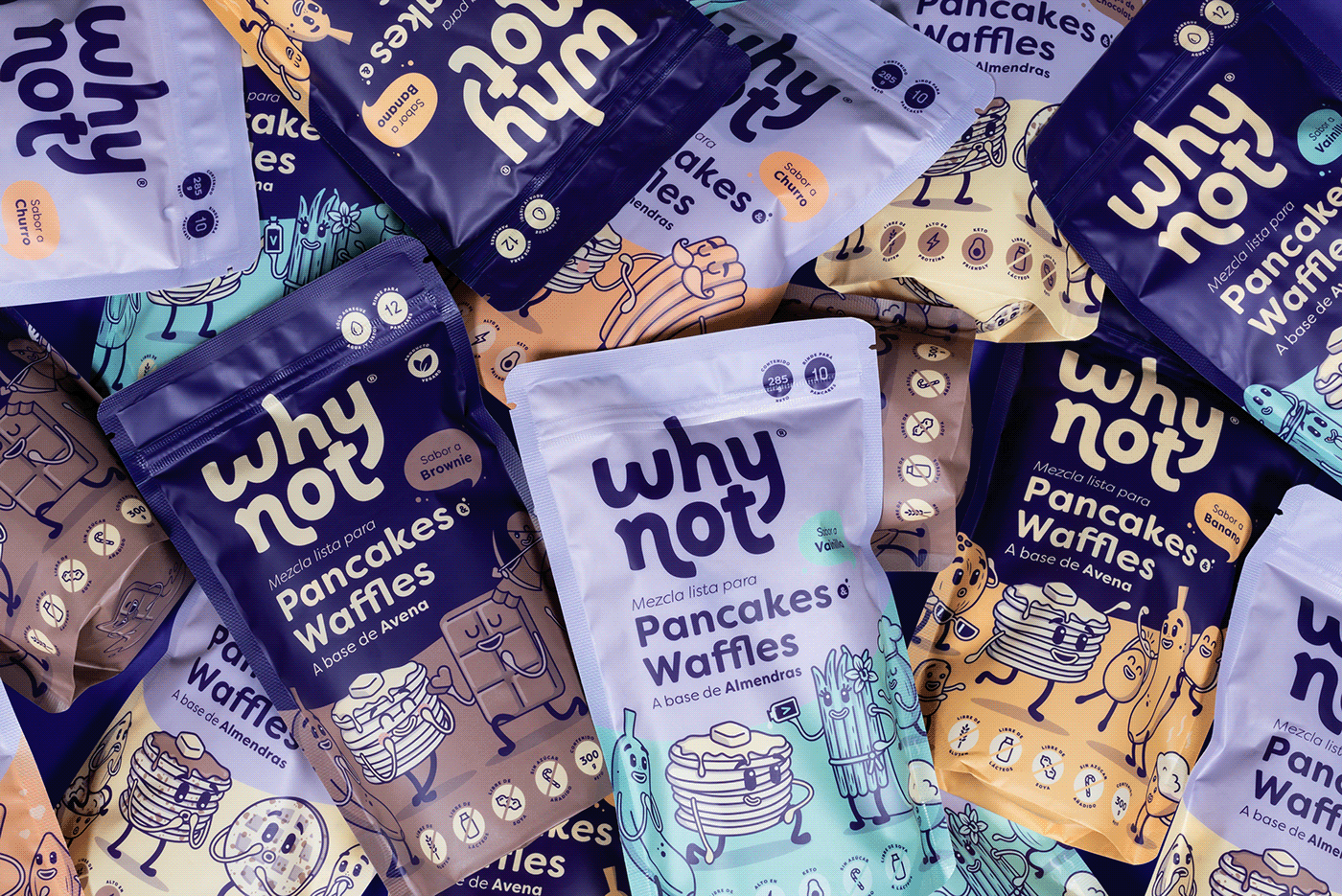
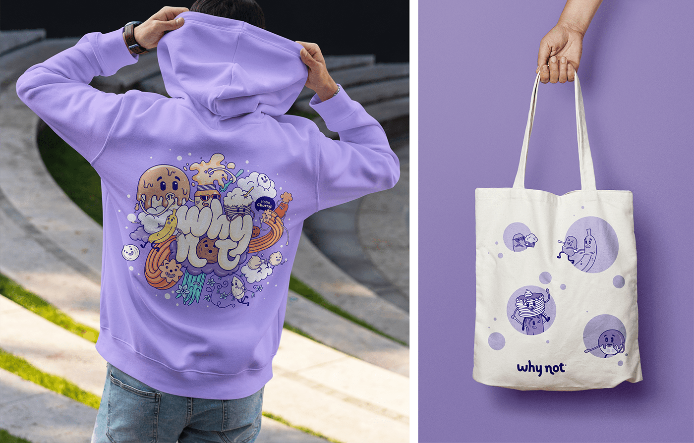
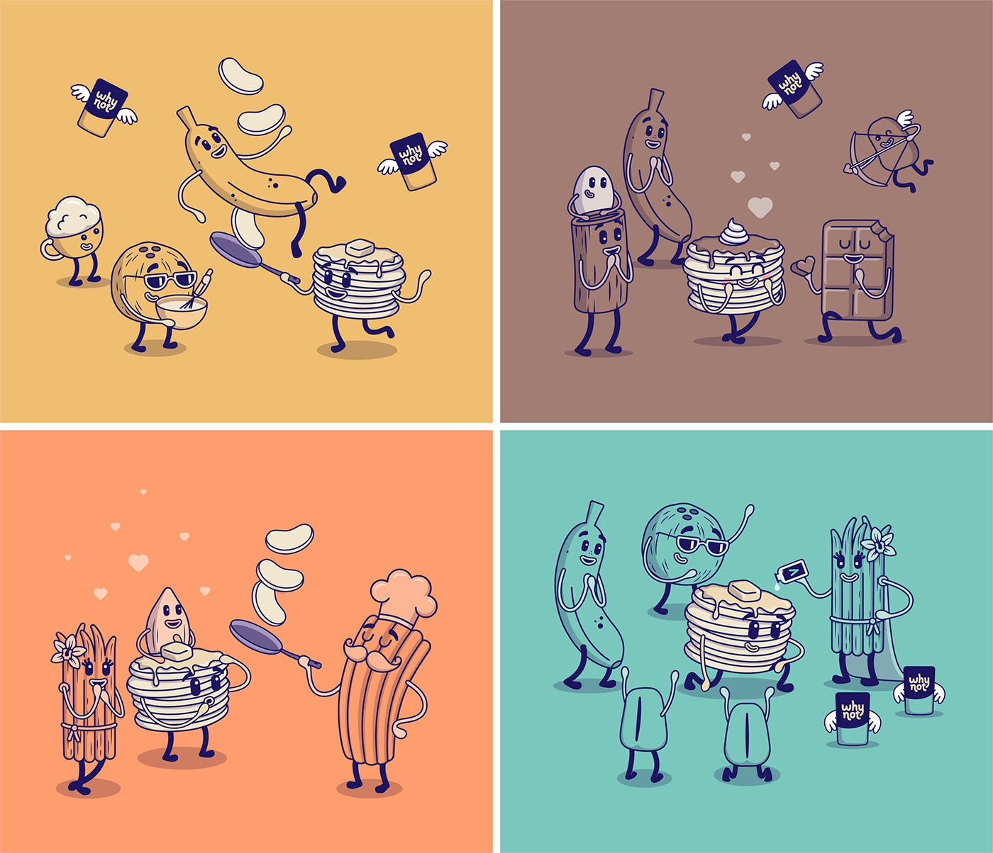
Why Not is a Colombian food brand that wants to overthrow the belief that indulgence equals unhealthy. The brand's name emphasizes the defiant idea of the founders of wanting to prove that the impossible can be achieved when it comes to changing the way we feel about certain types of food, such as pancakes, spreads, chocolate and thousands of foods that we usually think can only be eaten once in a while due to their high caloric content, because the ingredients are not of the best quality or because they include additives that can be harmful if consumed regularly. The question Why not? acts as the brand's engine to create delicious and easy-to-prepare/consume products, from the best quality ingredients and without the use of artificial additives –such as preservatives, colorings and sweeteners. The transparency and irreverence proposed by Why Not are complemented by a tailor-made visual identity that uses illustrated characters, vibrant colors, a bit of Spanglish and an innocent and optimistic personality to capture the attention of those who have contact with the brand so they crack a smile and establish an emotional connection that goes far beyond just buying products: towards a new way of relating to food, where happiness and tranquility triumph over feelings of guilt.
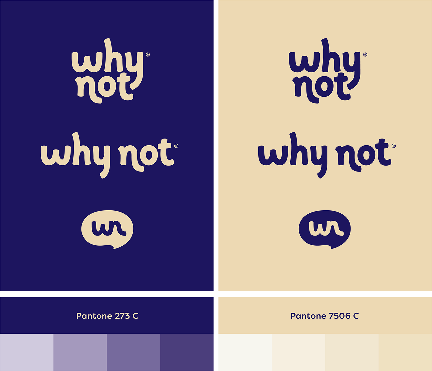

Created by Borondo®
Client: Why Not
Country: Colombia
Creative Direction & Design: Juan Montes
Logo & Monogram Design: Marianna Rezk
Illustration: Juan Montes


