We created Dia from scratch for TFP. We did product strategy, user research, design, user testing, development, branding, illustration, video, the whole lot. It was a big effort that resulted in a much-appreciated Red Dot Award.
Before we get any further, instead of writing what Dia is about, there's a video about it.
Dia has been thought of as more than just a period tracker. Which is what most competing Apps are used for. Dia aimed higher. It aspired to become a companion App, a lifestyle tracker, and a deeper insight into female health topics. Here...

Dia is an app for modern women – guided by the belief that women deserve better-designed, technological healthcare.
Women shouldn't have to put up with non-nuanced, under-researched healthcare. Their wellness and fertility pose unique journeys and challenges. Dia aimed to fill gaps in knowledge, unify a fragmented journey and give women tools to take control of their bodies.

Dia aspired high. It aimed to acknowledge women profoundly on such a personal topic (fertility). It sought to be used daily because the more data collected, the more accurate the insights would be. It aimed to empower women with knowledge about their bodies, cycles, and fertility. With all this, emotion was our sought-after outcome.
Using Dia had to be unique. Special. A carefully chosen colour palette, punny illustrations, and a welcoming tone go along with the crucial role of micro-animations when getting users engaged.

An App women are keen to use, eager to experiment with, and enthusiastic about. In a trendy sentence: Emotional UX.
2 tough challenges
The daily tracker
The Daily Tracker. It was the subject of deep user research. As the core section of Dia, the tracker had to be engaging, intuitive and effortless to use.

The overall feel should be catchy, dynamic, smart and engaging, and the interaction with the different cards should be incredibly easy, smooth and practical.
All interactions (big or small) were carefully studied and designed to provide an unforgettable personal experience, engaging with each user in an easy, smooth, and practical way.
The sheer amount of data Dia feeds back to the user is hard to grasp. Monthly view, cycle view, and a breakdown of each individual cycle – with all the data inputs in.
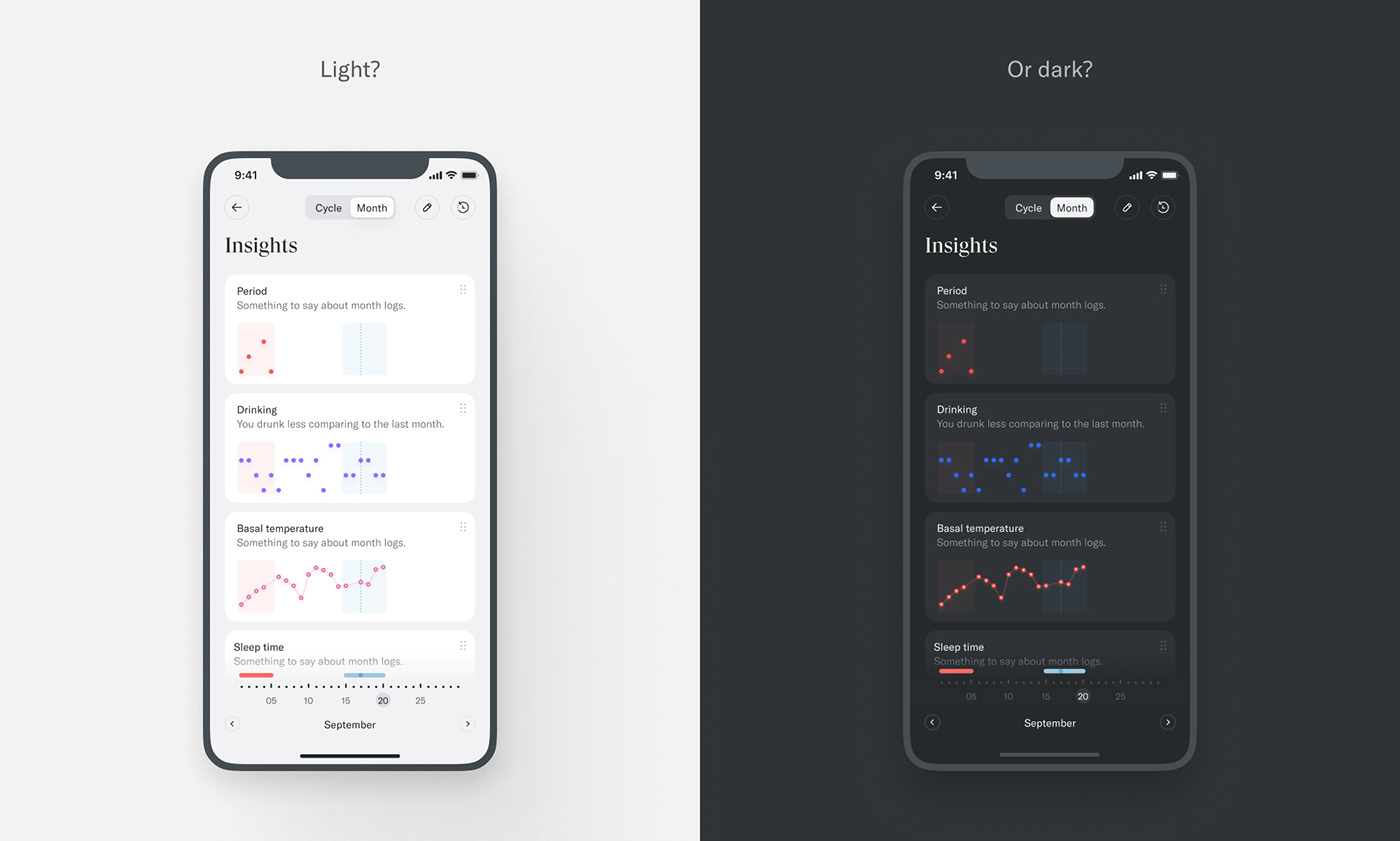
There's a bit of discoverability to it, with all the interactions possible. However, once you get it, this data is invaluable.

"Significa supported us through the whole journey.
From branding and setting the tone to the execution and the launch of a product that set a new standard for women's health apps."
Chakameh Shafii
Director at TFP, Head of Dia
Delivering new, tailored content regularly is vital to keep users bound to Dia. Dia takes all the user-input information and feeds back tailored content – articles, quizzes, and alerts – based on what they are going through. Research showed us these types of content are responsible for a large portion of the conversion of users, keeping curiosity and learning up to date.

Consistent. With a Design System
As we all know, creating a design system is halfway to getting it done. Creating a beautiful design system is how we get it done. Consistency is the only way that makes sense for us to design and develop a product.