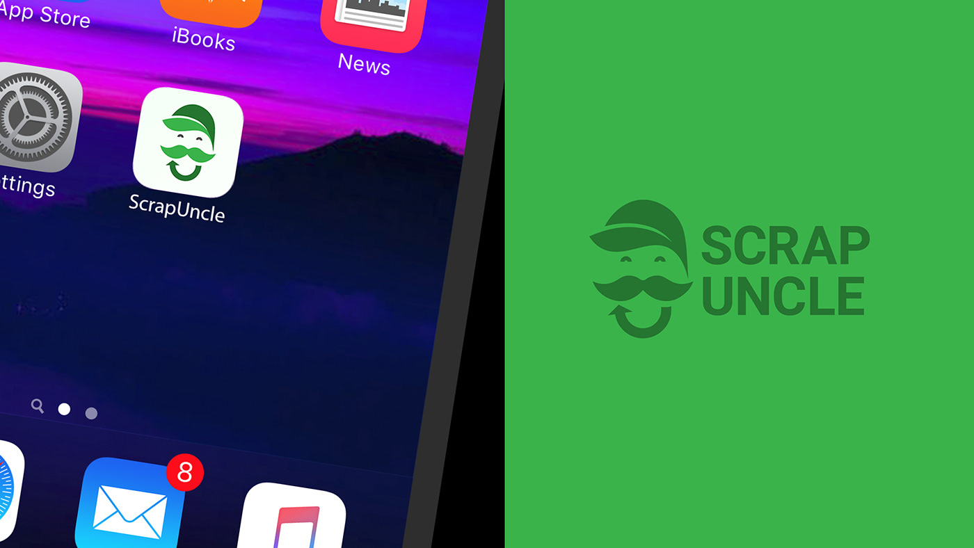
Scrap Uncle
-
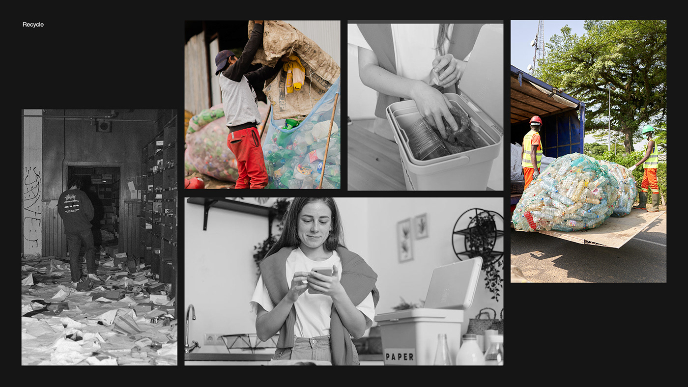
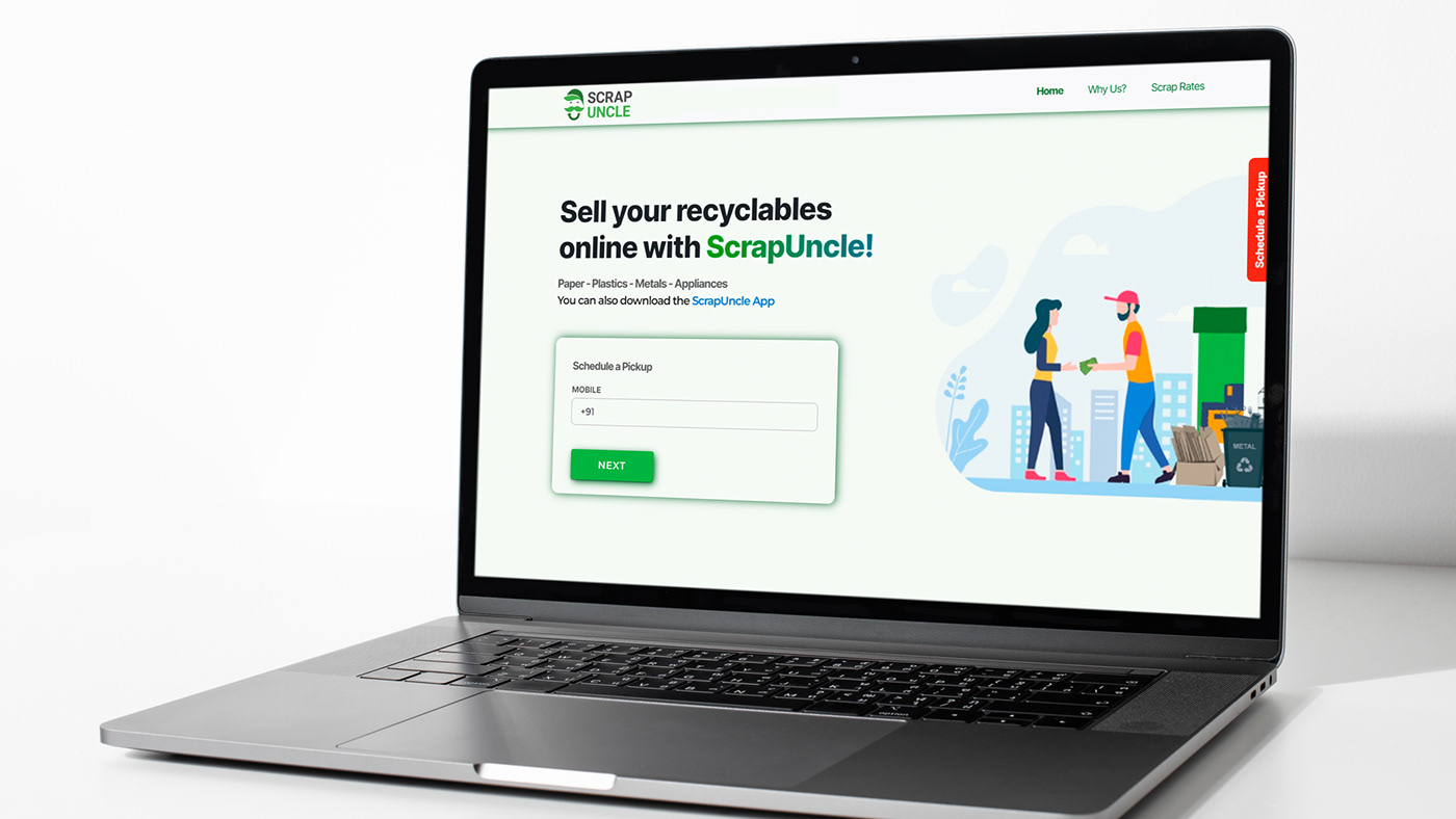
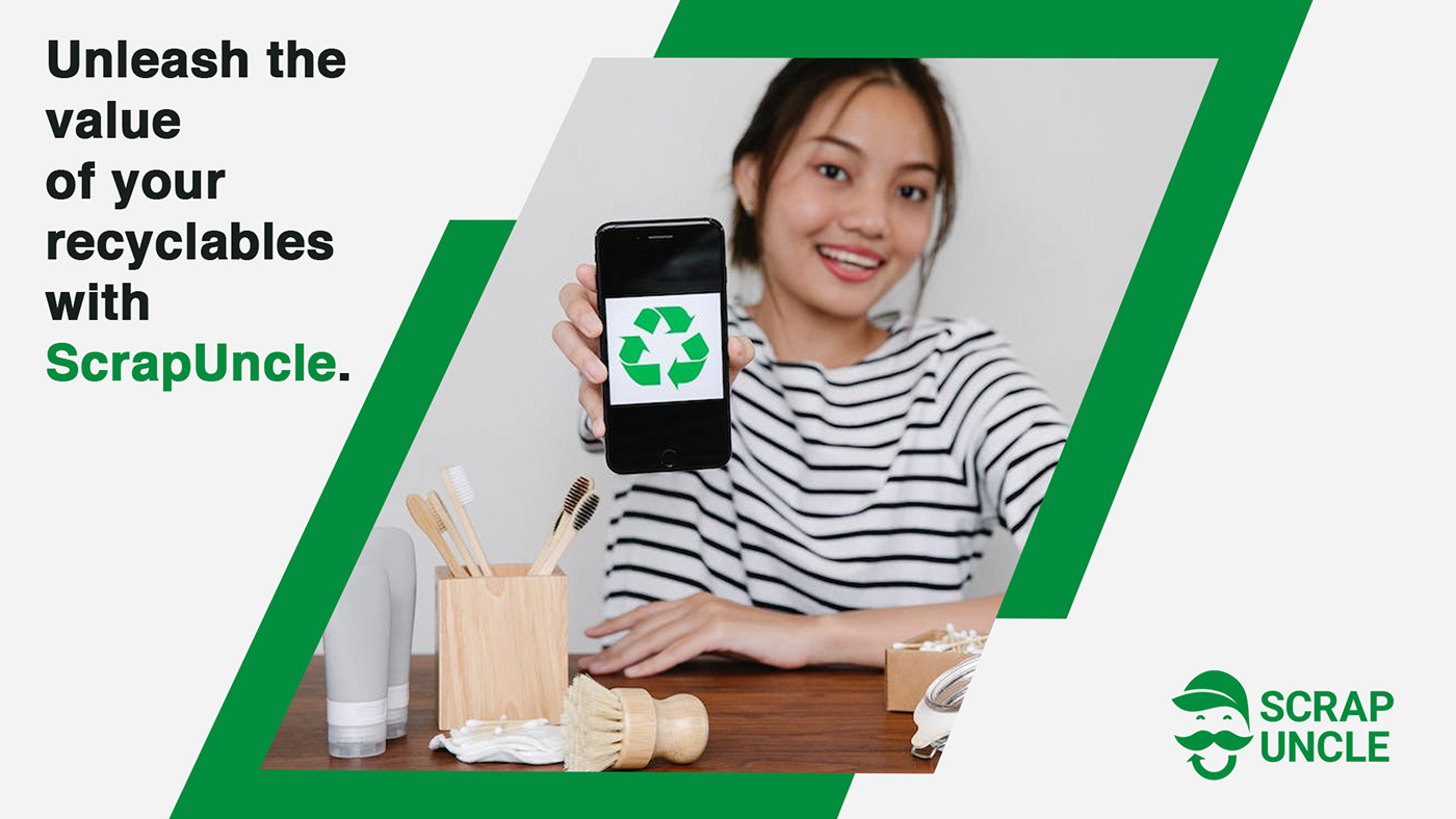
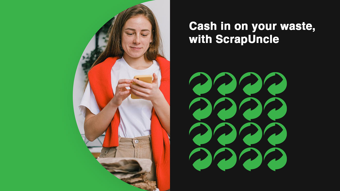
ScrapUncle is an online platform where individuals and businesses can sell their unwanted scrap items like paper, cardboard, plastics, metals, and electronic waste such as air conditioners, refrigerators, washing machines, computers, televisions, etc.
The platform offers an easy and convenient way to schedule a doorstep pickup at a preferred date and time, ensuring that the waste is channelled to authorized and efficient recyclers for processing.
With trained and verified staff equipped with digital weighing scales, ScrapUncle offers accurate and fair pricing for scrap materials. The platform also provides invoicing and formal payment services, as well as paper shredding services for added security.
Concept
-
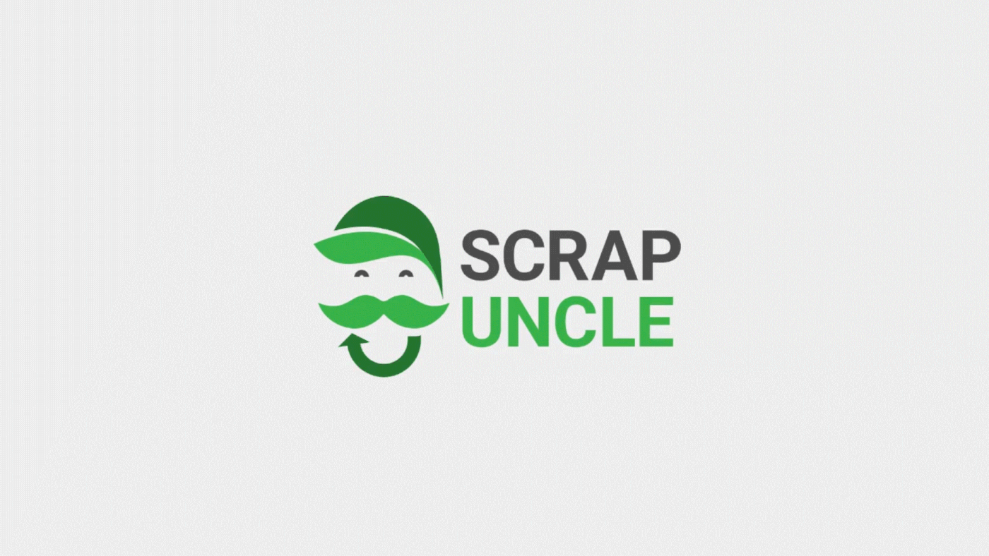
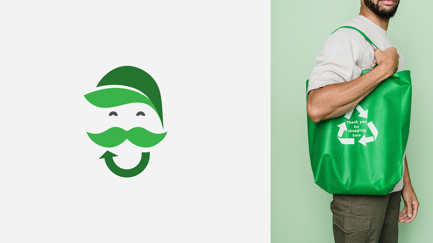
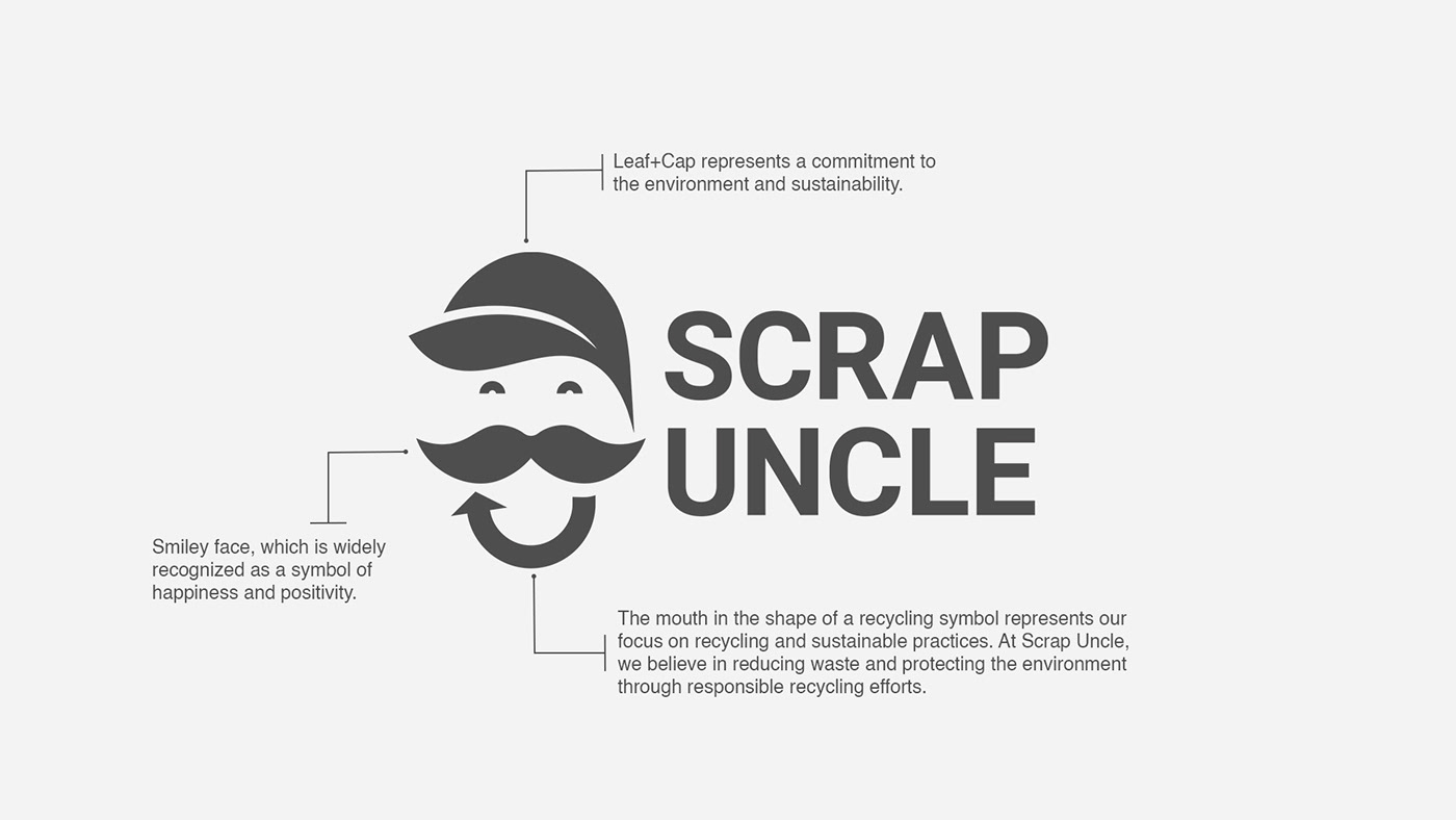
The logo concept for Scrap Uncle combines several key elements to represent the company's commitment to the environment and sustainability. At the heart of the logo is a smiley face, which is widely recognized as a symbol of happiness and positivity.
Along with the smiley face, the logo features a leaf and a cap. The leaf symbolizes nature and the environment, representing the company's commitment to protecting and preserving the planet. The cap, on the other hand, symbolizes protection and care, suggesting that the company takes its environmental responsibilities seriously. These two elements together create a visual representation of the company's commitment to the environment and sustainability, showing that Scrap Uncle is dedicated to reducing waste and protecting the planet through responsible recycling efforts.
Another key element of the logo is the recycling symbol in the shape of a smile, which represents the company's focus on recycling and sustainable practices. This symbol is integrated into the smiley face, with the mouth forming the shape of the recycling symbol. This design choice highlights the company's dedication to reducing waste and promoting sustainable practices, and helps to establish the brand's identity as an environmentally responsible organization.
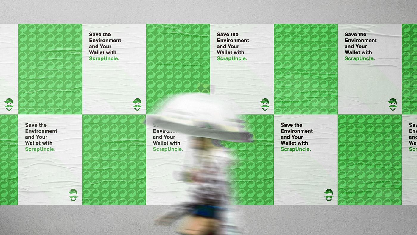
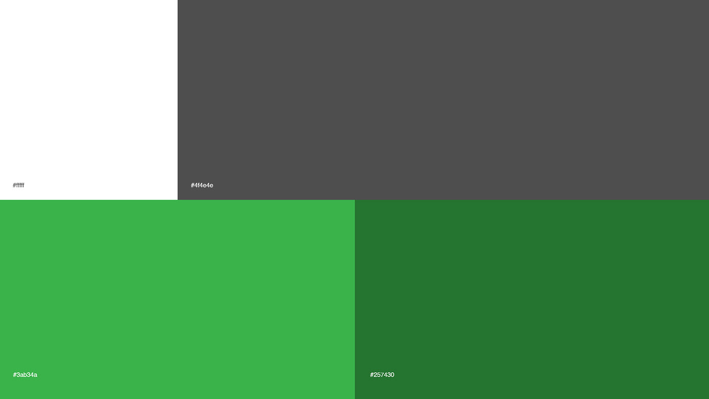
The overall color scheme of the logo is designed to evoke nature and sustainability, with shades of green and grey used to create a visual connection to the environment. This color palette is meant to suggest that Scrap Uncle is in tune with nature and is dedicated to preserving the planet for future generations.
In conclusion, the logo for Scrap Uncle is a powerful visual representation of the company's commitment to the environment and sustainability. The smiley face, leaf, cap, and recycling symbol come together to create a memorable and distinctive brand image that conveys joy, protection, care, and responsibility. The overall design of the logo helps to establish Scrap Uncle as a responsible and environmentally conscious organization, and is sure to be remembered by customers and stakeholders alike.