Nubia
Brand Strategy, Brand Identity, Web Design
Historically linked to the Granillo family, which has been in the industry for more than 35 years, Nubia (formerly Thermoteam) is an Italian company involved in the operation, management and maintenance of steam thermal power plants.
DilloStudio was asked to completely revise the company's brand identity in order to present it as an established, efficient and highly qualified partner in the eyes of customers and potential customers, generally large industries that require high temperatures within their production lines.
DilloStudio was asked to completely revise the company's brand identity in order to present it as an established, efficient and highly qualified partner in the eyes of customers and potential customers, generally large industries that require high temperatures within their production lines.


How to make a highly technical field like stokers fascinating? How to stand out from the competition? How to make the then Thermoteam a memorable brand? These are just some of the guiding questions that accompanied us throughout the entire project.
The first step was to choose a new name. After several iterations, the choice fell on Nubia, a union of the italian words that stand for "cloud" and "omnia", to represent 360-degree expertise in steam and its applications. A short name, easy to remember, spell and scan, with a round and delicate sound.
The first step was to choose a new name. After several iterations, the choice fell on Nubia, a union of the italian words that stand for "cloud" and "omnia", to represent 360-degree expertise in steam and its applications. A short name, easy to remember, spell and scan, with a round and delicate sound.

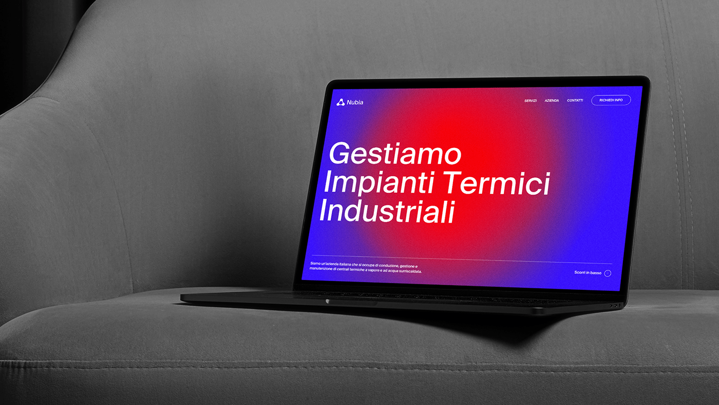
Around a bold name that breaks from the competition, we wanted to build an equally bold graphic language of gradients, vibrant colors, elementary shapes, modular grids, and strict typography.
The first expression of this approach is the new logo, inspired by the union of bubbles that occurs during the process of boiling water. These shapes (called "metaballs") are arranged on a triangular base to give solidity to the shape and recall the fire triangle, a representation of the chemical-physical process of combustion.
The first expression of this approach is the new logo, inspired by the union of bubbles that occurs during the process of boiling water. These shapes (called "metaballs") are arranged on a triangular base to give solidity to the shape and recall the fire triangle, a representation of the chemical-physical process of combustion.


Inspired by the typical colors of a flame, we created a vibrant palette whose colors, when mixed, give rise to different types of gradients. This choice stems from the desire to represent an abstract concept such as energy, which is constantly changing and is never the same.
The typographic choice fell on the Suisse Int'l Book, a sans serif typeface with a technical appearance, capable of communicating the rigor and reliability expected from a company like Nubia, but also versatility and modernity.
In order to facilitate the arrangement of all graphic elements in the space (typography included), we defined a basic grid consisting of 12 columns and 24 rows, to be used for the creation of any graphic asset, whether it is intended for online publication or print.


The new one page site's primary objective is to engage and amaze the visitor, through a user experience and an overall look & feel in stark contrast to the competition. All this takes the form of a perpetually moving background, combined with a sequence of on-scroll animations capable of giving rhythm and facilitating the use of textual contents.


