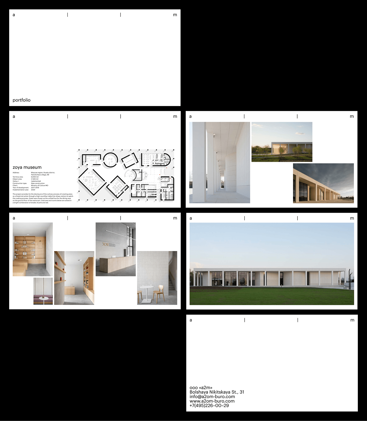
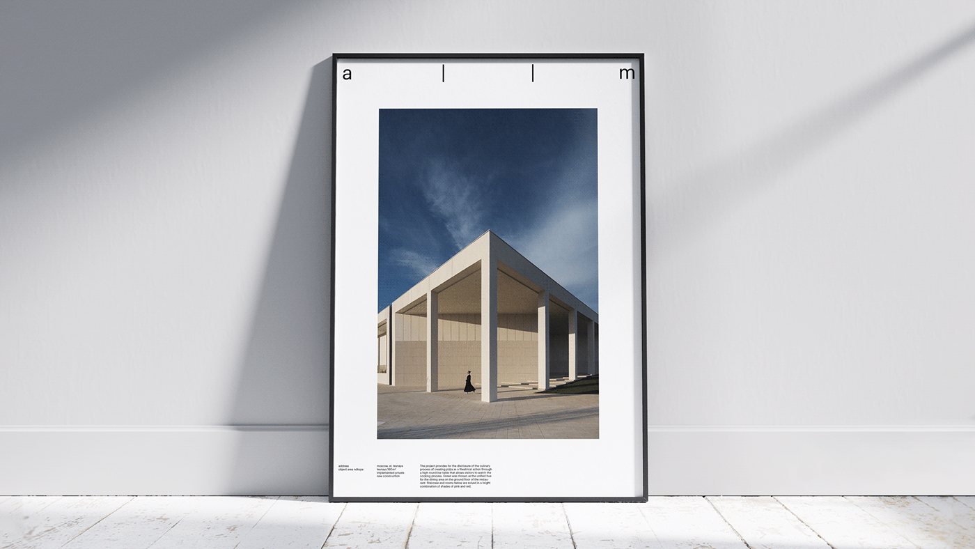
а | | m is the name of a young architecture bureau, the logo is based on the first letters of founders’ names: Adamovich and Matkovskaya. They design and build museums, commercial and residential buildings, create interiors and design furniture. We were noticed how they use the space in all their projects and built an identity on the same principle. The logo stretches across the whole width of the format, using the most of any space it is applied on. The rest of the typographic blocks are placed in the corners of the media to emphasize it’s edge and make the most space for images.
а | | м — название молодого архитектурного бюро, в основе знака — первые буквы фамилий основателей: Адамович и Матковская. Ребята строят музеи, коммерческие и жилые здания, создают интерьеры и проектируют мебель. Мы вдохновились тем, как во всех своих проектах они осваивают пространство, и построили айдентику на этом принципе. Логотип растягивается по ширине формата, осваивая всё новые и новые носители. Остальные типографические блоки мы разместили по углам, чтобы подчеркнуть пространство листа и сохранить место для изображений.