
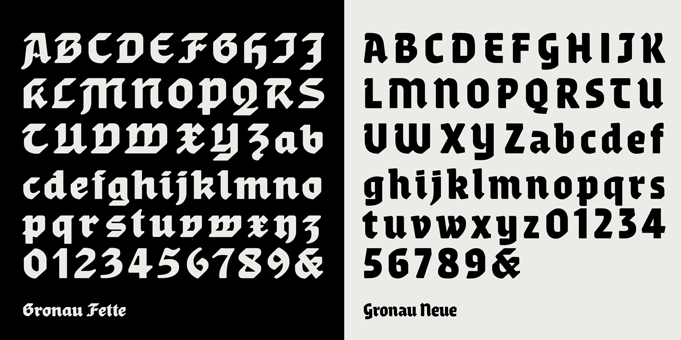
Andrea Tartarelli discovered the letterforms that would inspire his Gronau family
in a 1912 specimen by the Berlin-based Wilhelm Gronaus Schriftgießerei,
that showcased the typeface Fette Reichs-Deutsch, designed by Wilhelm Gronau
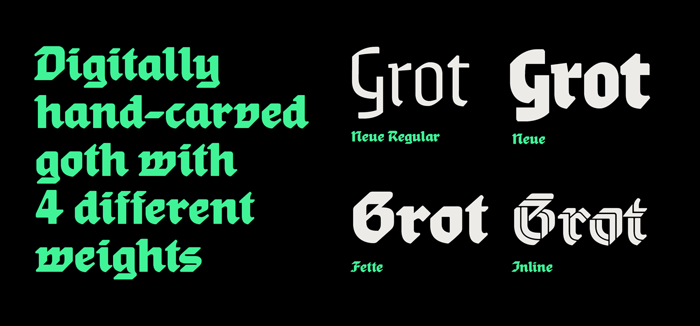
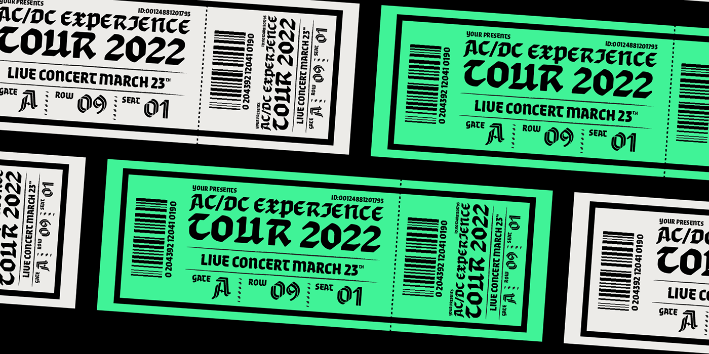
in 1902. Fette Reichs Deutsch, that Tartarelli digitised as Gronau Fette, sports a very broad and square structure, mild contrast and a very geometric treatment of shapes, with slightly rounded terminals, straight lines and clear 45 degree angles. This unusual, pre-modernist approach to letterform inspired Tartarelli to explore its potential for display use, with the creation of an inline version that modernises the original and pushes to the maximum its dynamic energy. Gronau inline design transforms the broad nib marks into a ribbon folding in 3d to recreate the original letterforms, adding a dynamic, sporty language to the original typeface gothic feel. With Gronau Neue, Tartarelli tried to find a contemporary, gestural interpretation of blackletter shapes, adding a slightly calligraphic look and feel to to the original hasty lines and energetic construction.
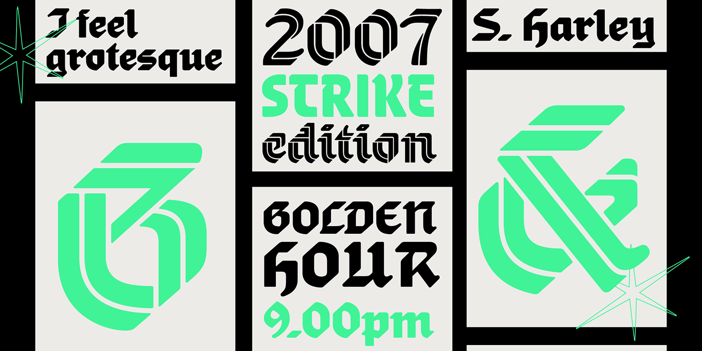
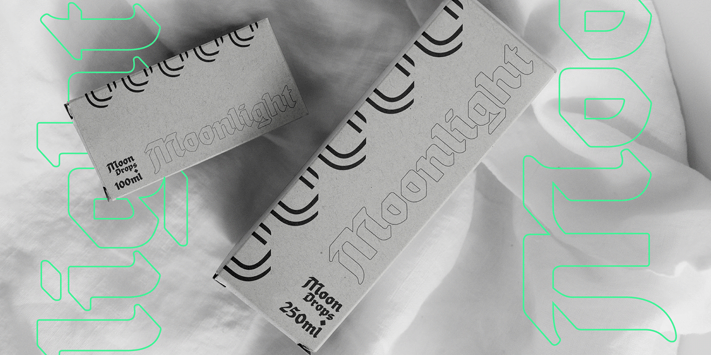
This third variant of Gronau is the one that most departs from the original mode: using generous x-height and condensed proportions, it achieves a more contemporary feel and extends the family expressive range into display, editorial and packaging options.
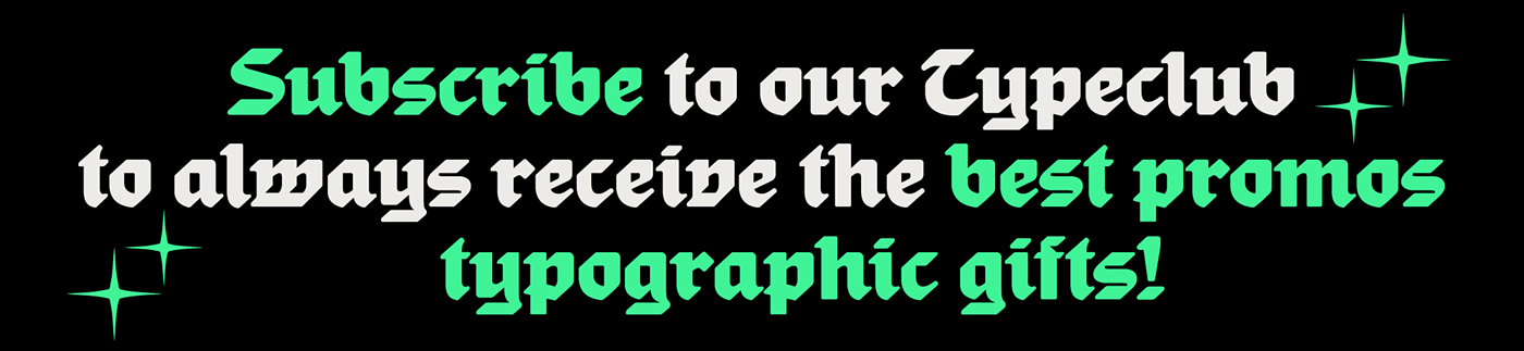
Join our Typeclub
or download for free the trial version
at zetafonts.com/gronau
at zetafonts.com/gronau


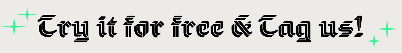
Discover the font and download the trial version for free


