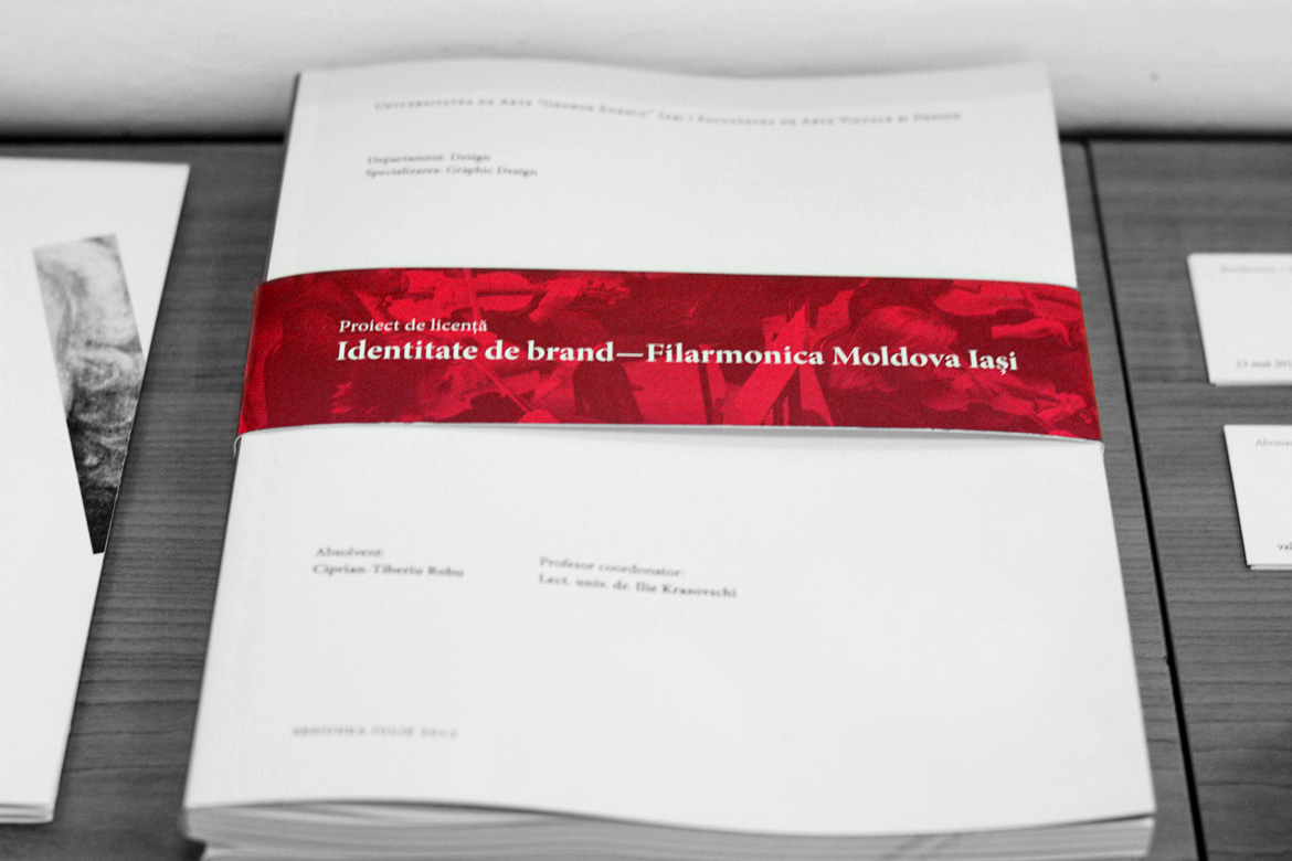
This project is the written component of my college thesis (the other half can be found here). It reveals the entire process for creating Moldova Philharmonic’s new brand identity, from early research to the final mobile app.
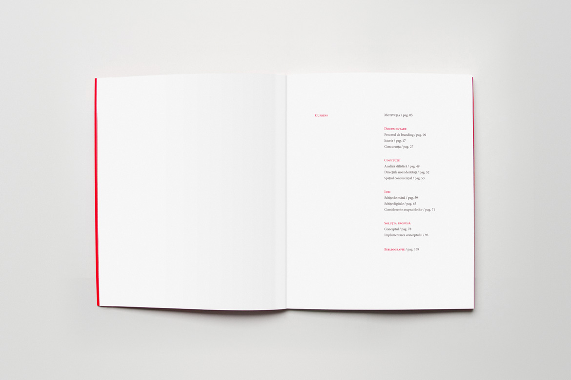
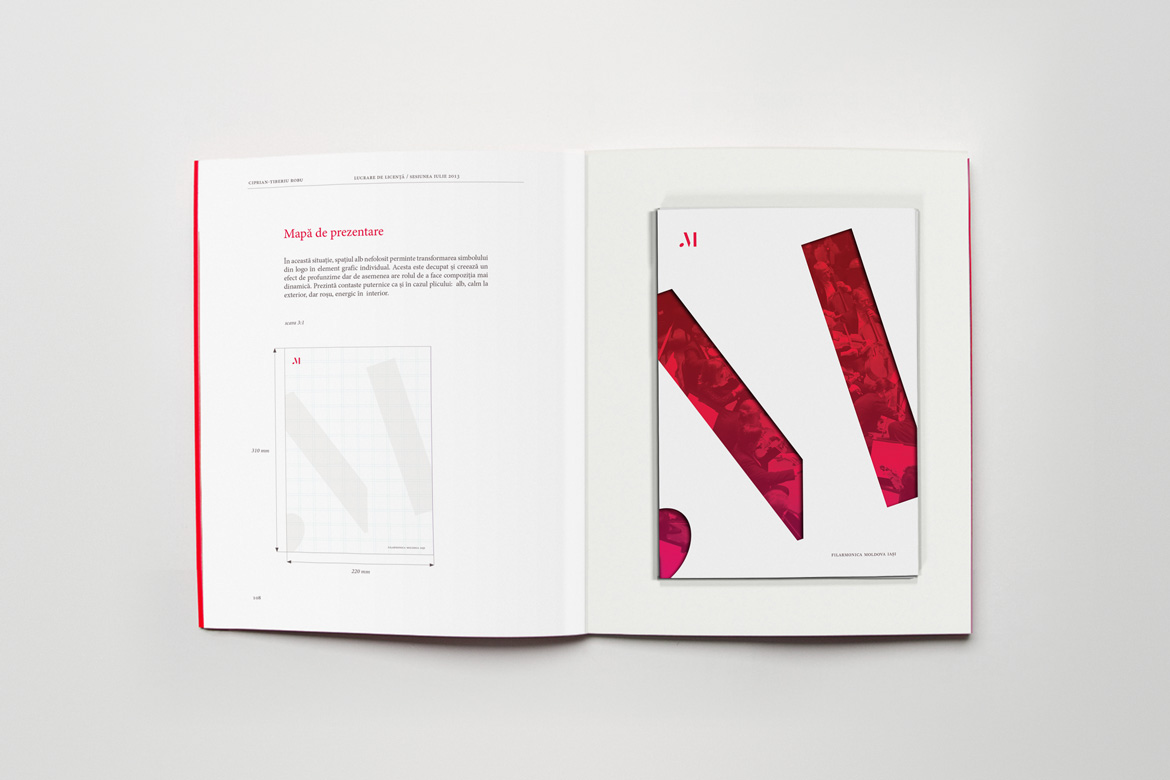
I wanted to reflect the institution’s dynamic activity with an asymmetrical layout for the book that includes the page numbers and text blocks. I used an 8-column grid for flexibility and Minion Pro as a workhorse typeface. Given the abundance of information (170 pages to be precise), I needed a strong visual system for dividing the chapters, sections, and titles. My solution was to use oversized numbers for the chapters, red backgrounds for the sections, and colored text for the titles.
At the time, I had not read Mr. Butterick’s Practical Typography yet, so I didn’t have a lot of knowledge about paragraph spacing and other details. The enter button was then my best friend. Unfortunately, we’ve since broken up. But it is, of course, nice to look back and see the evolution.