Salt Watersports was a rebranding done for a father-son watersports company on the North Carolina coast. When the son decided to branch off with his own section of the company, he decided it was high time for a fresh look. Going back to the basics was his focus, with a strong look that gets to the point right away -- get your butt in the water!
RG Fitness is a business/website that provides users and customers with tips and suggestions from nutritional and physical trainers for those looking to educate themselves on how to take care of their body. Two logo versions were created to help the business owners to determine the feel that they wanted consumers; the first speaks to more of a workout-heavy intent for a more serious audience, while the second was intended for those that may not be so comfortable with heavy workouts, but definitely want to improve their health.
The Charlotte Royals Rugby Club, based out of North Carolina, is a member of the International Gay Rugby Association and Board (IGRAB) and has been a party of the Charlotte LGBT community since 2004. As they finish up a nearly undefeated fall and spring season and prepare for the 2014 Bingham Cup in Sydney, the team is developing a more impressive reputation in Charlotte and thus, lends itself to a more impressive look.
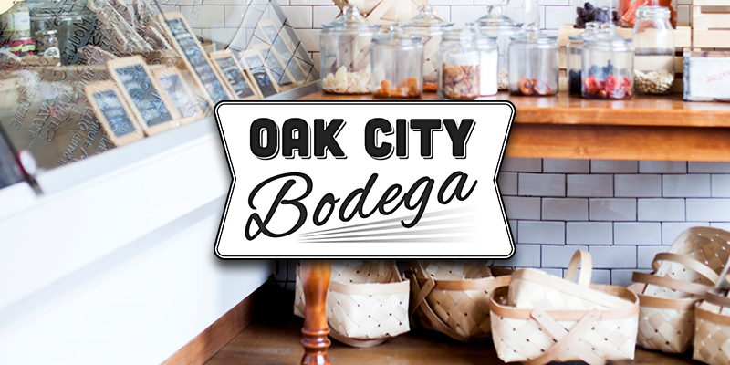
Oak City Bodega is a branding done for an upscale convenient store sourcing and selling goods from local small businesses. Getting back to an older, small-town feel I went with a more retro look and kept it simple to allow for the option of adopting this model to any small town, not focusing on local imagery in the main logo.
