Claypot
Brand design
Claypot allows companies that use machine learning to power their services to do continuous evaluation & continuous deployment of their machine learning models faster and more reliably. We were approach by the team to design a brand identity which would represent the technically advanced spirit of the brand with a connection to the organic origins of the name.
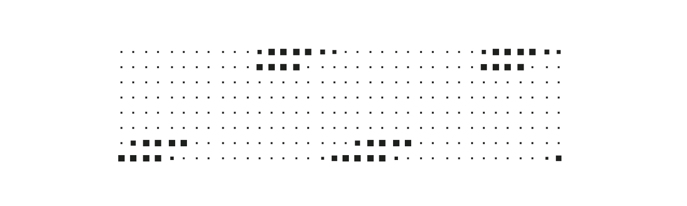
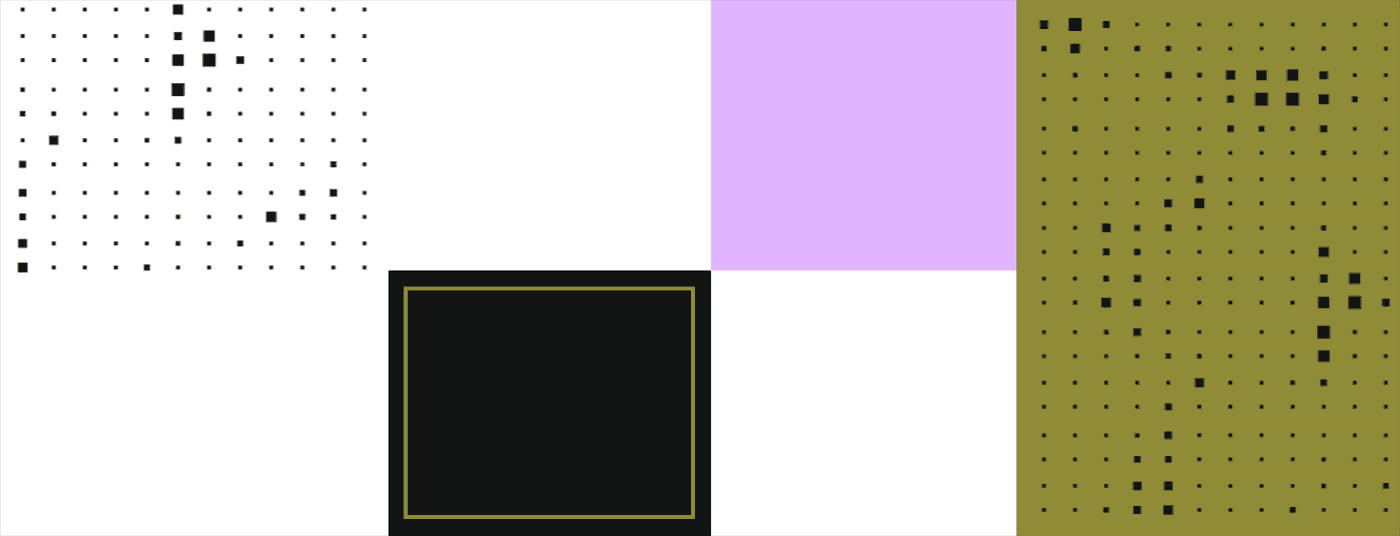
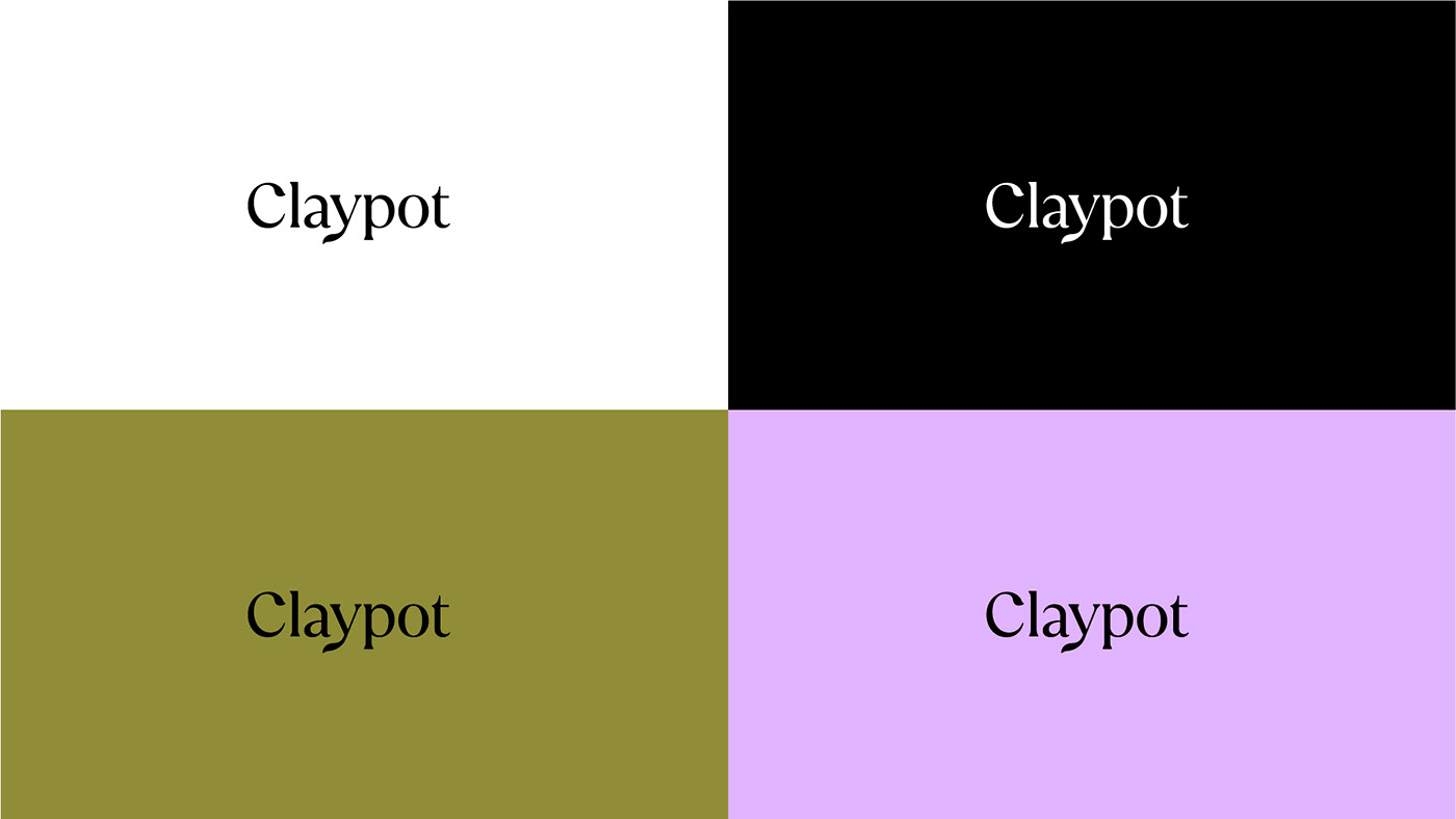
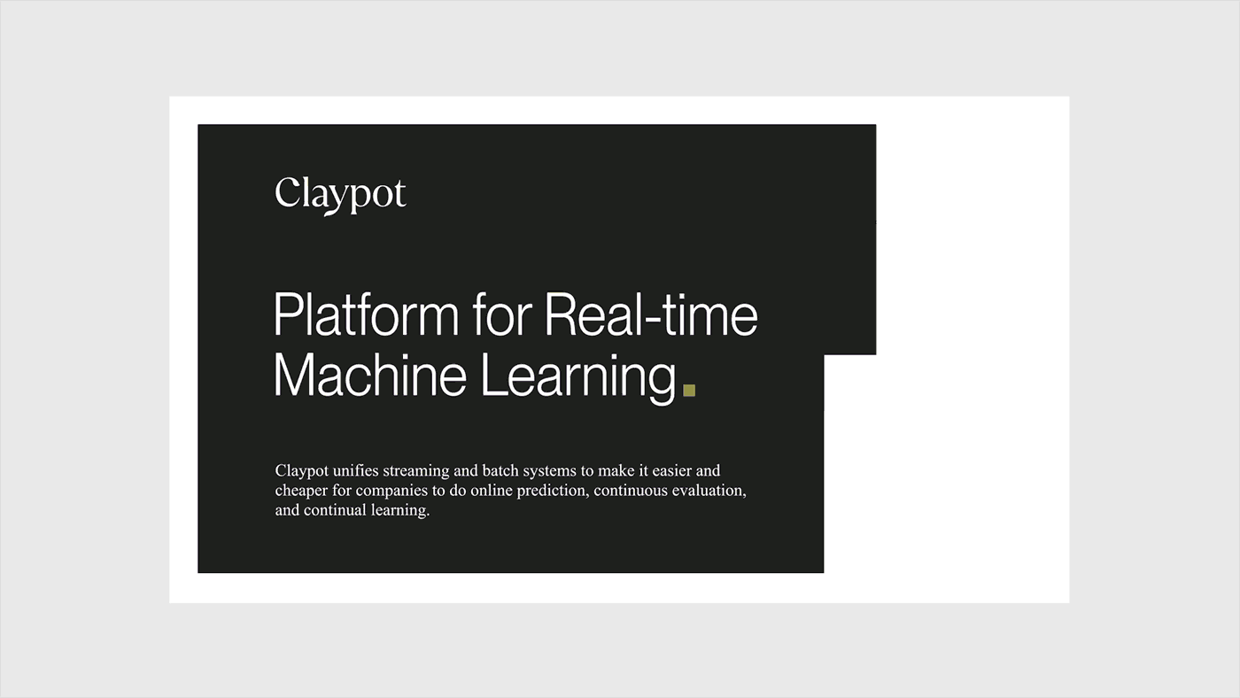
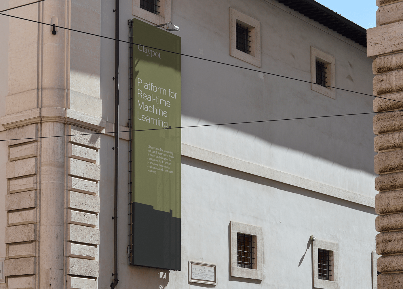
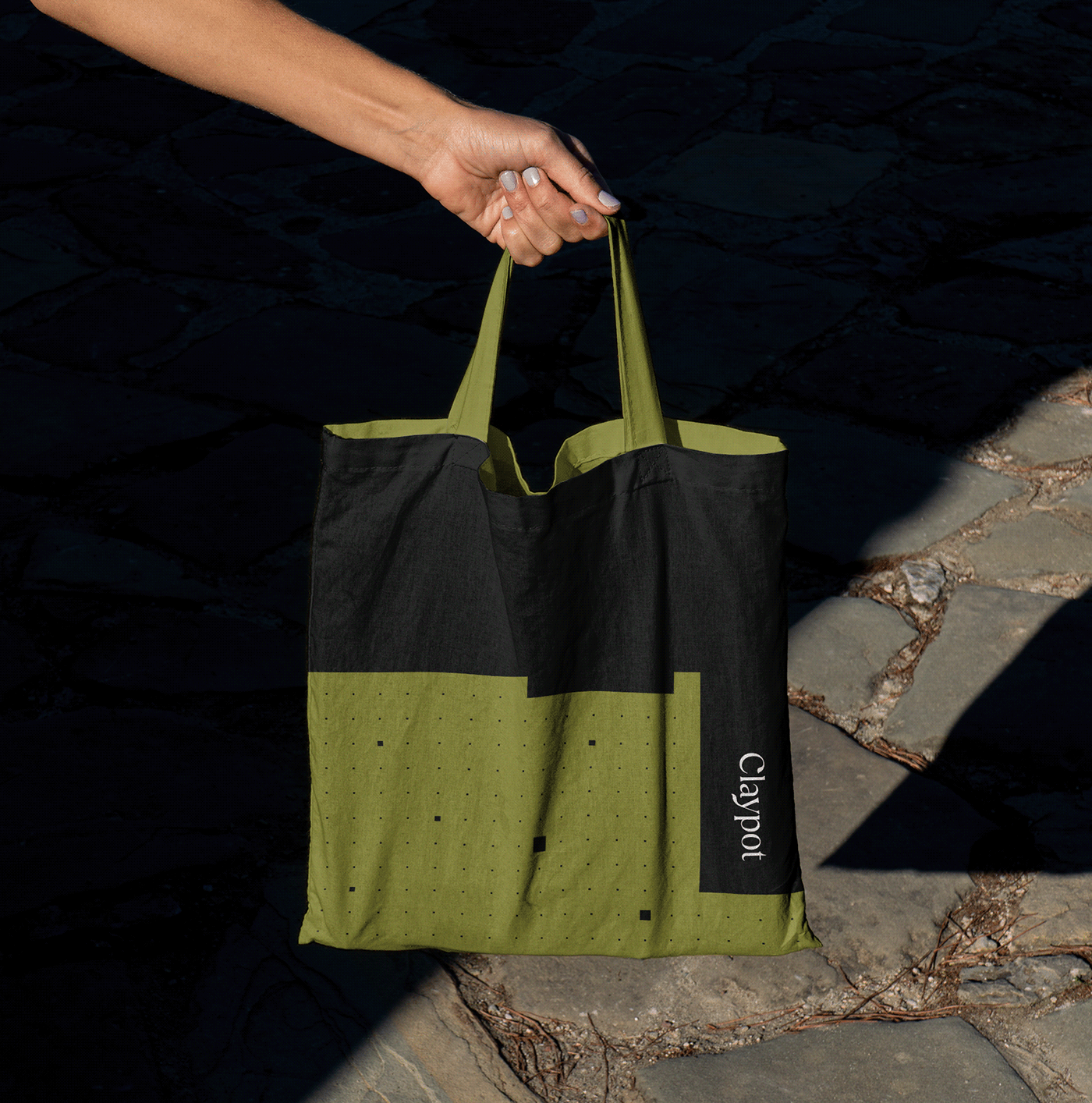
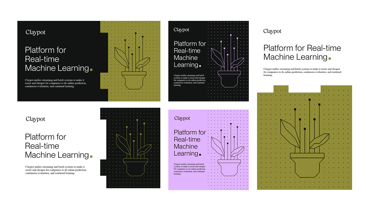
What we came up with is a grid-based brand identity with an organic logo design and varied typography. The squares which are an important part of the brand design are a building blocks that not only are an important part of the layouts, but also represent data flow perfectly.

A graphic theme built with
squares is the central part
of the brand design system.
The layouts are based on the squares and rectangles heavily. They can build a background shape, a grid and an illustration, therefore providing the variety a brand design system requires.


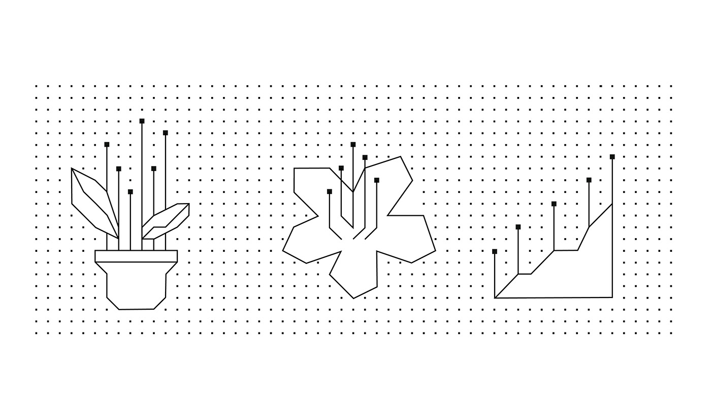
Grid-based layouts are a base for organic illustrations.
Illustrations are an important part of the brand design. We based them on a grid which provides a base on which these vector drawings are created. Simple shapes allowed us to design clean techy illustrations with an organic spirit.
Smooth online experience
with a clean-cut.
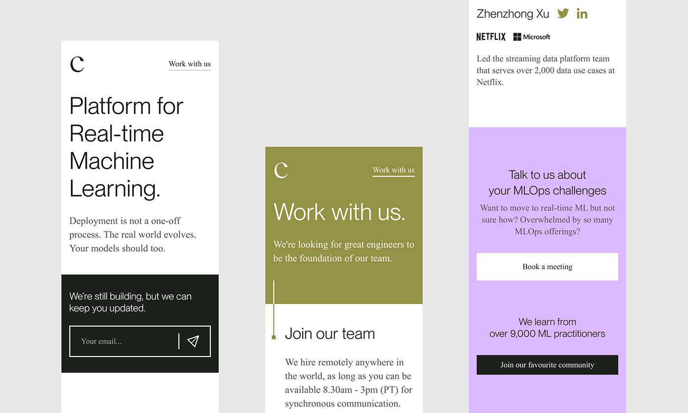
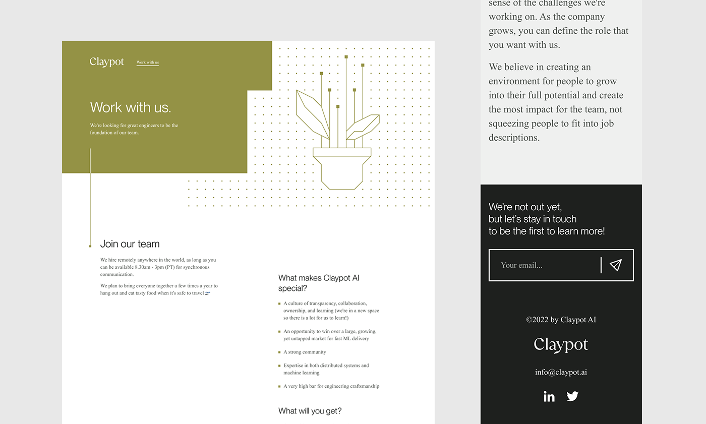
Part of the brand is of course the website, which is a clean landing page with all of the necessary brand-related visuals in places, for a smooth on-line experience and a clear message.

Talk to us
about your brand.
Project credits:
Art Direction & Brand Design / Natalia Żerko
Art Direction & Brand Design / Natalia Żerko
Logo design / Bartosz Buszkiewicz
3D & Animation / Jacek Janiczak
Website Design / Przemek Kosiński
Website Design / Przemek Kosiński


