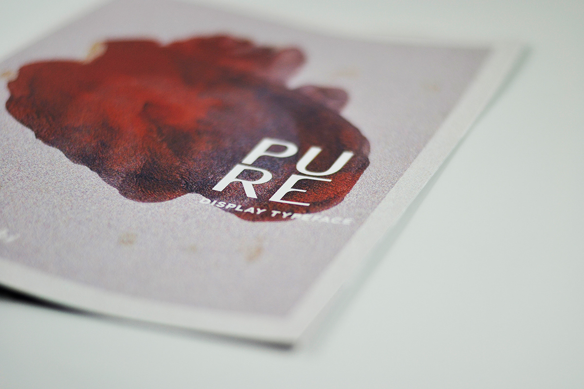
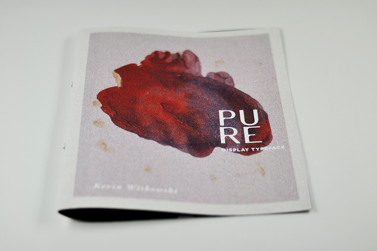
This dynamic and hybrid typeface is called PURE. The beginnings and visual constructs of PURE have been very experimental. An extreme contrast between strokes and letter forms, it was a competition between visuals, feel, and atmosphere that finalized the product that PURE is today.There were many vast inspirations that have had an impression on this typeface.


Mostly due to today’s modernism, I decided to create a hybrid geometrical and organic sans serif. This typeface has been constructed by the impressions of typefaces such as Bodoni, Bodoni XT and Stilla. Well-known typefaces for their aesthetic and portrayal of letter forms. You can detect the Bodoni atmosphere in this typeface due to the contrast of thick and thins.


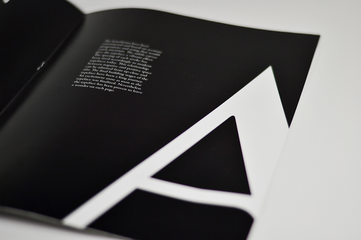
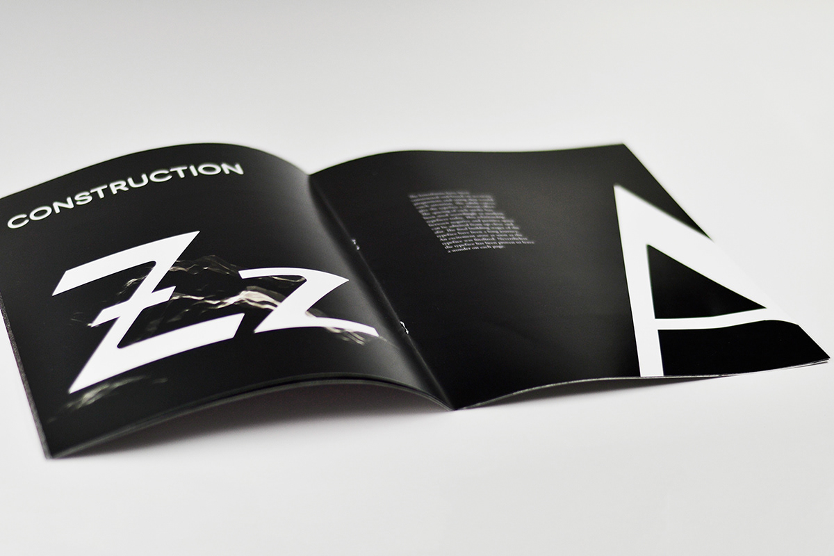


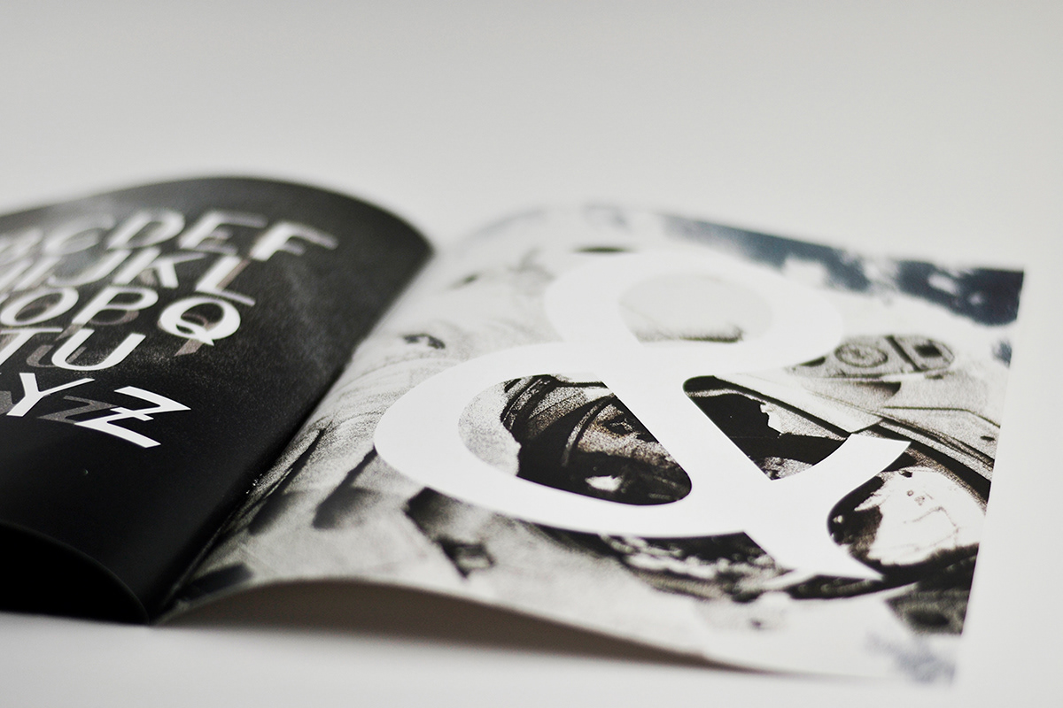


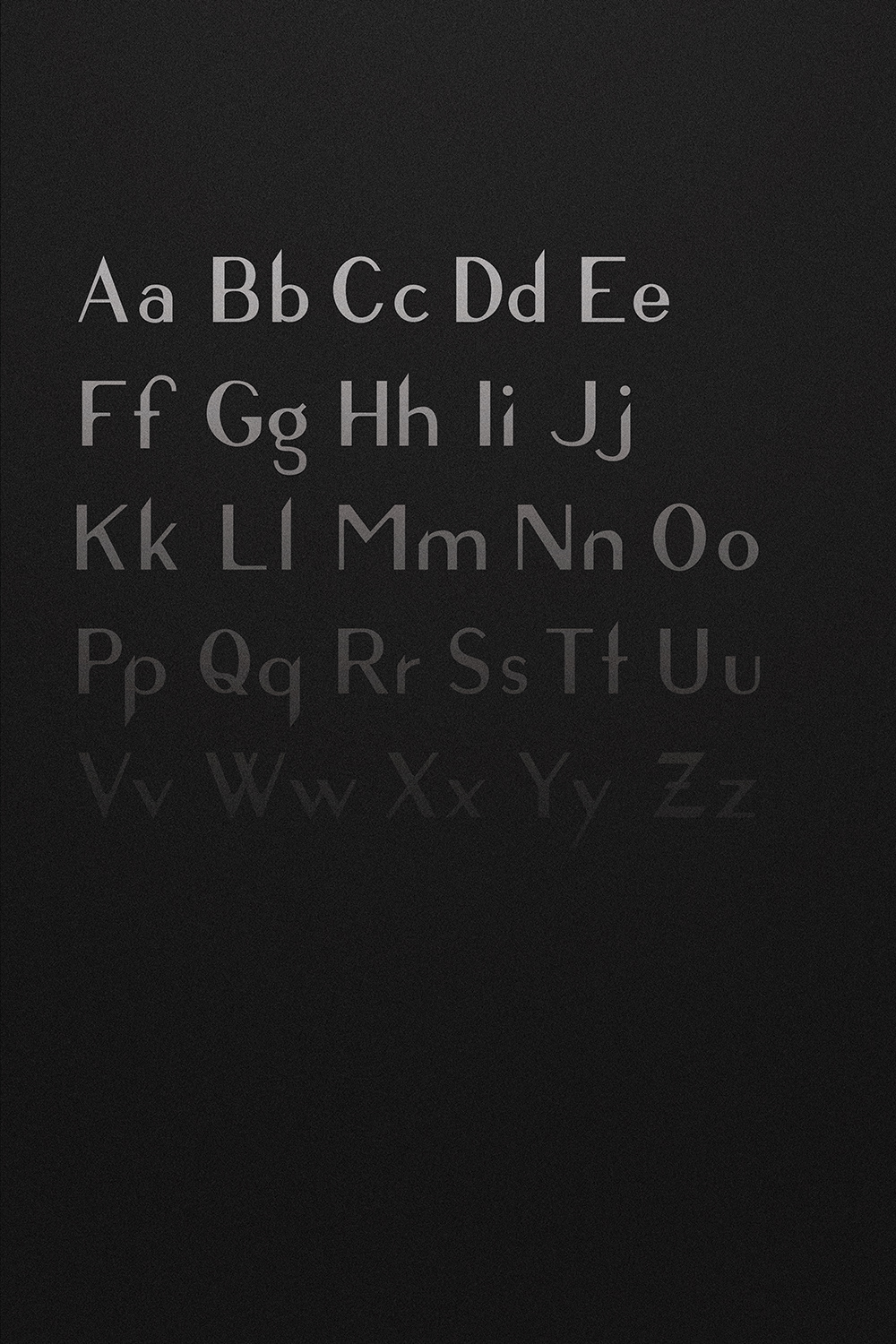
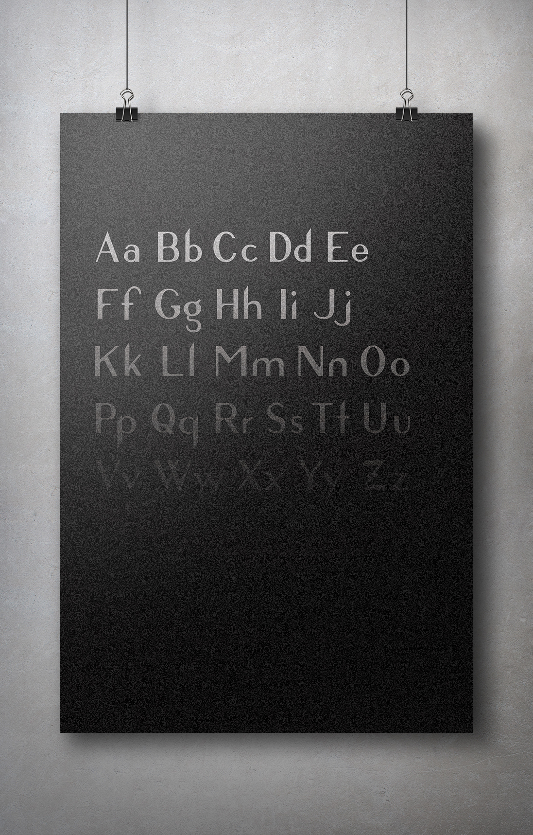


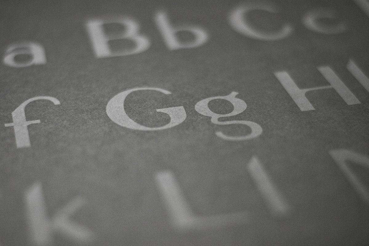
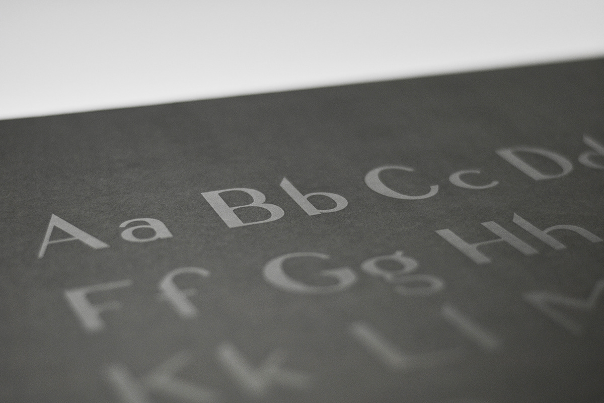

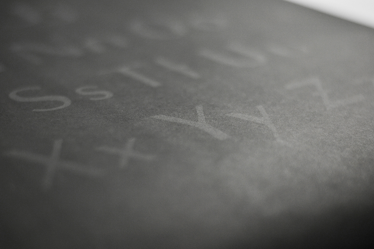

The letterforms have been constructed and based on accurate proportions and sizing that would catch attention. The subtle curves give the typeface a vibrant effect. This relationship between negative and positive space can be admired from up-close and afar. The final building stages of the typeface have been a long journey.


