De Smaak van Rotterdam
The project 'De Smaak van Rotterdam' consists of a group of dutch guys who want to make their own 'moonshine' which captures the spirit and the 'taste' of Rotterdam. Since you can never agree on just one piticular taste, only one batch is made of each flavour, and therefore each batch is a new taste.
Every batch is given a number, that way you can distinguish between the different editions.
I was asked to come up with a visual identity for the project, a design for the bottle and label of the booze and a launching campaing for 'De Smaak van Rotterdam'

Logo
The logo is a black on white plastic sticker, and exists in to different sizes.

Logo, edition 1

Logo, edition 2

Stationary and businesscards
Bottle and label design
For the label I used handdrawn illustrations, which incorporate the number of the bottle in the drawing. Each edition is supposed to represent a special caracter of the city - multiculturalism, urbanism and the harbour feeling of the city.
The backside of the label is filled with handdrawn illustrations from caractiristics of the city - logos, places, people and so on.

The bottle and label design of three versions of 'De Smaak van Rotterdam'

Number 6, front

Number 6, back

Number 18, front

Number 18, back

Number 27, front

Number 27, back

The magnifying and distoring result of seeing the backside of the label through the glass and the clear liquid
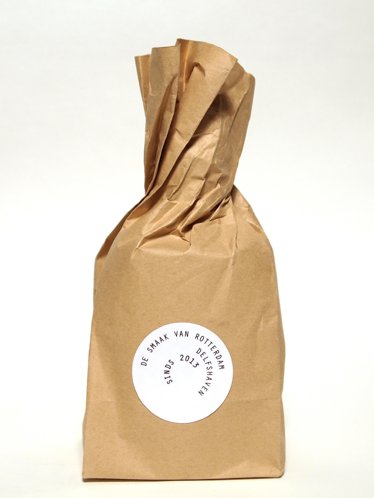
The brown gift bag

Brown gift bag, coasters, cigar and matchbox

Seeing the logo on the coaster through a shot of licqour

All together
The campaign
15 sec movies that flourishes online on social media such as facebook and instagram.
The movies shows the two founders of the project, looking for the right flavour for the booze by tasting some of the caracteristic places in Rotterdam.
A fish caught in the Euromast park
Water from the river 'Maas'
An old ferry which now is a hotel/reastaurant
A statue of an old famous boxer
A big statue of Santa Claus the locals call kabounter buttplug (buttplug gnome)


A huge thanks to everyone at Ping-Pong design, Rotterdam.


