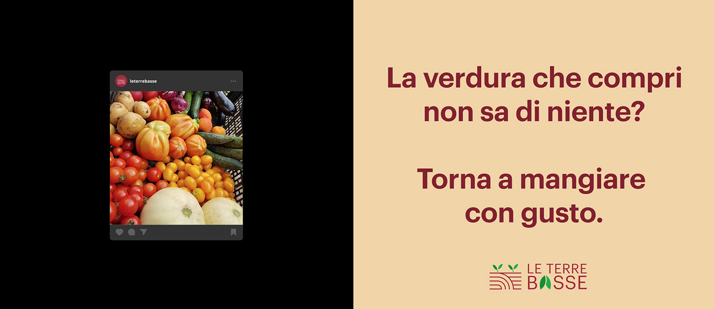
Brand Identity i designed for Le Terre Basse, a service thought to sell products grown in a specific area of the Lombardy countryside, in the north of Italy. The two small farms behind the project want to promote a traditional way of farming, to best preserve the flavours to those lands.
Starting from the value proposition of the project, the tone and the mood have been set. The aim is being reliable and professional, but at the same time being familiar, real and tangible, without artifacts. This mood has been reflected in the entire brand system: the iconography of the logo, the font and the colours.


The concept of simple farming without pesticides, in order to preserve the naturalness and the flavours of the products, and the concept of continuity with the older generations in the way of farming which brings a sense of familiarity and nostalgia. The shapes of the logo want to embrace those concepts.