


Margem
PT
Inclusão, valorização e personalidade foram alguns dos conceitos que serviram como base para o redesenho de marca da Margem. Levando em consideração a identidade visual atual e a história da marca, buscou-se representar sua evolução visualmente, para assim, agregar valor e criar algo atemporal, adaptável e coletivo.
Inclusão, valorização e personalidade foram alguns dos conceitos que serviram como base para o redesenho de marca da Margem. Levando em consideração a identidade visual atual e a história da marca, buscou-se representar sua evolução visualmente, para assim, agregar valor e criar algo atemporal, adaptável e coletivo.
Uma das premissas principais da Margem é trazer quem está à margem da sociedade para um lugar onde ela se sinta incluída, livre, sem medo de julgamentos. Tendo isso em vista, o redesenho do logotipo teve a intenção de mostrar essa força que a Margem tem, assim como seu envolvimento e preocupação com o público se sentir livre. Para isso, o logotipo foi construído a partir de uma tipografia com inspirações clássicas com bastante contraste, característica que agrega valor, respeito e força. A tipografia em caixa baixa traz humanidade ao logotipo, se tornando, além de tudo, uma marca inclusiva para o público.
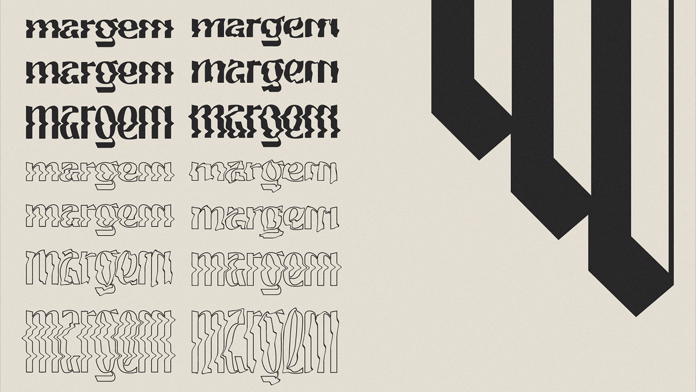
Com a personalização da tipografia, foram criadas diversas versões e elementos gráficos para que a marca seja dinâmica sem perder suas características. Assim, foi desenvolvida uma identidade visual duradoura e de alta aplicabilidade, atendendo aos aspectos mais importantes da Margem.
EN
Inclusion, appreciation and personality were some of the concepts that served as the basis for Margem's brand redesign. Taking into account the current visual identity and the history of the brand, we sought to represent its evolution visually, in order to add value and create something timeless, adaptable and collective.
One of the main premises of Margem is to bring those who are on the margins of society to a place where they feel included, free and without fear of judgment. With that in mind, the redesign of the logo was intended to show the strength that the brand has, as well as its involvement and concern for the public's freedom. The logo was built from a typography with classic inspirations and a lot of contrast, adding value, respect and strength. The lowercase typography brings humanity to the logo, becoming, above all, an inclusive brand for the public.
With the customization of the typography, several versions and graphic elements were created so that the brand can change without losing its characteristics. Thus, a lasting and highly applicable visual identity was developed, meeting the most important aspects of Margem.


Paleta de cores
PT
Uma paleta criativa, forte, primária, com tons clássicos que remetem ao estilo de impressão antiga, com predominância do cinza escuro e do off-white.
EN
A creative, strong and primary palette, with classic tones that refers to old printing, with a predominance of dark gray and off-white.

Tipografia
PT
Satoshi é uma família de fontes sem serifas, uma grotesca com desenho mais geométrico. Ela possui uma boa variedade de pesos resultando em muitas possibilidades de uso na comunicação digital e offline. Por ter um desenho clássico mas moderno, ela não interfere no estilo das fontes que serão usadas nos materiais de cada festa.
EN
Satoshi is a sans serif font family, a grotesque with a more geometric design. Is has a good range of weights, resulting in many useful possibilities in both digital and offline medias. By having a classic but modern design, it doesn't interfere with the style of the fonts and designs that will be used to communicate each party.


CREDITS
Client: Margem
Creative Direction: Victor Schmitt e Bruna Paz
Design: oitozerooito — Bruna Paz, Larissa Mendes, Pablo de Almeida, Victor Schmitt
Design: oitozerooito — Bruna Paz, Larissa Mendes, Pablo de Almeida, Victor Schmitt


