


As a beauty product, Azloe cares about the process of taking care of the skin. Just like flowers growing in the garden, every process is lovely. Four years of walking along the path, Azloe has gone through a transformation process where it became more cheerful, more youthful, just like summer flowers in bloom.

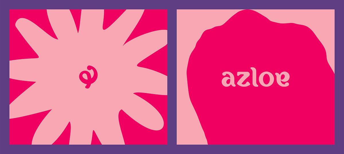
To express Azloe’s visual identity, we try to bring up the idea about flower as the symbol of being cheerful and adorable. We also take notes on how flowers are depicted to have positive sentiments and symbolisation on beauty and liveliness. Flower comes from seeds that’s been planted in the dirt, if we take care of it properly, it will bloom beautifully.
Azloe wants to express the importance of keeping our young spirit alive by radiating the joy of doing things and expressing it. We see Azloe as the big sister who listens and understands the ups and downs of skin journey which is felt by Azloe Sisters. We want to bring up awareness about the beauty of process, which happens to all of us. Everyone goes through different phase of skin journey, and Azloe wants to be a part of their blooming process. Because it’s not really about the age, everyone can feel youthful.


Azloe also wants to encourage its audience (Azloe Sisters) to grow and glow.

POT Branding House for Azloe.
Account Executive & Producer Zidah Noerwenda. Project Manager Islam Bilhaqy. Creative Director Bayu Rengga Mauludy. Researcher Rika Fitriani. Senior Graphic Designer Asrul Adam Pasai. Graphic Designer Aprilia Annisa. Copywriter Risabella Miranda. Photographer Dani Effendi. Videographer Raoul Adam. Sound Designer Dissa Kamajaya.
Copyright © 2020. All rights reserved.


