


Viber Media
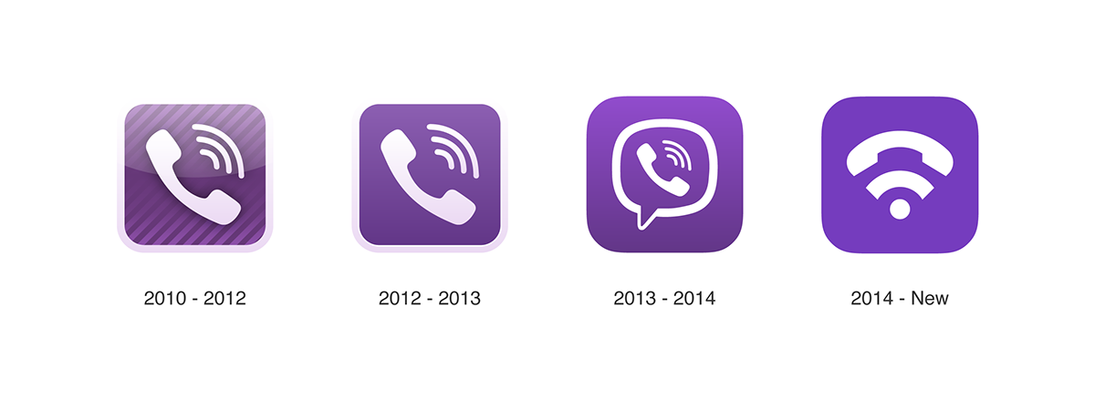
This innovative "V" shaped logo is created for Viber Media. Its identity was designed having the Wi-Fi icon and a telephone handset in mind, both of them implying a connection. The top part of the brand mark symbolizes a telephone handset, which, even though retro in itself, has become an acknowledged icon used to depict the action of calling and messaging - simply put, communicating. The overall Wi-Fi symbol refers to being able to use the application through the internet connection, freely.

Symbol Construction
The brand mark was carefully and attentively crafted using the Golden Ratio along with a minimalistic approach, resulting in a new identity that is straightforward, memorable and iconic. Such an identity will be effective in various applications and will become recongnizable trademark worldwide.


