About
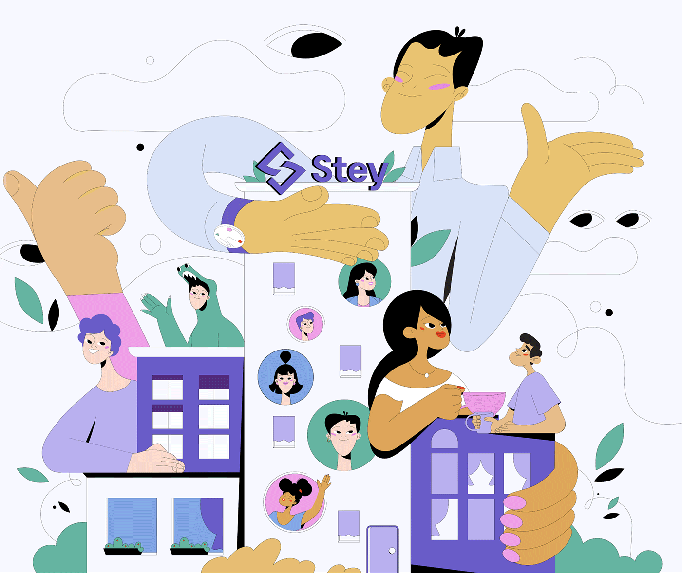
Stey is a combination of technology and modern design. It offers a new perspective on the way we live and where we live.
The main feature is flexibility and maximum customization regardless of location, mixed with social connections.
Our task was to highlight the most important features and present them in an engaging and snappy story.

Script
It could have been a standard explainer in which the time in the animation is filled to the brim with information. It certainly would not give pleasure to the viewers.
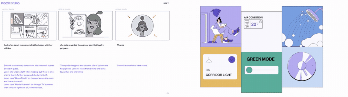
Well-balanced voiceover filled with useful pieces of information,
packed with an easy and friendly story.
Changing the pace of the animation keeps the viewer's mind in focus until the end.
Interest and belief in the coolness of the presented technology, startup, or product are worth more than insightful understanding.
This belief is a common reason why we value one solution over another. Despite a huge amount of information, we keep in mind that it has to look cool and likeable.
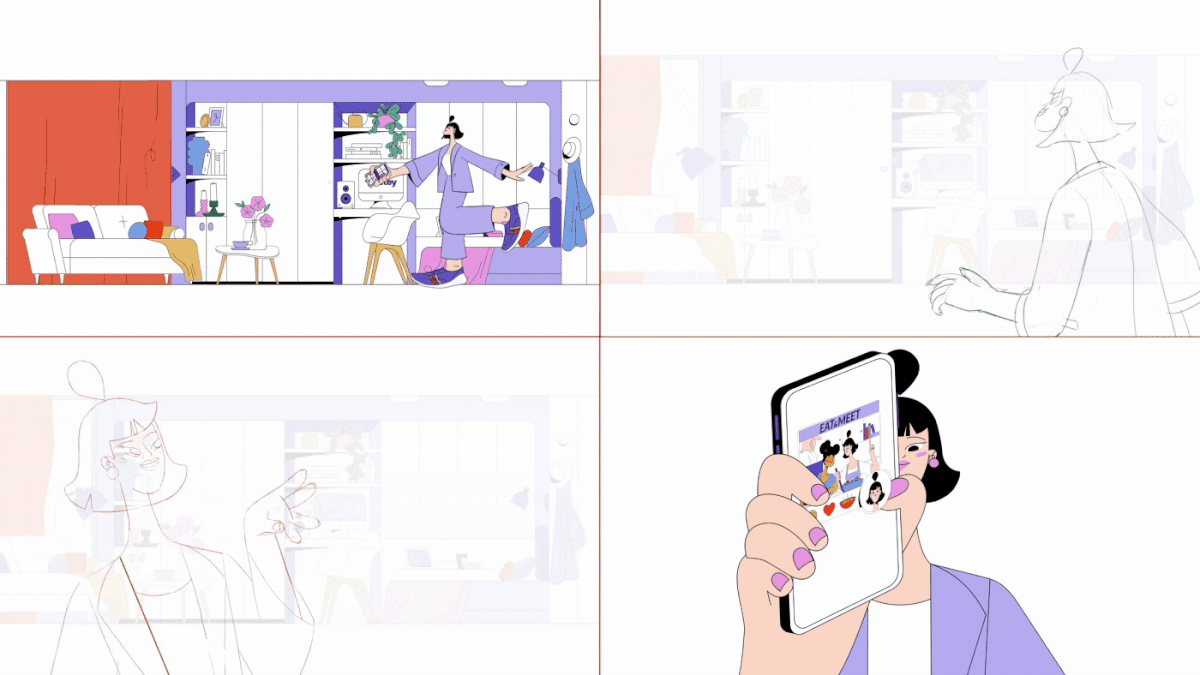
The main assumption when writing the voiceover text was that there are two protagonists. The leading voice and the main heroine.
The narrator, in the way he addresses the main character, brings us closer to her. Our first impression of Jannet is that she might be someone we'd like, and perhaps we would like to know her better if we met her in the hotel.
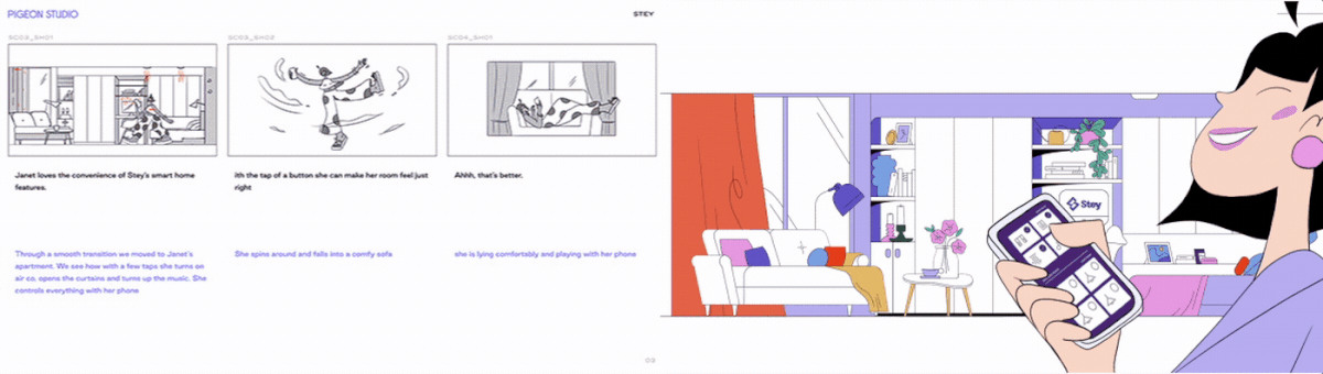
Thanks to the narration, we know that Jannet likes comfort, she is open-minded, and she is constantly on the move.

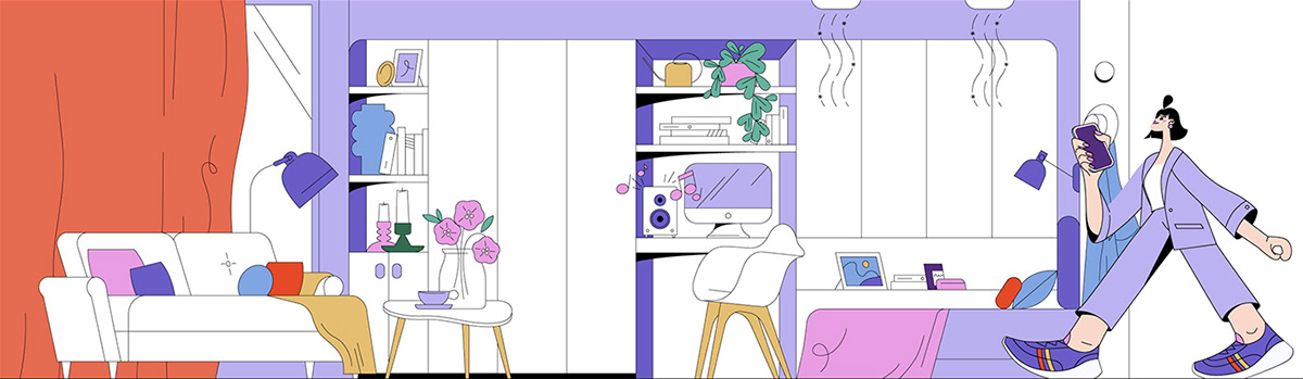
Character Design
Creating a main character of the animation is almost like creating
a brand hero but faster. ;-)
a brand hero but faster. ;-)
However, the requirements remain the same.
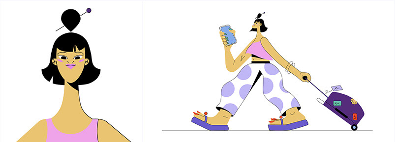
The character must be in line with the values of the brand, and represent the target group.
Below you can see how Jannet's character has evolved in successive versions.
Below you can see how Jannet's character has evolved in successive versions.
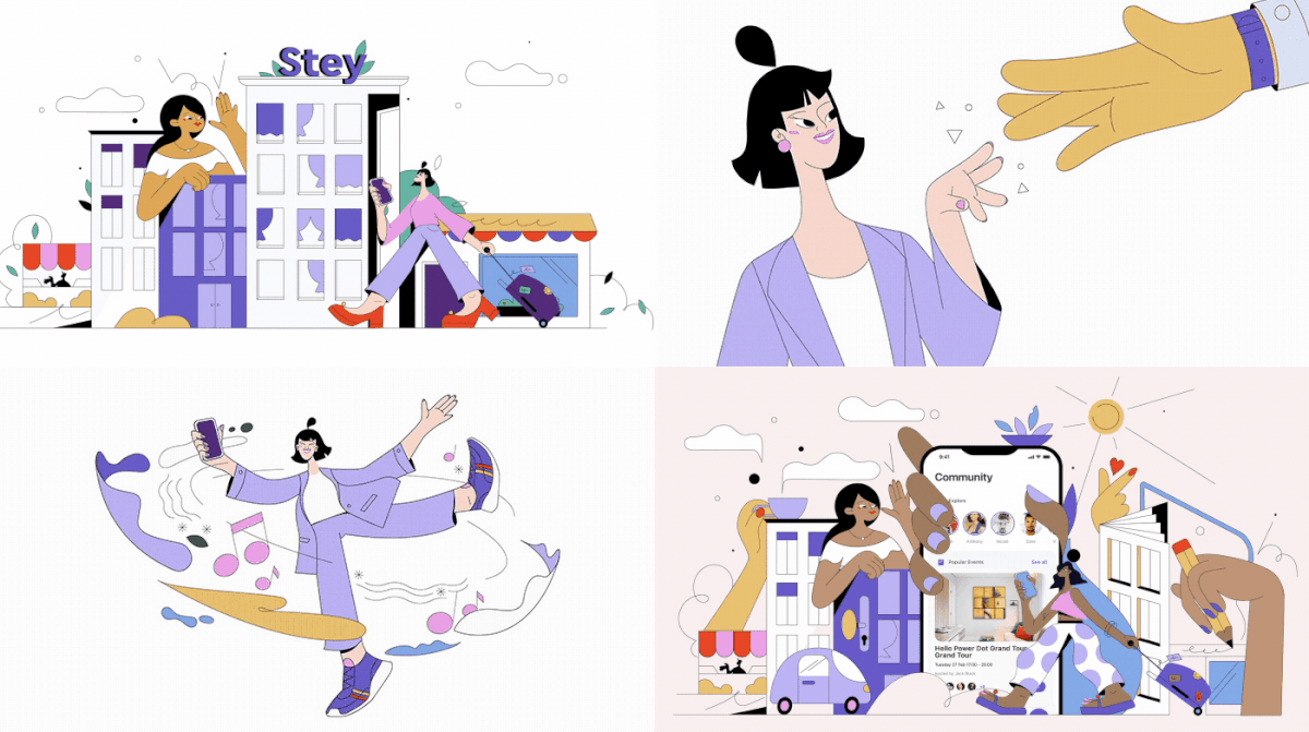
Illustration
The original assumptions for the styling were a little different from what was finally created.
Originally, the style was to reconcile illustration and animation and combine with the design of the STEY app. While working on the project, we departed from this assumption and the entire animation is in a unified style.
Stylized characters and selective color scheme smoothly correspond to the brand, result in a clear and attractive illustration.
Rather than leave the background ordinary, we designed the illustrations in a way that corresponded with things that did not ring in the voiceover.
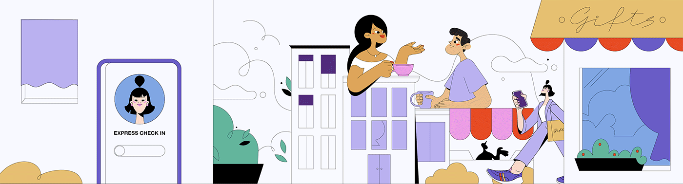
The atmosphere of the city and its friendly character are symbolized by characters sipping coffee on the roof of the building which they treat as a table.
The kitchen atmosphere is heightened by giant hands sprinkling spice, and when there is a shortage of milk, a friendly fellow serves it by coming out from inside the refrigerator.
Why?
Because, why not?
Sound
It hurts, but sound is 80% of the success of any animation. Even more brutal statement is that poor animation is much better to watch when it has very good sound.
Conversely, great animation will not defend poor sound.
Unfortunately, all of this is true.
Therefore, we rely on the best cooperation, and work with creators can go deeper to find what our animation needs. Toward the beginning, it seemed important to keep the sound abstract.
Instead of taking inspiration from reality, the obvious sounds were interpreted
and recreated to become part of the music track. The best example are in the first 10 seconds of the video.
Creative Team
Creative Director: Sławek Wydra
Copy: Mike Irvine
Project Manager: Kasia Kucaj
Client Relation Manager: Agnieszka Jania
Art Director: Romka Kapusta
Lead Animator: Kasia K. Pieróg
3d/2d Animation: Wojtek Siejak
2d Animation: Sara Marinoni
Cell animation: Julia Marchowska
Alicja Grotuz
Agata Patoła
Motion/Animation: Michał Kowalczyk
Lead Illustrator: Magda Koźlicka
Illustration: Gosia Jeniec
Sound Design: Robert Ostiak