


Ocumen Software Development Company
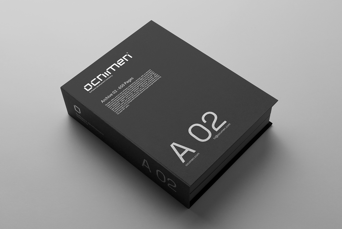
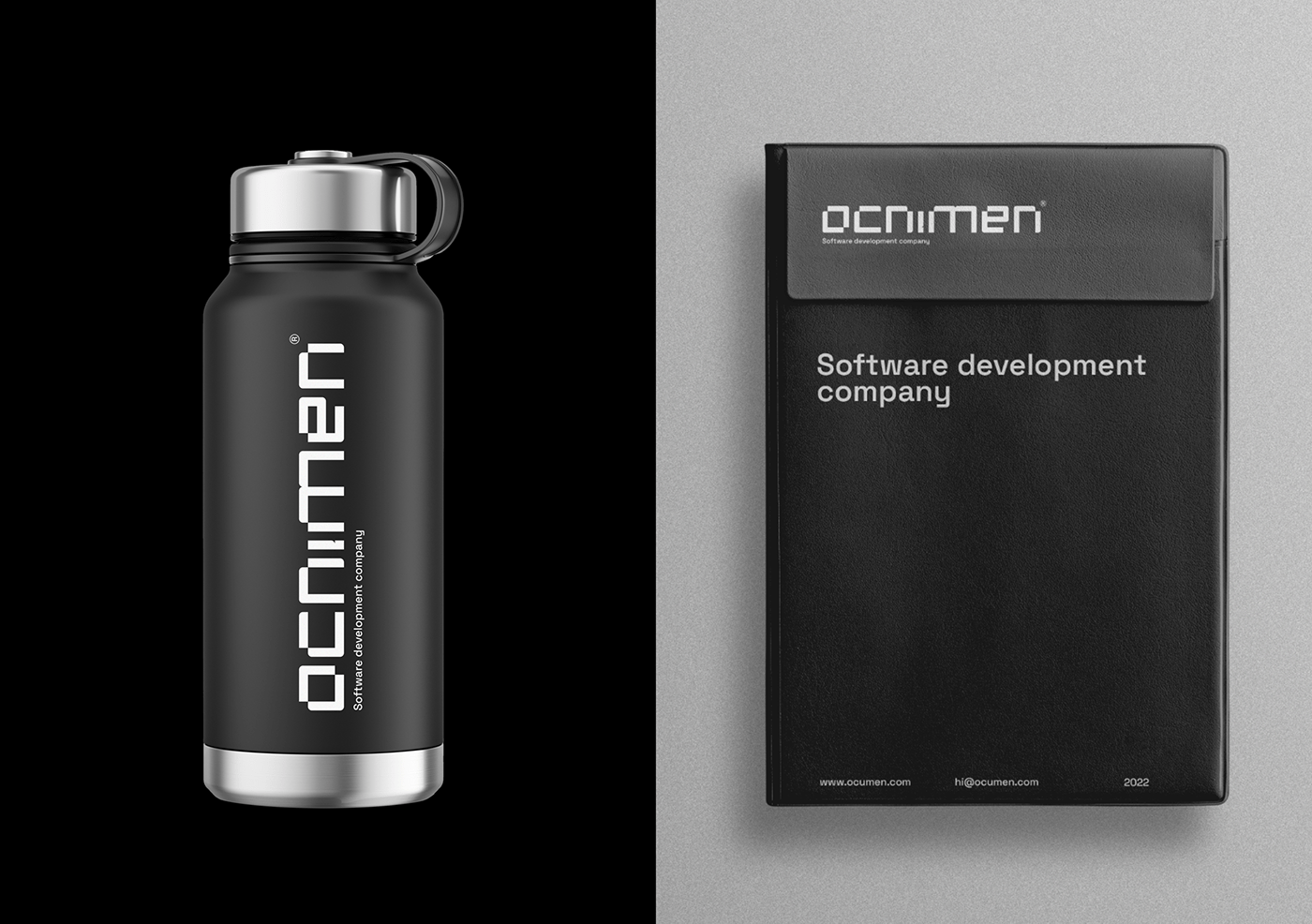
ocumen is a fictional project for the software development company. The logo is based on modular style and Latin letters. Instead of the Latin letter U , I use the Armenian letter U, as an accent of Armenian origins. The basis of Brand identity is purity and solidity, so I used 3 colors: black, white and gray.
The symbol is the letter O, which also represents 2 brackets (). It is used a lot in programming. Which creates a lot of associations with the company’s services. It creates a connection between the visual brand and the company. The entire visual brand is made in one font.The symbol is the letter O, which also represents 2 brackets (). It is used a lot in programming. Which creates a lot of associations with the company’s services. It creates a connection between the Brand identity and the company. The entire Brand identity is made in one font.
Goal:
Make a Brand identity for software development company, which will be solidly, modern based on typography, little Armenian accent in logotype, leaving the impression of trust and professionalism.


Ocumen Brand identity
Design by Tonelyan Vahan
Thanks
3d Artist Garik Khodaveerdi
Motion Designer Artavazd Klekchyan


