KUBIEC BRAND REDESIGN
ECUADOR
CONTEXT
Kubiec offers innovative products for construction and metalworking, manufactured using environmentally friendly processes.
GOAL
Analyze the old logotype and redesign it in order to fix its visual problems.
The old logo had many problems regarding its composition and hierarchy. Due to it having a very horizontal composition and putting a lot of focus in the isotype, the performance of the logo was compromised when it was used in small sizes or from afar. The used type felt as old dated, and made the brand look old.
SOLUTION
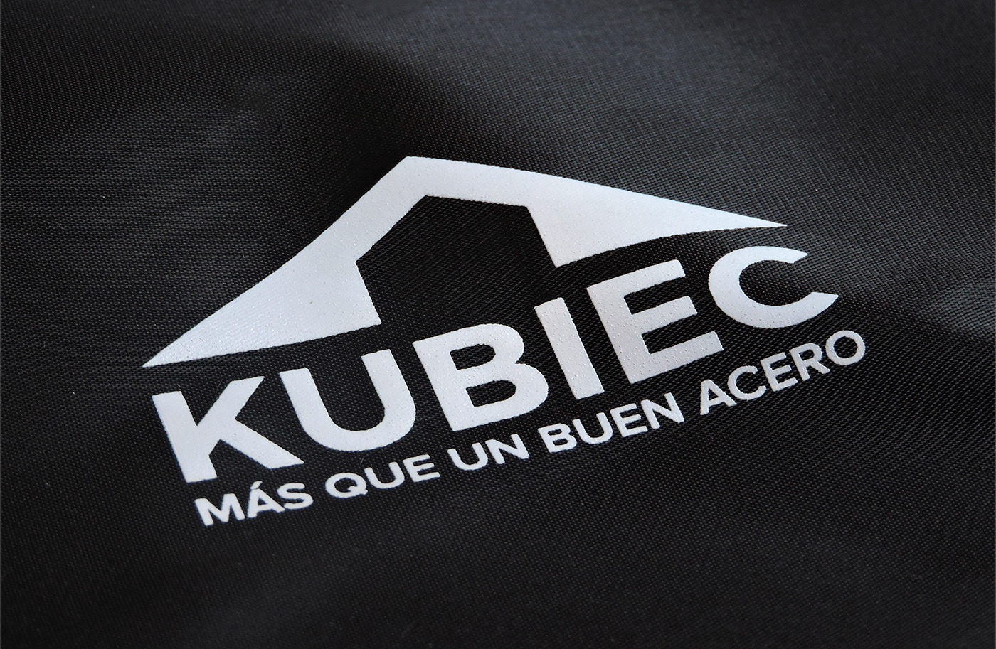
After an analysis of the old logo, two key elements were identified: the triangle-shaped symbol and the green color. The symbol was modified to have a better performance, and a strong and neutral typeface was chosen that would not compete with the isotype. A more vivid green color was chosen, and the color palette was complemented with a dark gray.


