Client
A group of fast food delivery restaurants Secret Kitchen, which was launching a new food direction — Japanese cuisine delivery.
Task
The client wanted to develop a new brand of Japanese food delivery where the quality, taste and aesthetics play the main role. Our task was to find the visual identics which reflect the client’s positioning. To complete the task we had to analyze the market, examine the product, form a way of highlighting the brand and explain the value of it to the consumer.
Solution
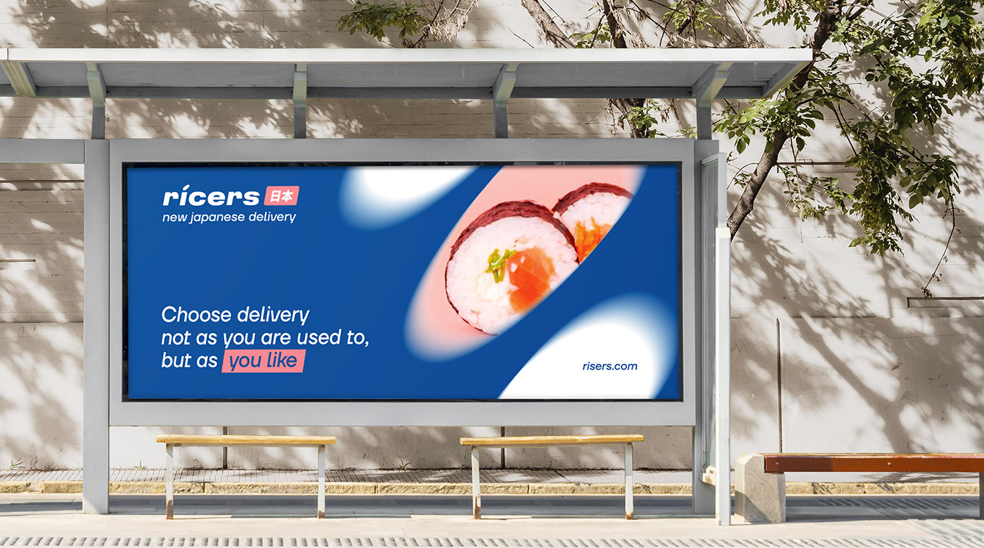
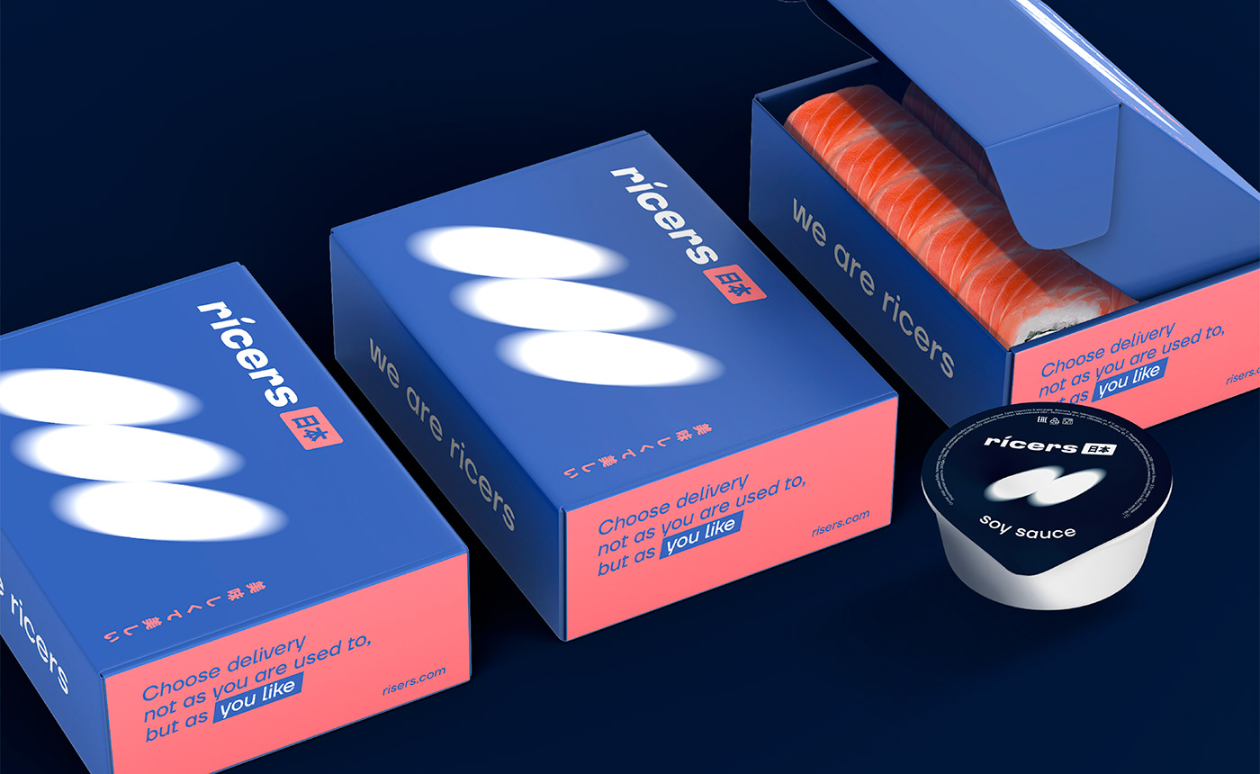
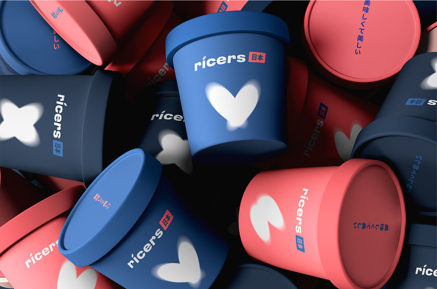
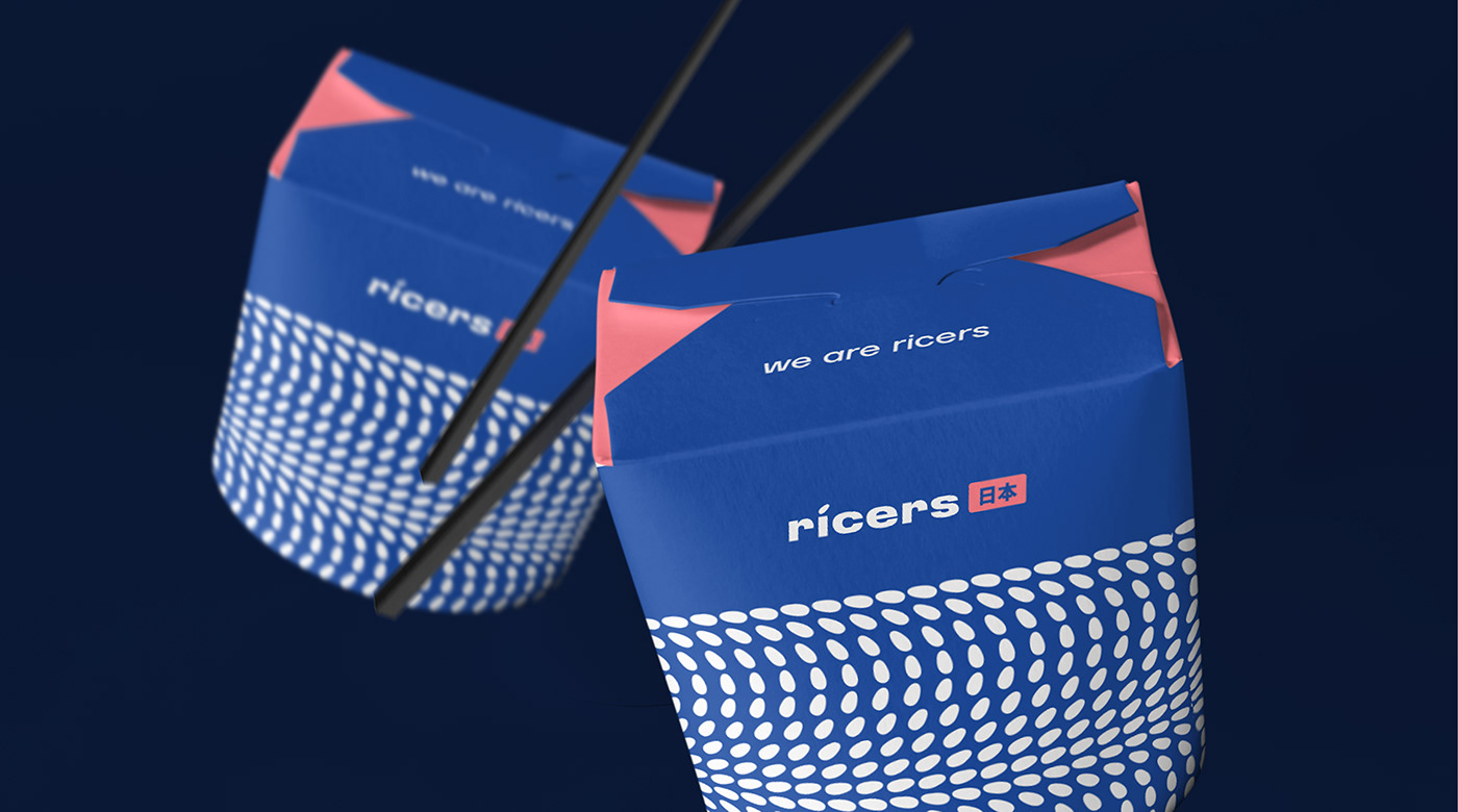
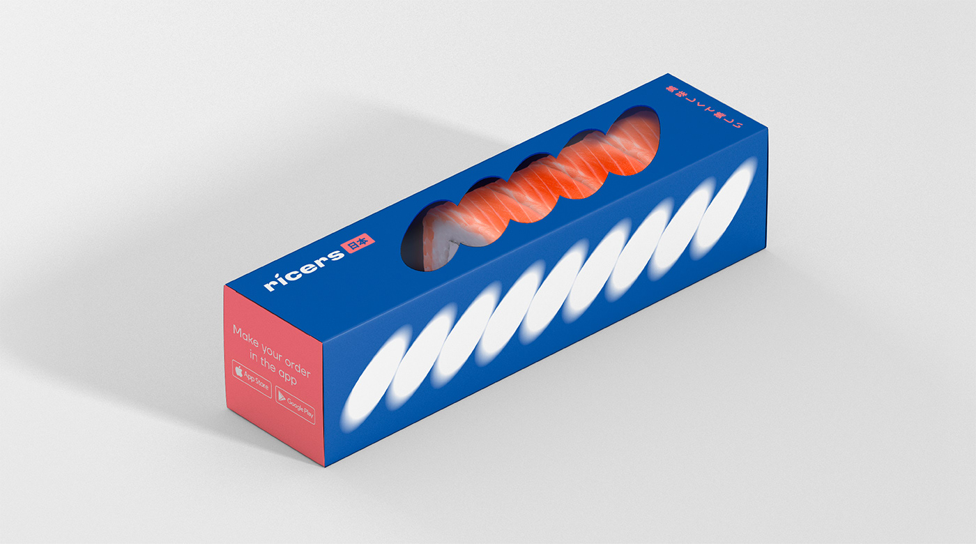
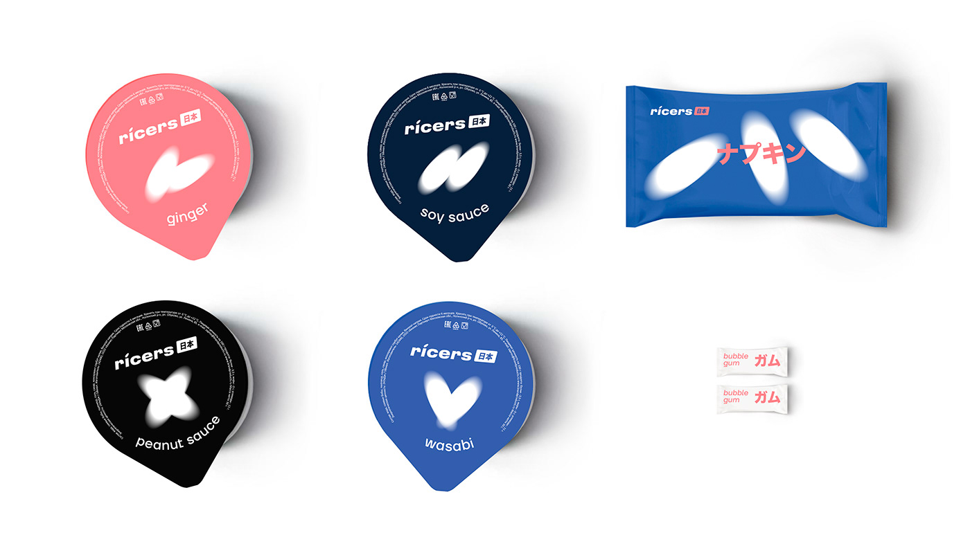
The logo font is made with a slight tilt, which sets the desired degree of dynamics and sends speeds. The fact that The Ricers is about real Japan is indicated by the hieroglyph next to the font part. What are the common points in naming, product and logo? A small piece of rice. We decided to make it not just the basic unit of the brand identification or a concise and recognizable symbol, but also a real character. It interacts with consumers in social networks and makes communication friendly.


Communication
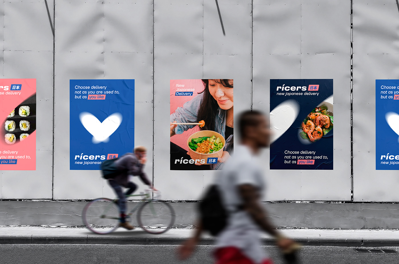
To enrich the brand communication and make it more friendly we draw some characters. They form a friendly brand image and the photo style continues the everyday hedonism idea. The food seems to be bright and accent, delicious and appealing. Bright colors create anticipation and make the product desirable.