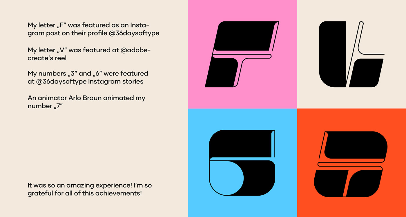
This year I participated in the international #36daysoftype challenge. It was the 9th edition and I had some minor and major successes in this edition (recognition by Adobe Create, by 36daysoftype, or in the stores challenge).
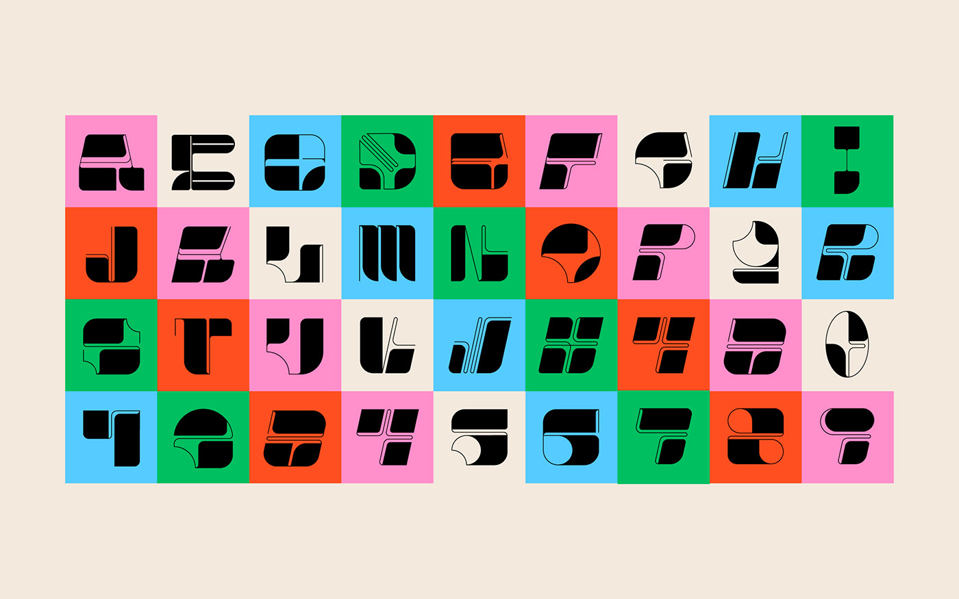
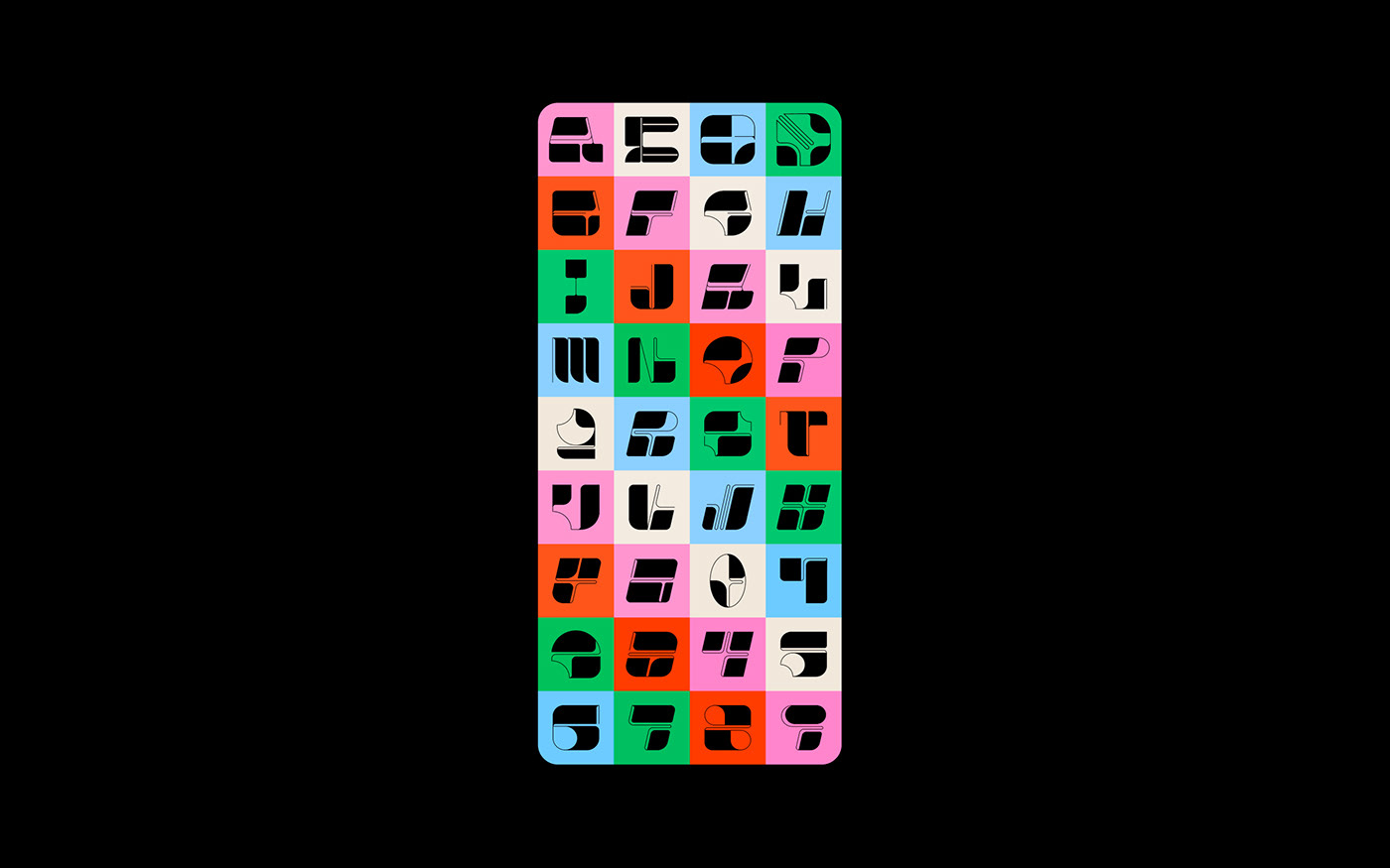
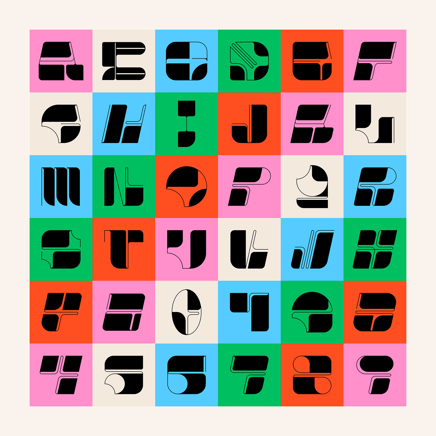
My main idea, which guided me, was to design each letter as a divisive, individual piece of art, where I bring out what I see most interesting and valuable in a given letter. I used solid shapes combined with linear elements.
My main idea, which guided me, was to design each letter as a divisive, individual piece of art, where I bring out what I see most interesting and valuable in a given letter. I used solid shapes combined with linear elements.