


Cashnote Brand Identity Renewal
Project Overview
Cashnote started in 2016 as a chatbot-based sales notification service for small business owners and expanded its scope to multiple services including finance, community, and marketing. In 2019, Cashnote faced the reality of business owners whose livelihoods were jeopardized beyond difficult times due to the emergence of COVID-19 and its prolonged effect on society. At this time, Cashnote established trust by providing customized news related to government grants that offered substantial financial assistance and Cashnote now is a service used by over one million business owners.
With the rapid growth of the brand, Cashnote realized its brand assets are mixed and confusing. It was time to have a consistent brand identity that encompasses the overall brand. Accordingly, Cashnote planned a project to build the simplest and most intuitive Cashnoteness to which internal and external consumers could easily relate.
Project Approach
Cashnote started as a simple sales notification service using mobile messenger but now it is moving forward as a brand for sharing every moment of business and offering more comprehensive services for business owners based on the brand vision and mission: Easier, faster, and smarter. Cashnote is expanding its lineup of services to include a function to easily check tax information and the community to have conversations with other business owners in the same industry. However, consumer’s brand awareness of Cashnote still remains as the sales notification service, which generates a gap from our goal of becoming a brand that shares every moment with business owners.
Brand Essence
The common ground found through the direction of Cashnote service that continues from the beginning to now and was prominent in interviews with the internal personnel was that Cashnote is an exclusive service for business owners. Cashnote’s identity was defined based on the brand’s ultimate goal to help business owners focus solely on the essence of their business and the internalized brand direction.
Brand Core Value
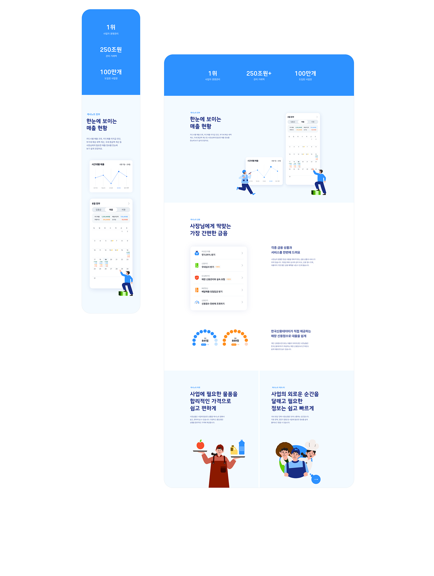
To intuitively show Cashnote is a brand that shares every moment of the business, we looked into how Cashnote empathizes with heavy responsibilities, loneliness, and the need for help that business owners feel and what it does to help business owners.
First, Cashnote starts the day of a business owner with the sales notification service. Cashnote offers services such as taxation reports and managing regular customers that can be forgotten at busy times as well as organized data to check the history of daily sales at the end of a tiring day. Cashnote is an assistant that always supports business owners and is sometimes a reliable business partner for solving today’s problems and preventing problems in the future. The value Cashnote promises to business owners every moment of the day was established as Cashnoteness based on the experiences of business owners who are actual users of Cashnote.
Brand Tagline
“Fulfilling your business”
The old tagline of Cashnote, the easiest sales management could not embrace the expanding services of Cashnote. The goal was to include the brand essence and the convenience of consumers when using the service to support Cashnote’s identity. By expressing the consumer’s perspective of my business is filled, it was designed to emphasize the point that Cashnote reduces unnecessary time and costs for business owners, so they focus on the essence of the business and build sustainable, long-term goals for their brand. This reflects Cashnote’s sincerity in caring about business owners and their success in reaching their customers.
Symbol
Using the initial C and circling dot, the symbol of Cashnote represents the brand image of Cashnote for always staying next to business owners and looking over every moment of the business. In addition, the logo animation where the circling dot rotates around C in various forms intuitively expresses Cashnote for taking care of business owners from various angles.

Logotype
The English and Korean logotype of Cashnote reflects the characteristics of the symbol and includes details that can naturally integrate with the symbol. At the same time, it ensures legibility in a limited environment. The logotype is designed in the Geometric sans serif shape with straight lines and curves to give a friendly and trustworthy image.
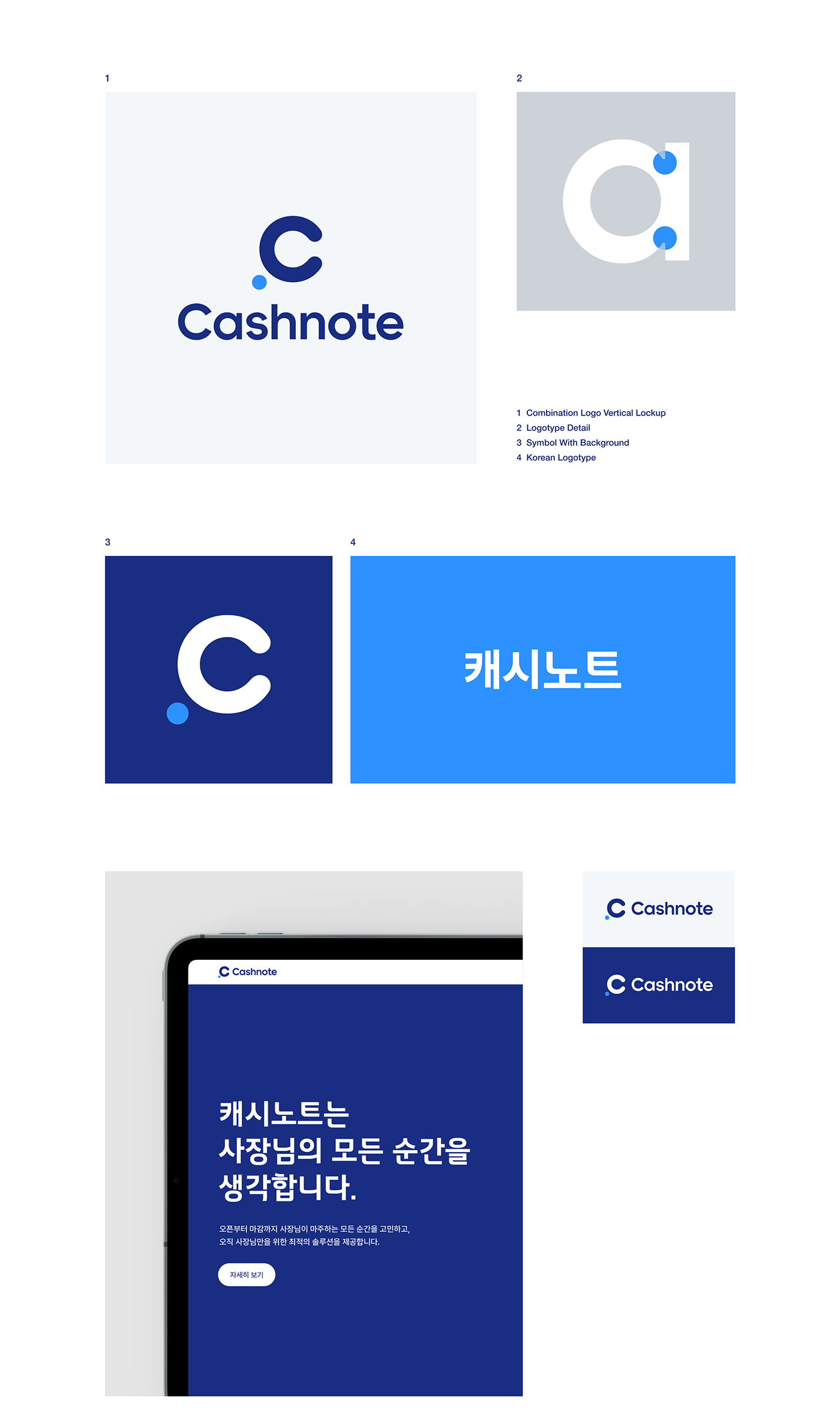
Color & Typography
The primary colors of Cashnote are in 6 steps: bright blue (Primary B 60) representing the honest and bright brand image and navy (Primary B 80) delivering the reliable and stately brand image.
The typography system of Cashnote is based on the characteristics of the contact point used. Pretendard with high usability and expandability was used as a UI system font, and Intelli Sans Round was used as a communication font because it delivers a friendly image and attracts attention.
The typography system of Cashnote is based on the characteristics of the contact point used. Pretendard with high usability and expandability was used as a UI system font, and Intelli Sans Round was used as a communication font because it delivers a friendly image and attracts attention.
Iconography
The iconography of Cashnote was developed by combining the circling dot motif of the symbol that always stays by business owners and the dynamic one-stroke drawing method. The iconography can effectively show the service characteristics of Cashnote in partial areas and when combined with key visuals, it expresses a friendly brand image of Cashnote that is always with business owners.
Illustration & Infographic
The detailed character illustrations reflecting the natural image of business owners emphasize the goal of Cashnote services that only care for business owners. Character illustrations are divided into a business owner who is the service user and Cashnote to depict various situations in the business from two perspectives. They also represent the lively and intuitive Cashnote services. Cashnote’s illustrations are a combination of individual elements, which can be used in diverse ways with object illustrations.


Brand Design Application
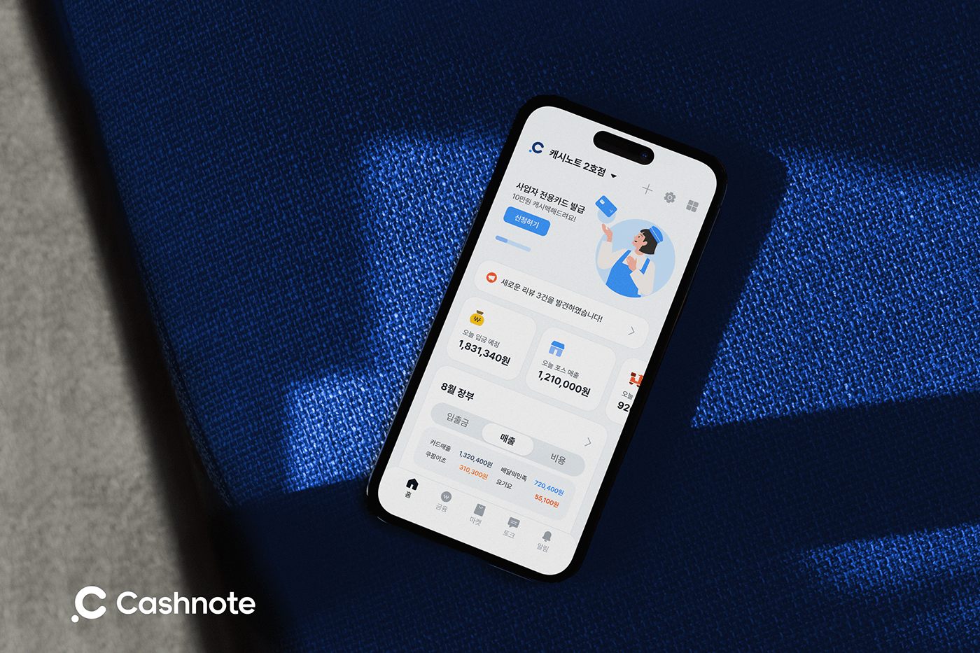
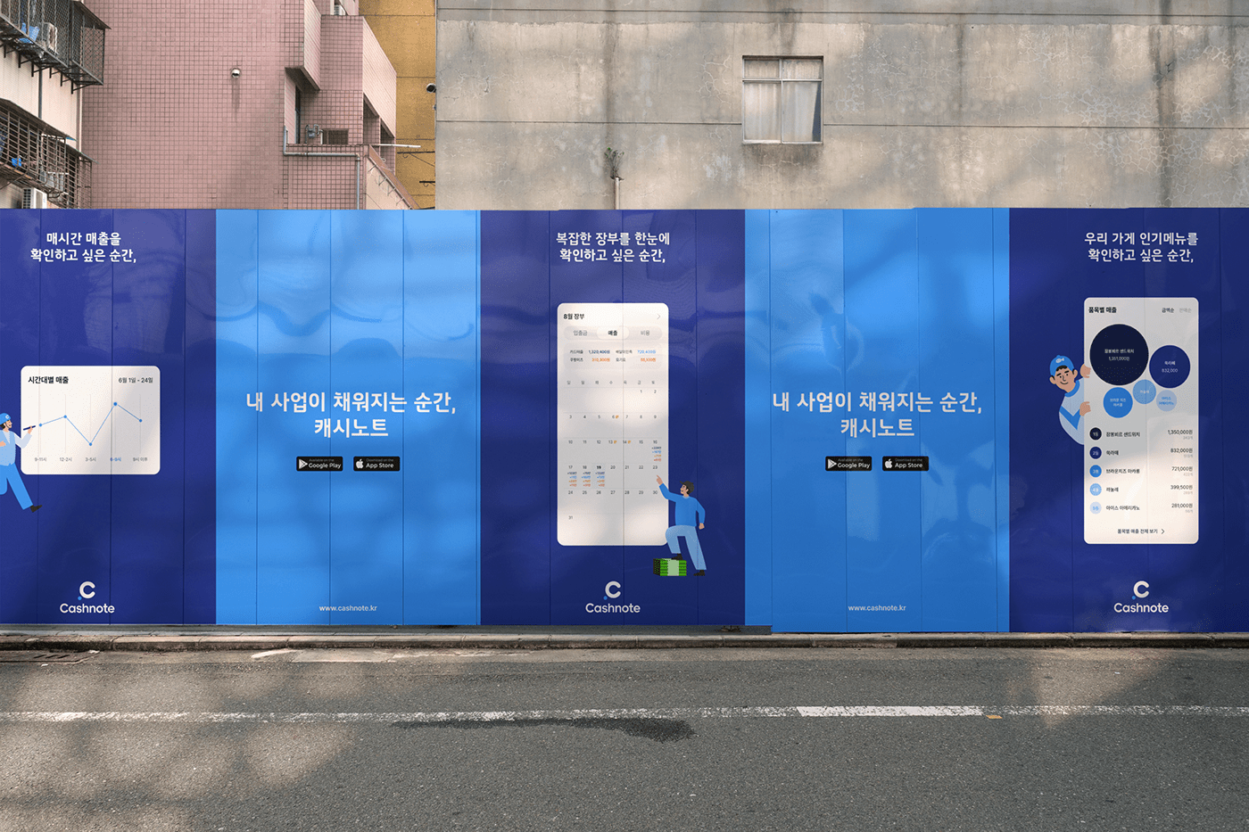
Key brand elements creating the brand identity of Cashnote such as logo, colors, fonts, icons, and illustrations reflect the friendly and trustworthy image of Cashnote taking care of business owners from various angles. All brand systems of Cashnote share the same principle of design expression and they are designed carefully to effectively express the brand image and ensure usability inside the application. These brand design elements are applied to online and offline contact points of Cashnote to organically connect the brand and its products and provide coherent brand experiences.


Cashnote Brand Identity Renewal
Plus X Creative Partner
Creative Director: Tyodi Hyojin Lee
Brand Design Advisor: Myungsup Shin
BX Design Director: Sunghwan Im, Sieun Baek
BX Strategist: Jeeyoung Song, Hyemin Oh
BX Designer: Yoonhak Lee, Sukmin Son, Seokjoon Kim
Korea Credit Data
CEO: Kelvin Kim
Brand Design Advisor: Myungsup Shin
Brand Communicator: Ella Lee
Brand Communicator: Ella Lee
Hour Minute Seconds
Brand Film Design: Kwangmyung Lim, Hyeonmo Kim
©2023 Plus X Creative Partner.


