The title for the booklet is a play on words with Professor Baker’s name. It is both a cookbook for Professor Baker and a booklet that bakers may enjoy as a change of pace from the food preparation they do daily. Hence, “Cooking for (a) Baker.”
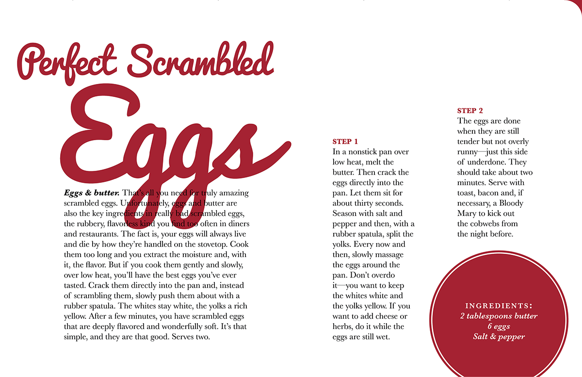
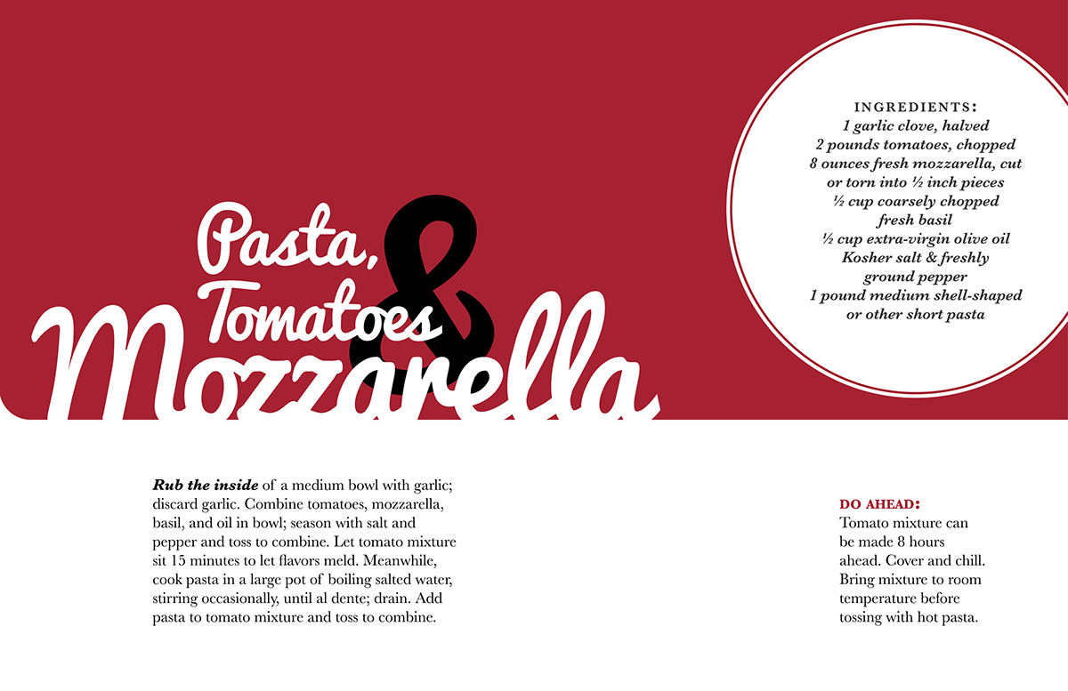
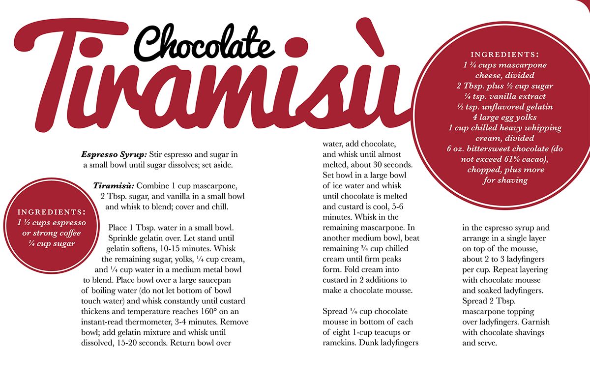
I searched for a typeface that felt both refined yet with a bit of inherent playfulness. After finding several solutions, I went with Pacifico. I loved the feel of the C, K, and B. My body copy is comprised of variations of the typeface Baskerville. Subheds are bold italic. Ingredient lists are semibold italic. Though not drastically different from the subheds styling, the subheds are far more scarce allowing for the ingredients list not to compete with the subheds. The ingredients hed is all caps but at a smaller point size with greater tracking. The space between capital letters allows for greater readability. My design is based on a seven column grid. This allows for an asymmetrical layout, and I have one column actually aligned between the center of two columns. For the titling of each page, I focused on a contrast of scale and the spatial relationships between words.
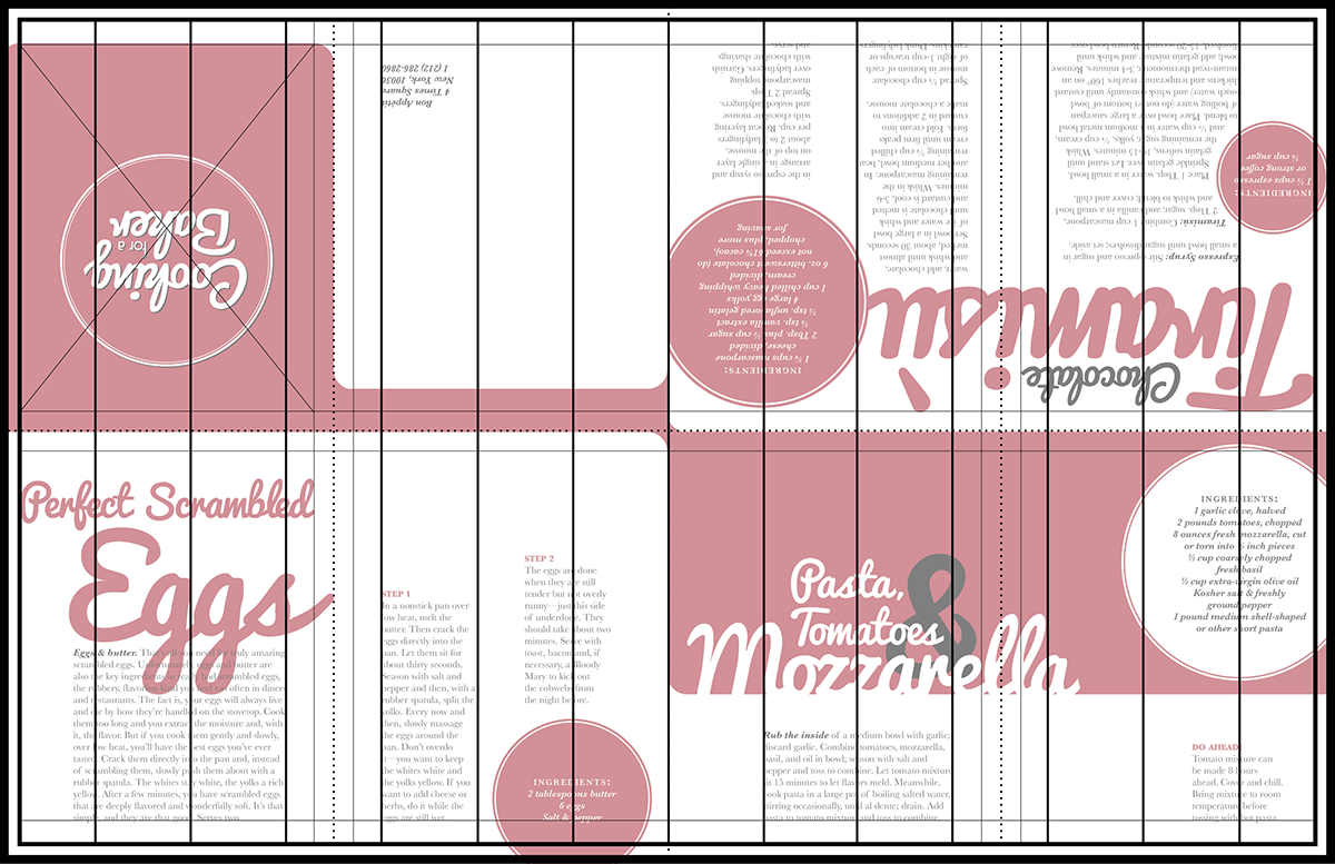
This is the way the booklet was originally designed. The printed booklet was to be folded from a single sheet, so certain pages had to be flipped upside down. The 7 column grid was over each spread. Otherwise, its a 3.5 column grid per page.

