


FITA.SP
VISUAL IDENTITY / PACKAGING
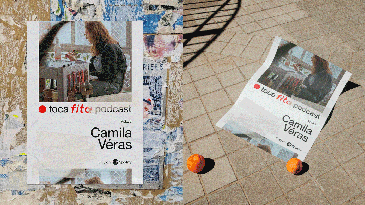
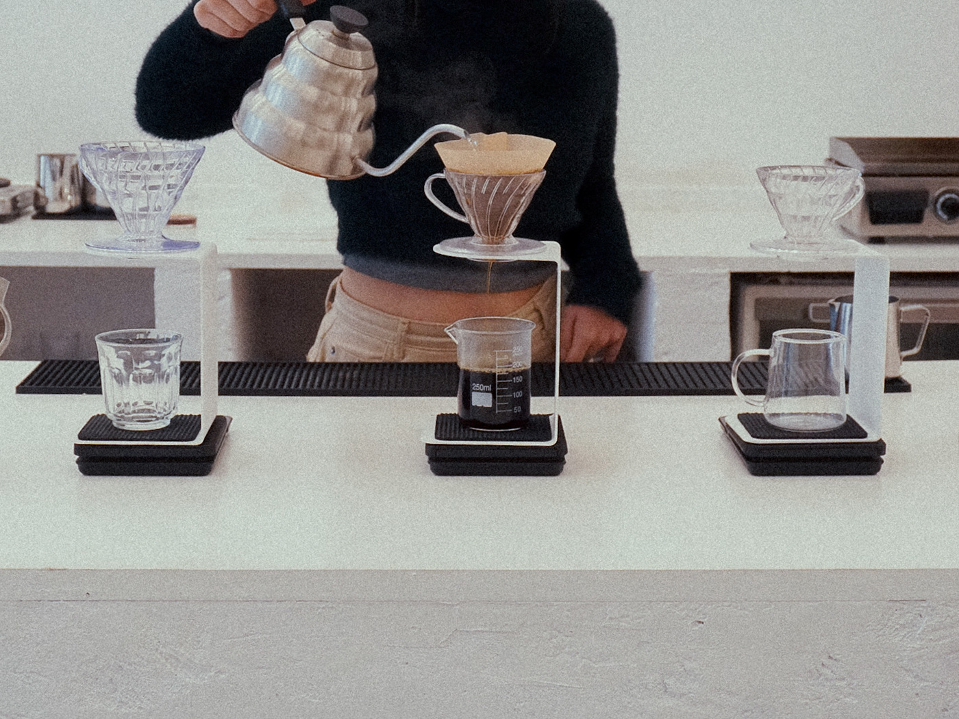
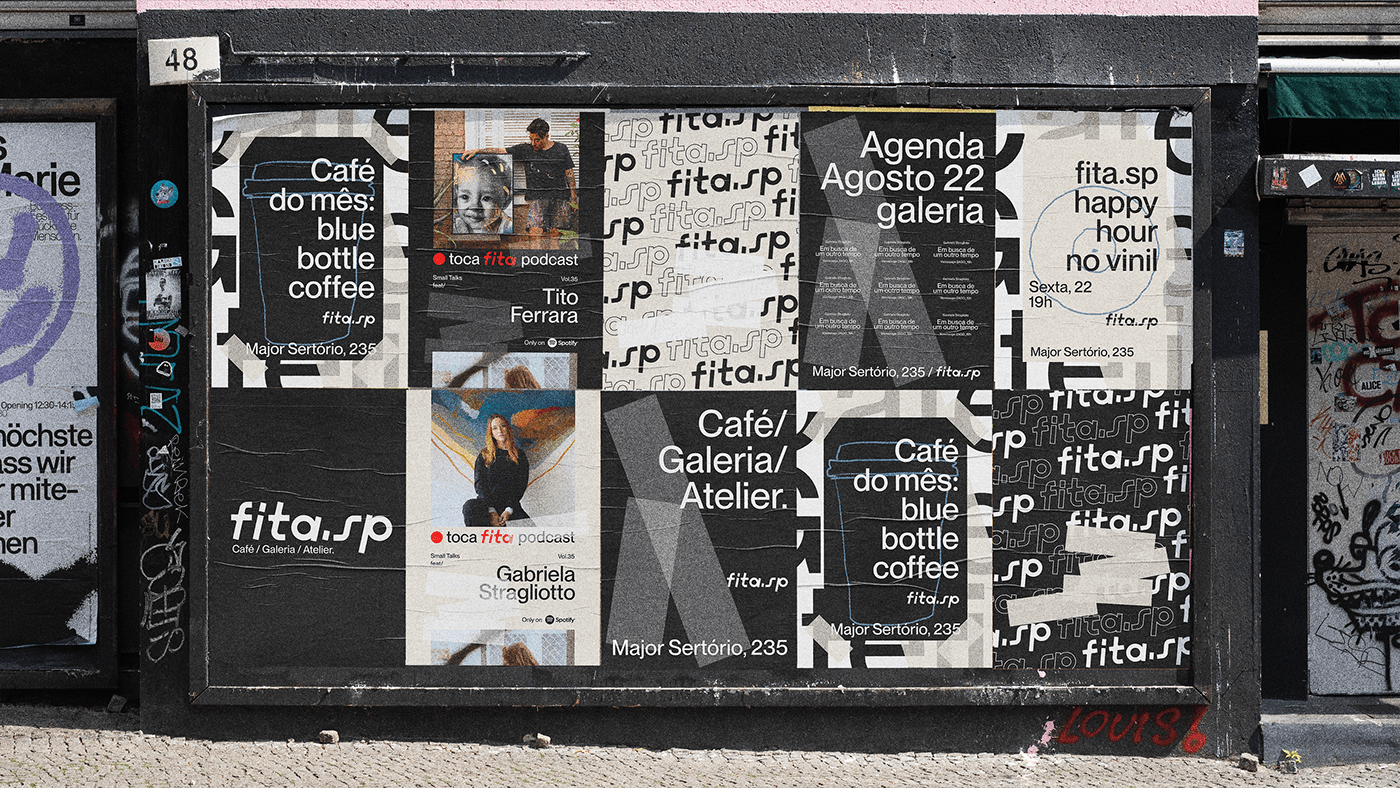
EN FITA.SP is a plural space in the heart of São Paulo, Brazil. The place has more than 3000 sq. We are talking about a coffee shop, an art gallery, a collaborative artist's atelier and also a workshop space within it.
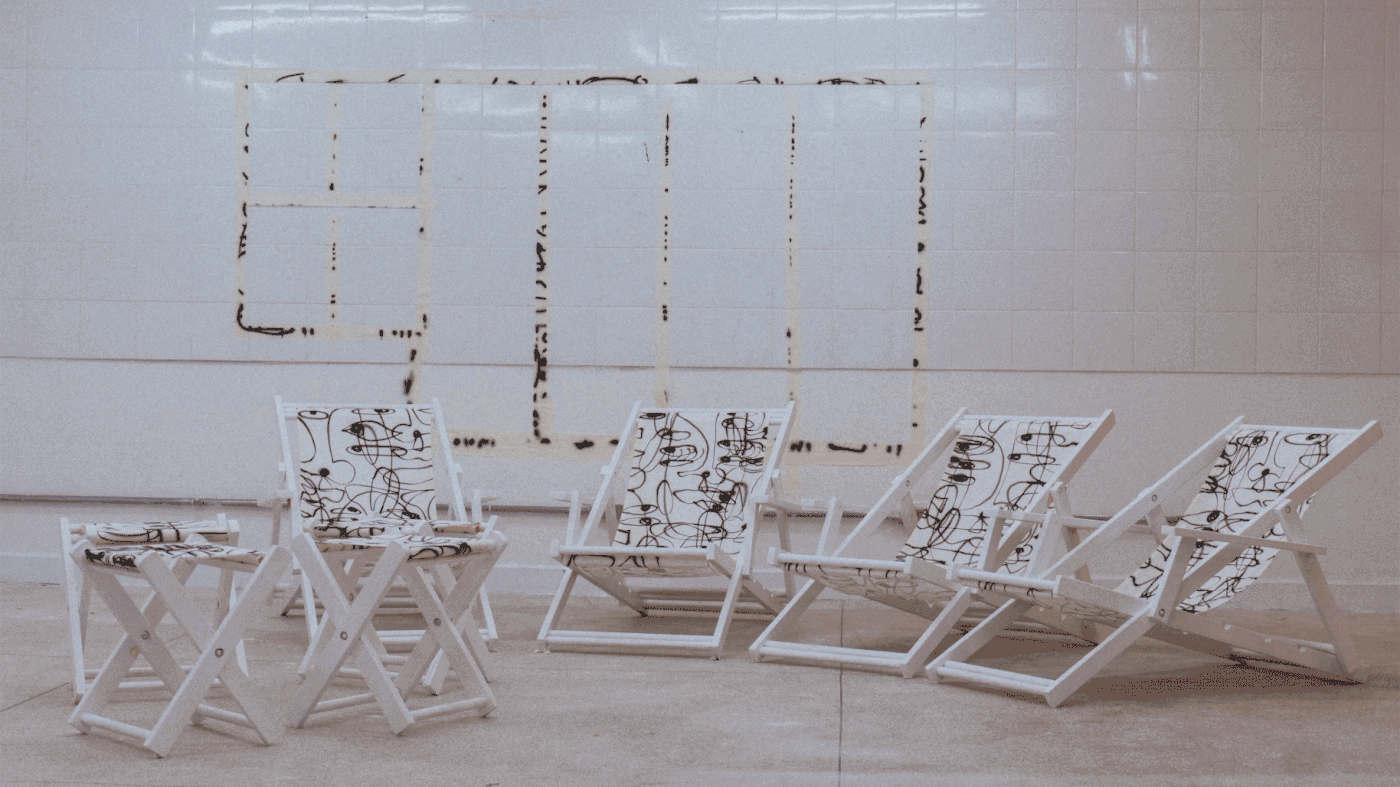
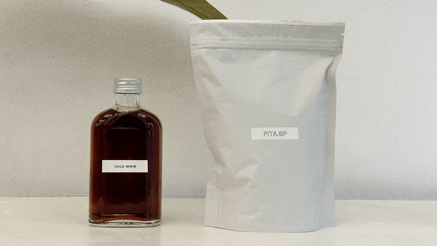
As a space that would become home to so much talent and inspiration we thought of slowing down the pace and create a canvas type of brand that would not overpower its core business and platform, the art. This brand comes to life with essential messaging, a nude hue tho play with the black&white, lots of natural fibers, parquet wood tiles, raw materials and negative space to be filled.
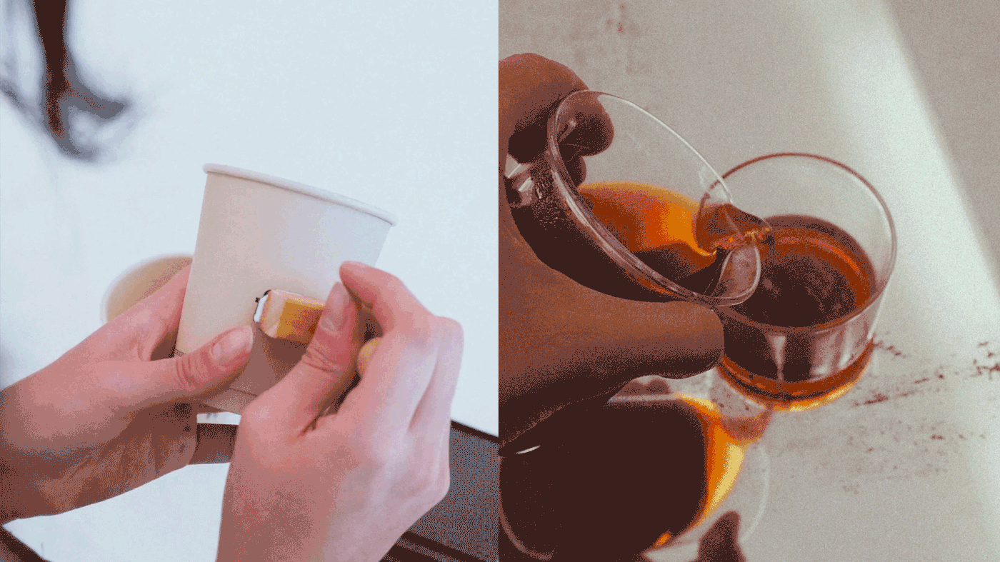
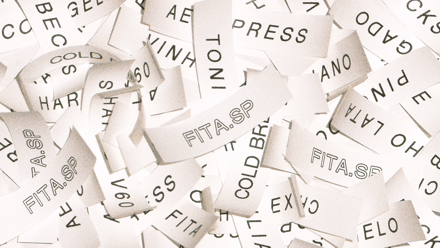
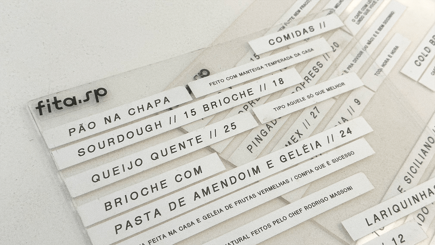
A brand identity that embraces the analogic and old school methods of hospitality branding, such as stamps and machine printed products on the menu. A place of warm people to embrace the brutal landscape of the region.
PT
FITA.SP é um espaço plural no coração de São Paulo, Brasil. O local tem mais de 3.000 m². Estamos falando de um café, uma galeria de arte, um ateliê de artistas colaborativos e também um espaço de oficina dentro dele.
Como um espaço que se tornaria o lar de tanto talento e inspiração, pensamos primeiro em diminuir o ritmo e criar uma marca tipo "Canvas" que não sobrepujasse o core business e plataforma principal do espaçco, a arte. FITA.SP nasce com uma narrativa simples e essencial, um tom nude que brinca com o P&B, o algodão em tom cru da bandeira na fachada, o parquet de madeira.
Uma identidade de marca que abraça o mundo analógico e a velha escola de branding de hospitalidade, como selos e produtos impressos à máquina no menu. Quente, aconchegante mas cru e impactante. Real.
Casamento perfeito com a região em que se encontra na cidade em São Paulo.


FITA.SP ®
A PROJECT BY BODEGA DESIGN STUDIO
CREATIVES
Artur Cunha
Eduardo Brandalise
WHAT WE'VE DONE
Visual Identity, Packaging
----------------
FOLLOW US: @saybodega
WEBSITE: bodega.design
A PROJECT BY BODEGA DESIGN STUDIO
CREATIVES
Artur Cunha
Eduardo Brandalise
WHAT WE'VE DONE
Visual Identity, Packaging
----------------
FOLLOW US: @saybodega
WEBSITE: bodega.design


