


The Luzhniki tennis club located at the legendary sports complex is the first and unprecedented project for amateur and pro tennis players, as well as for those who just want to stay fit or introduce their kids to the world of sports.
Sport and Fitness with Meaning is the key motto of our project that arose out of a comprehensive analysis of the future sports facility, the fitness market in Moscow, the audience demand and similar projects around the world. It reflects the main idea: the Luzhniki tennis club is a place where racquet sports amateurs and pros, as well as fitness aficionados, can meet and structure their training in a thoughtful way reflective of every club member’s personal goals and capabilities. Everything there will make you enjoy the very process of training. They are not going to just handle your body:
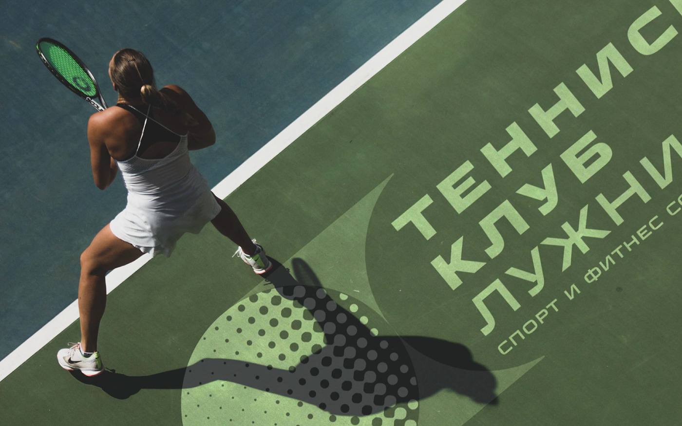
the Luzhniki tennis club is a place for NETSPORTING that satisfies both sporting and social needs.
Сorporate style, built around a tennis ball mid-flight, symbolizes the dynamic and the process of achieving the key result: being happy with sport and fitness.
Wayfinding was also developed, which was born from the brand and architecture of the new building of the tennis club.


credits:
art direction: Marina Slobodyanina
graphic design: Nastya Petrova
wayfinding design: Olya Poplawska, Natasha Kabaeva
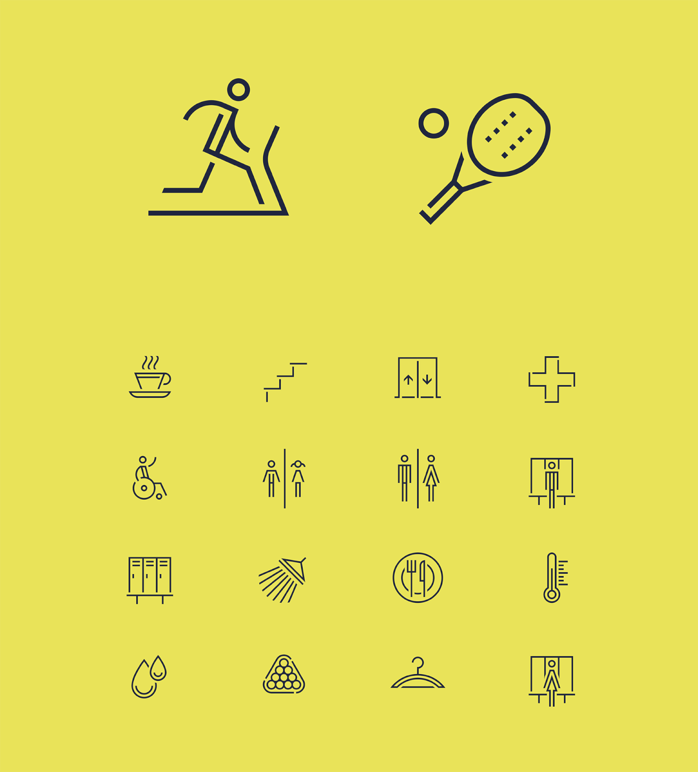
icon design: Marina Novikova
map design: Alexander Pivovarov
CG: Oleg Mushta


