
Zarantonello
Branding
© 2022 by Mate ®
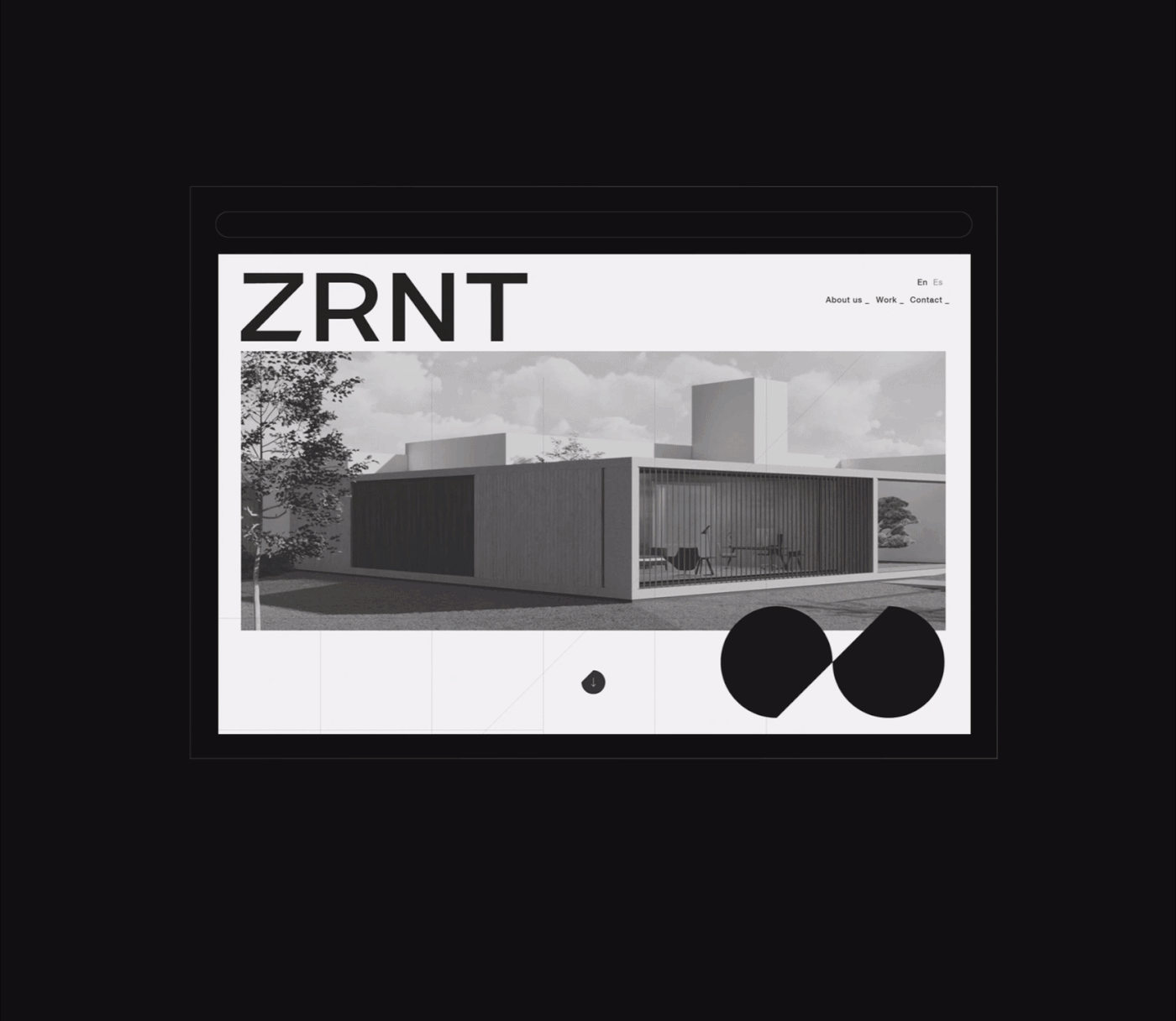
ZRNT/ es un estudio de arquitectura caracterizado por su diseño innovador y funcional, con aires metódicamente constructivistas, donde el uso de paralelas y diagonales se encuentra en todos sus proyectos. Paradójicamente, la Z inicial que lleva el nombre de su fundador, es una de las pocas tipografías del abecedario constituida por una diagonal. Este elemento nos permitió construir una identidad, siendo fieles al universo estético que dicha información nos arrojaba. Un key visual medido, estudiado, milimétrico. Un branding que no conceptualizamos en una hoja, sino en un plano.
ZRNT/ is an architecture studio characterized by its innovative and functional design, with a methodically constructivist approach, where parallels and diagonals are found in all its projects. Paradoxically, Z, the initial that bears the name of its founder, is one of the few fonts in the alphabet made up from a diagonal. This element gave us the information we needed to build an identity, being faithful to the constructivist aesthetic universe. A measured, studied, millimetric key visual. A branding that we did not conceptualize on a sheet, but we did on a plan.