

Intro
This project was created during my studies of Google's UX Design Certificate course. The mobile app concept was designed for an Ottawa area non-for-profit bookstore.
The Nonprofit
Secondhand Stories
This nonprofit recycles pre-loved books, with all profits benefitting animal sanctuaries. Their product photography was also used within the app mocks, to keep the genuine look and feel of the nonprofit bookstore.
The Problem: Instagram Store
The nonprofit was operating via Instagram posts and stories. Though they were reaching their audience, it was becoming clear that users needed basic e-commerce tools to continue shopping with the nonprofit.


The Goal
Create an app to provide users with a more efficient shopping experience: dynamic search, simple checkout and account capabilities to encourage user retention.
My Role
Individual team member
My Responsibilities
- Completed user research, personas and determine current roadblocks for users
- Conceptualizing the user flows, and journey to purchase
- Designed visual concepts through sketching, wireframes + prototypes in Figma
- Conducted usability testing at low-fidelity and high-fidelity stages

Research
Understanding the Audience
Personas, If/Then Statements and problem statements were completed to gain a deep understanding of user motives, emotions and end goals.

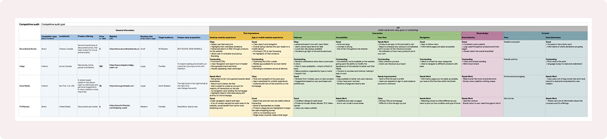
Competitive Analysis
A competitive audit was completed for direct & indirect competitors. Their branding, interactions, visual design and content were reviewed to determine factors that made them stand out, common patterns that are found in the industry and room for improvement.
Storyboarding
I utilized Storyboards to better understand when a user may use the app. Big picture + Close-up storyboards show the purchasing journey.


Sketching & Low Fidelity
I started off by exploring popular e-commerce apps: taking screenshots of UI patterns that I felt could be re-used within my app, making note of possible features and understanding the product information that is necessary to sell books. I continued my ideation phase by sketching some ideas for the homepage of the app. My goal was to design a structure that was familiar and intuitive. I then proceeded to re-create a compilation of my sketches as low-fidelity mocks within Figma.


Usability Testing
UX Testing Summary
6 participants were asked to utilize the low-fidelity prototype to purchase a book on the app. Each described their steps and answered questions after each prompt based on their experience and expectations. The research study helped me understand how user’s find products, browse and necessities when purchasing a product through an app. The findings also make it clear that a more personalized browsing experience could increase sales as users were very receptive to suggested books and series.


Round 1 Findings
1. Suggested lists could be personalized to each user based on their preferences and shopping experience
2. Condition ratings on the second-hand products provided value to shoppers
3. When scheduling pickup, a calendar might be easier to understand

Round 2 Findings
1. User’s would like to see a summary before finalizing their order + pickup details
2. User’s would like to have shipping options along with local pickup option

Accessibility
Making the unique characteristics of the app usable by all.
Key Considerations
1. Visual: Brand colours have been modified to provide a high-contrast palette to accommodate those who may be experience visual impairments.
2. Robust: Alternate Text is provided to describe the books condition when user’s may not be able to view the visual product photos. This also ensures the app is compatible with technology people may be using such as screen readers.
3. Cognitive: Icons are utilized to help user’s more easily consume the information and navigational cues to reduce cognitive load. Longer lists of books are split into smaller sub-groups to help users find items quicker and reduce the chance of loosing their place in a long list causing frustration.

Screen Mocks
Mockups of the final concept screens.


