THE SPACE
Sector: Food & Drinks, Arts & Culture
Practice area: Visual Identity System, Poster Design, Packaging Design, Copywriting
Designed by Pocca
Started in 2016, THE SPACE is one of the few early spaces in Shanghai that mixes coffee, drinks, food, and art. After six years of operation and development, THE SPACE has gained a lot of popularity for its quality coffee and brunch, while at the same time, the space is equipped with an art display environment on par with professional galleries, and has presented a wide range of quality exhibitions for art lovers over the years, such as prints, photography, painting, design and other aspects. THE SPACE's own description says, “The Space is an indefinable space that provides a venue for creative, expressive, and communicative people to meet, create opportunities for thinkers and doers to meet, and inspire new possibilities. It also offers a good cup of coffee and a leisurely time for those who seek quality ……”.
We first met THE SPACE in 2019 when the exhibition we curated for New Zealand designer Catherine Griffiths launched there. After a series of small-scale design collaborations, we were asked by THE SPACE to put together and design a new visual identity to help them embark on a new journey. According to statistics, Shanghai has the highest number of coffee shops in the world, you can find all kinds of coffee shops in Shanghai, and there are more and more retail and restaurant spaces like The Space with mixed business operations. In such an environment, is it better to create a completely different image or to continue the brand's existing style? Is it better to incorporate eye-catching trends or to continue the brand's original cleanliness? Should we add a definitive term to THE SPACE or keep it undefined? These questions and choices became the most discussed part of our discussions with the two founders of the brand.
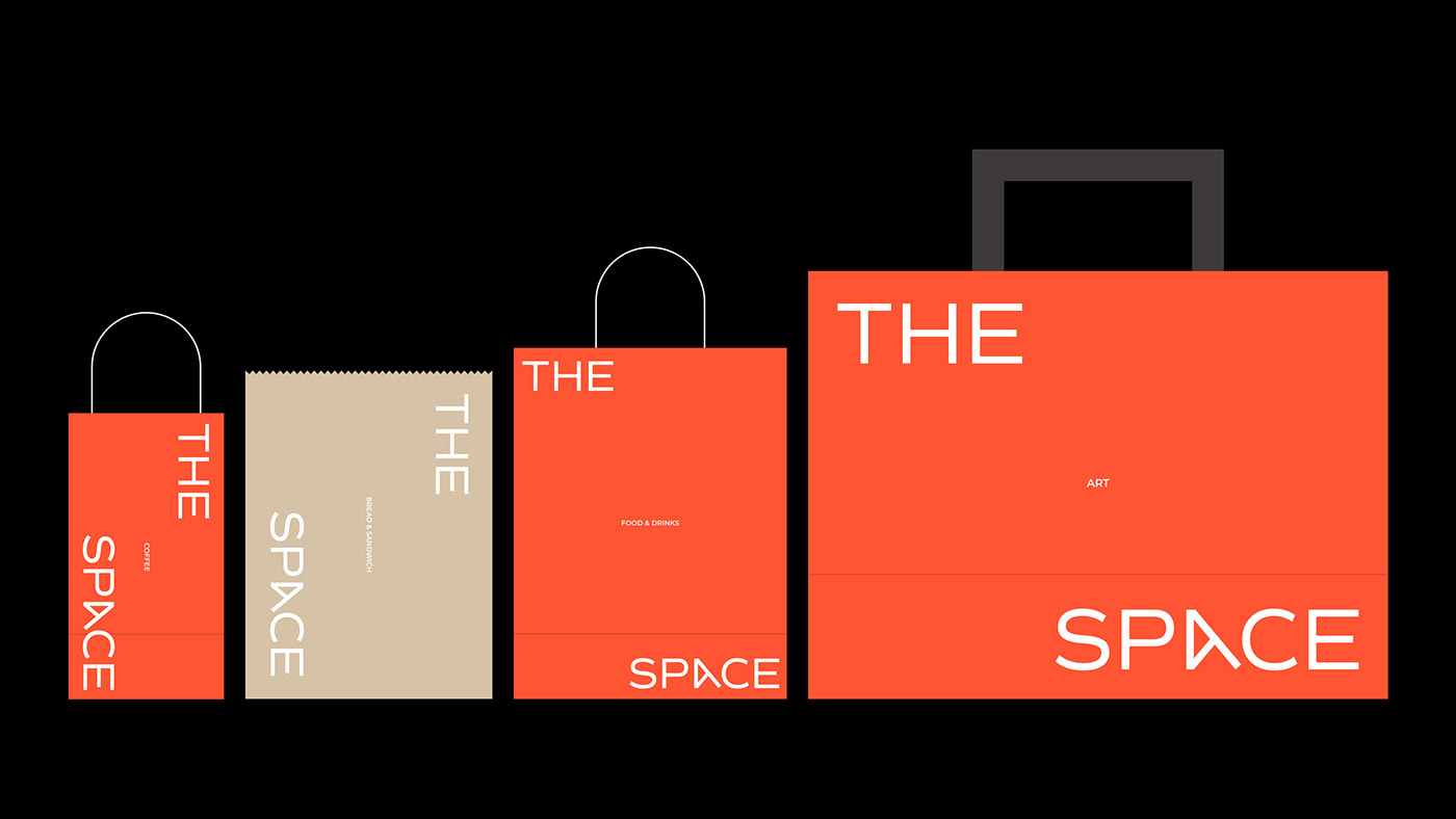
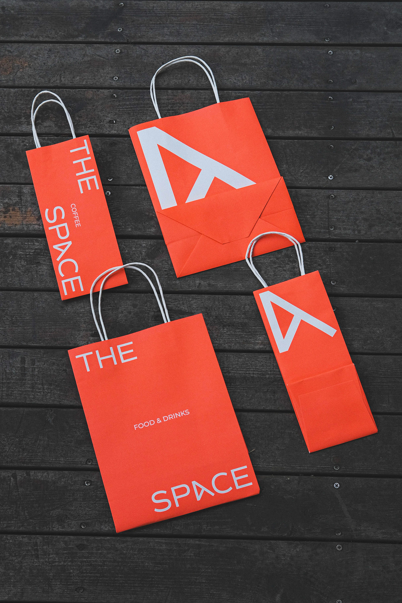
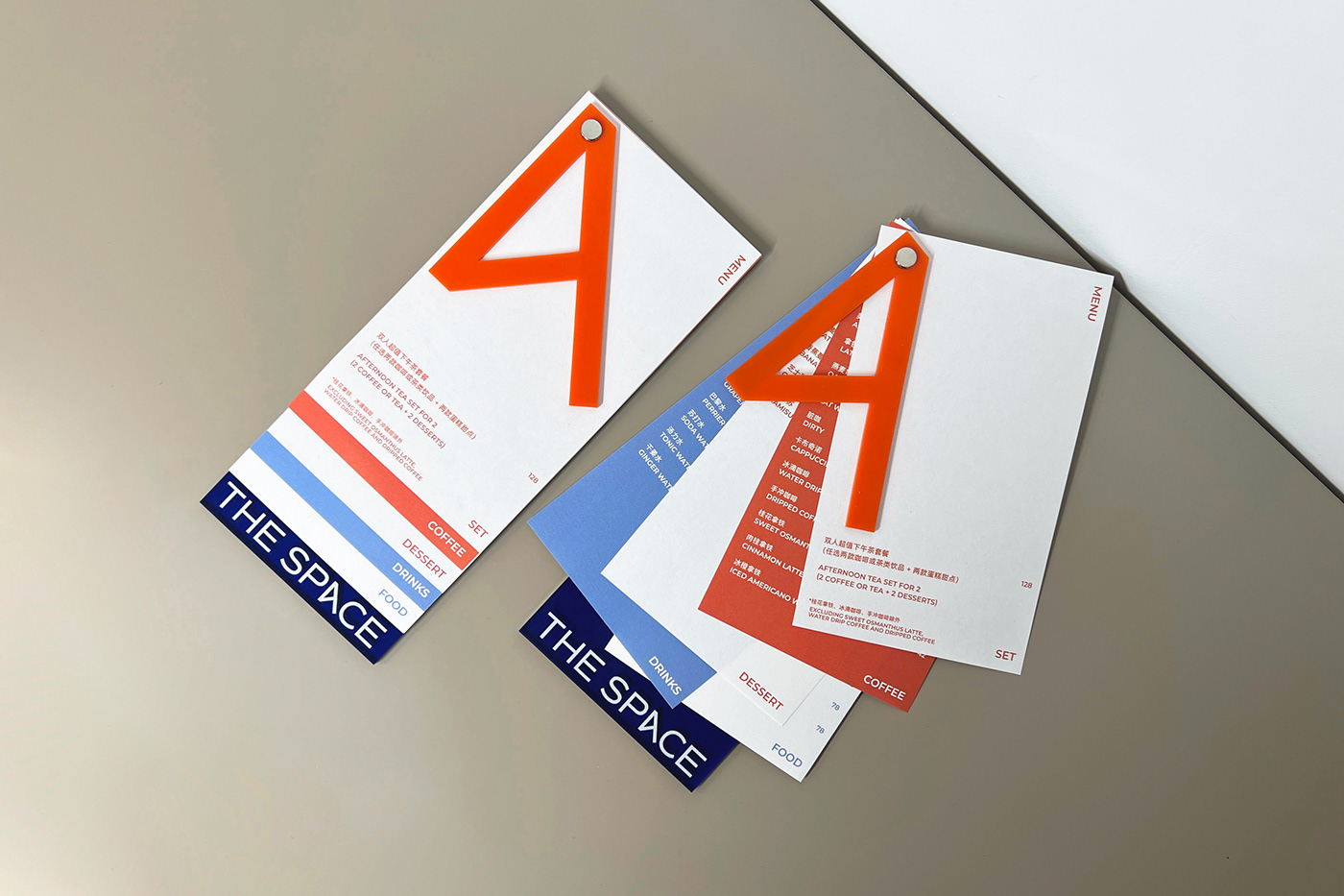
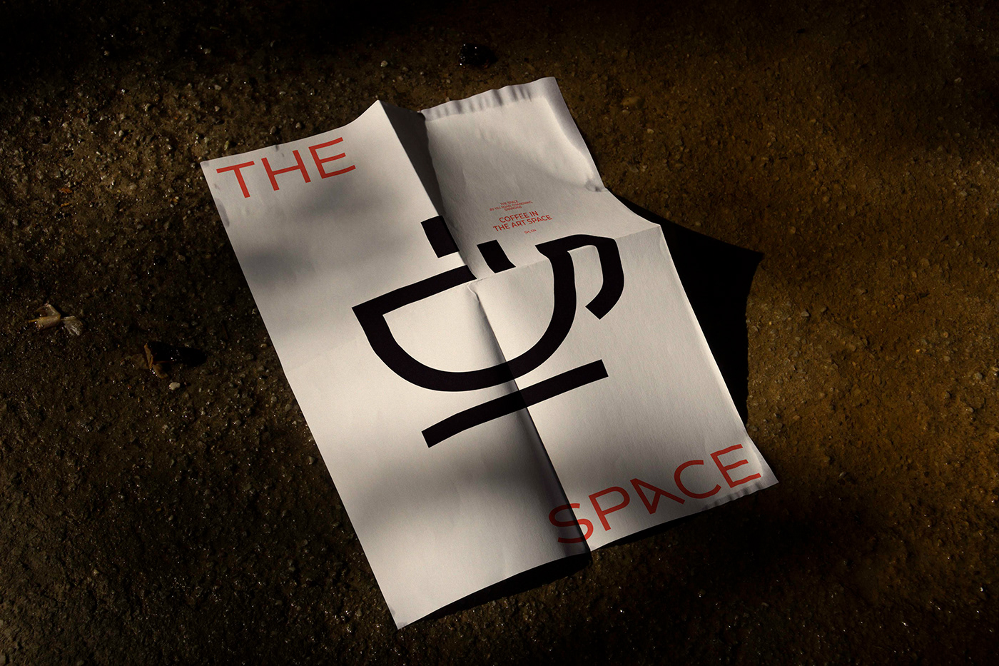
In the end, we decided to move on from the architectural geometry of the brand's original logo and integrate the gap of “undefinable” into the grammatical dismantling of “THE SPACE”, so that “THE SPACE” becomes “The XXX Space”. It also seems to be an invitation to all people related to the brand to create a definition for this space. Based on this idea, the whole visual language is naturally laid out, and “THE SPACE” can be flexibly used in different layout, both as the brand's logo and name, and as part of the specific information in the pages. At the same time, we wrote a playful note “IN THE ART SPACE, ART IN THE SPACE, THE SPACE IN ART” for the brand based on the qualities of the name itself. The letter A in the brand name is designed as a structured shape, a kind of continuation of the original logo, but also a separate symbol in the new identity of THE SPACE, emphasizing the artistic nature of the brand.